Sydney Children’s Hospital Placemaking + Environmental Graphics
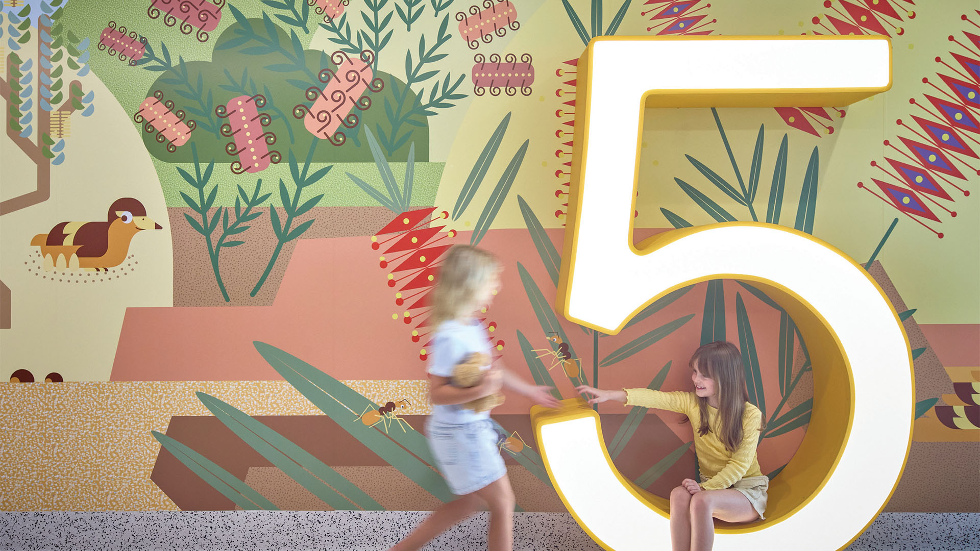
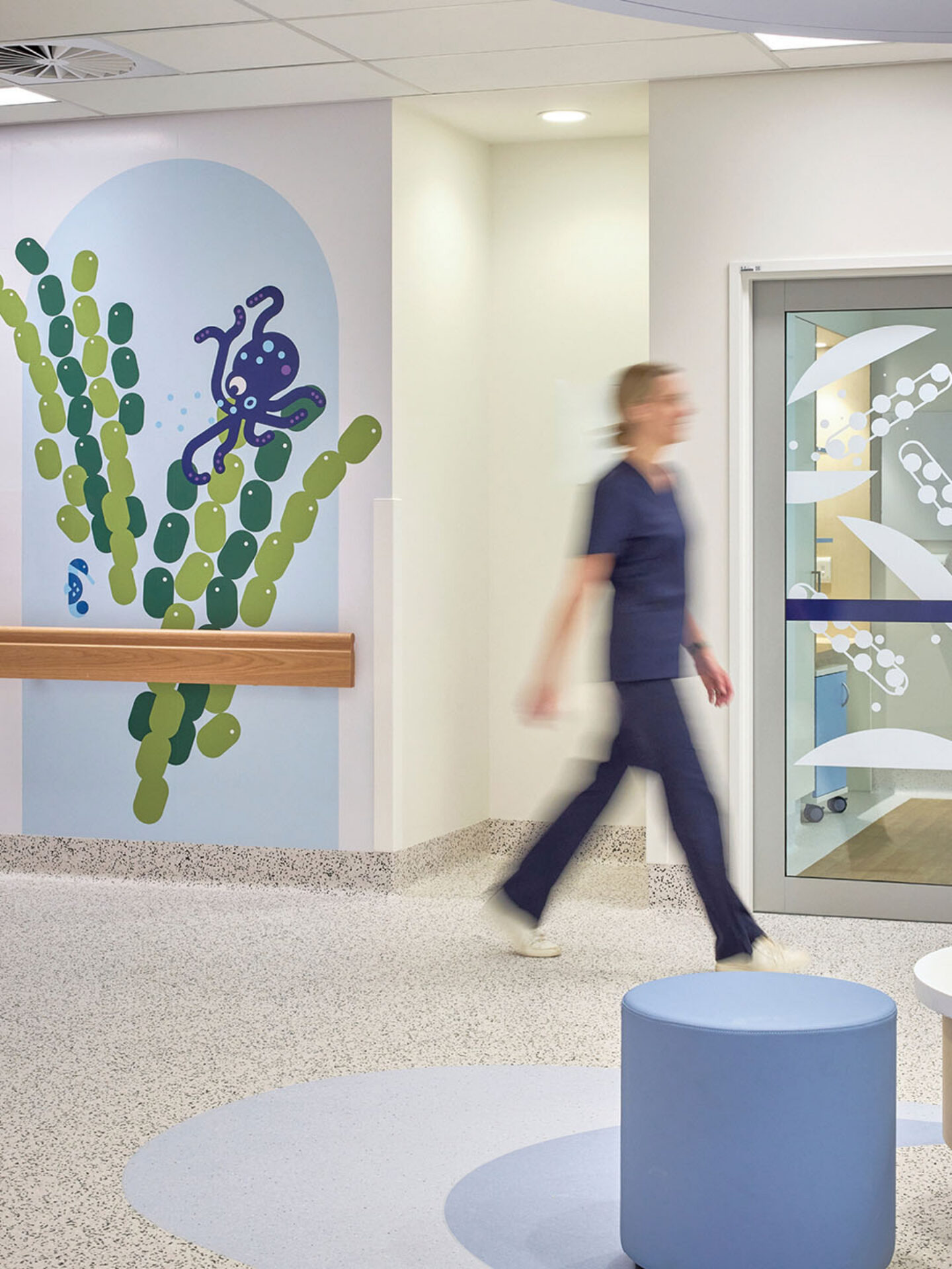
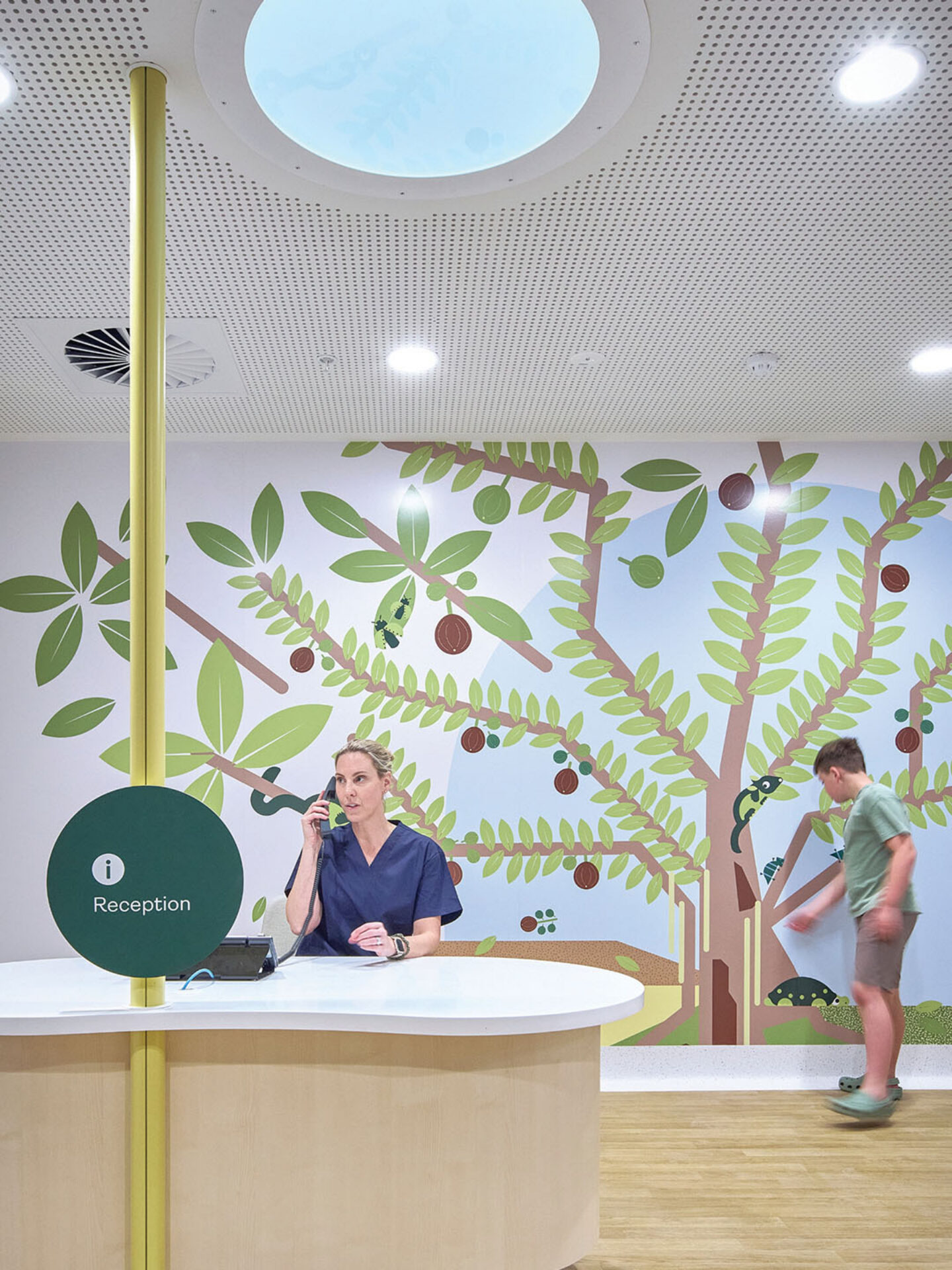
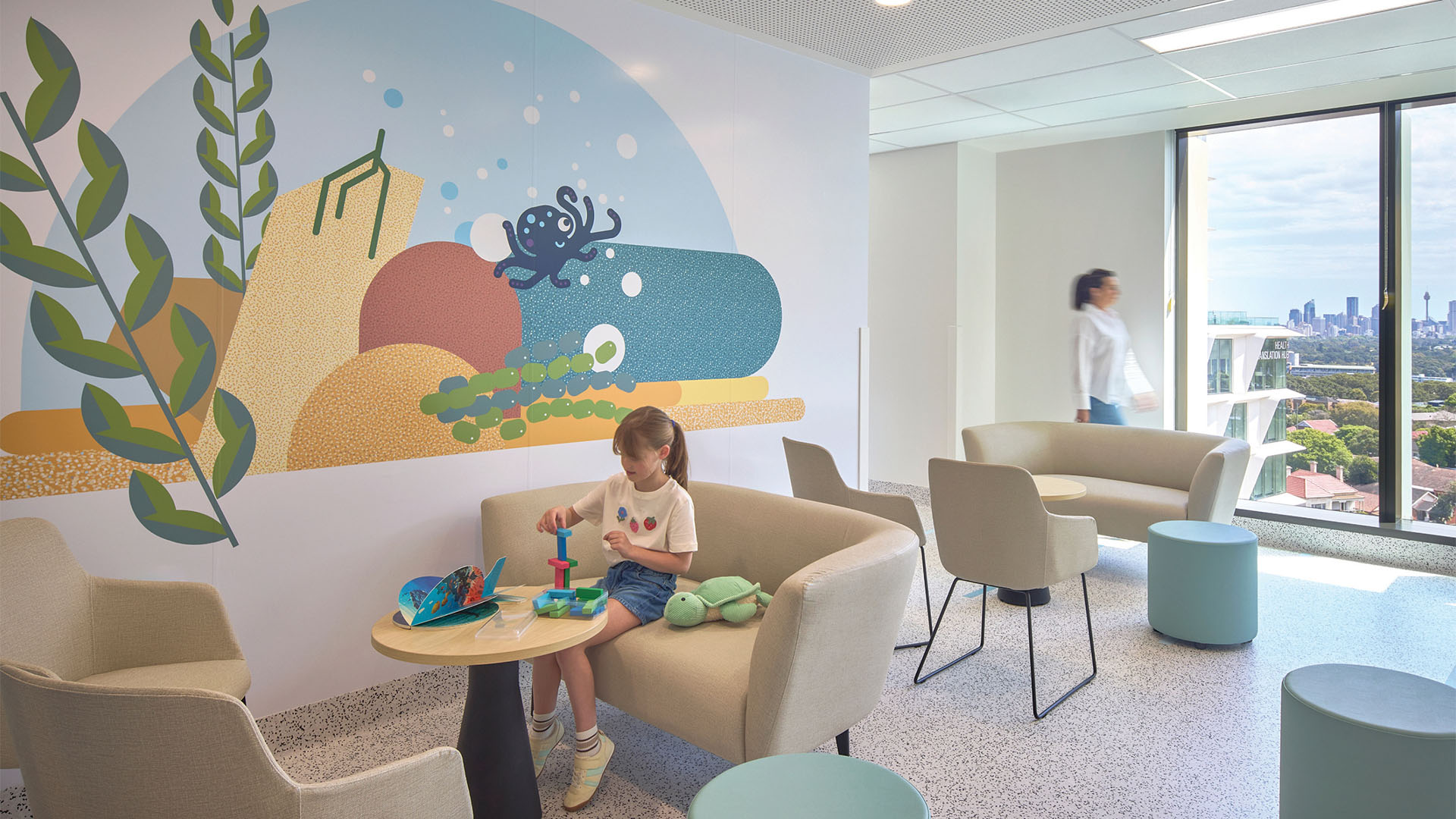
The Sydney Children’s Hospital Building is one of Australia’s most new and complex pediatric healthcare environments, serving children, families, carers and clinicians across 12-stories. For many visitors, the hospital is experienced not once, but repeatedly and for long periods, often during emotional moments.
Agency
Frost Collective
Practice Area
Client
Sydney Children’s Hospital
Industry
The Challenge
Working with a joint curatorial team from the Gates Discovery Center and Designing Motherhood, one of our challenges was to help the visitor make sense of such a wide array of items. A long, winding ‘umbilical table’ organizes the eclectic yet powerful content into the chronological stages of pregnancy, to help guide the visitor.
Project Vision
Designing Motherhood examines not only the design of objects connected with childbirth, but their powerful socio- and political impact. Audience engagement—rather than just passive viewing—was a key goal. We worked to design four different types of activity, including building a collective timeline about parental leave. Visitors were also encouraged to learn what it’s like to ‘wear a baby’’ — they could try out wearing a cloth wrap baby carrier, using a life-like NeoNatalie ‘infant.’
Design + Execution
To give the many small artifacts visual presence and contrast against the wood and dark steel of the Discovery Center, we introduced white as a backdrop for the content, both in the winding table and in the surrounding alcoves. A vibrant peach-orange color was used as an accent and a highlight throughout, in particular for quotes, to elevate diverse voices. In a nod to the gridded architecture of the Discovery Center, we established a modular system throughout the space for everything from the radial curves of the table (made the same width as the floor tiles), to the display system of square pedestals and captions along the table tops.
Project Details
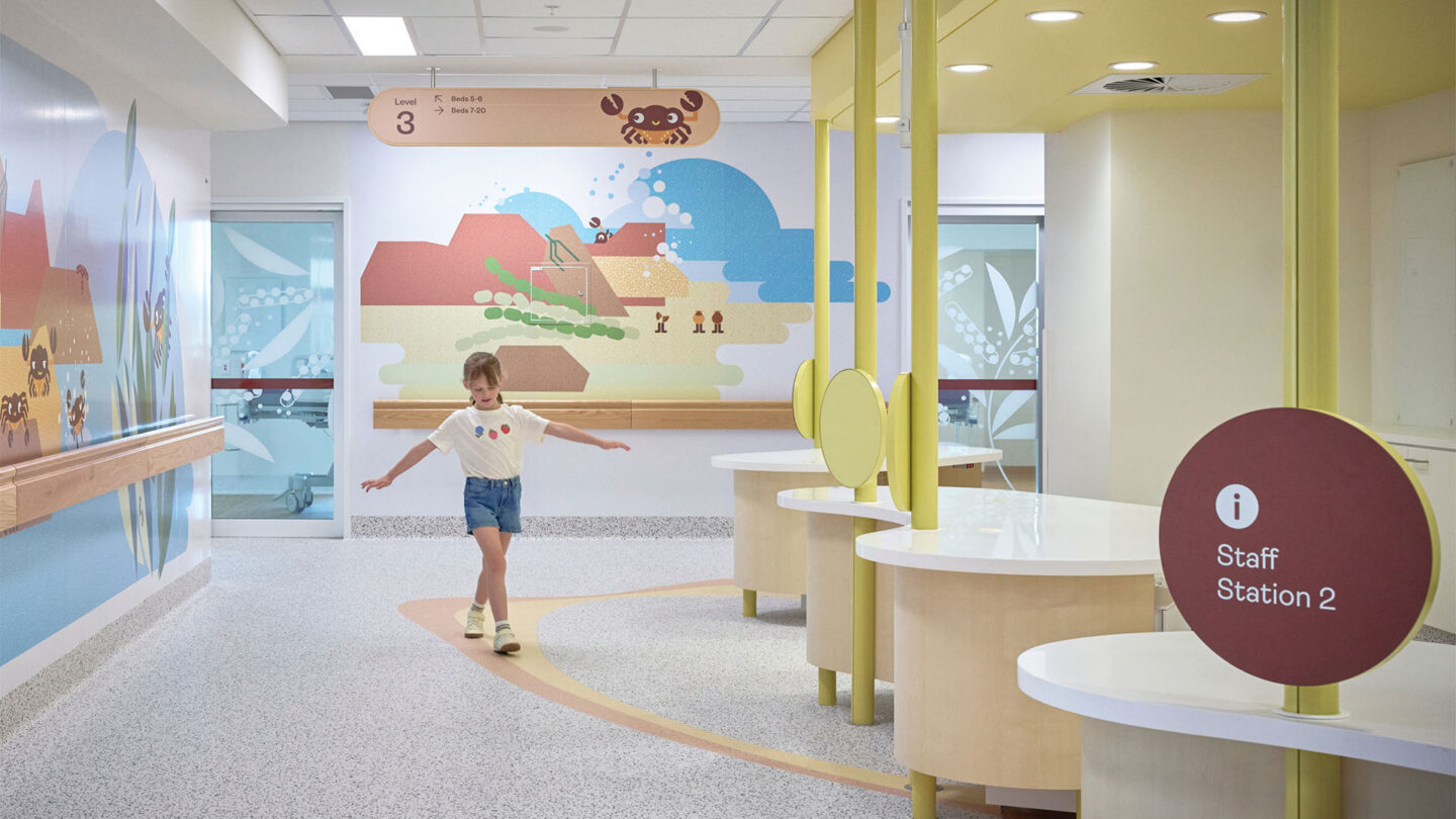
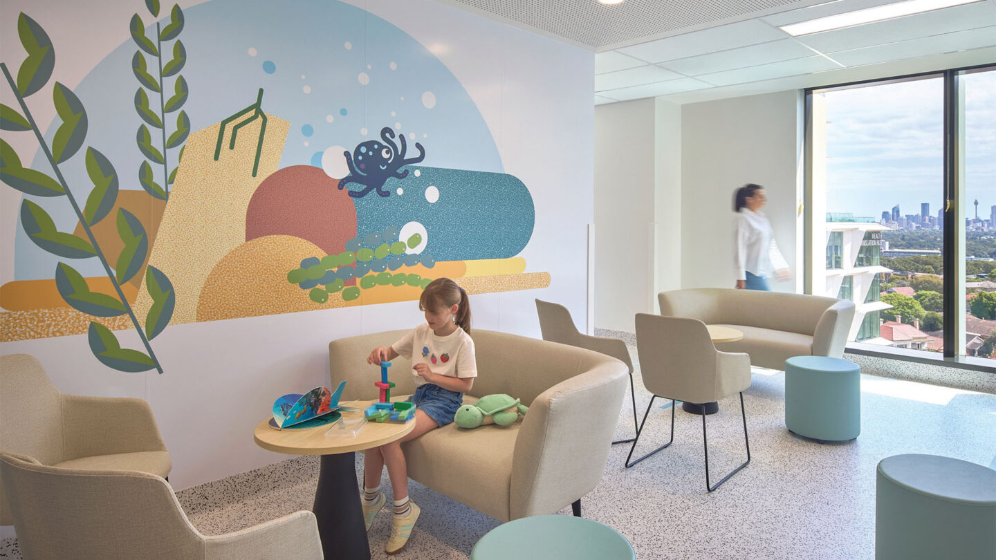
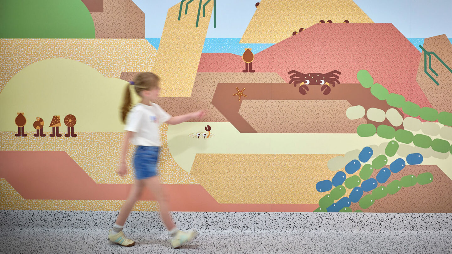
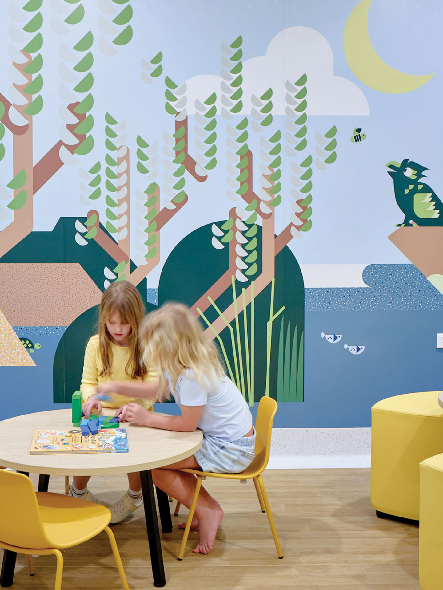
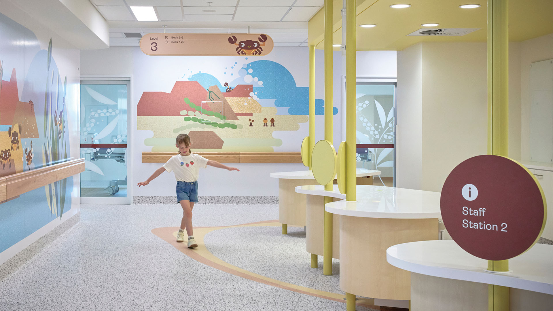
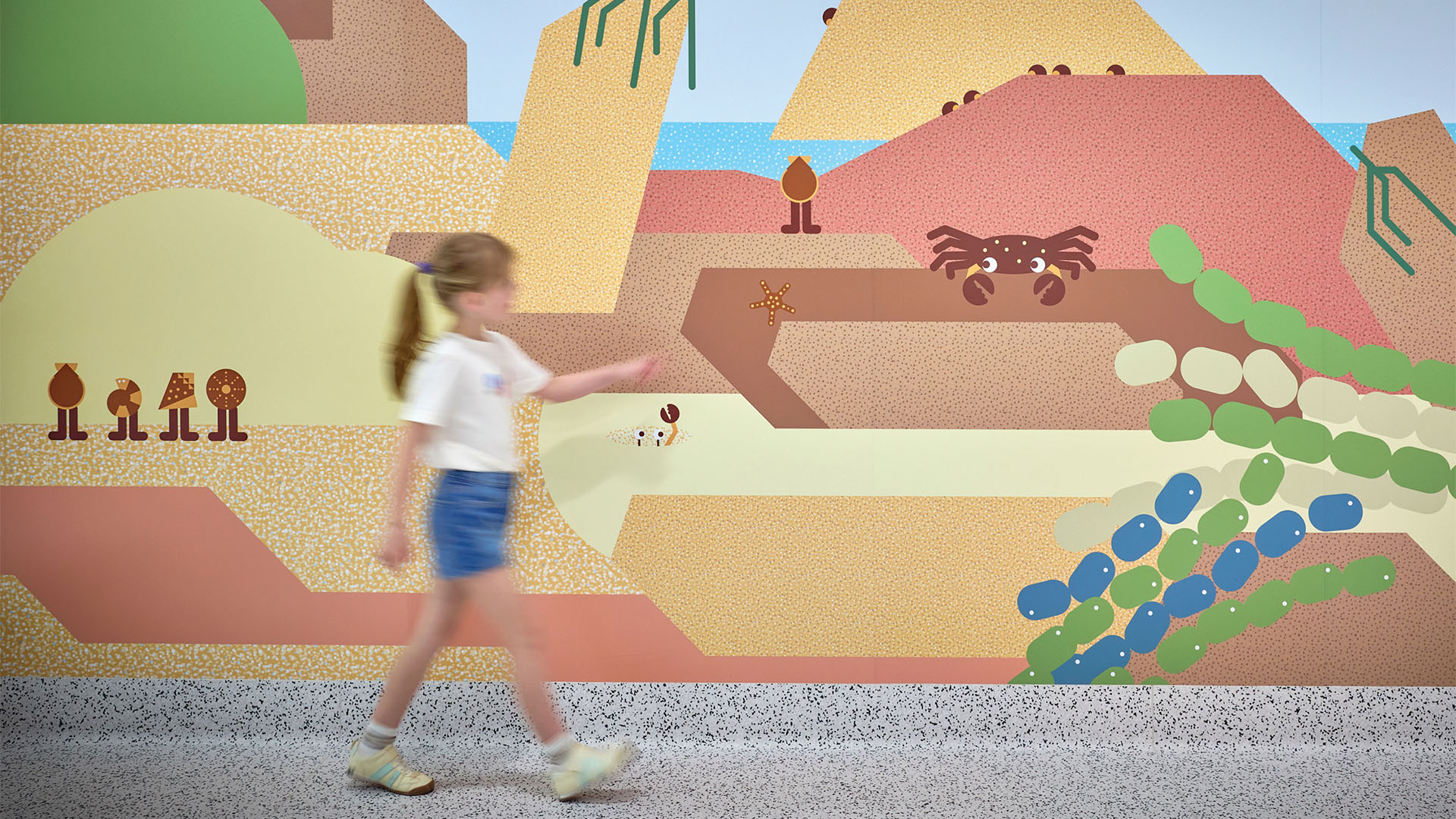
It’s a fun and engaging setting for children with well executed graphics and typography, but the calming color palette and beautiful illustration are what truly stood out – offering safety and security during a potentially very unsettling experience.
Placemaking at its best: a welcoming, cohesive illustrative system that gives a clear identity while unifying the patient experience. The illustrations bring joy to children when in one of their most vulnerable states.
Design Team
Vince Frost (executive creative director)
Anthony Donovan (group creative director)
Sarah Estens (creative director)
Fiona Boyan (design director)
Brenda Schofield (head of environments)
Alicia Devereaux (junior designer)
Collaborators
Billard Leece Partnership (architecture)
Aspect (landscape architecture)
John Holland Group (physical fabrication firm)
Photo Credits
Toby Peet (photography)
Jonathan McIntyre (videography)
Open Date
December 2025
More in Placemaking
All Projects-
Read more Harbourfront Centre Community Square
Harbourfront Centre Community Square
MJMA Architecture & Design -
Read more La Nube STEAM Discovery Center
La Nube STEAM Discovery Center
-
Read more Fort Churchill State Historic Park
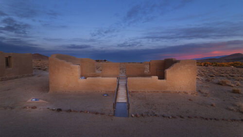
Fort Churchill State Historic Park