A Softer Approach to Wayfinding: Designing for the Theodore Roosevelt Presidential Library
How a site-specific system of signage, custom typography, and environmental graphics creates clarity across the North Dakota Badlands while preserving the landscape’s extraordinary sense of place.
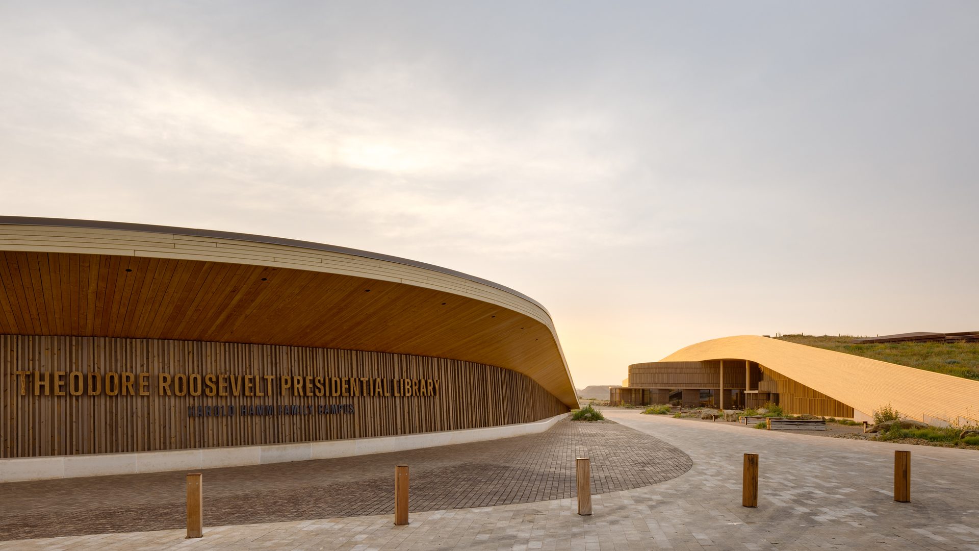
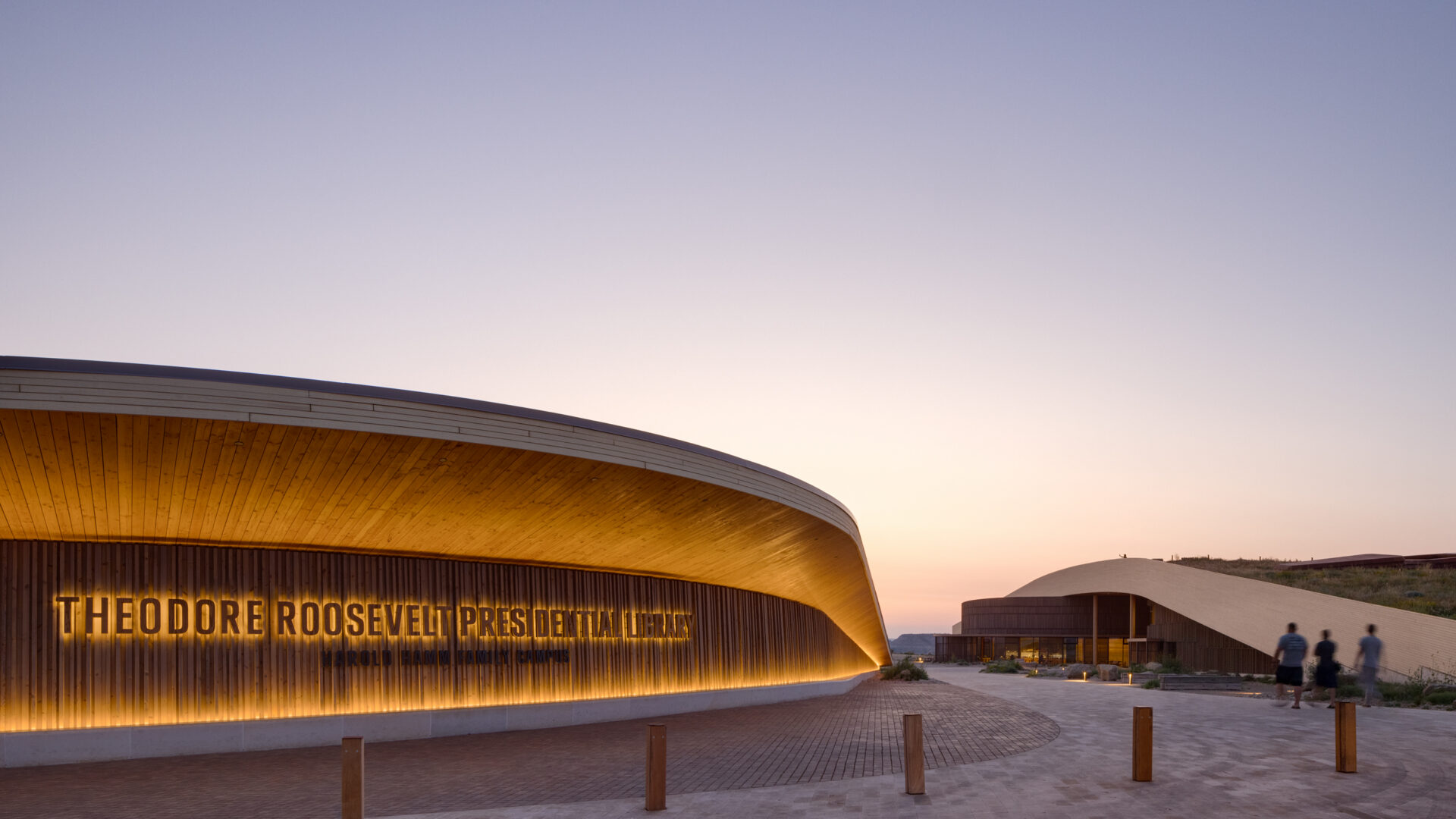
In the rugged landscape of Medora, North Dakota, the Theodore Roosevelt Presidential Library brings together architecture, storytelling, and the natural environment to celebrate the life and legacy of America’s 26th president. Designed by Snøhetta, the new cultural institution is deeply connected to the Badlands landscape that shaped Roosevelt’s life and his commitment to conservation. For Studio Loutsis, the Brooklyn-based branding and design practice responsible for the library’s signage, wayfinding, and environmental graphics, the challenge was to create a system that could provide clarity across an expansive and complex site without competing with the landscape itself.
Working closely with Snøhetta, type foundry Commercial Type, and fabrication partner Dimensional Innovations, Studio Loutsis developed a comprehensive environmental graphic system extending across the 250-acre campus, from the 100,000-square-foot museum to hundreds of acres of surrounding Badlands landscape. The project brings together wayfinding, custom typography, donor recognition, and environmental graphics to create a holistic visitor journey across scales. The Theodore Roosevelt Presidential Library is one of only 15 presidential libraries ever built.
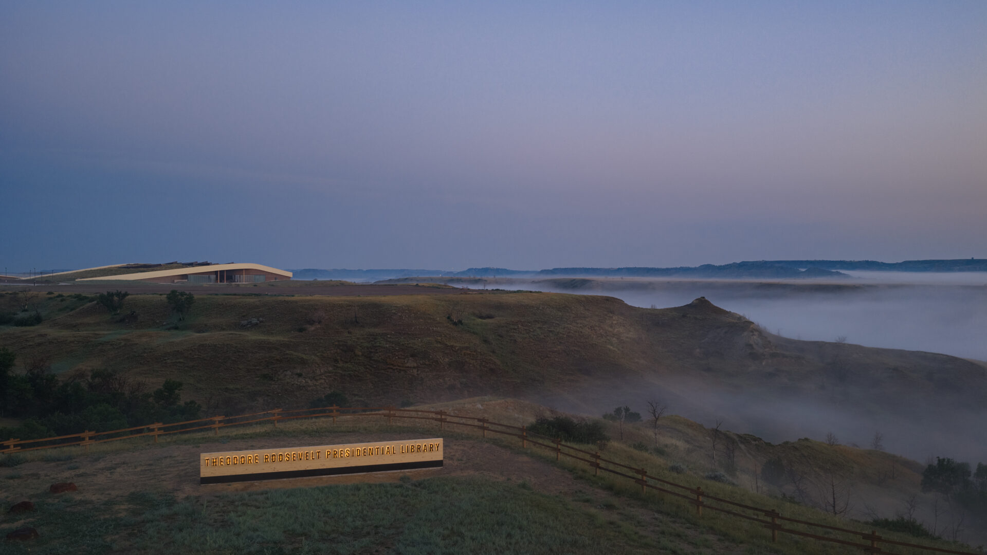
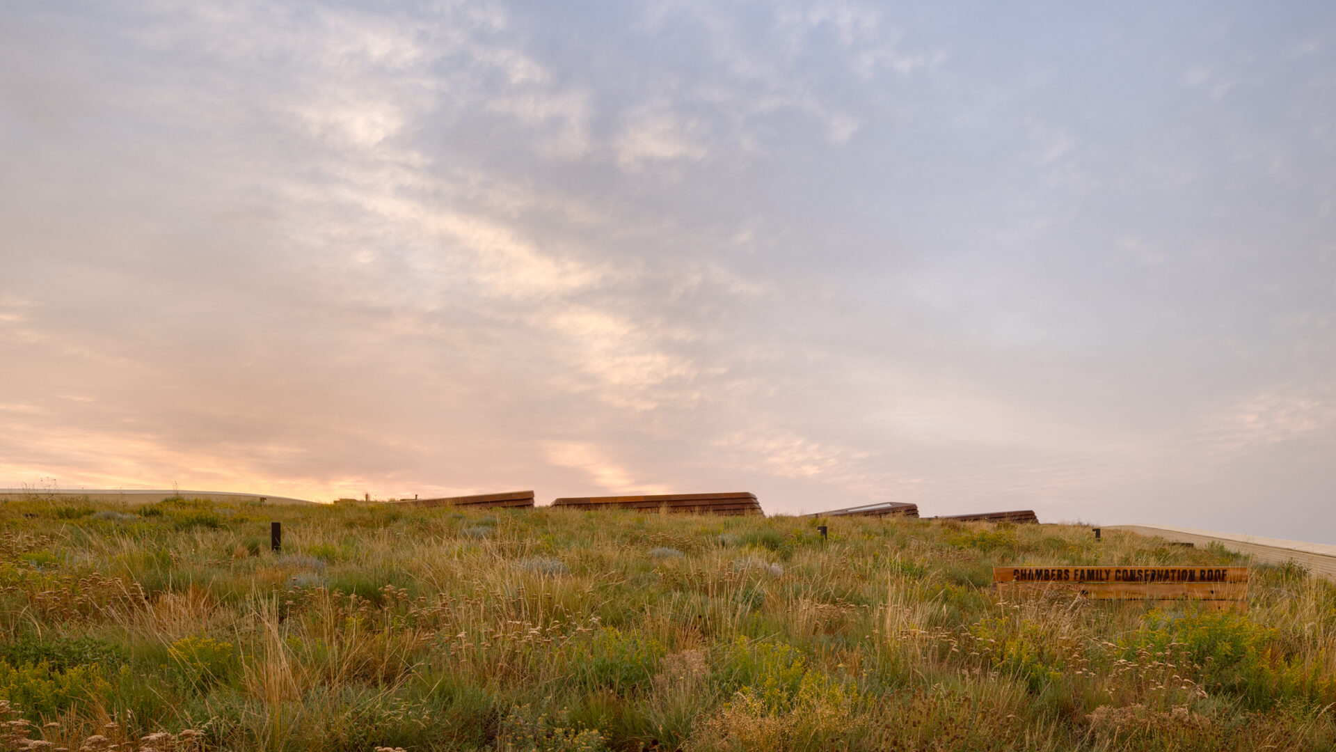
The library is conceived as both a cultural institution and an expansive public landscape, with the signage and wayfinding responding to the quiet and vastness of the surrounding Badlands. Softness became a guiding principle for the system, expressed through curvature, subtle shifts in contrast, and a restrained visual presence across the landscape. Rather than compete with the site, each intervention is designed to sit quietly within it, supporting a visitor experience rooted in Roosevelt’s relationship to the land.
Photographed by Rafael Gamo
A Wayfinding System Designed to Recede
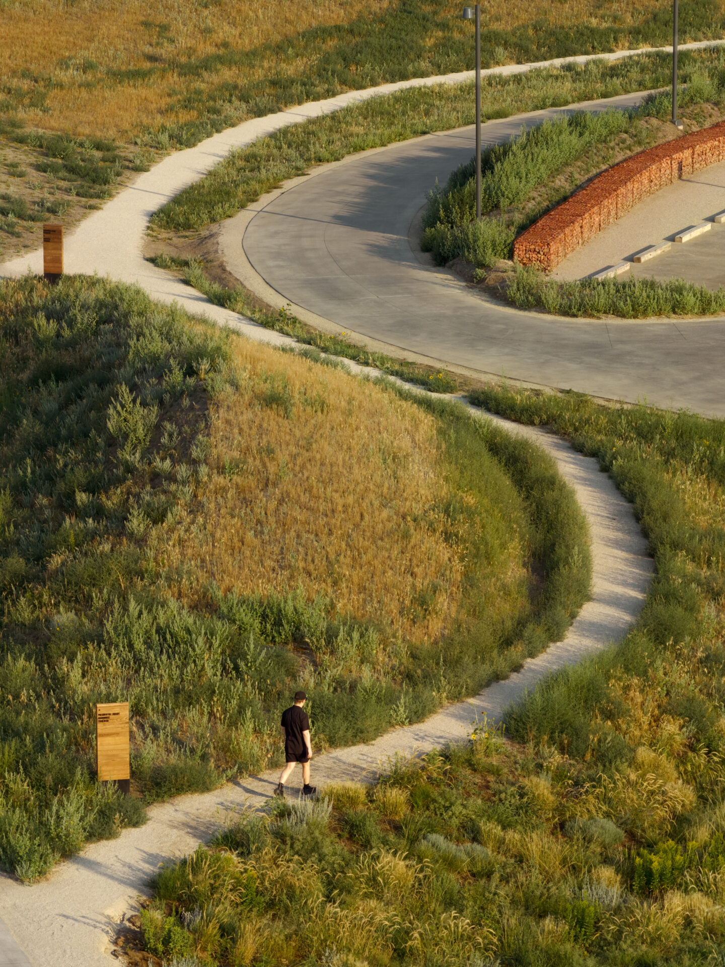
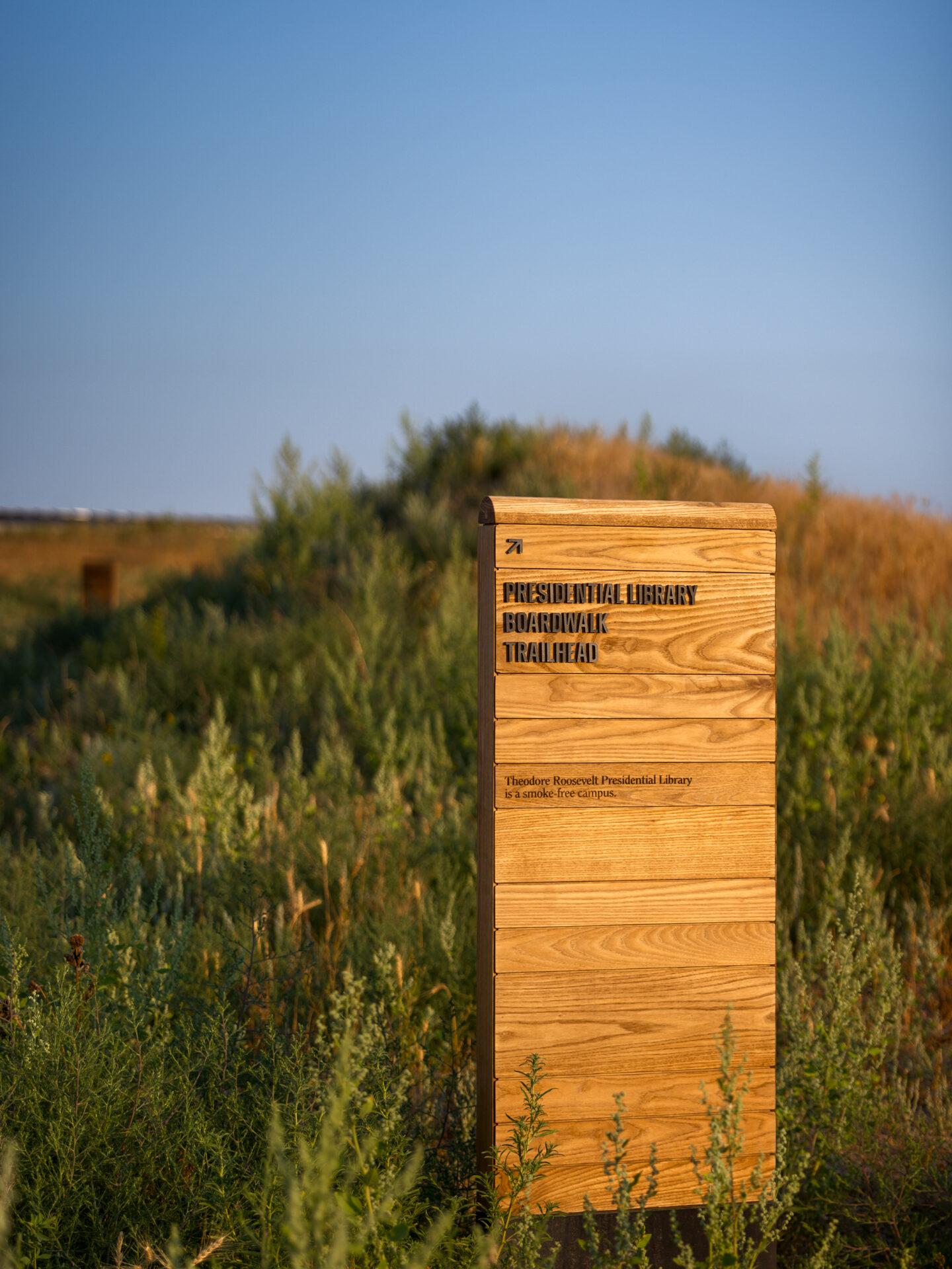
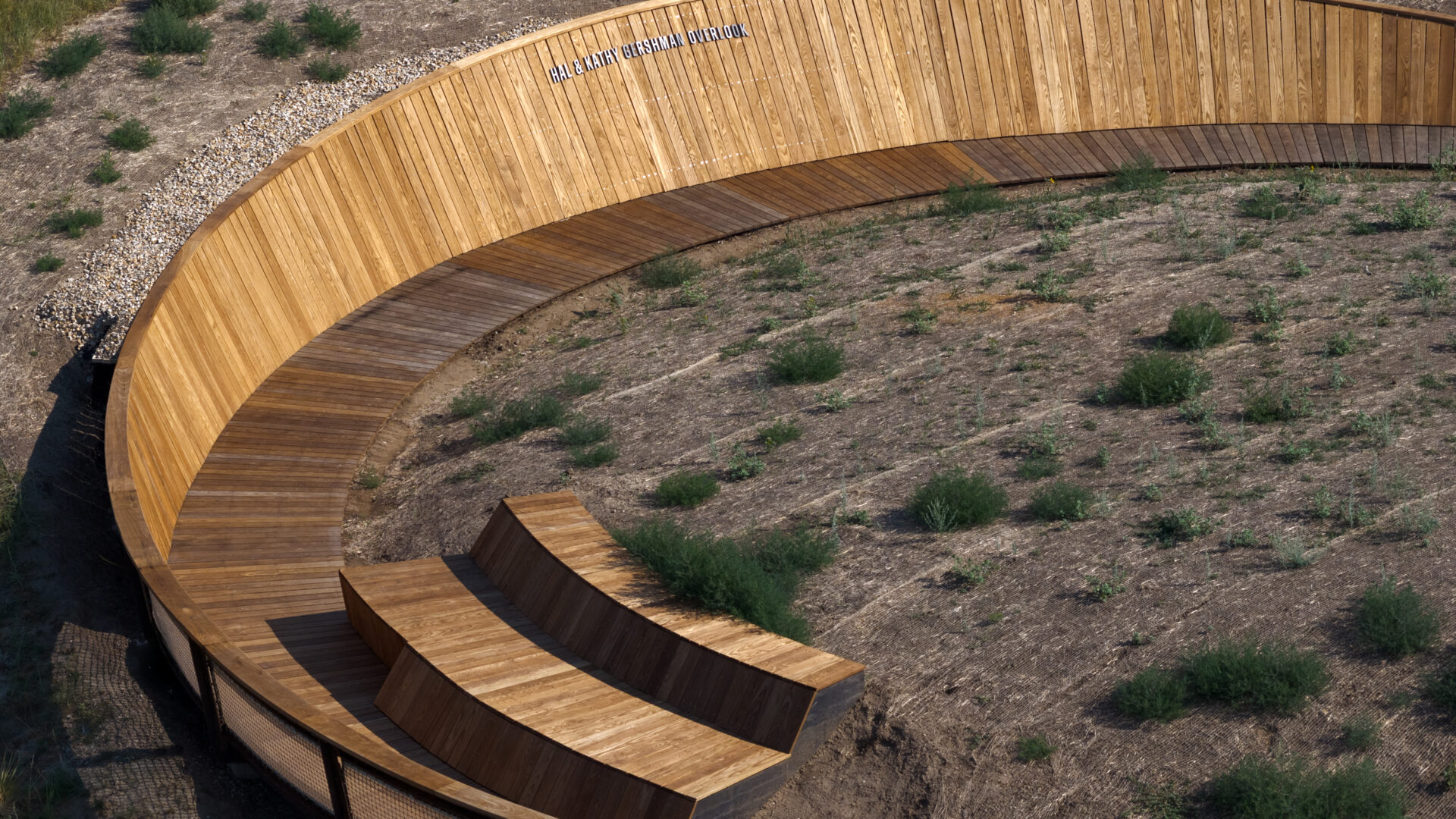
Across the campus, the signage was designed to appear precisely when needed and recede when it is not, preserving the extraordinary relationship between architecture and the Badlands landscape. Working closely with Snøhetta, Studio Loutsis developed a system with an intentionally quiet footprint: low to the ground, carefully integrated, and designed with minimal illumination or elements that interrupt the horizon.
“The landscape carries so much of the meaning of this project,” says Taylor Loutsis, Founder and Creative Director of Studio Loutsis. “Our role was to create a visual language that could provide clarity across an incredibly complex site without competing with that experience.”
The design draws relationships from the landscape design and architectural sensibilities and the visual character of the Badlands. Those relationships became an opportunity to rethink what institutional wayfinding could be: not a layer applied to the campus, but a system deeply integrated with the experience of moving through the site.
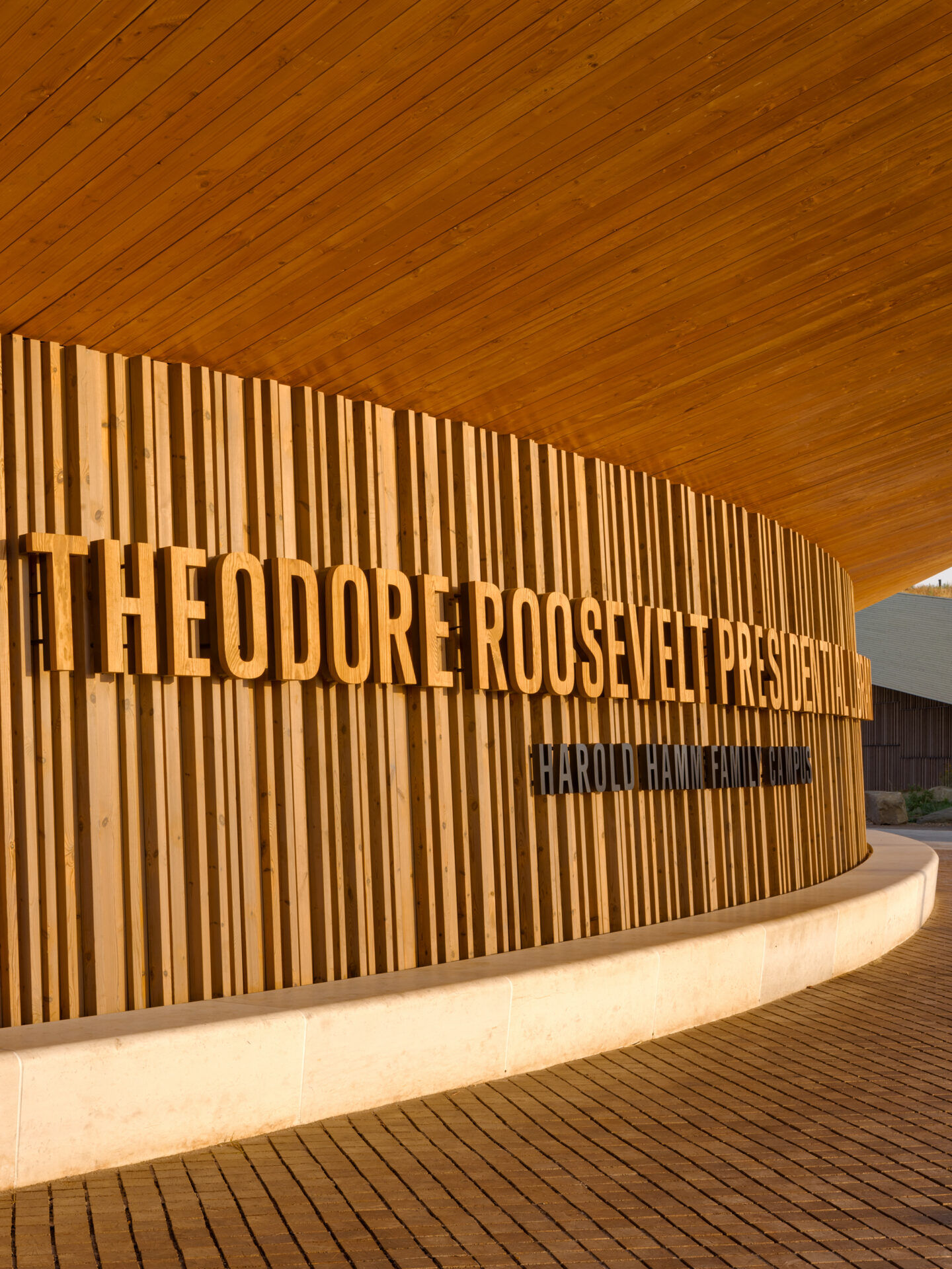
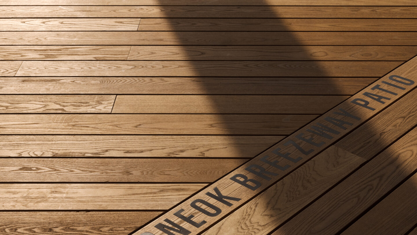
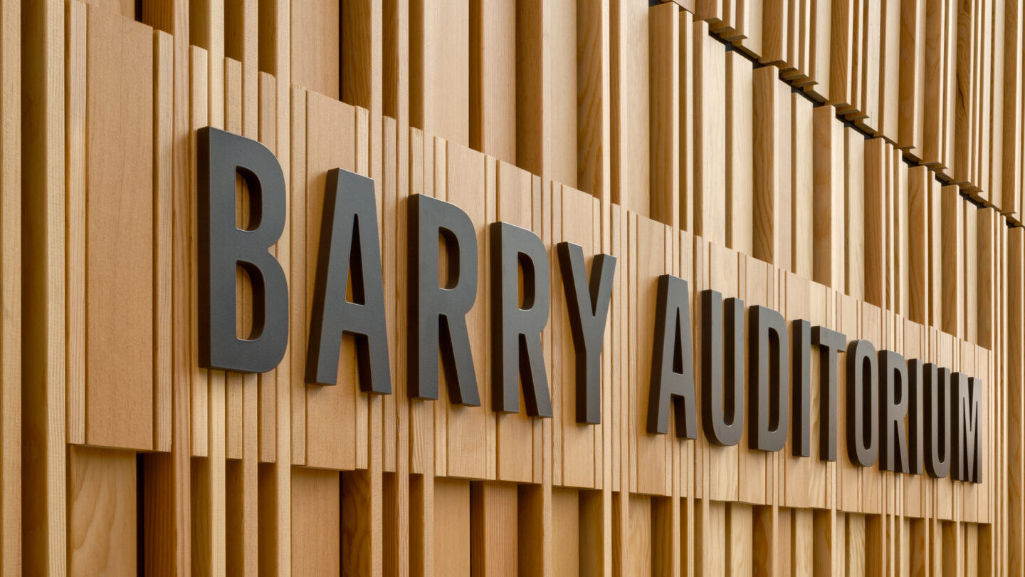
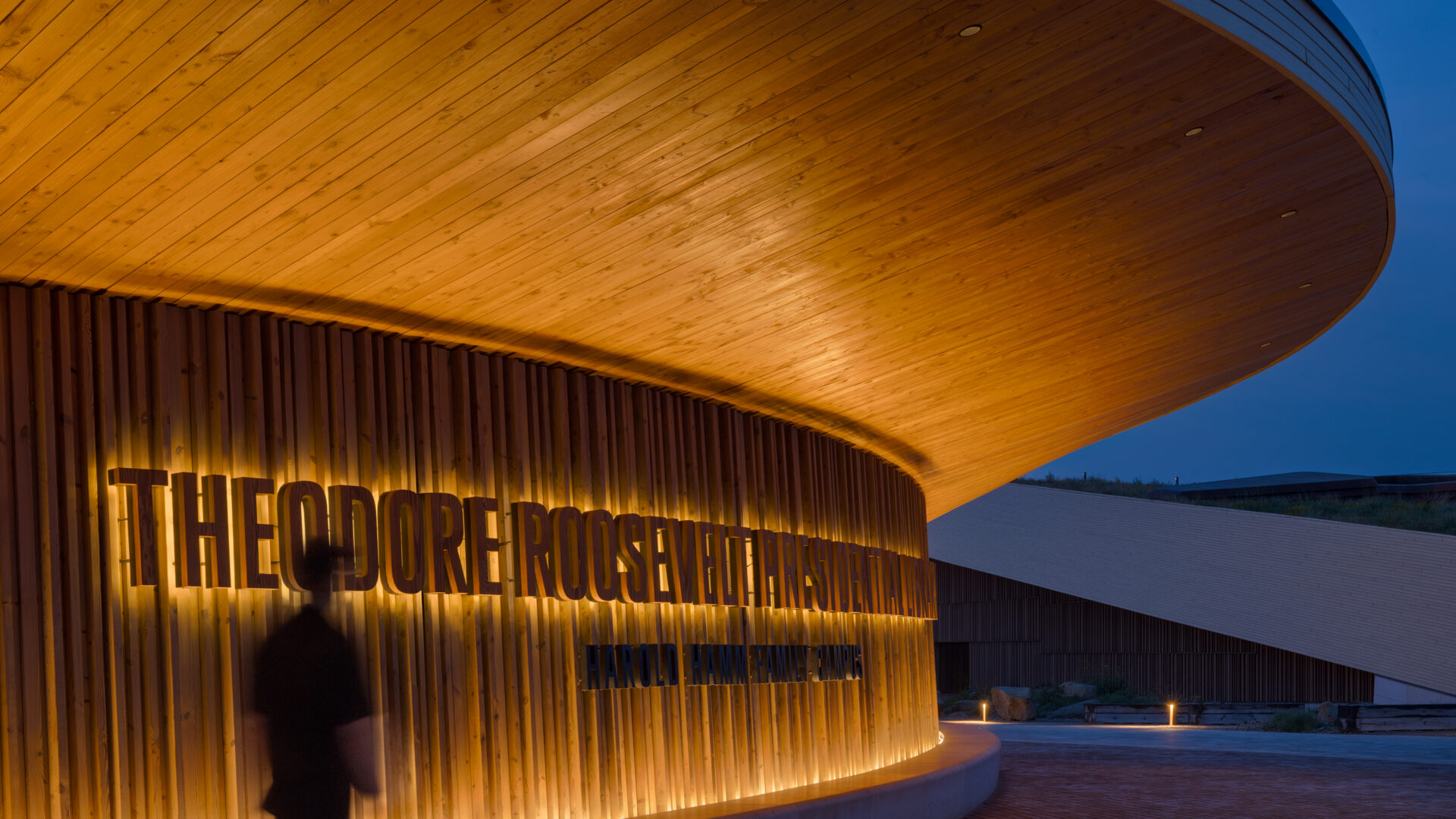
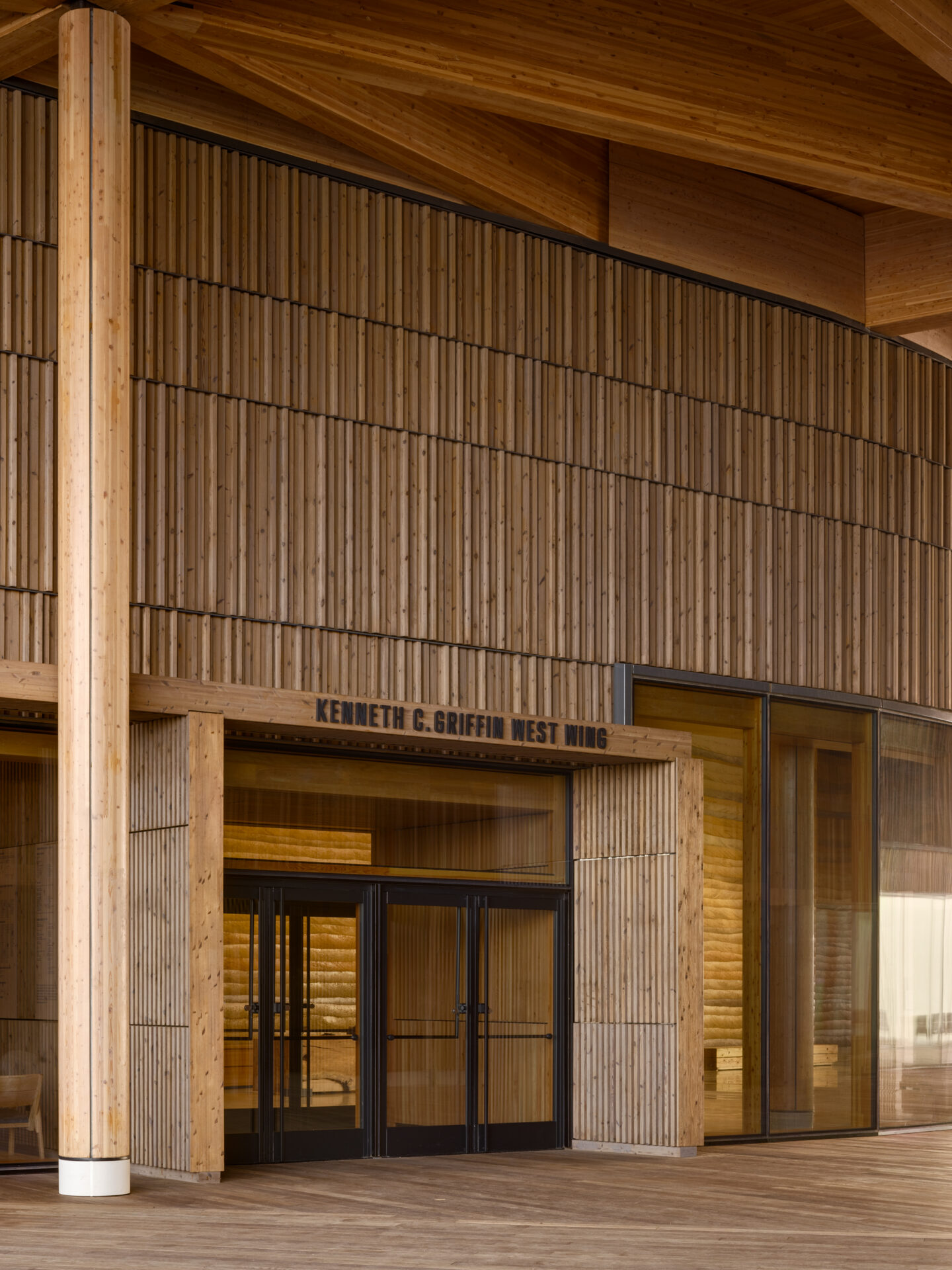
Every detail reinforces this approach. Curved forms echo the geometry of the building; materials and finishes establish subtle relationships with the changing colors and textures of the landscape; and signage shifts in scale and presence as visitors move from the open Badlands into the museum. At the primary entrance, monumental wood identification is embedded directly into the architecture, while across the grounds, maps, directionals, and identification elements create carefully calibrated moments of orientation.
Photographed by Rafael Gamo
Photographed by Rafael Gamo
Photographed by Rafael Gamo
A Typeface Specific to Place
Studio Loutsis commissioned Commercial Type, well known for designing typefaces for significant institutions including The New York Times and MoMA, to develop a custom typeface for the library. Its development began with understanding the local vernacular of typefaces found in the region of Medora. Letterforms and details found throughout the town informed a typographic language that connects the institution to its immediate context.
The resulting typeface is used throughout the signage and wayfinding system, balancing the clarity required of a civic institution with a character specific to the project. Its development also presented an important design challenge: the library’s established visual identity had a distinct, but its existing typefaces had not been developed specifically for the demands of readability standards in environmental wayfinding. As Taylor Loutsis explained during the 2026 SEGD Conference Experience Kansas City, evaluating those letterforms against legibility criteria revealed challenges with their proportions and stroke characteristics at certain sizes and viewing distances.
Working with Commercial Type, the team explored how regional lettering could inform a contemporary typeface without becoming nostalgic or overly literal. The objective was to create something unmistakably connected to the library and its setting while performing effectively across a range of spatial conditions.
Photographed by Rafael Gamo
We knew the typography needed to endure. It couldn't be overly influenced by a particular moment in design, so we wanted something clear, grounded in the character of Medora, and capable of serving visitors for generations to come. That same sensibility extended to the iconography system, which was designed specifically to work in concert with the typeface.
The custom typeface includes an expanded character set and diacritics to support the library’s naming and language needs. Studio Loutsis also developed a family of 96 custom icons and directional arrows designed in concert with the typography, establishing a cohesive visual language across identification, orientation, and informational applications.
Information at the Scale of a Landscape
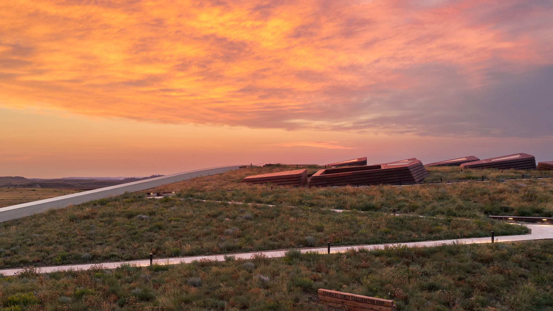
Navigating the library meant Studio Loutsis had to consider the sequence and scale of information across hundreds of acres and radically different moments in the visitor journey, from arrival and movement through the landscape to orientation within the museum. The wayfinding was intentionally designed around a simple idea: visitors should only encounter the information they need, when they need it.
At the scale of the landscape, the system establishes primary destinations. As visitors move closer to their destination, the information becomes more specific, guiding them from buildings to entrances and, ultimately, individual rooms. This progressive hierarchy allows an incredibly complex system to feel simple, intuitive, and quiet. When information became too complex, Studio Loutsis deployed custom maps designed to improve orientation.
“Much of the work was determining what someone actually needs to know at a particular point in their journey,” says Loutsis. “The system becomes more detailed as you move through the site, but you never need to understand all of it at once.”
This careful sequencing of information also informed how the signage shifts in scale and presence across the campus. Large-scale identification establishes key destinations, while smaller directional and informational elements respond to the needs of visitors as they approach the museum and move through its interior spaces. The system supports navigation without demanding constant attention, reinforcing the design team’s broader commitment to creating a quiet, intuitive experience.
Where Design and Fabrication Inform One Another
Achieving the signage system’s quiet integration within the architecture and landscape required close collaboration between Studio Loutsis, Snøhetta, Dimensional Innovations, and the broader project team. Studio Loutsis brought its expertise in graphic design, typography, and systems thinking together with Dimensional Innovations’ knowledge of materials, engineering, and fabrication, allowing design intent and technical considerations to inform one another throughout the process.
One example was the monumental identification integrated into the museum’s wood façade. Studio Loutsis envisioned lettering that appeared to emerge directly from the architecture, following the building’s distinctive curvature and material rhythm. Realizing this vision involved detailed studies of the façade’s complex geometry, material properties, and environmental conditions. Through close coordination, the team developed a solution that preserved the intended visual relationship between the lettering and architecture while ensuring long-term performance.
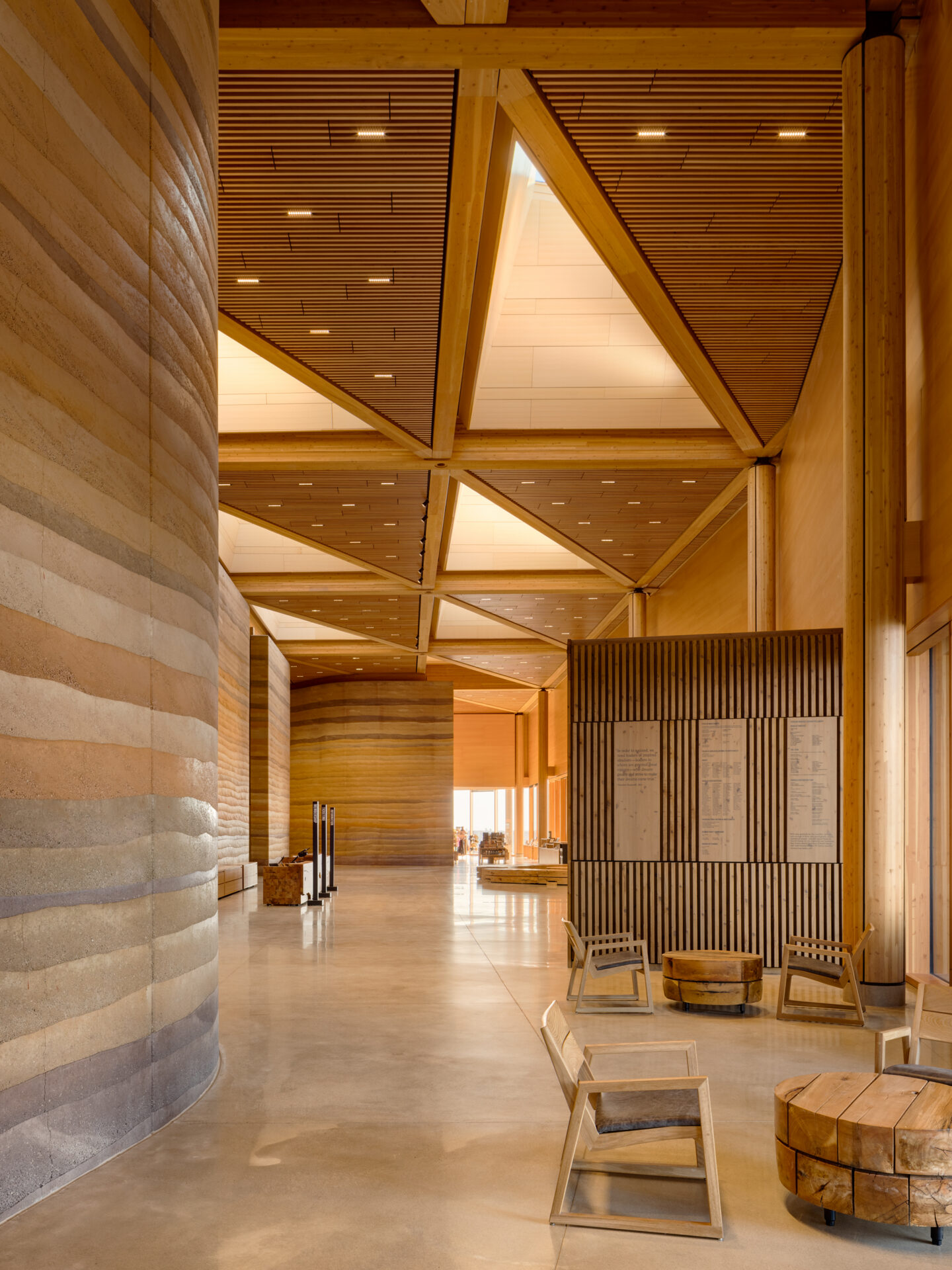
The project also pursued the rigorous Living Building Challenge, introducing demanding requirements around material sourcing, chemistry, and fabrication. Building upon years of architectural research by Snøhetta and the broader design team, Studio Loutsis developed a signage palette that complemented the building’s wood, metal, stone, and rammed earth while maintaining the clarity and identity of the environmental graphics.
At the 2026 SEGD Conference Experience Kansas City, Taylor Loutsis and Paula Neston, Cultural Practice Executive at Dimensional Innovations, explored how the tensions between creative ambition and fabrication realities became opportunities for innovation and collaboration.
Donor Recognition. Photography by Rafael Gamo
Designing for Permanence and Change
Beyond navigation, the environmental graphics also needed to accommodate information that would evolve over time. The library’s donor recognition program included 218 opportunities across eight tiers, with 124 requiring bespoke solutions. Studio Loutsis established a hierarchy that prioritized the most architecturally integrated locations, allowing critical design and fabrication work to advance while preserving flexibility as donor information continued to evolve.
A similar challenge emerged in the museum’s retail environment, where signage needed to integrate seamlessly with Snøhetta’s custom millwork while accommodating changing merchandise and operational needs. Working with Dimensional Innovations and a local millworker, the team developed a concealed magnetic system that allows labels to be repositioned without compromising the architectural character of the space.
Both solutions reflect an important consideration for cultural institutions designed to serve generations of visitors: creating something enduring does not necessarily mean making it fixed. Thoughtful integration and adaptability can work together to support the changing needs of a place.
A Visual Language Rooted in the Badlands
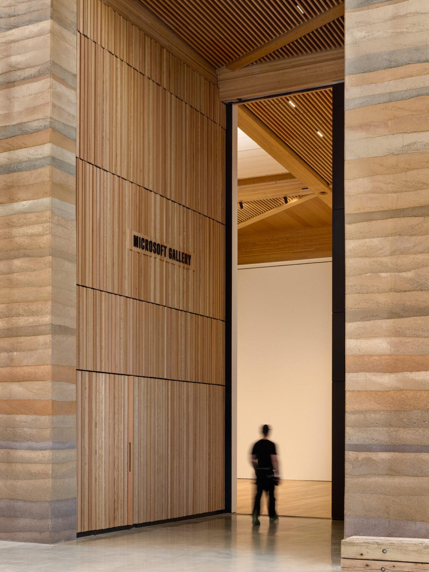
Across the Theodore Roosevelt Presidential Library, the environmental graphic system brings together typography, materials, architecture, and information into a unified visitor experience. Its presence shifts with the scale of the environment, from monumental building identification to quiet moments of orientation and recognition. Each application responds to its immediate surroundings while remaining part of a recognizable whole.
What makes the project particularly compelling is not simply its restraint, but the collaboration required to achieve it. The tensions between creative ambition and practical constraints became productive forces in the design process, leading to stronger, more considered solutions while maintaining the integrity of the original vision.
Through carefully considered typography, materials, scale, and placement, Studio Loutsis and its collaborators created a system that provides clarity across a complex site while allowing the architecture, landscape, and Roosevelt’s connection to the Badlands to remain at the center of the visitor experience.
Project Team
Client: Theodore Roosevelt Foundation
Signage, Wayfinding + Environmental Graphics: Studio Loutsis
Architecture + Landscape: Snøhetta
Typeface Design: Commercial Type
Architect of Record: JLG Architects
Content: Future of StoryTelling
Signage Fabrication: Dimensional Innovations
People also viewed
-
Designing for Civic Participation: Inside the Obama Presidential Center Museum

Designing for Civic Participation: Inside the Obama Presidential Center Museum
-
America at 250: Our Members Help Tell the Nation’s Story
America at 250: Our Members Help Tell the Nation’s Story
-
Positively Presidential—Exhibitions that Honor Our Highest Office
Positively Presidential—Exhibitions that Honor Our Highest Office