POST Houston
POST Houston is a grand feat of preservation in a city that prefers tear downs, that’s known less for remembering and revitalizing than forgetting and razing. Formerly the Barbara Jordan Post Office, built in 1961, the cavernous, long-vacant mail-sorting facility lives on today as a mixed-use cultural hub, featuring a food hall, the state’s largest rooftop garden, and spaces for co-working, community events, and the arts.
Agency
Formation LLC
Practice Area
Client
Lovett Commercial
Industry
To promote cohesion and futuristic ambiance in the O Atrium, our sign program combined the warm neon lines with custom mounting details. Every stall both stands out and fits in.
Mickey Aloisio

The tenant sign blends the scale of urban forms—wheatpastes, billboards, the shopping-center sign—with ethereal qualities of Dan Flavin and Do
Ho Suh. It distills the brand into one
architectural space.
Mickey Aloisio
Project Overview
The primary challenge was to brand this complex environment in a clear way that linked the legacy and promise of a historic structure. Our solution involved a sensitivity to materials and the artful use of color, light, and a custom visual language.
Proof of the project’s success can be found in enthusiastic attention from local and national media and the return of activity and energy toa moribund swath of north downtown. An area that lay dormant for years is suddenly flourishing with cultural programming and family-friendly activities—game watches, live concerts, a regular flea market. The city’s largest daily newspaper praised POST as “exactly whatdowntown Houston needs,” while local architecture and design journal Cite named it “the next milestone in the city’s history.”
A Brand System that Integrates History
Connecting past and future is central to the brand’s visual language. A vibrant blue inspired by classic USPS colors anchors the minimal palette. The design team looked to the original structure’s signature facade—rhythmic rows of vertical concrete fins that slice the lightinto dramatic stripes. And they drew on the pure geometry—the X, Z, and O forms—of the new space’s sculptural staircases and food-hallstalls. These combined influences formed the basis for a modern system of lines, a “Stick language” that guided POST’s layouts, library ofpictograms, and low-contrast typography.
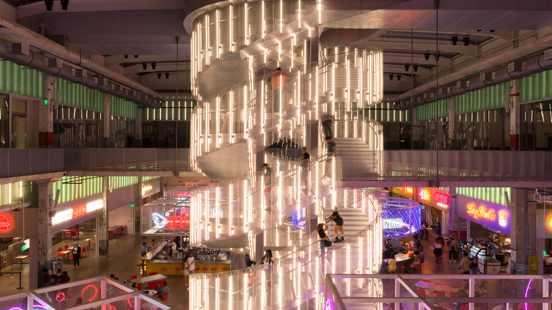
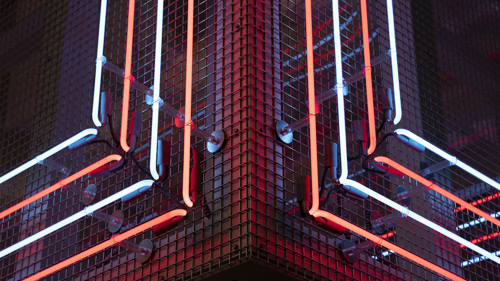
Atmospheric Signage for a Bustling Market
The architects envisioned the POST Market, the food hall in the O Atrium, as an atmospheric, 21st-century gathering space electrified by Houston’s reputation as a culinary destination. But the variety of vendors had the potential to overwhelm visitors. Too many types of light and material could easily clash. To promote a sense of both cohesion and futuristic ambiance, we oversaw a sign program that rigorously attended to details of fabrication. By combining the warm haze of neon logos with custom mounting details—special washer fits, glass cylinders, and reflective blockout paint—the signs achieved an uncanny sense of floating. Now every stall simultaneously stands out and fits in.
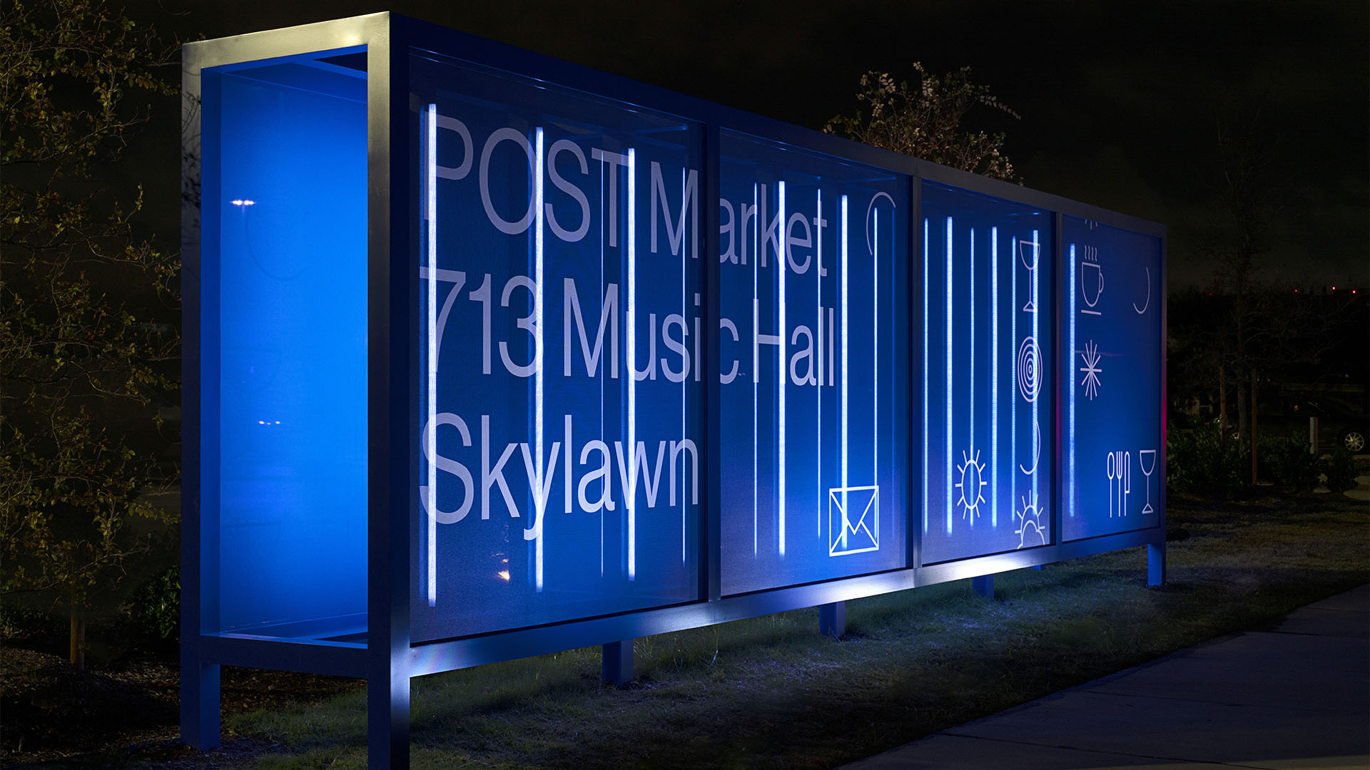
Tenant Sign as Dynamic Brand Installation
The tenant sign blends several urban forms—the surface messaging of the wheatpaste, the vernacular modularity of the shopping-center sign, the billboard’s giant scale. At night, it shimmers with the glowing lines of a Dan Flavin artwork; during the day, the mesh-covered structure has the ethereal translucence of a Do Ho Suh installation. At all times, it artfully introduces drivers and pedestrians to the entire brand system by corralling the POST typography, the saturated blue, the icon system, and linear lighting into a single architectural space.
Branded Guidance in a Sprawling Garden
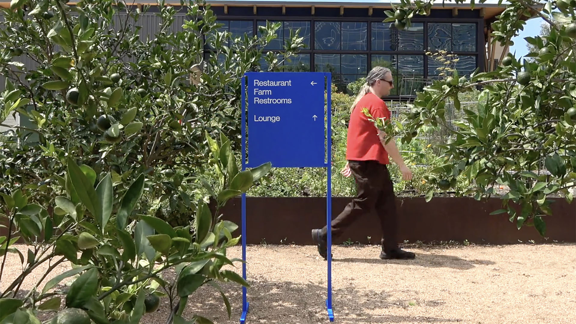
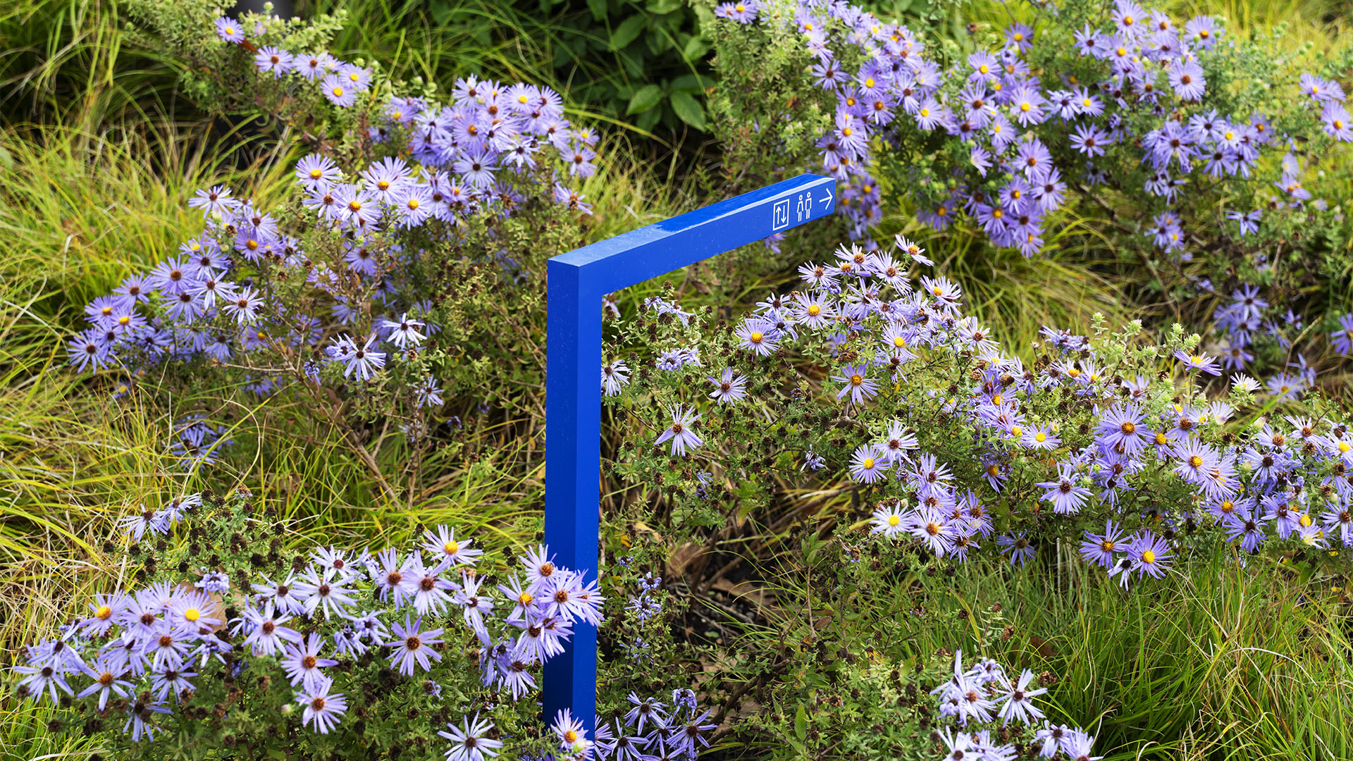
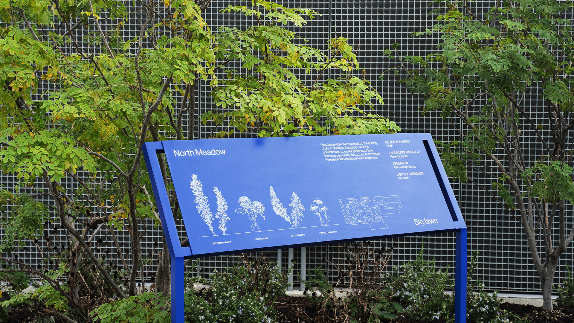
The Skylawn posed a unique design challenge: how to extend the brand across a 170,000 square feet of rooftop space, including performance spaces and a six-acre urban farm. Signage had to avoid competing with the visual abundance—the ambling visitors, the plantings, the dramatic views of the Houston skyline. The palette and angular forms of the brand system were ideal for the task. Against the softer palette of the foliage and concrete, the bold blue and white signs are there when you need them. Interpretive signs mark and explain the garden’s seven biogeographic zones, while subtly placed knee-level directional markers leaned into the Stick system, assuming the form of lines bending out of the landscaping, pointing the way with custom pictograms

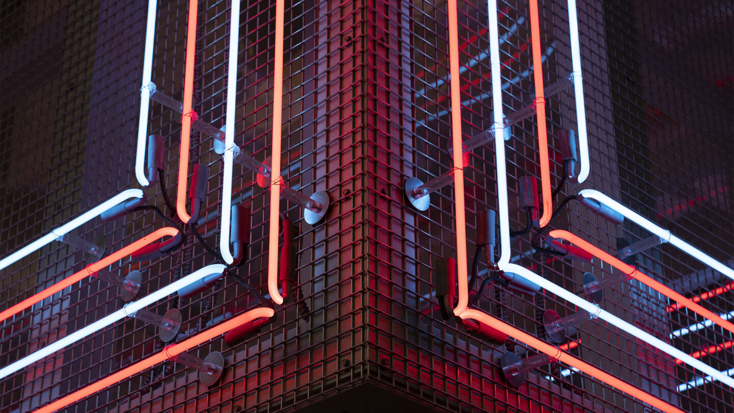
The POST Market neon interacts with the
warm, original brickwork with respect,
keeping penetrations of the material to
an absolute minimum.
Mickey Aloisio
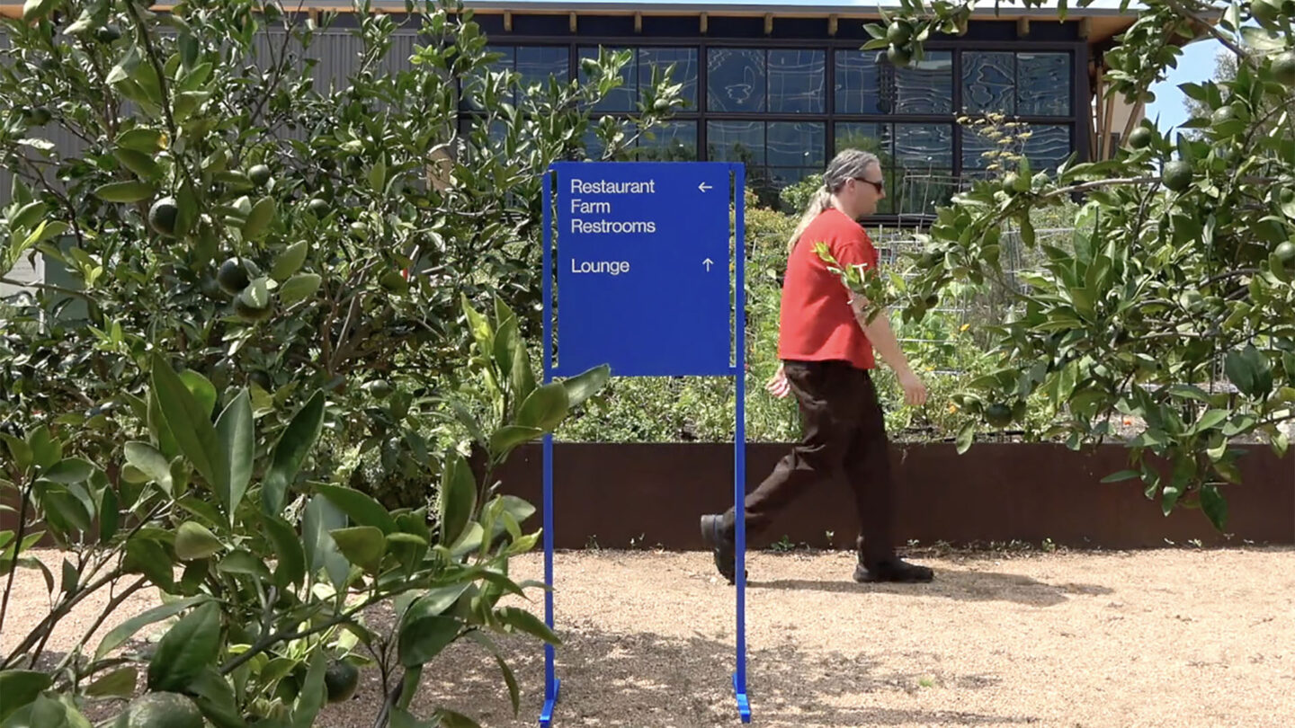
1:1 scale mockups were built and tested in a local park/garden. Recorded video helped stakeholders reach agreements on size, style, and placement.
Tyler Swanner

In the garden, subtly placed knee-level directional markers leaned into the brand’s Stick language, assuming the form of lines bending out of the landscaping, pointing the way with custom pictograms.
Mickey Aloisio
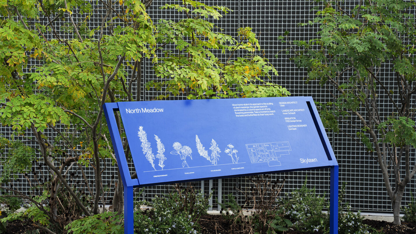
The bold palette and angular forms of the brand system contrast with the greenery without dominating the space. Illustrated interpretive signs explain the sprawling Skylawn’s seven biogeographic zones.
Mickey Aloisio
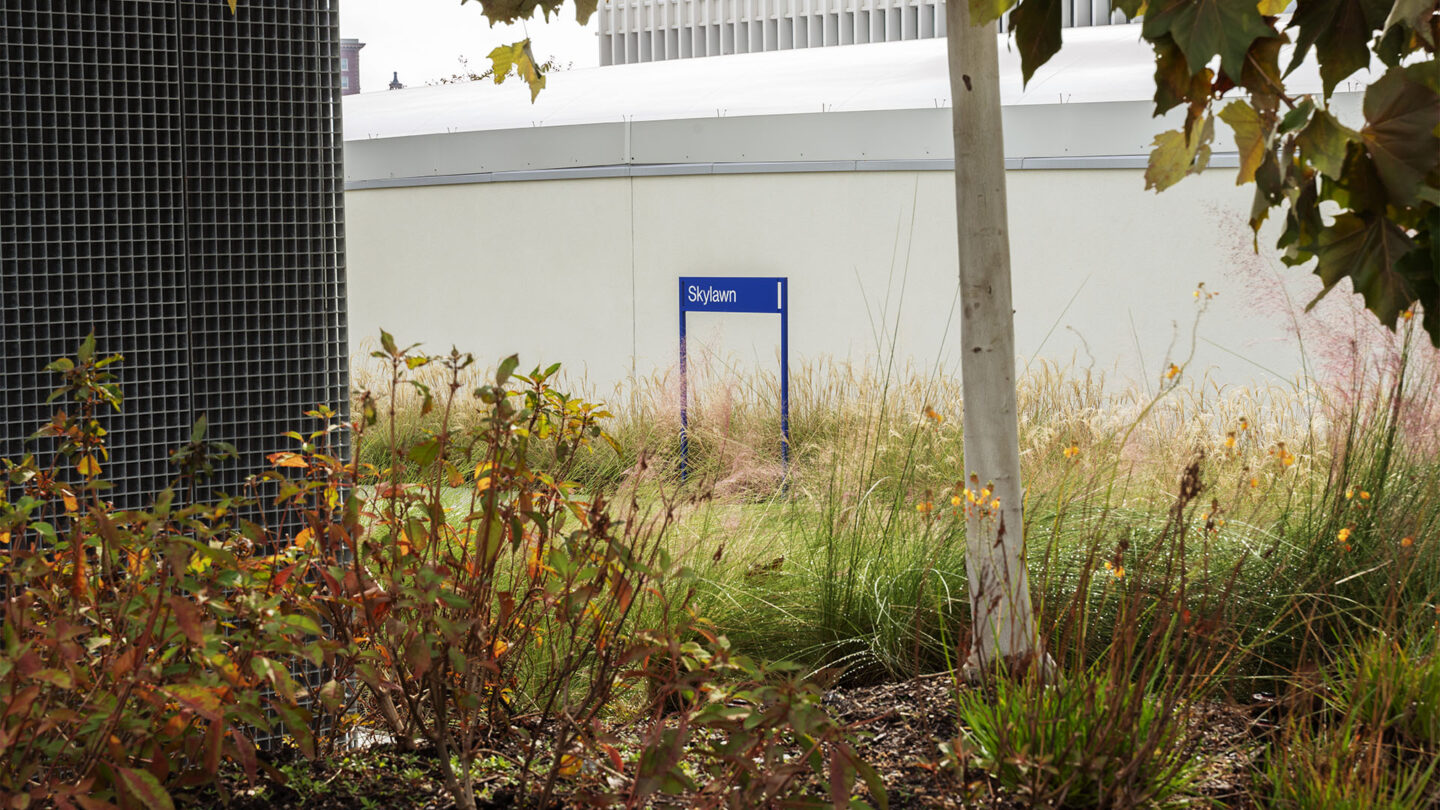
Skylawn signage avoids competing with the visual abundance of people, plants, and skyline. Against the softer palette of the foliage and concrete, the linear blue signs emerge
where needed.
Mickey Aloisio
Project Details
Design Team
Formation LLC
Photo Credits
Mickey Aloisio, Tyler Swanner (photography)
Open Date
November 2021