Homefield Kansas City Showcase Center
Homefield Kansas City was designed to redefine the standard for youth athletic centers, bridging the gap between community recreation spaces and professional-level facilities. Situated in the heart of Kansas City, this $60 million facility provides an elevated training and competition environment while serving as a hub for athletes, families and the community.
The Challenge
One of our primary challenges was delivering a top-tier training venue within a fixed budget established prior to the onset of the COVID-19 pandemic. As material and labor costs surged dramatically in 2020–2021, the team was required to continually adapt and refine program elements. Despite these financial pressures, the team remained committed to fulfilling the client’s vision for a premier destination for youth sports events and training.
Project Vision
The project’s vision was clear: create a space that supports athletic excellence while fostering a sense of community. With a unique balance of gritty, edgy elements and warm, inviting touches, Homefield Kansas City reimagines what a youth athletic center can be — a destination that empowers athletes, engages parents, and enriches the local community.
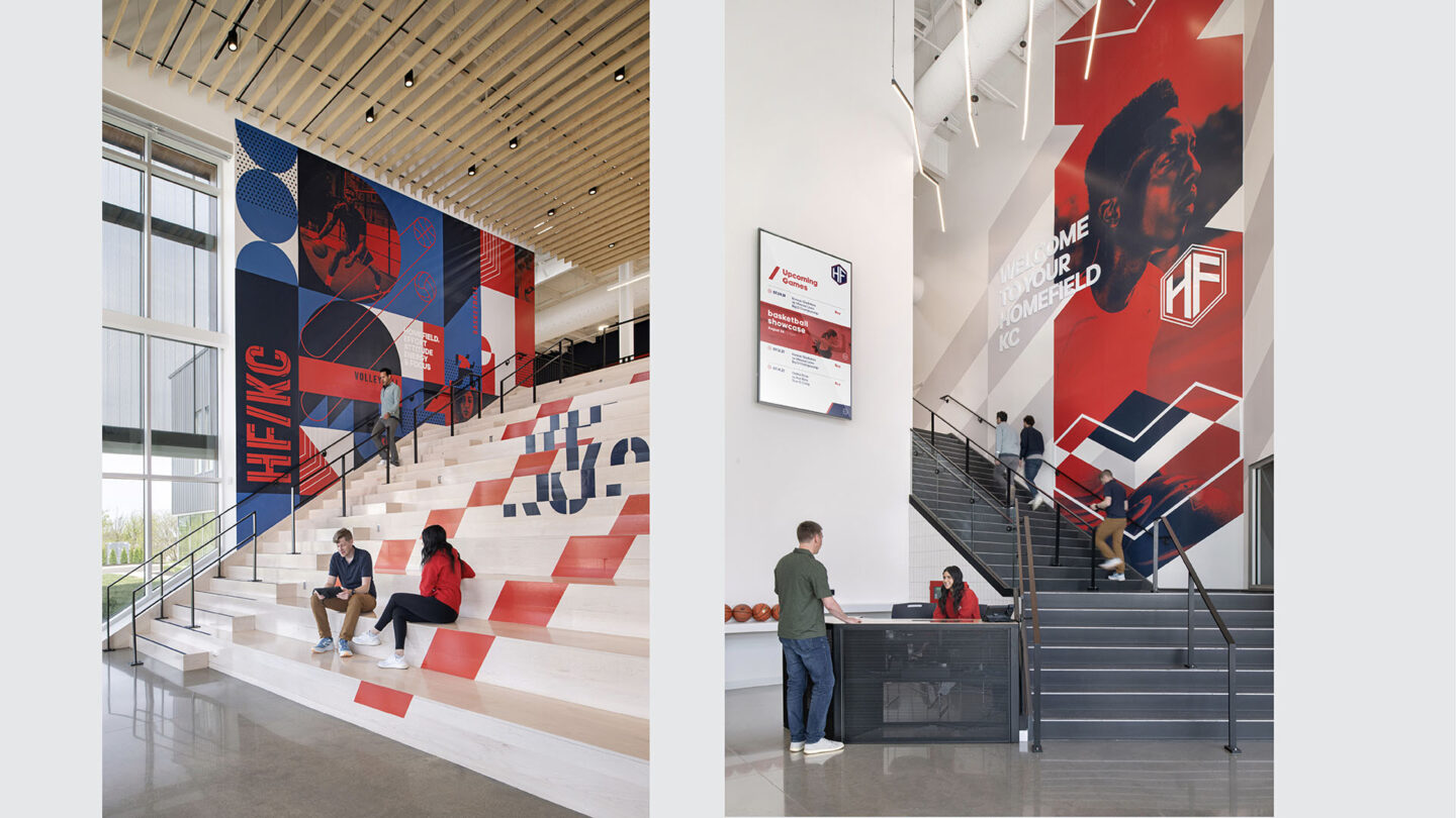
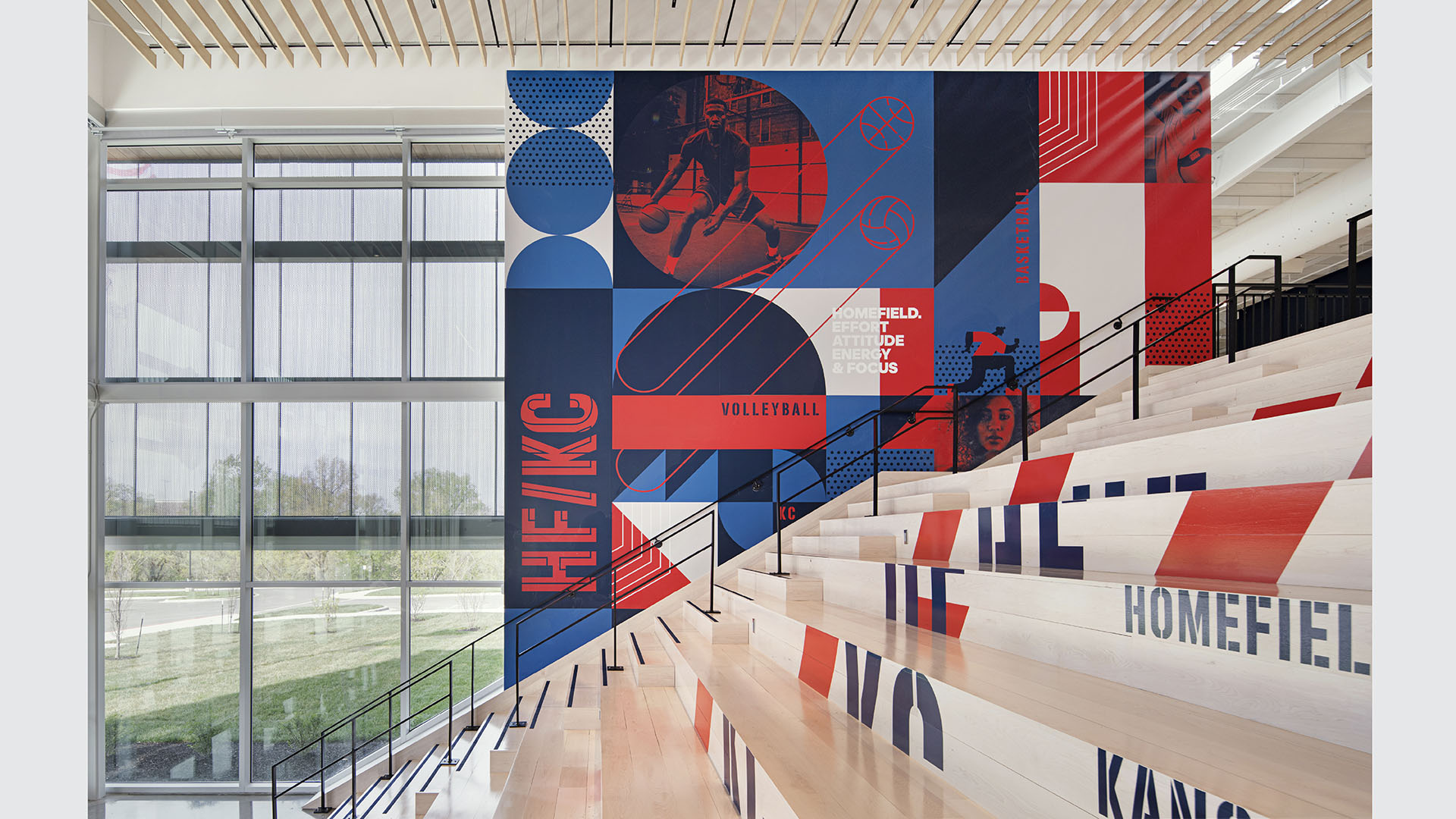
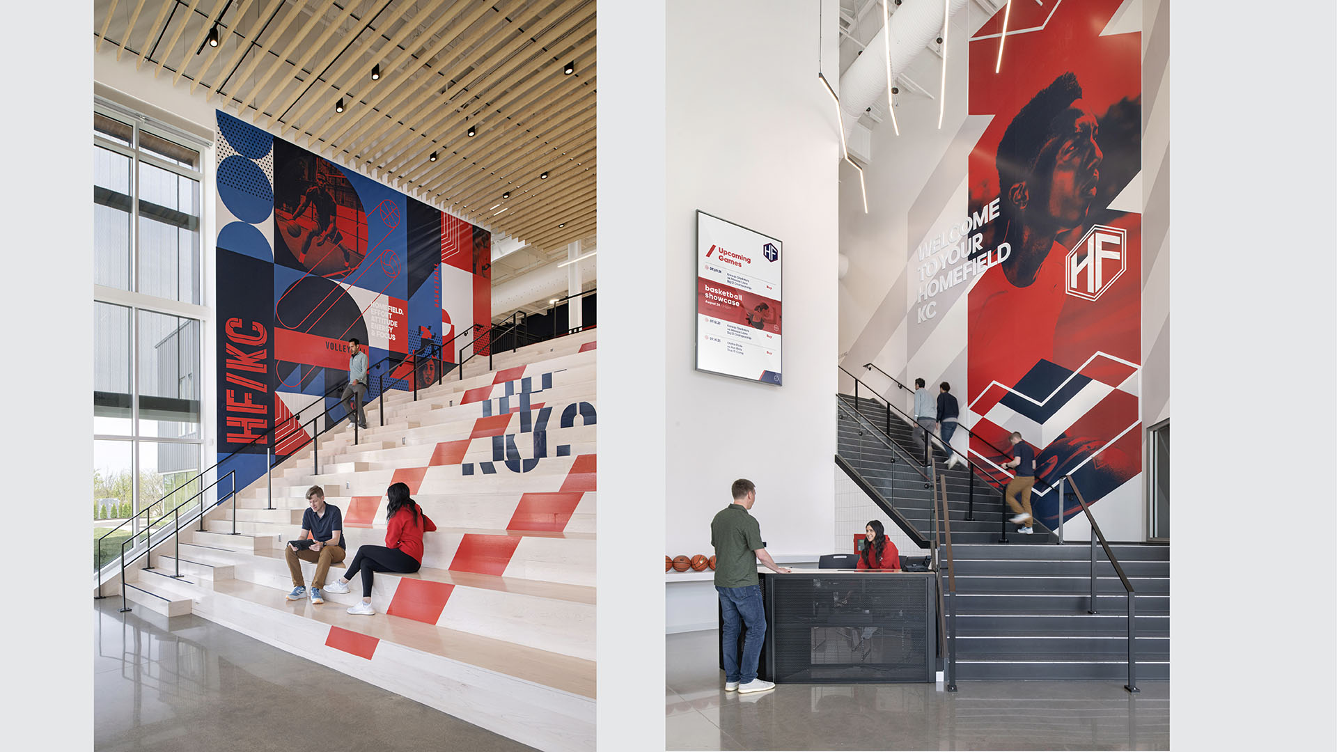
Learning Stair and Lobby Stairs
Matt Kokourek

Court graphics and color applications are seamlessly integrated, creating a cohesive and unified environment.
Matt Kokourek
Design + Execution
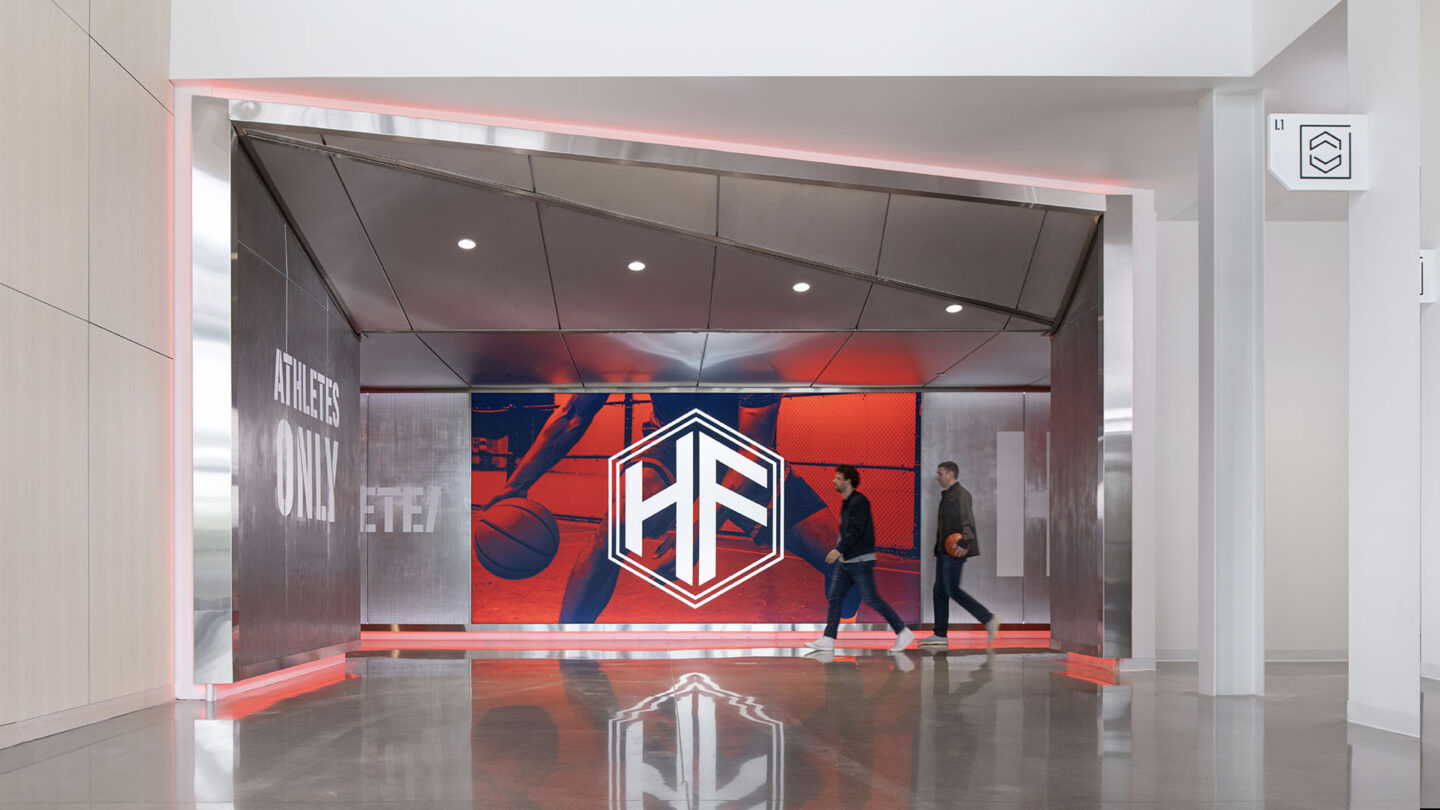
Our design approach focused on creating a facility that blends function and inspiration. The building welcomes visitors with a striking, backlit perforated metal curtain wall that sets the tone for the experience within. Inside, an airy lobby flooded with natural light showcases vibrant graphics and a wood-slat ceiling, creating a space that is both energetic and welcoming. A bold entry tunnel labeled “Athletes Only” immediately immerses youth participants in an environment designed for focus and competition.
The design thoughtfully incorporates spaces tailored to the diverse needs of its users. The Learning Stair, for instance, is more than a functional architectural element; it’s a multi-use centerpiece that encourages team gatherings, coaching sessions and presentations. Its dynamic form, paired with a muraled backdrop, transforms it into a landmark within the facility — a place where connection and inspiration naturally converge.
The branding strategy at Homefield Kansas City seamlessly integrates design with storytelling, creating a space that celebrates both athletic achievement and local culture. Every element, from the graphics to the wayfinding, contributes to a cohesive narrative that inspires athletes and engages the community.
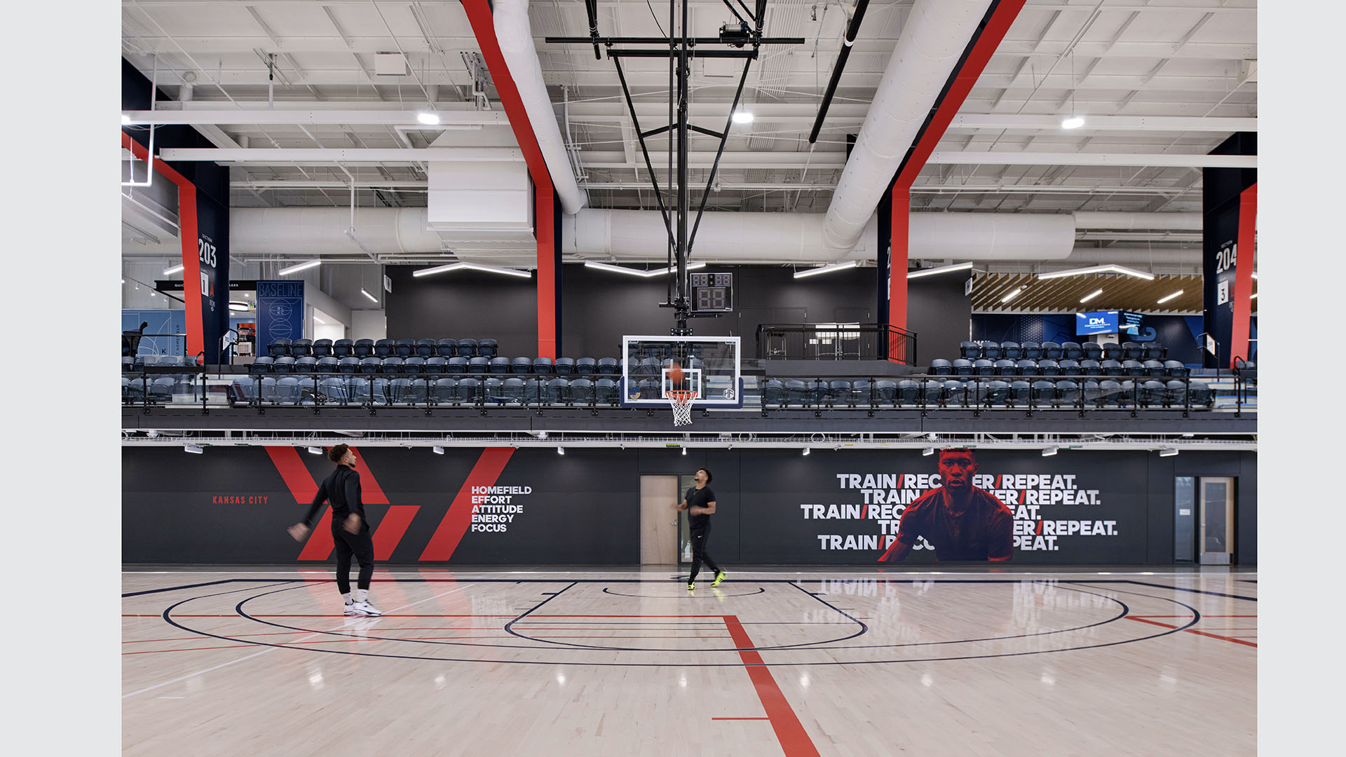
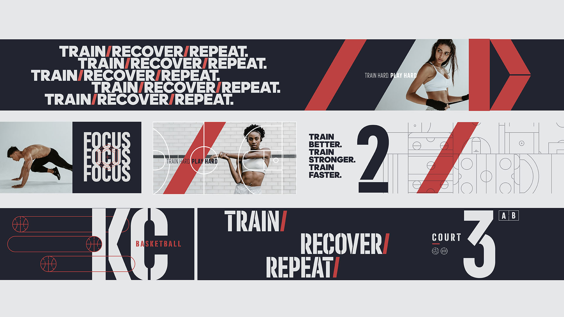
Environmental graphics blend Olympic-inspired visuals with photography of local street sports, grounding the facility in Kansas City. These images, paired with vibrant murals and bold typographic elements, infuse the space with energy and personality. The “Pathway to the Pros” messaging runs throughout the facility, reinforcing aspirations for young athletes and tying the space to broader goals of athletic excellence.
The “hype tunnel” is a standout feature in the branding approach, designed to evoke excitement and exclusivity for athletes. Its dramatic lighting and “Athletes Only” signage underscore the importance of focus and determination. The Learning Stair, adorned with a graphic mural, serves as both a functional space and a photogenic backdrop, further tying branding into the architectural experience.
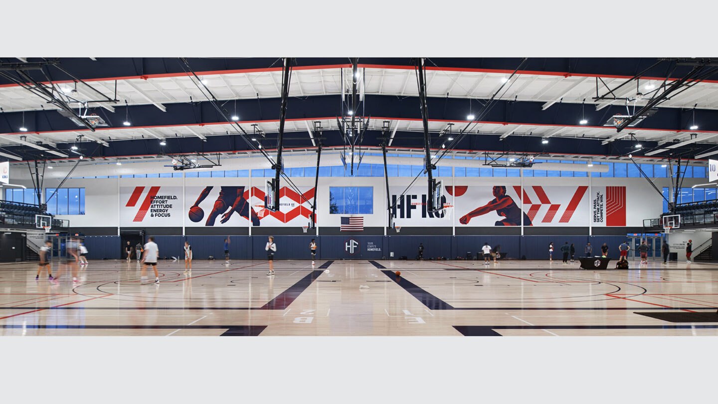
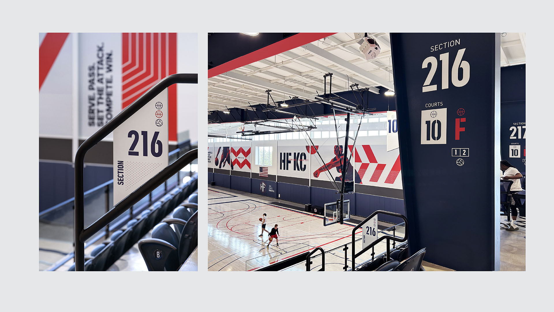
Wayfinding and court markings are carefully designed to complement the facility’s visual identity. The integration of color — from court lines to overhead beams — creates a sense of unity and clarity throughout the space. Even the seating areas reflect the branding ethos, with distinct zones for public and private use that highlight the versatility of the Homefield system.
This intentional branding approach elevates Homefield Kansas City beyond a traditional sports facility, making it a space where athletes, families and the community can connect, compete and celebrate.

The graphic language was developed to find a balance between edge and friendly competition, with bright color accents throughout
Matt Kokourek

The signage system continues the EG language and offers maximum flexibility for varying court schemes for basketball and volleyball
Matt Kokourek
The Youth Athlete Entry Tunnel transitions from the warm lobby materials to dynamic, edgy graphics, energizing youth athletes and preparing them for upcoming competition.
Matt Kokourek
Graphic applications create unity in the space through intentional color and geometry
Matt Kokourek
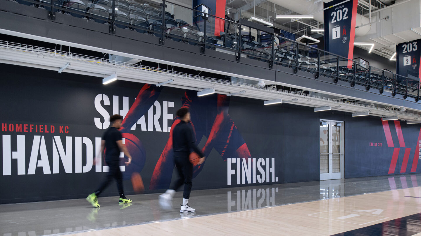
Court Side Graphics serve as daily messages and vibrant background pops of color for the courts.
Matt Kokourek
Project Details
All of this design in a single gym? Now that’s impressive. Although there is a lot going on here visually, it manages to be both coherent and explosive at the same time.
Emphasizing the team’s colors, the integration of bold graphic rich statements are cleverly incorporated into the building’s interior facades in a variety of ways and with a large-scale impact.
Design Team
Francisco Besa (creative director)
Earl Santee (principal in charge)
Mike Donovan (project manager)
Mitch Brown (project architect)
Norman Friedman (project designer)
Collaborators
Star Signs (fabrication)
Photo Credits
Matt Kokourek
Open Date
April 2024
More in Branded Environments
All Projects-
Read more Relish’in Change

Relish’in Change
IA Interior Architects -
Read more The Art of Craft

The Art of Craft
Asterisk -
Read more University of Nebraska—Lincoln Osborne Legacy Complex
University of Nebraska—Lincoln Osborne Legacy Complex
Populous -
Read more History and Machine Learning Fuel Inspiration at Le Visionnaire

History and Machine Learning Fuel Inspiration at Le Visionnaire
Local Projects