V&A Wayfinding
Over the last 10 years, visitor numbers at the V&A have tripled. In order to protect its future, the design team was asked to create a comprehensive wayfinding system unifying seven miles of galleries across three interconnected buildings, five temporary exhibition spaces, four shops, three cafés and 60,000 objects to enable the V&A’s 4 million annual visitors from across the world to explore the museum with renewed confidence and curiosity.

The Challenge
How, then, could the design team create a system that was sensitive to both the countless pieces in the collection and to their Grade I-listed surroundings?
The answer lay in navigating a careful line between confidently directing, while at the same time being discreet enough to let the collection take center stage.
Reserving it as a highlight purely for paid exhibitions, color acts as a beacon, drawing visitors along a breadcrumb trail through the busy ground floor and getting them to their destinations faster—thus protecting a core revenue stream that helps keep the permanent galleries free to explore.
Project Vision
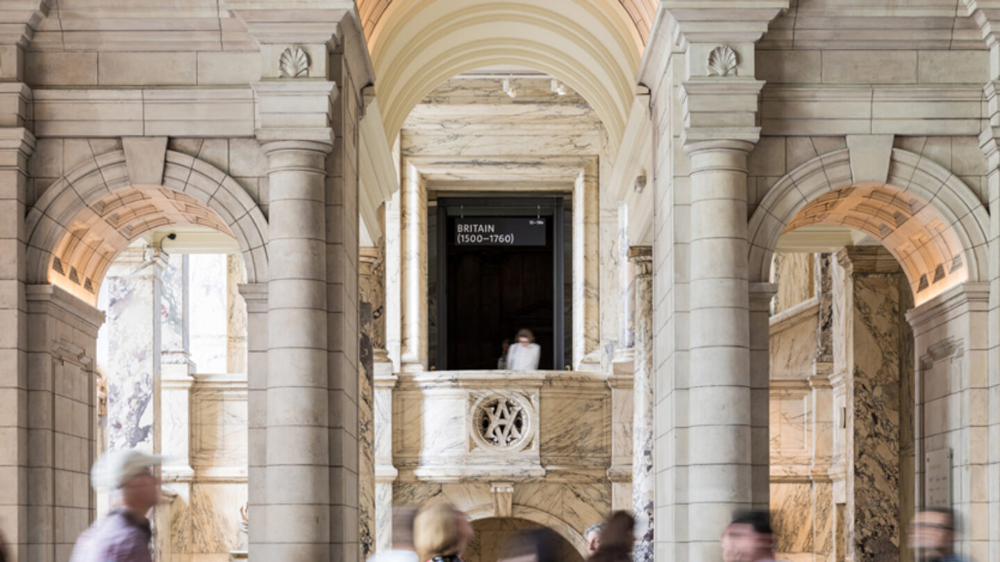
Black tulipwood totems and signs have a tactility that speaks to the museum’s preoccupation with materiality, while chamfered edges create the illusion that the signage is almost floating, never intruding.
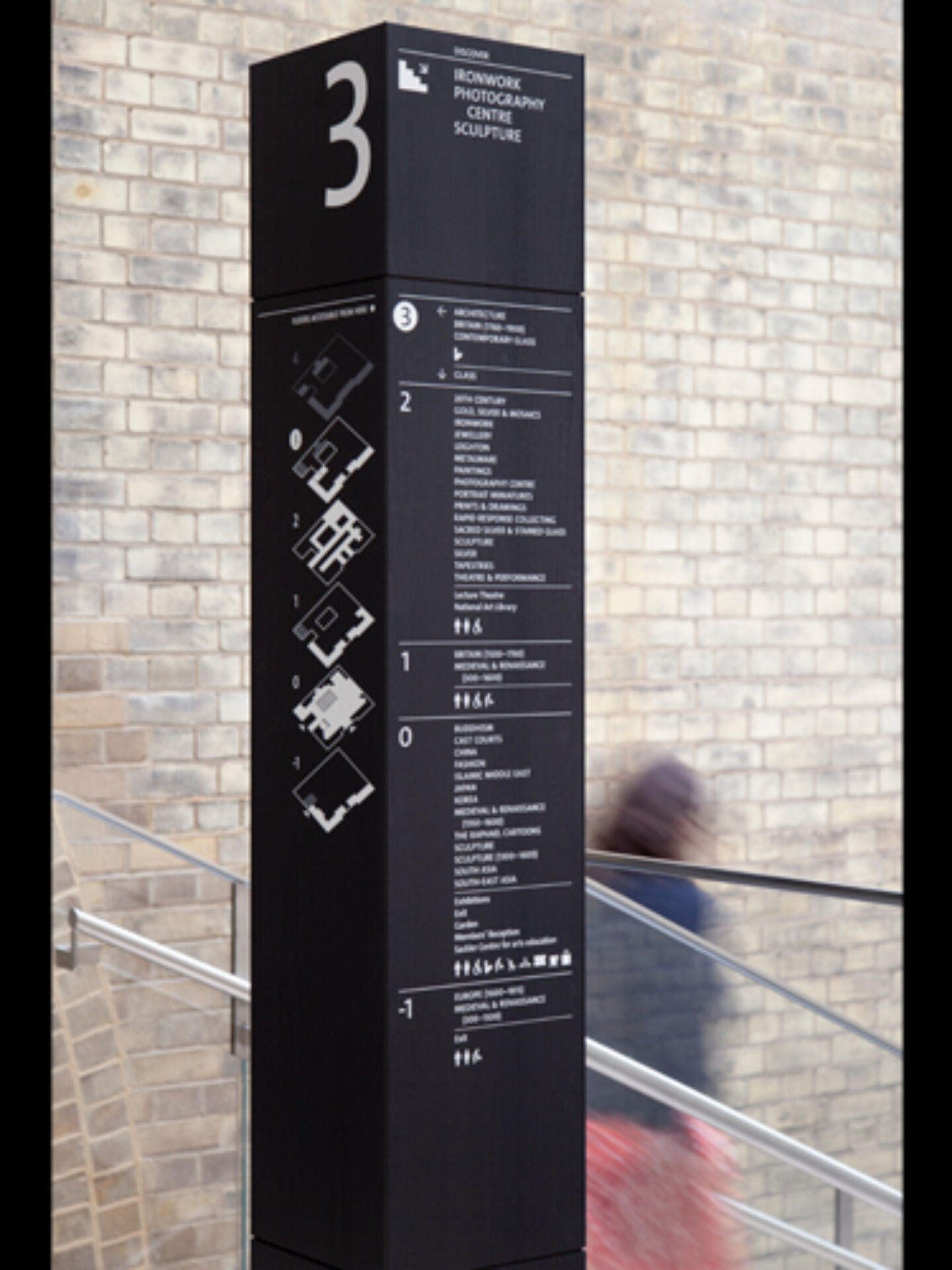
They also created facilities signs that project from the walls to be seen more easily from a distance. These signs are supported by new floor numbering and a new map of the V&A—a central component of the new system that makes it more legible, approachable and manageable. The new map is designed to be used in digital environments as well as in print, so vertical circulation points all aligned across floors, and icons were considered at multiple scales. The icon set was drawn to harmonize with the V&A’s own humanist typeface—curved and flared in the right places, but with enough character to feel that they belong here and nowhere else.
Our wayfinding system unifies seven miles of galleries across three interconnected buildings, helping opening up the museum’s treasures to four million visitors annually.
Sam Bush

Colour acts as a beacon drawing visitors through the busy ground floor to paid exhibitions — protecting revenue and helping keep permanent galleries free.
Sam Bush

Borrowing from the existing visual language of the museum, the new signage echoes the plinths used to display artefacts — solid yet simultaneously discreet.
Sam Bush
Tulipwood, dyed black to harmonise with its surroundings was chosen for the signs, ensuring a crafted yet solid construction in keeping with the museum’s aesthetic.
Sam Bush
Design + Execution
All in all, there were over 400 signs installed across the V&A over several weeks, much of the work done at night when the museum was finally closed to visitors and private events.
Working around this schedule was a complex dance and involved patient negotiation with the museum’s estates team and a controlled movement of signs from one location to another as there was limited storage space on site.
The V&A undertakes continual visitor surveys and the results speak for themselves: in Q2 2019, 74 percent of visitors said that they found navigating easy or very easy, compared to 58 percent in the same period last year. The proportion of visitors answering “difficult” or “other” fell from 18 percent to just three percent.
Anecdotally, the project has been a great success, too. Director of Design, Estate and Futureplan at the V&A, Philippa Simpson, says, “With this project, we wanted to encourage visitors to explore the lesser-known parts of the museum. This wasn’t just about getting people from one place to another, but about nurturing and allowing for unpredictable behaviors, as people wander and stumble across parts of the collection unexpectedly.”

Re-drawing the map to increase legibility and reduce unwieldy cross-referencing also prompted the wholesale renumbering of floors making the museum feel more manageable to newcomers.
Sam Bush

The system treads a careful and restrained line to live comfortably in this monumental, airport-scale environment where no one space is the same as another.
Sam Bush

Threshold signs between spaces reassure visitors of their route when their destination is out of sight — like the breadcrumb trail in Hansel and Gretel.
Sam Bush

Facilities signs project from the gallery walls. This both increases visibility from multiple directions and brings order to the rich and varied interiors.
Sam Bush
Project Details
So simple, yet you can see the thought and attention to detail. Beautiful juxtaposition yet amazingly seamless.
Knowing the complexity of the project, the designers avoided the typical pitfalls of working within a classic iconic institution while maintaining the high-brow presence. The signage manages to blend and stand out simultaneously.
Within the V&A premises, a wayfinding system has been integrated smartly and intelligently, which forms an interplay with the historical foundations of the building. The typography, compositions and colors chosen make perception, legibility, and navigation easy. The system integrates into the space and produces good orientation at decision points, which is not that simple a task within a complex of three buildings. New navigation systems don’t dominate. Instead, they explain in the right places and to the correct degree.
Design Team
Patrick Eley (creative director)
Zoë Barrett (project director)
John Wynne (lead designer)
George Cudby (designer)
Consultants
allpointswest
JBC London (accessibility consultant)
Fabricator
Reade Sign
Photo Credits
Sam Bush (photography)
Richard Coldicott (videography)
dn&co (photography, videography)
Chris Zabriskie (music)
Open Date
July 2019