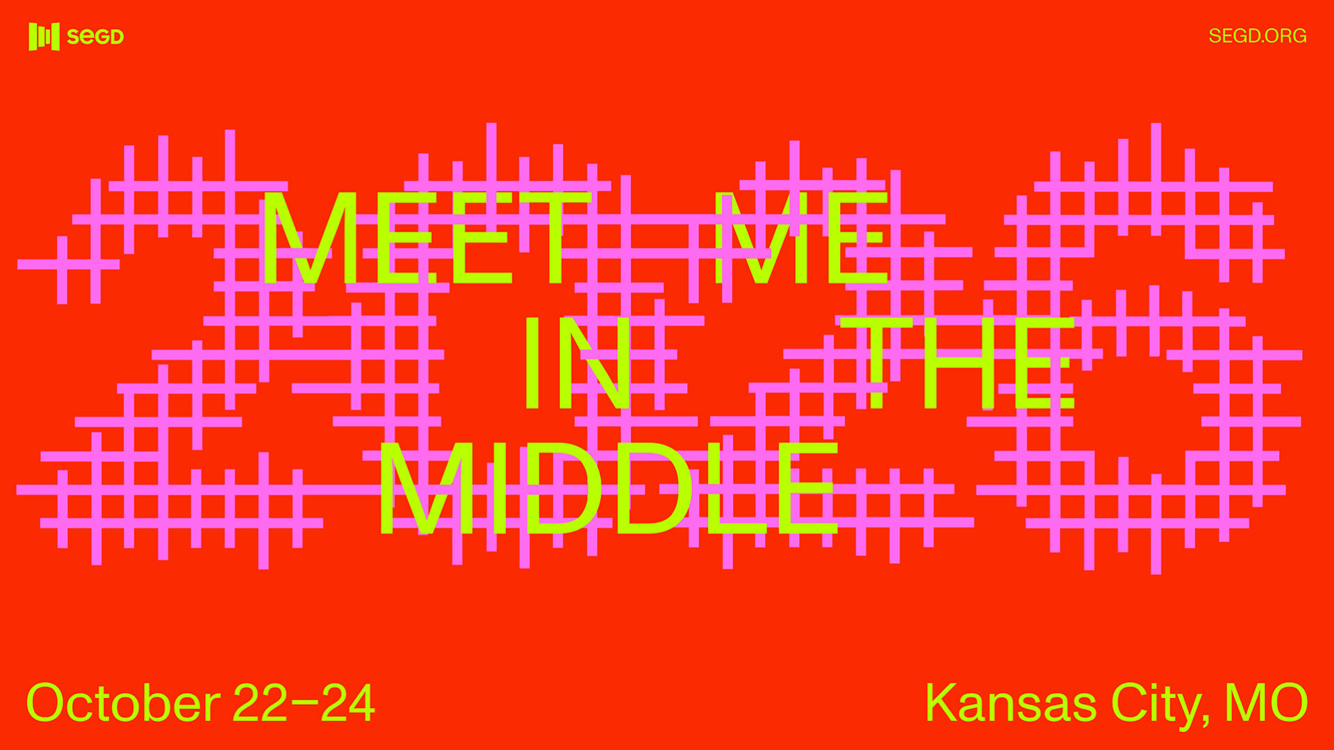
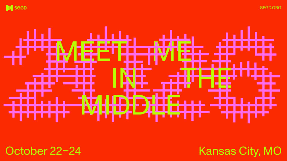
Meet Me in the Middle: 2026 SEGD EXP Poster Challenge
Submissions are open for the 2026 EXP Poster Challenge, hosted in Partnership with the 2026 SEGD Conference Experience Kansas City
DEADLINE: Friday, August 14, 2026
FORMAT: Static poster for print or activated digital poster. See Format & Submission Details below.
OPEN TO: Designers, artists, creatives, students, and visionaries within the SEGD community, who are either in the first five years of their professional practice or a transitioning professional moving into the field of experiential design.
Design Brief
As an extension of this year’s conference, we invite you to design a printable or digital poster that aligns with the conference theme: “Meet Me In The Middle”
“Meet Me in the Middle” is more than a conference theme; it is an invitation, a philosophy, and a provocation. Kansas City sits at the literal and geographic heart of the United States, and this year, SEGD uses this framework as a lens to examine everything our community stands for.
The middle is not a compromise. The middle is where meaning is made.
As experience designers, we have always worked in the middle: between client vision and user need, the built environment and the human spirit, data and story, and the world as it is and the world as it should be. We are translators and meaning makers, and now more than ever, the world needs our voice.
This theme acknowledges the rifts we experience in society, and the divides in culture, politics, and place. It asserts that design has a role to play in healing them, not through naivety or slogans, but through craft, storytelling, and shared experience. SEGD 2026 is where the design community gathers to do the hard and hopeful work of meeting one another and the world, in the middle.
We invite you to bring your unique voice to this larger conversation. A successful poster submission should visualize your interpretation of what “meeting in the middle” means; whether that’s from a geographic, collaborative, social, emotional, or some other meaningful perspective.
The Challenge
In your own voice and with your own unique perspective, consider solutions that:
- Reimagine design as a practice of active integration; a space where friction, contradiction, and difference become productive rather than divisive.
- Visualize convergence, synthesis, division, and/or duality to address design’s role in healing societal rifts
- Embody dynamic qualities of movement, dimensionality, and spatial activation – even in print.
- Invite interaction or prompt an immersive experience.
- Convey audacity, push boundaries, and engage in deeper cultural inquiry.
- Explore visual narratives that hold tension, reflect complexity, and examine how design
can shift systems and stories. - Consider what it means to design not only for what people see visually—but for what they feel, remember, and carry forward.
Why this matters—Where Will It Go?
This is more than a design challenge; it’s an act of immersion and imagining. Selected designs will be part of a larger exhibition at the SEGD Annual Conference Experience in Kansas City, October 22-24, 2026. All design submissions will be juried by a panel of experienced and respected SEGD members, and will include opportunities for special in-person recognition both at the conference and in post-conference articles and social media features. We invite you, our EXP community, to contribute your voice and to initiate a conversation with the larger SEGD community through the lens of your own practice.

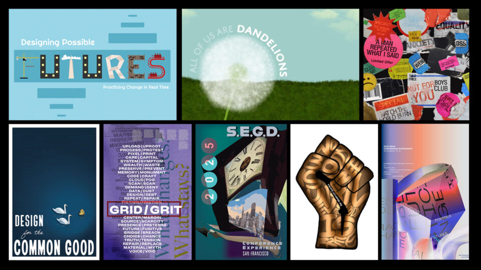
What are people saying about participating in last year’s poster challenge:
I’m so glad I participated in the SEGD EXP poster challenge last year. I decided to apply because I wanted to challenge myself to present work to more experienced designers in order to continue growing even as a working professional. Thinking through the prompt was a very gratifying creative exercise, one that you don’t see regularly outside of the academic world. Seeing my work in print and knowing that so many colleagues who I greatly respect were seeing it in person was very exciting. I would highly recommend fellow emerging experiential professionals push themselves to submit their work to this challenge.
Working on the EXP poster challenge was an excellent learning experience. I was hesitant at first, and I'm not fully confident in my skills as an experiential designer, but it was very heartwarming to receive such a welcoming response from the EXP poster challenge and SEGD as a whole. Although I wasn't sure if I want to submit a design for the challenge, I'm glad I decided to listen to my instincts to seek every opportunity I can to grow, and seeing my work on SEGD's official social media accounts was amazing.
Working on the EXP poster was a fun experience and challenged me to design in ways I haven’t before. I found out about the challenge by already being involved with SEGD. When I first saw the requirements and what was needing to be in my designs, I thought why not try. I already had one of my artworks made from the summer before and thought it fit the prompt perfectly especially in today’s time with injustices for POC. I wanted to also add something else to that, so I made my other submission, which was digital, based on something everyone could relate to which still had elements of injustice but was also relatable to nature. I felt so happy to see my work digitally and on social media, as I have never had one of my artworks displayed/printed in a large format. It was a really cool experience, and I would love to submit more work for these kinds of challenges.
Format + Submission Details
DEADLINE: Friday, August 14, 2026
PRINT-READY DESIGNS:
Format:
- 24” x 36” portrait or landscape
- Provide full bleed for print or provide clear margins in design
- CMYK, all fonts outlined and links embedded
File Type:
- PDF, TIF, or EPS
- 300dpi resolution for print, or the best possible for transmission via email
DIGITALLY ACTIVATED DESIGNS:
Format:
- 1:1 square aspect ratio (1080×1080 min.)
- RGB
File Type:
- .MPEG4 (preferred), .MP4, or .GIF
- Highest resolution possible for transmission via email
SUBMIT VIA:
- Attach/compress the file for email and send it to exp@segd.org along with your full name and contact information. A brief statement about your design may be included. If you do not receive a response confirming receipt of your file within one (1) business week, please reach out via text-only email to troubleshoot.
DISCLAIMER:
- All jury-selected designers will be asked to sign a standard SEGD Photo/Content Release prior to exhibiting at the Conference or on other media. All those who submit a design entry acknowledge that they are supplying their own work and not infringing upon any known copyright or intellectual property. All entries will be reviewed anonymously by our jury; all submissions are subject to exclusion for any reason, e.g., if found to be slanderous or overtly violent in nature.
QUESTIONS? Reach out to exp@segd.org for inquiries or accessibility needs.
People also viewed
-
2026 SEGD Conference Experience Kansas City
2026 SEGD Conference Experience Kansas City
-
EXP Poster Gallery
EXP Poster Gallery