2025 SEGD Innovation Award
The SEGD Innovation Award recognizes members who have demonstrated innovative expertise and processes that expand the potential impact and engagement of experiential and environmental graphic design. Past recipients include Modulex, Prime Access Consulting, and SignAgent.
Tactile Studio
In 2025, SEGD is honored to recognize Tactile Studio, an international design practice whose pioneering work in accessible, multisensory learning has transformed the way museums and cultural institutions engage with audiences of all abilities.
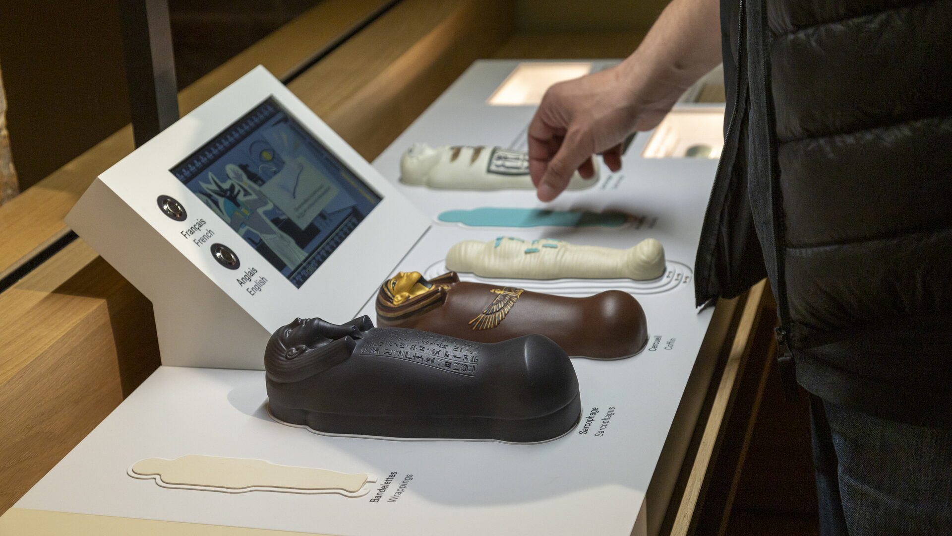
Founded in 2010, Tactile Studio creates tactile models, raised illustrations, inclusive signage, and interactive educational tools that seamlessly blend aesthetics, durability, and accessibility. Their interdisciplinary team—spanning designers, graphic artists, engineers, model makers, and craftspeople—integrates universal design principles into every step of their process, ensuring that each project delivers a meaningful and inclusive experience.
Collaborating with exhibition designers and curators across the globe, Tactile Studio’s work can be found in institutions such as the New York Public Library, the Jones Beach Energy & Nature Center in New York, and the Cité des Sciences in Paris. Through these partnerships, they have expanded the possibilities of experiential design, making complex stories and environments accessible through touch, interaction, and embodied learning.
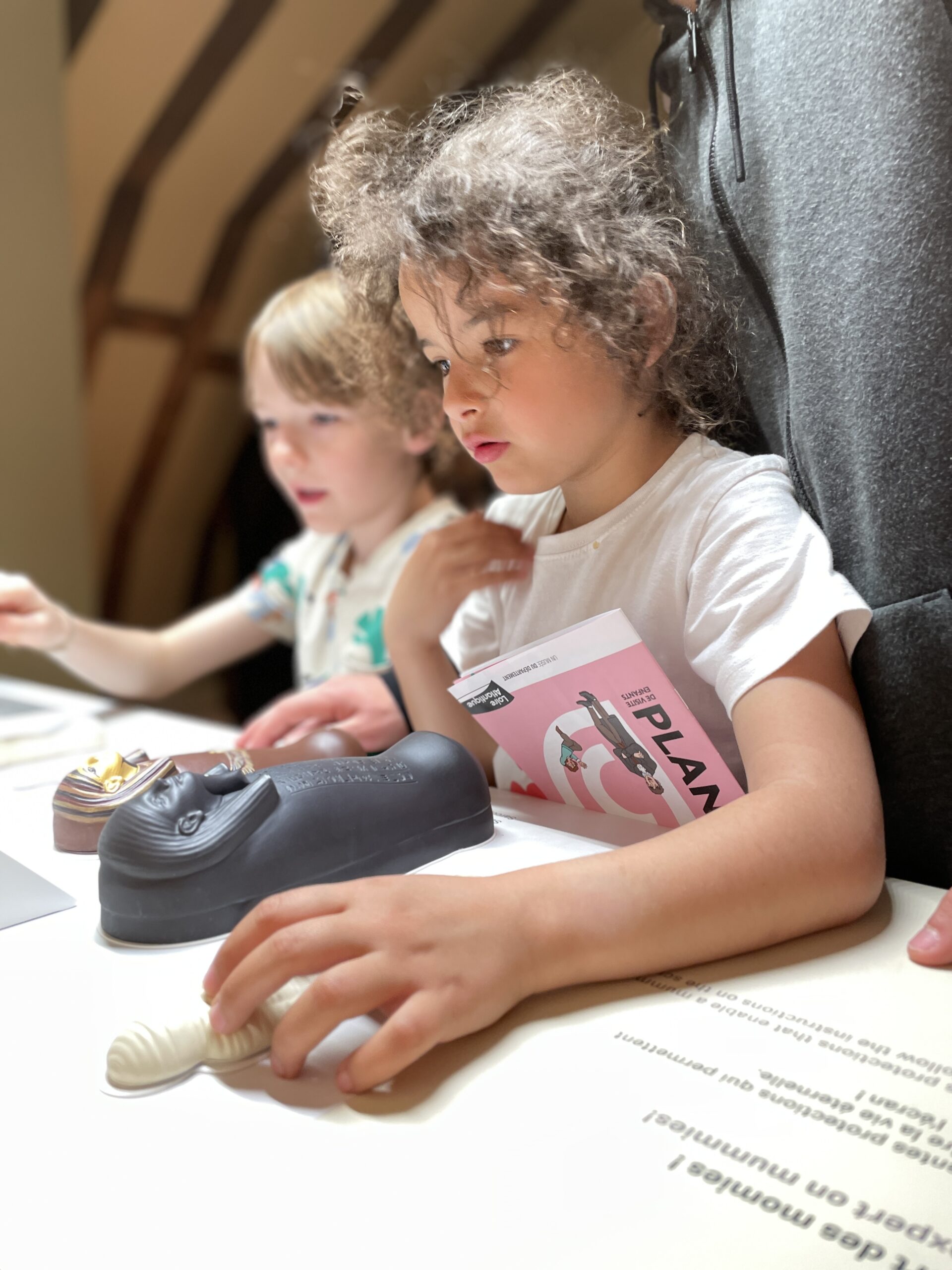
What sets Tactile Studio apart is their commitment to elevating accessibility from an accommodation to a core design value. Their solutions do more than comply with guidelines—they interpret content for tactile exploration, integrate sensory layers into narratives, and empower visitors with visual impairments, cognitive differences, and diverse learning styles to engage fully with cultural environments.
Their innovation lies not only in their technical expertise but in their philosophy: that inclusive design enriches experience for everyone. By continuously pushing the boundaries of materiality, fabrication, and interpretive storytelling, Tactile Studio has become a leader in shaping a more equitable, immersive, and human-centered future for experiential design.

People also viewed
-
SEGD Announces the 2025 Achievement Award + Fellow Honorees
SEGD Announces the 2025 Achievement Award + Fellow Honorees