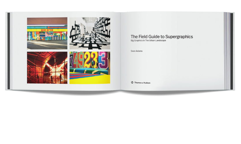
The Field Guide to Supergraphics—Big Graphics in the Urban Landscape

Earlier this month, a new experiential graphic design volume was released by Thames & Hudson entitled “The Field Guide to Supergraphics: Big Graphics in the Urban Landscape.” Written by acclaimed author and designer Sean Adams, the tome explores daring, bright and meaningful large-scale experiential graphics installations around the world. Read several excerpts below.
Sean Adams knows a thing or two about graphic design: He served two terms as National President of AIGA, co-founded the firm AdamsMorioka, has written nine books on design in addition to the much-lauded blog Burning Settlers Cabin, contributes to and serves on the editorial board of Design Observer and is the Executive Director of Graduate Graphic Design at Art Center College of Design in Los Angeles. His latest book, “The Field Guide to Supergraphics: Big Graphics in the Urban Landscape,” is intended to address a wide swath of readers in addition to the graphic design community. The Guide features over 60 projects and breaks down what makes them so successful from function to visual language. The discussion includes interviews with leading design practitioners, categorizing supergraphics work into four sections: typographic, color, graphic and vernacular.
We caught up with him to ask a few questions about The Field Guide:
Why supergraphics? How did “The Designer’s Dictionary of Color” lead to “The Field Guide to Supergraphics?”
As I collected assets for “The Designer’s Dictionary of Color” I found great images of large-scale environmental work. There were so many good projects that didn’t fit the Color book content, but I had to do something with them. Clearly, the world needed a separate book on supergraphics. I love the work included because it is about changing culture. There are no projects that simply paint stripes on a bland wall. Each one included uses architecture, the environment, light and space and the culture of the community to add meaning and value.
How does your work in education at Art Center College of Design inform your writing about graphic design?
Teaching has always been a large part of my professional life. I taught during my years at AdamsMorioka, and I’m now focused full time on the program at ArtCenter. This gives me access to raw, unfiltered and exciting ideas and work. It’s that spirit that gives me the inspiration to write books and articles about design. Our work as designers can only be richer with access to great projects and inspired thinking. I can do a small part of moving some of that content out into the world.
Did you discover anything unexpected in the process of writing the book?
I was happy to see that there was the common thread of improving daily life in the work. Environmental graphics interact with all the issues of design: concept, typography, form, color and scale. They also live in a world of architecture and urban planning. Working on that large canvas can be an exercise in self-aggrandizement of engaging the world in a positive way. Every project I found, including the ones that I’m saving for another book down the road, was about doing good.
What do you hope your readers will take away from The Field Guide?
Firstly, I hope they’ll notice how much incredible environmental graphics surround them. Secondly, I hope the readers will see how important environmental graphics are in the world to make change culturally, financially and with the community. And finally, I’d like to think it will inspire everyone, both civilians and designers.
+++
The Field Guide to Supergraphics: Big Graphics in the Urban Landscape
Introduction
As a species, we have added language and imagery to our structures for thousands of years. The Egyptians adorned their temples with hieroglyphs and paintings to tell stories and explain how to live and die. The Olmec and Aztecs built large cities and huge pyramids, and then filled the interiors with words and images. Western cultures built great cathedrals and used stained glass and Biblical stories to create narratives for a mostly illiterate population.
Today, we continue to use words, symbols, images, and forms as part of our built environment. We may not be telling the story of Hathor, Quetzalcóatl, or Moses, but we use design to bind communities, create branded spaces, help a visitor find the way, and create delight with colour and typography. Supergraphics were long considered an inferior form of communication, used on dull architecture to hide flaws, and in many instances, this is exactly what happened. Large bands of coloured stripes adorned bland waiting rooms and municipal government offices in the 1970s. However, the definition of supergraphics has changed over the last twenty years. Once, only a large geometric design on a wall or building was a supergraphic. Today, the term encompasses architectural delineation, wayfinding and identifying signage, illustrative murals, and branding elements.
Digital technology now allows for interaction and screen-based media on a large scale. The audience can now actually communicate with an architectural space in a unique and personal manner. The difference between a large overwrought design on the wall and a successful supergraphic is typically based on three points: a strong concept, interaction with the architecture, light, and space, and relationship to the viewer. Many people can paint stripes on a wall, whereas a designer can use the entire volume, sense of place, and context, and change the environment to create a story with words, colour, and shapes. This book includes examples of the best supergraphics internationally. These are evidence of the sense of delight evoked when a beautifully crafted graphic solution, smart concept, and awareness of the community are combined.
+
Chapter 1: Types of Supergraphics
Vernacular
The term ‘vernacular’ refers to language. In design, it is a culture’s specific visual language. This can take the form of colours related to the local community, typography based on historical references, or materials that are indigenous to, or synonymous with, a region, such as flip-flops and Sydney.
Vernacular design can be created by a trained designer. As integral to a unique culture, it can also be made by non-designers such as a sign painted by a shop owner. The primary factor of vernacular supergraphics is a visual solution based on a specific set of cultural connections.
+
Chapter 3: Colour
Life
Boa Mistura
Location: Bogotá, Colombia
Usage: Public space
Date: 2016
Plaza de la Hoja is a complex of twelve buildings built to house 475 families displaced by violence and conflict in Colombia. These families share little in common. They are from various regions: the Pacific, Caribbean, Amazon, and mountains. The only thing they share is having lived the drama of fleeing without looking back, abandoning their land, customs, and most of their family, as a result of armed conflict. Their new home, the Plaza de la Hoja, was deemed ugly and prisonlike by the press.”
At the centre of the Plaza, Boa Mistura added a giant leaf, created from hundreds of smaller leaves that are arranged to form the word ‘life’. Each of these smaller leaves belongs to a significant species from the ecosystems of Colombia, symbolically representing the places of origin for the inhabitants of the building. It brings a piece of their land to them. This is a reminder to the 457 families who have been relocated in this urban housing development that they must rebuild their future together. The mural was painted in collaboration with the residents, creating a sense of community. The painting on the ground is perceived very differently by a pedestrian at ground level than by a resident viewing it from above. At ground level, the viewer perceives enormous geometric coloured forms, but when seen from above it takes on a greater meaning, representing the hope of a new beginning.
+
Chapter 4: Graphic
Wired Store
Mother Design
Location: New York, New York, USA
Usage: Retail
Date: 2012
For Wired magazine’s annual New York retail experience, Wired asked Mother Design for an environmental design concept that helped to showcase the most innovative products and technologies of the past year.
Mother’s team added a physical dimension to the magazine’s existing ‘What’s Inside’ monthly feature. Mother Design added architecture to space, designed custom furniture and fixtures, and created a visual system that spoke to both the editorial and experiential inner workings of the publication. Large-scale interactive installations investigate a variety of products, from mobile phones to cars.
Mother created a digital shopping platform to purchase any product featured within the space. The exhibition displayed a mixture of commissioned and selected works featuring older aesthetically exploded technologies.
+
Chapter 5: Vernacular
Planned Parenthood
Pentagram
Location: New York, New York, USA
Usage: Branded environment
Date: 2017
For over a hundred years, Planned Parenthood has fought for reproductive health and rights, championing the idea that women should have the information and care they need to live strong, healthy lives and to manage their fertility. Pentagram’s Paula Scher and her team designed a large-scale installation that spotlights the dynamic history of this remarkable organization. The mural at Planned Parenthood’s new national headquarters remixes graphics from a century of ephemera created by Planned Parenthood, capturing its dedication to caring, education, and activism.
The designers collaborated with the project architect, Juan Matiz of Matiz Architecture and Design, to integrate the graphics in a high profile location in the offices. In addition to the installation, Scher placed smaller murals on walls throughout large conference rooms and other meeting spaces. The mural is a colourful collage composed of artefacts from a century of various initiatives – a mix of newspaper ads, instructional posters from clinics, protest posters, pins, photos of protests, and other historical material from the Planned Parenthood archive. The installation acknowledges the important role that activism and posters, placards, symbols, and other graphics have played in garnering support.
+++
Find “The Field Guide to Supergraphics: Big Graphics in the Urban Landscape” at Thames & Hudson.
More about Sean Adams