What Do You Make of This?
The exhibition was commissioned to feature the design work of Kristine Matthews, who is Chair of Visual Communication Design at the University of Washington’s Division of Design, and also principal of Studio Matthews.
Agency
Studio Matthews
Practice Area
Client
School of Art and Art History and Design, University of Washington
Industry

The Challenge
The audience was primarily University of Washington students, staff and faculty, but also the broader design community. The challenge was to present a body of design work but also explain the process and philosophy that underpins that work.
Project Vision
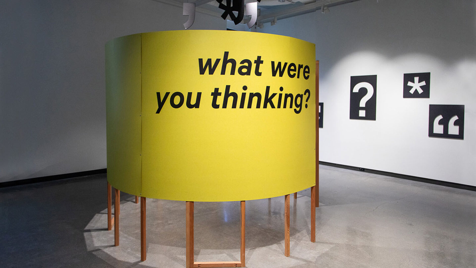
Creating an exhibition offers an opportunity to not just showcase design projects and process, but use the exhibition itself as a case study on sustainable exhibition design. The three galleries celebrate three principles that underpin effective experience design: sustainability audience participation inclusivity each gallery poses a different question for the audience to consider as they peruse a range of featured projects. The title “What Do You Make of This?” refers not only to making sustainable material choices, but to inviting the audience into the conversation. Material samples and mock-ups from a range of projects helps to explain sustainable material choices. Within the circular structure are exhibition, branding and installation projects that feature audience participation and contribution of ideas, hence the title: “What Were You Thinking?” In a third gallery (not shown), featured projects highlight the voices of typically underserved groups. The headline question is: “Who Belongs Here?” The design of “What Do You Make of This?” hopes to inspire current design students to seek out ways to make their own work and processes more sustainable and thoughtful.
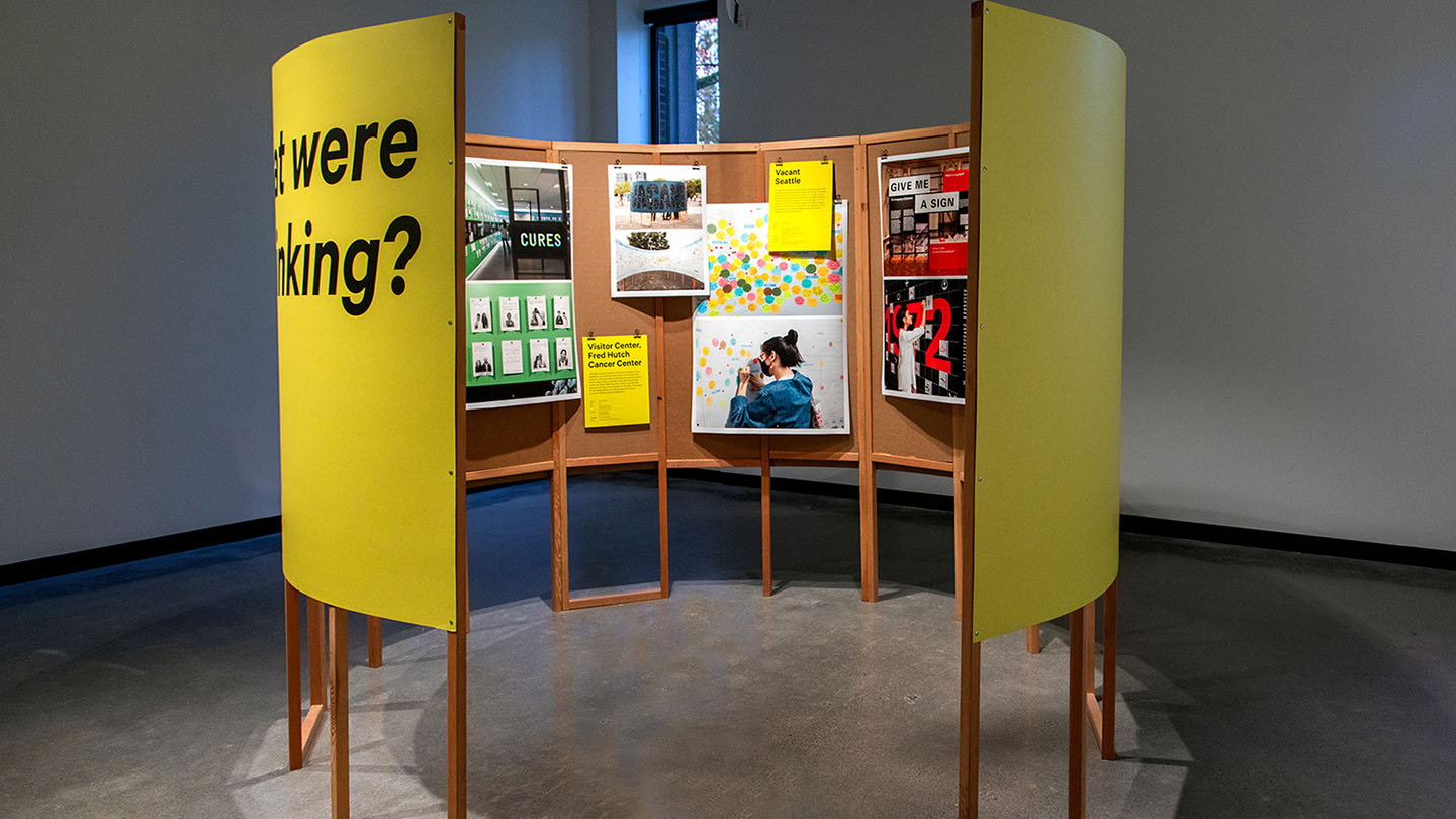
Within the circular structure are a range of exhibition, branding and installation projects that feature audience participation and contribution of ideas, hence the title: “What Were You Thinking?”
Natalie O’Rourke

Sustainable approach: Repurposing various structures minimizes waste and cost. The large yellow cardboard wrap was later transformed into hand-printed New Years cards.
Natalie O’Rourke
Design + Execution
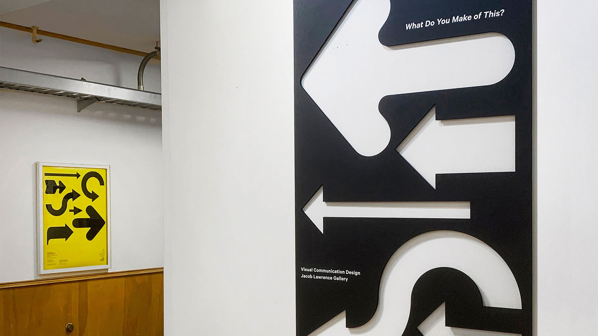
The exhibit design demonstrates sustainable practice, minimizing its environmental footprint while still creating spaces with impact. It accomplishes this in multiple ways: Lightweight cardboard, in various weights and colors, features throughout and allows for easy recycling. Black cardboard arrows direct visitors to the gallery entrance. A promotional extra-large “poster” is created from the remaining material. By using both the positive and negative shapes, every inch of material is used. Various structures were re-purposed from previous projects: The “Re-Made” framework was originally created as a prototype for the Give Me a Sign exhibition on view at Cooper Hewitt, Smithsonian Design Museum in New York. The structure was loaned out and brought to life again by University of Washington Design Senior Ash Gibson for her capstone installation at the 2023 UW Design Show. It was reinvented once again for “What Do You Make of This?” The Re-Made project itself takes old material samples wallpaper graphics, color tests, construction scrims, etc. and transforms them into a range of durable, unique bags. The circular “What Were You Thinking?” structure was originally created for an installation titled Vacant Seattle, conceived for the 2021 Seattle Design Festival. For this exhibition it was re-wrapped in printed cardboard. After the show came down, this yellow cardboard was cut into pieces to transform into cheerful holiday cards. The careful re-use of materials also kept fabrication costs to a bare minimum: just under $3500 for an exhibition encompassing over 2000 sq feet of gallery space.
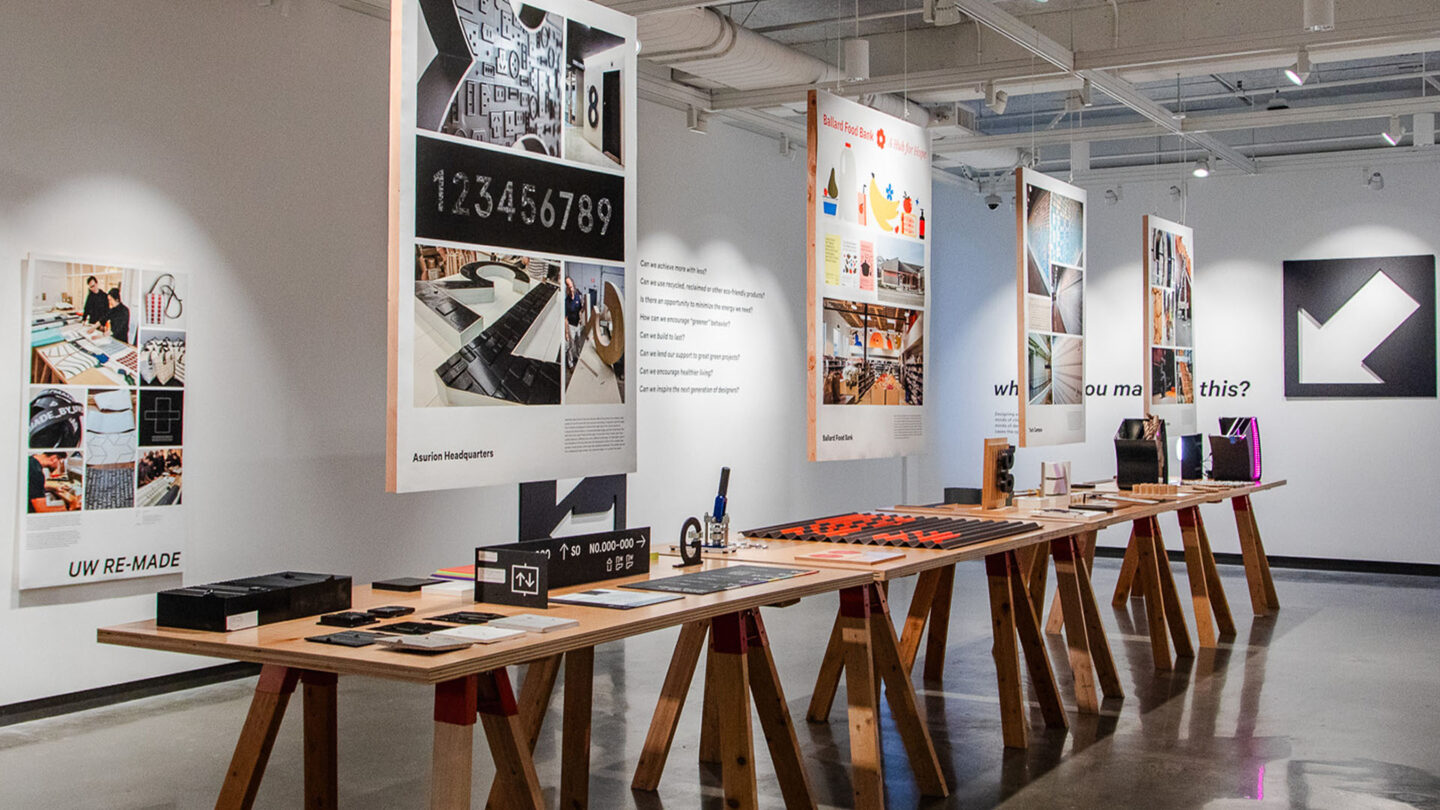
The central gallery features material samples and mock-ups, paired with imagery of finished projects.
Natalie O’Rourke
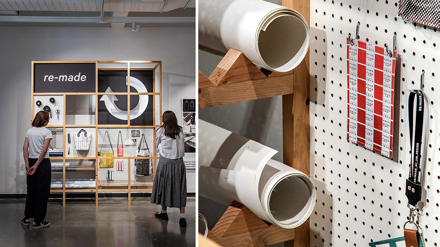
The Re-Made project takes old material samples wallpaper-graphics, color swatch-tests,
construction scrims, etc. and transforms them into stylish carrier and phone bags. Structure is reclaimed exhibition design prototype.
Natalie O’Rourke
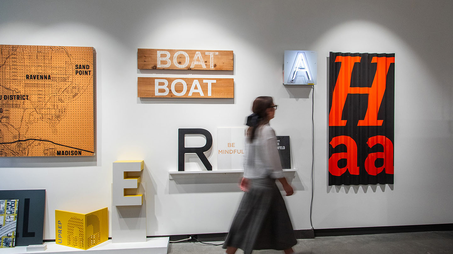
Material samples and mock-ups from a range of projects helps to explain sustainable material
choices.
Natalie O’Rourke
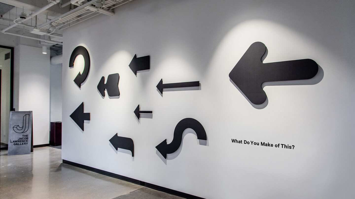
Black cardboard arrows direct visitors to the gallery entrance.
Natalie O’Rourke
Project Details
Sustainability and environmental responsibility have recently risen to prominence as the world continues to grapple with climate and climate change. This applicant was able to salvage materials from other exhibitions to create a powerful design on an extremely limited budget.
I enjoyed that this project highlights the process and materials that go into developing a compelling exhibition. By up-cycling and deconstructing past exhibitions you further the lifecycle of the material but also created a way to expose how our industry could think more long term and sustainable about our building practices.
Design Team
Kristine Matthews (design principal)
Nicole Fischetti (design support)
Peyton Todd (design support)
Angus MacGregor (design and installation support)
Meg Graham (project manager)
Collaborators
Imagine Visual Service (selected graphics)
Webster Crowell and the Jacob Lawrence Gallery team
Karen Cheng (professor, division of design, university of washington)
Photo Credits
Natalie O’Rourke, Studio Matthews
Open Date
October 2023
