Serviceplan Signage System
The Serviceplan signage system communicates the agency’s plurality, internationality and diversity.
Agency
büro uebele visuelle kommunikation
Practice Area
Client
Serviceplan
Industry
The Challenge
The Serviceplan Group’s new House of Communication in Munich’s Werksviertel provides a common home for over a thousand employees from a wide range of cultures, nations and communication disciplines and is an open meeting place for conferences, events and parties. It takes the principles of New Work to the next level and allows employees to work in a maximal agile, flexible and interdisciplinary way. But how do you give them orientation and create identification in such an open space concept?
Project Vision
A typographic signage and branding system that is as creative and diverse as the people for whom it was made.

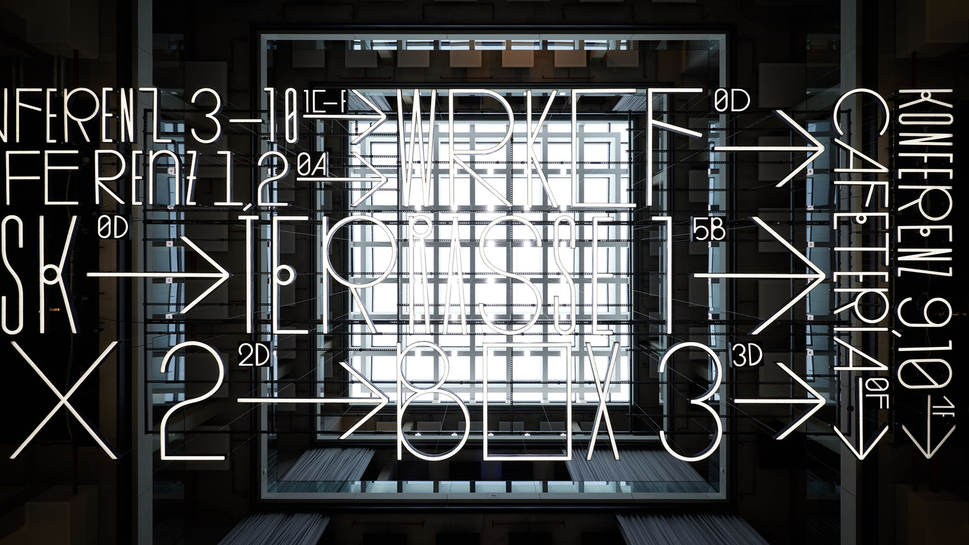
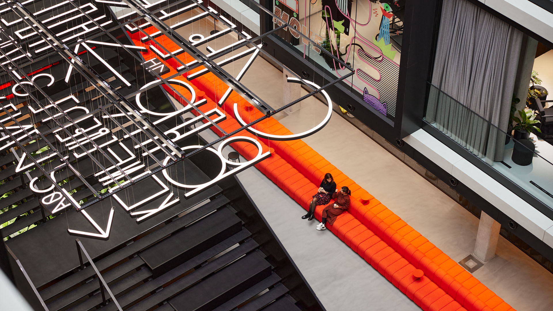
House of communication, atrium, flying carpet
Mark Seelen

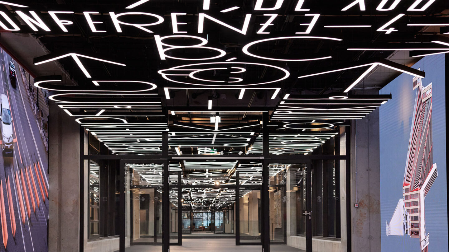
130-metre long, 6-metre wide light installation runs through three buildings
Mark Seelen
Design + Execution
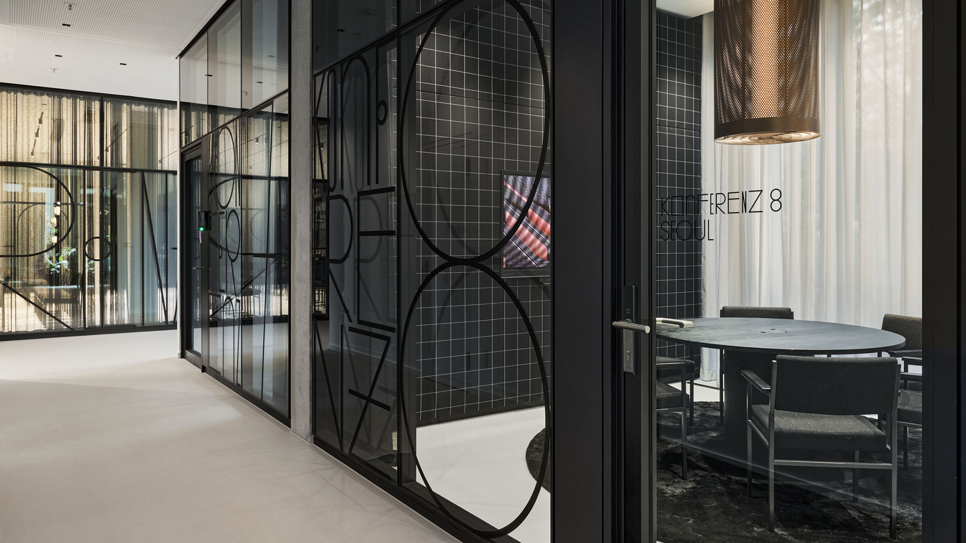
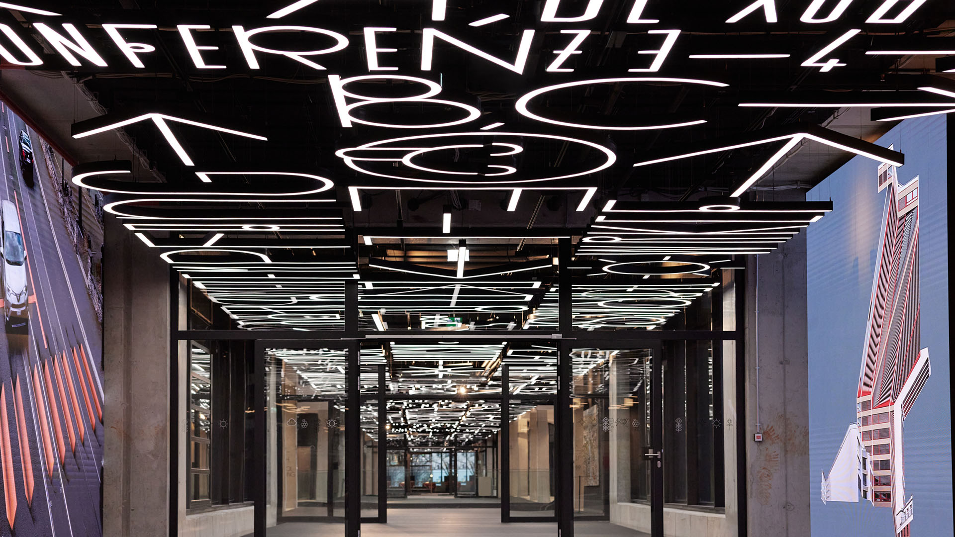
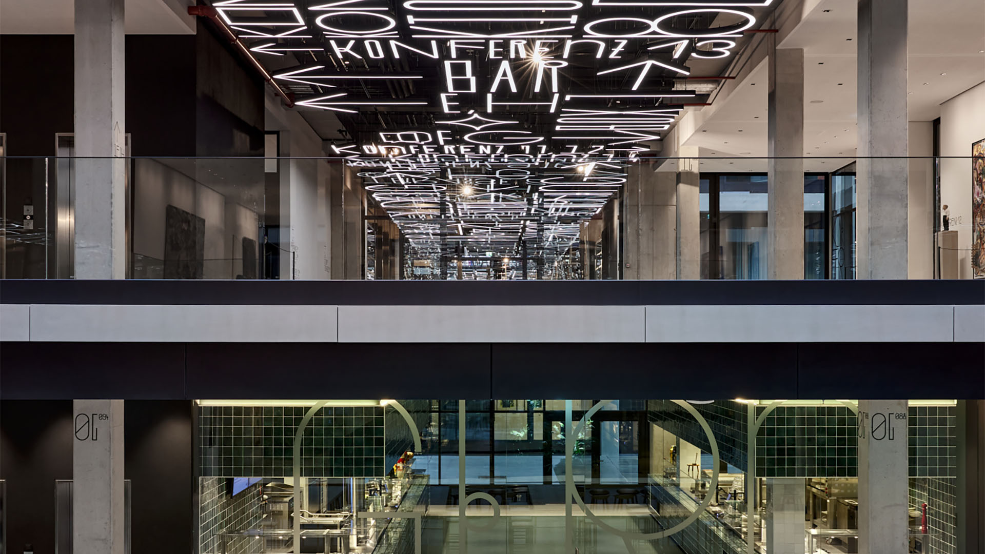
Based on the brand icon and the square grid of the interior design, a specially designed typeface, “Service,” with letters in four different alternatives each, ensures that nothing in the new campus is uniform, but everything is consistent. Pictograms support the liveliness of the typographic system, which offers spatial orientation and at the same time creates identity. In impressive spatial elements, such as the illuminated sign-like floating lettering and the 130-meter-long, 6-meter-wide light installation that connects all three parts of the building, it becomes a work of art that celebrates language and communication.

Here we have not just a bespoke typeface but also a suspended block of illuminated text
Mark Seelen

Customised names and lettering for key destinations
Mark Seelen
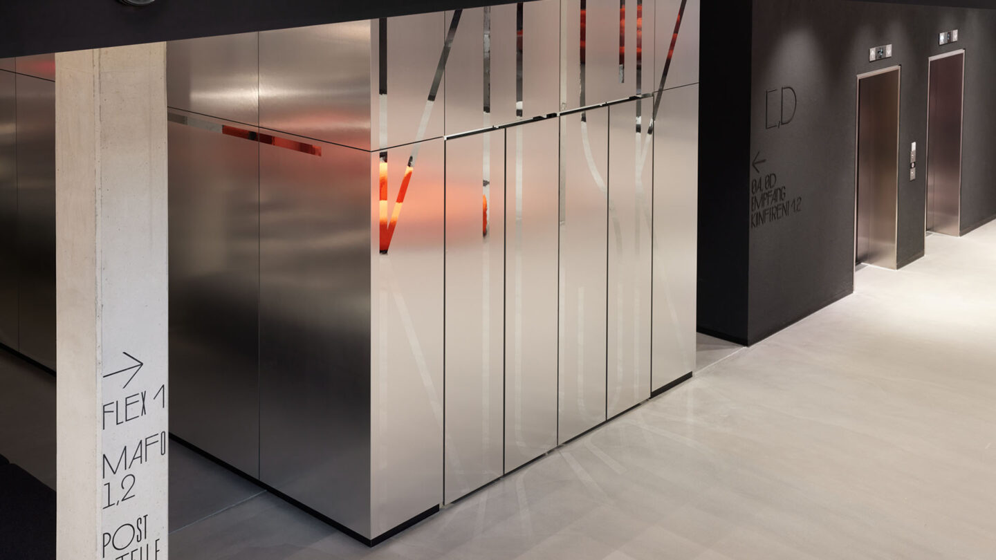
This luminous optical and functional backbone is accompanied by a signage sub-system on walls and pillars
Mark Seelen

A flying carpet – set in our unique font
Mark Seelen
The pictograms and all the other signs, arrows and symbols were also designed to match the typeface
Mark Seelen

Project Details
This unique typographic treatment is not only defining the space but also functional to help guide visitors throughout the buildings. The font is whimsical and carried throughout the primary and secondary wayfinding systems for a very cohesive and engaging space.
We like the unique use of the ceiling graphics as a wayfinding system. It was both beautifully designed and functional. The double layer of wayfinding on the ceiling and in more traditional locations was effective for a variety of different users. You were also able to carry over the system seamlessly across all surfaces across multiple buildings.
The primary and secondary wayfinding elements provide functionality, while the tertiary wayfinding adds a compelling element of design and placemaking for the environment.”
A professional and multifaceted environmental graphic work of wayfinding. This work exemplifies a surprising and outstanding experience in wayfinding design. It is a perfect balance of typography and materials, and the interaction of space and graphics.
Design Team
Andreas Uebele (managing partner)
Carolin Himmel (managing partner)
Nadja Ratz (project manager)
Anika Pehl (project manager)
Anna Pfältzer
Lorenz Grohmann
Collaborators
Henn (interior design)
RKW Architektur (architecture)
Projektleuchten GmbH (fabricator)
Photo Credits
Mark Seelen
Open Date
July 2022