The Senses—Design Beyond Vision
Museums are places for community education, yet they are seldom accessible to everyone nor equitable in their presentation of content. Acknowledging the unfortunate truth that visually impaired people struggle to enjoy museum experiences, “Senses: Design Beyond Vision” invited visitors of all abilities to actively engage in the exhibition in ways surpassing conventional “universal design” considerations.
Agency
Studio Joseph
Practice Area
Client
Cooper Hewitt Smithsonian Design Museum
Industry

The Challenge
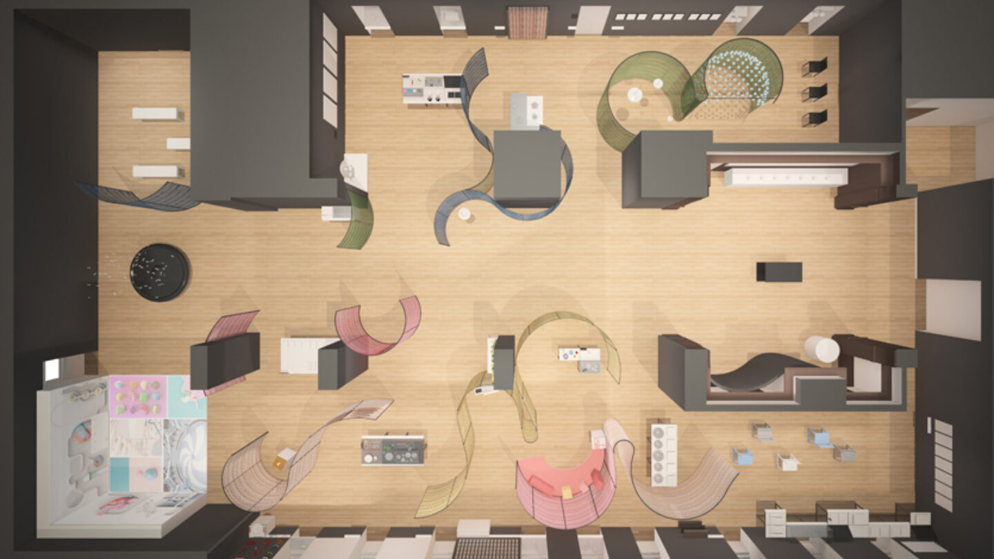
Given the historic building fabric and its fragile finishes, the museum required the 10,000 square foot installation to maintain structural independence from the envelope—a challenge that was solved through the use of undulating steel screens made with richly colored vinyl threads from Bolon.
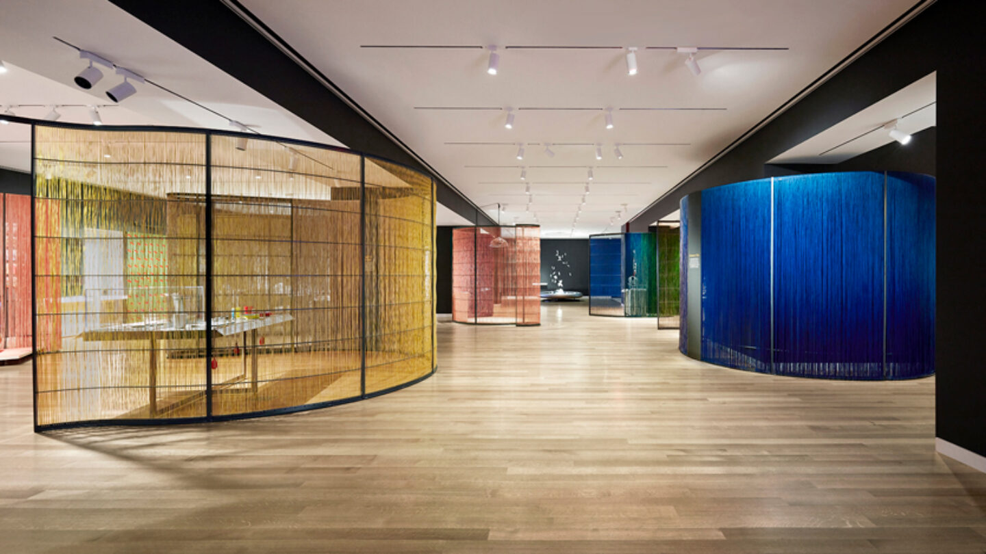
Designers were impressed by Bolon’s color range and the fact that each thread yard is comprised of two colors. The material itself is inexpensive, a significant factor in providing an economical temporary installation with an overall $100K budget. The screens were either woven for more transparency between areas or hung for more privacy between visitor and object onto black steel frames.
Project Vision
Offering both visual and tactile stimuli, these screens evoked “moods” by oscillating between cooler, low-frequency colors and warmer, high-frequency colors that seamlessly blended into different gradients.
They served as both backdrops to the objects and definers of spaces, allowing different aesthetics to occupy the same installation while pragmatically solving issues of sound and aroma bleed and requirements for varied lighting levels.

The Senses: Design Beyond Vision | New York | 2018 | Studio Joseph
Thomas Loof

The design takes into account issues of aroma, sound and light conditions allowing each work of art its criteria.
Thomas Loof

The design solution involved a clear layout with logical paths of circulation. Without any prescribed visitor path, the exhibition arrangement gave visitors clues as to how to follow the curatorial narrative.
Thomas Loof

The Senses: Design Beyond Vision
Thomas Loof
Design + Execution
The modes of display considered how visitors would interact with the works both individually and in groups. Visitors were encouraged to smell, feel and listen to highly distinct and original manifestations of design to better understand the complexity of our world, beyond vision.
While some exhibition pieces were secured under vitrines, the majority were experienced through multiple senses and required custom means of installation, security, and contamination prevention. As awareness on accessibility was the show’s intent, a cohesive braille overlay on museum labels provided simultaneous information for all. Labels remained at a static height, tilted for custom accessibility throughout all areas.
A complimentary smartphone app connected visitors to full-length visual and aural materials and T-coil–enabled devices provided audio descriptions of video content. The use of scent and vibration became an attraction for those with hearing impairments. The ability to understand music in varied ways coupled with other presentation techniques were of particular interest to this segment of visitors.
A large number of museum professionals visited the show. They were specifically interested in how we met the challenges of making meaningful displays that use tactile presentations. Also, there were numerous visits by groups of blind persons and those with low visibility. The use of braille in conjunction with the labeling in a consistent way made this show an excellent example of how to work with their population.
The show’s success was measured in that it effectively breaks the barrier of sight, signaling to all that there is a broader sensory environment and as such sets an example for other museums, and that visitors felt a greater appreciation for how design can provide alternative means of understanding through a multi-sensory process.

An armature of woven vinyl fiber worked that is at once a divider, and a framing screen is a connective tissue that holds together the works.
Thomas Loof

The armature itself became part of the show experience. The visitors played with the fibers and enjoyed their tactile sensation. Although they did not emit any scent, visitors even smelled them as there were so many aromas that were part of the show.
Thomas Loof

Ultimately, the success of the show lay in its overriding sense of inclusion that allowed all visitors to understand the sensory world together.
Thomas Loof
Project Details
Love the subject matter, content, and how the designers created a laboratory for exploring with a light touch with the use of threads, playing on the idea of vision as spaces overlap through translucency.
A sensitive solution has been found for the exhibition’s subject of inclusive design—exhibition premises integrate into the spatial structures in open, interactive and communicative ways.
Design Team
Monica Coghlan (associate for design)
José Luís Vidalon (associate project manager)
Ellen Wong (lead designer)
Sam West(designer)
Derek Lee (designer)
Emma Chen (designer)
Collabortors
David Genco (graphic design)
Capitol Museum Services (fabricator)
Photo Credits
Thomas Loof
Open Date
April 2018