Scarborough Foreshore
The refurbished Scarborough Beach development transforms the beachfront from a disconnected foreshore dominated by a car park into an activated urban beach experience. It brings locals and tourists together, by mean of a transport hub, surf club, skate park. swimming pool, amphitheater and retail. The redevelopment called for a
user-led wayfinding solution, which had to be robust, withstand vandalism and be durable in the coastal environment. The solution’s design draws inspiration from its surroundings and celebrates Scarborough’s history as a surf, swim and leisure hotspot.
Agency
Diadem
Practice Area
Client
Metropolitan Redevelopment Authority (MRA)
Industry
The Challenge
The Scarborough Foreshore redevelopment called for a user-led wayfinding strategy that would draw people together and help them easily navigate the precinct’s spaces. The signage system had to be robust, withstand vandalism and be durable in the coastal environment. The solution’s design draws inspiration from its surroundings and celebrates Scarborough’s history as a surf, swim and leisure hotspot. The signage needed to contribute to the physical character of the place.
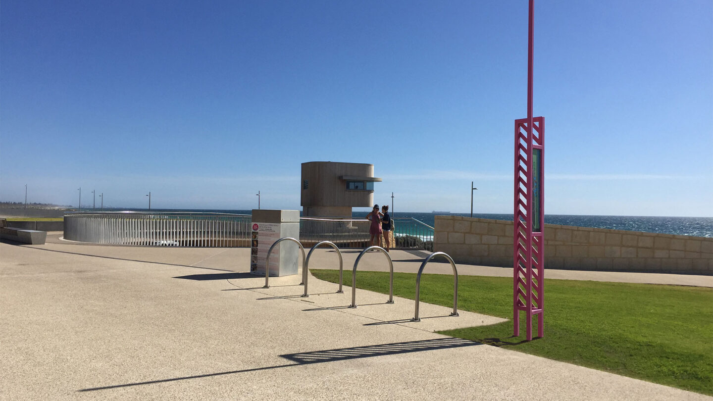
A pink pedestrian directional’s chevron-like shadow extends out onto thoroughfare in the harsh daylight sun.
Kelly Wong

This blue facilities identification sign’s flowing, wavy pattern projects onto the pavement, paying
homage to the Scarborough surf.
Kelly Wong

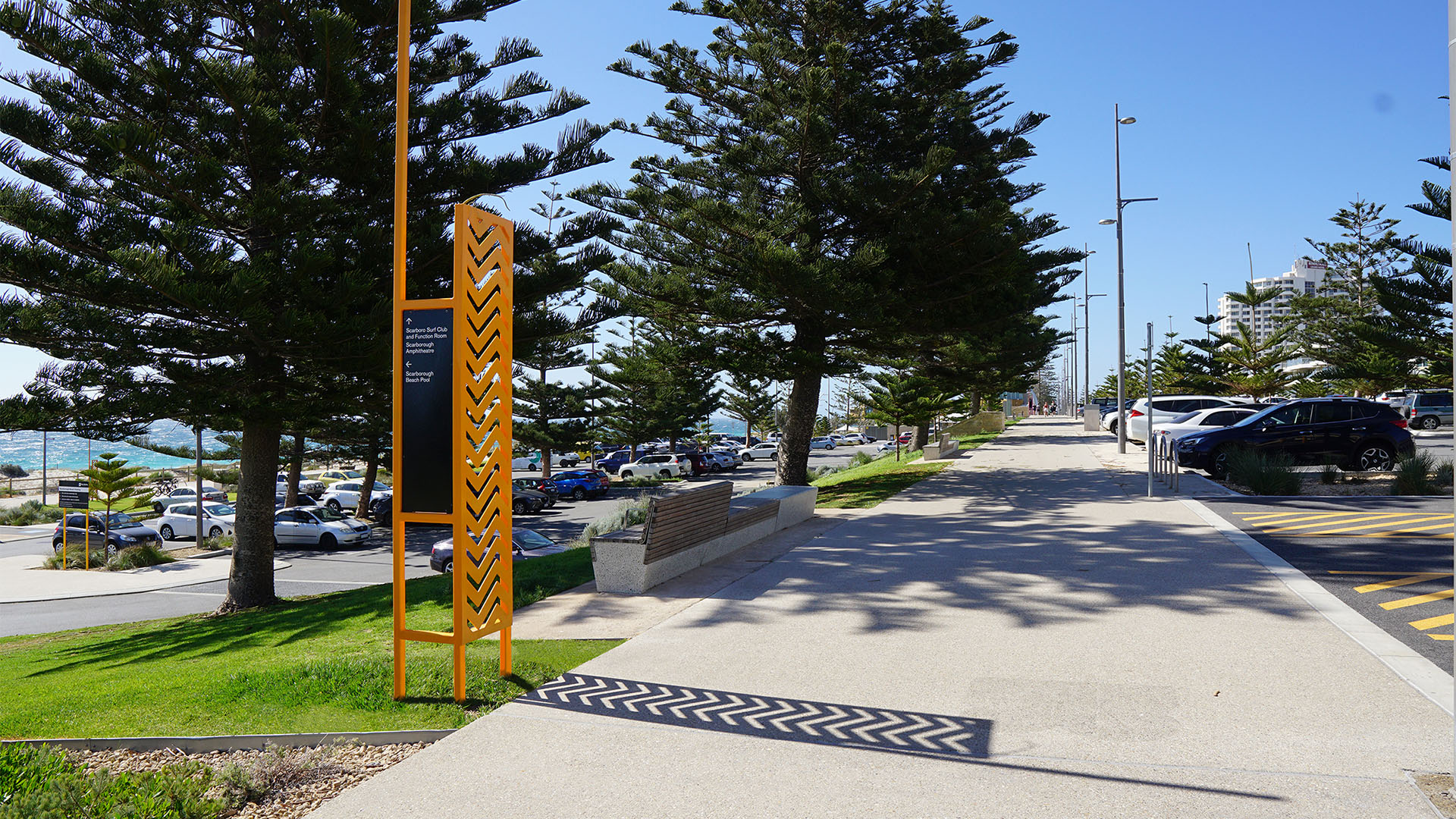
This yellow pedestrian directional’s jagged pattern stretches onto a walkway nearby one of
Scarborough’s main carparks.
Sam Lowth

This purple pedestrian directional sits atop a stairway fronting the Scarborough foreshore. Its
jagged shadow prints upon the walkway.
Kelly Wong
Design + Execution
The signage suite patterns were designed to cast shadows onto the Scarborough terrain when hit by the harsh sun, changing throughout the day and connecting the signs to land. Diadem undertook sun studies to determine the signs’ positioning and optimal shadow-casting.
The signage contributes to the physical character of the place. Combined, the shadows and colors take their cues from the laid- back recreational environment. The signage suite’s color palette is taken from Scarborough’s brand colors and theme – morning to night – and represents the festive nature of the beach and its environs. The progression of the palette from sky blues to warm yellows and deep purples ensures high visibility for beachgoers. The suite’s various patterns, including chevrons, double-chevrons and stripes, reference those often seen on beach towels, board shorts, bikinis and umbrellas. The signs were also designed and strategically positioned so that when the harsh summer sun hits them, their respective patterns cast shadows. Diadem undertook a sun study to determine shadow lengths at various times of day in both summer and winter and assessed beach use times to bring the Wallu theme to life. This determined the positioning of the signs and the optimal shadow-casting during summertime, when the beach is at its peak.

A vehicular directional sits beside a key roadway. Its sky blue color is inspired by Scarborough’s
own brand palette and the early daylight.
Kelly Wong

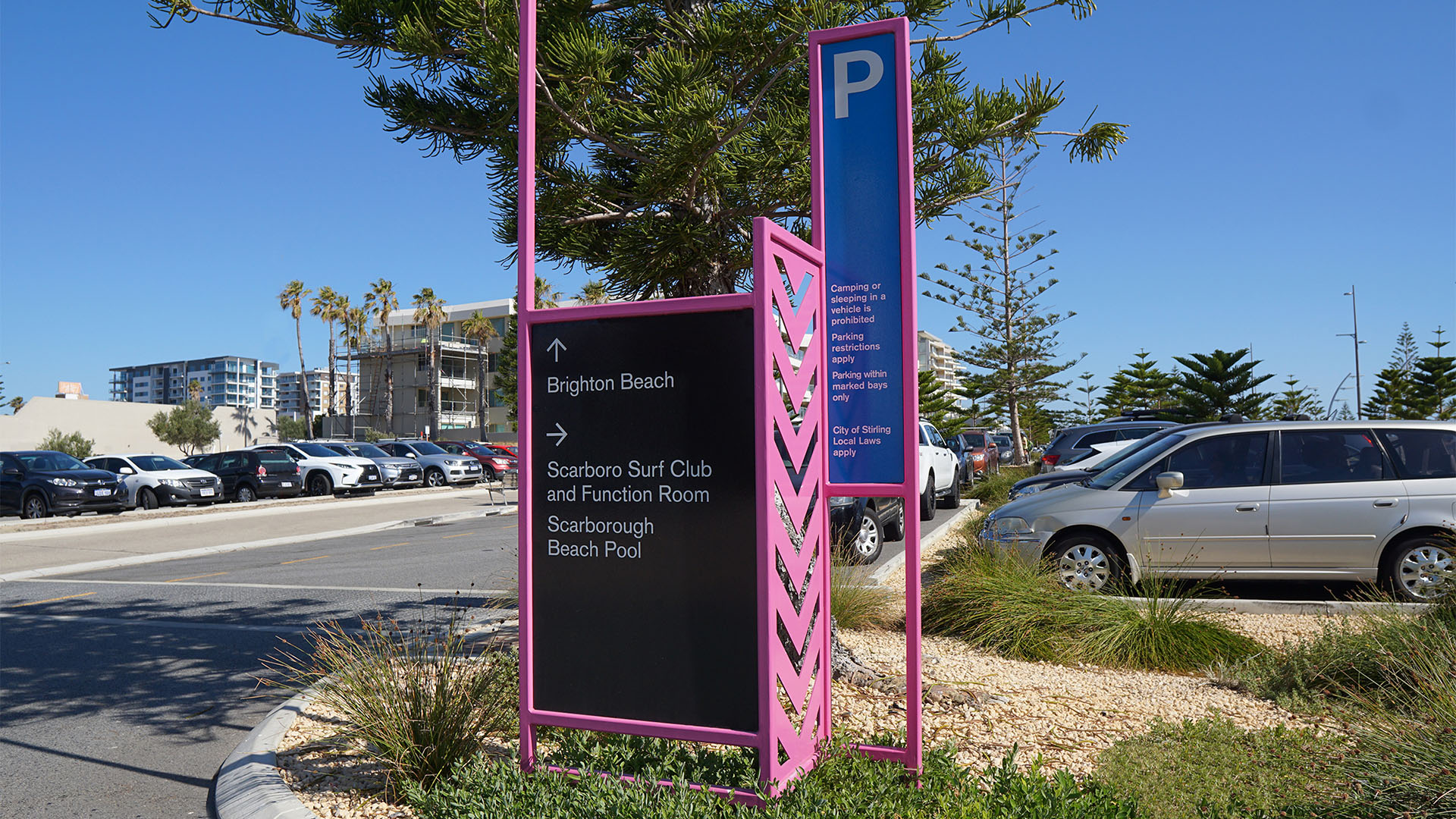
This pink sign doubles as carpark identification and vehicular directional. Sign messaging is
accompanied by a panel adorned with a down-arrow-like pattern.
Sam Lowth

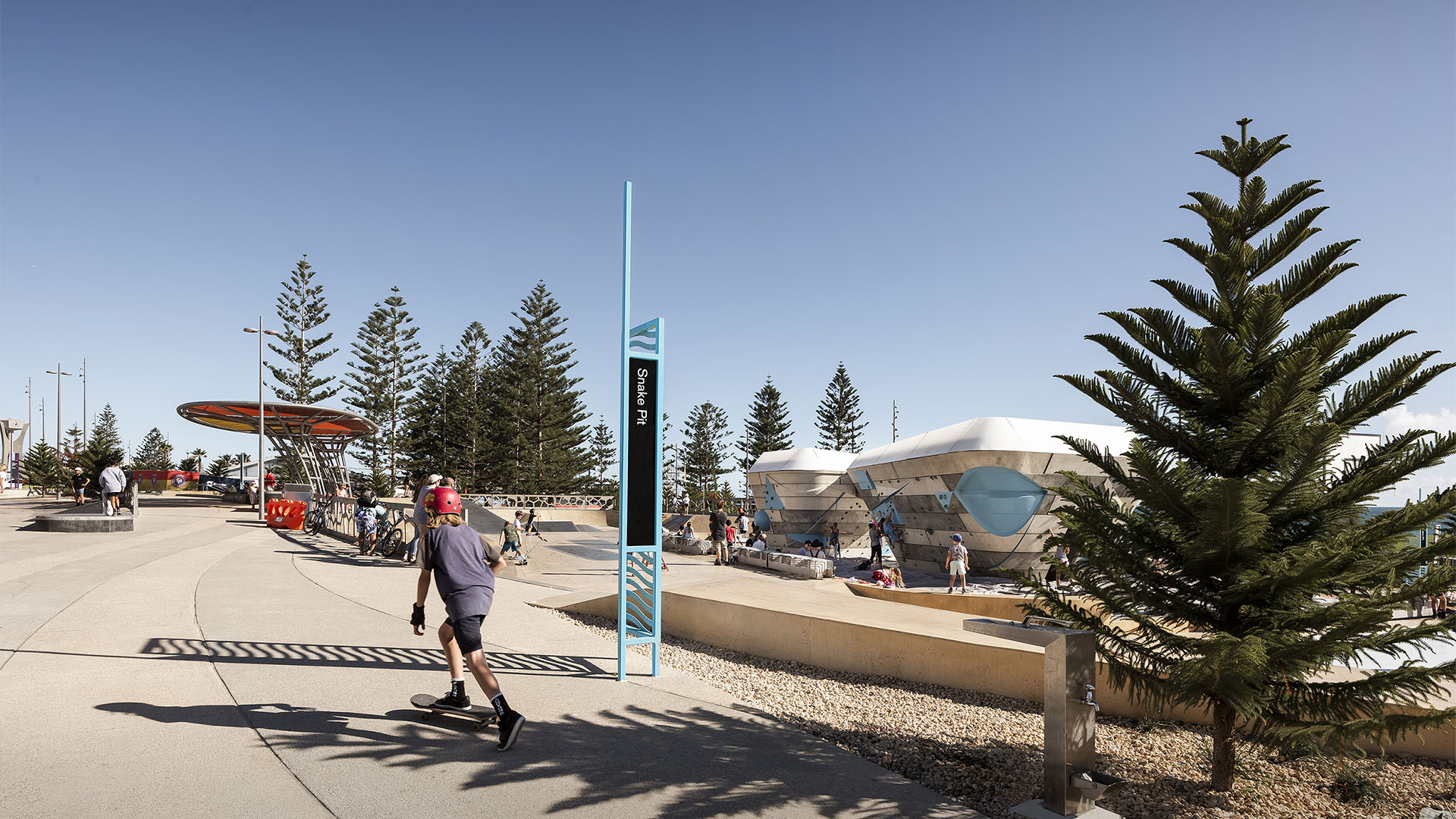
Close-up of a sky blue pedestrian directional (secondary pathways) sign. This site map identifies key locations along the Scarborough foreshore.
Sam Lowth

Project Details
Design Team
Mark Janetzki, (creative direction and strategy), Brett Gosbell, (concept design), Rosanne Green, (design management), Sung Chua, (design development), Chris Oroszvary, (documentation)
Collaborators
TCL | Taylor Cullity Lethlean (lead consultant, urban landscape architects),
MRA, Metropolitan Redevelopment Authority (government body),
ARUP (structural engineers),
UDLA (landscape architects)
Photo Credits
Dion Robeson, Kelly Wong, Sam Lowth
Open Date
March 2018