Port Authority Wayfinding Manual
Over the last decade, the Port Authority of New York and New Jersey (PANYNJ) saw its ASQ ratings steadily fall, surpassed by new and renovated airports. A revamp of its Wayfinding Standards provided a singular opportunity to refresh the airport wayfinding system and provide a unified, cohesive, 21-century experience.
Agency
Mijksenaar USA
W&CO
Practice Area
Client
Port Authority of New York and New Jersey
Industry

The Challenge
In the early 2000s, the Port Authority commissioned a system-wide wayfinding manual, ultimately adopted by all PANYNJ airports and terminals. It showcased the value of a uniform system across all the terminals, becoming a global icon. However over the years, changes such as post-9/11 security protocols, increasing passenger volumes, new transportation options and shifted passenger flows led to a subpar experience.
Project Vision
The work started by benchmarking similarly-sized, top-rated airports in the U.S. and internationally through desk research and in-person visits. The team then developed a set of focus areas for improvement, including wayfinding strategy, connections, spatial zoning, digital tools, governance, and sense of place. The team conducted an exhaustive site visit of 14 terminals and 17 AirTrain stations, creating a comprehensive database of over 10,000 existing signs. They also spoke to customer care representatives, security agents, and facility managers to understand the perspective of on-the-ground staff. They observed passengers using the facilities, highlighting moments of increased stress and confusion, compiling all these observations into a report for each terminal.

A comprehensive, holistic, flexible system considers sign types for every step of the journey and numerous facilities.
Mijksenaar, W&CO

The web-first manual provides easy access for stakeholders on any device. The user-friendly format also encourages iteration and ensures the manual can be easily updated.
Mijksenaar, W&CO

The distinctive, faceted sign construction elevates flat graphics to dimensional blocks of color, acting as beacons connecting people to their destinations.
Mijksenaar, W&CO
Design + Execution
The design system imparts the bold, energetic, no-nonsense personality of the New York/New Jersey region into the wayfinding experience. As the entry and exit point for residents and visitors alike, the airports are but a portion of one’s transportation experience. The team aligned the airports to the region’s iconic transit vernacular to create a seamless, holistic journey. The team designed a distinctive, faceted sign box elevating signage from flat graphics to dimensional blocks of color, recognizable from more angles. They act as beacons to connect people to their destinations, enabling quick, subconscious recognition.
Critically, the team went beyond aesthetics to improve the backbone of the wayfinding experience. A harmonized, airport-wide gate numbering strategy serves as an intuitive positioning tool. They defined a destination-focused information strategy to help users find destinations based on common terminology.

The content module can flex to accommodate a breadth of screen sizes, dimensions, orientations, and technologies—whether current or yet-to-be-deployed in the future.
Mijksenaar, W&CO

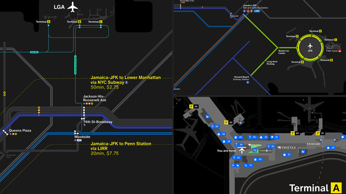
As the entry and exit point for users, airports are just one step of the journey. Maps link the airports to the region’s iconic transit vernacular, creating a seamless experience.
Mijksenaar, W&CO

A flexible yet structured grid system allows for precise sizing and scale of any element, and is designed to expand and grow to accommodate new and unique situations.
Mijksenaar, W&CO

The team prototyped the design system through a collaborative, iterative process (pre-Covid), leveraging knowledge and expertise from a breadth of backgrounds.
Mijksenaar, W&CO
Project Details
I really appreciate how such a challenging project was planned, researched, and structured. I loved how the key areas of opportunities were defined in a simple and easy to understand manner by treating every design element to fit in a flexible design system.
A Herculean feat that will serve the PANY/NJ well into the future. May the “Political Will” gather to support it, because this extraordinary effort to improve the NYC airport experience absolutely requires political and financial support. The PANY/NJ has laid a very strong foundation with this manual.
Design Team
Mijksenaar, Herbert Seevinck (principal in charge)
Mijksenaar, Fenne Roefs, (creative director)
Mijksenaar, Nicole Kwan Leighton, (project lead)
Mijksenaar, Sietse Wiersma, (project manager)
Mijksenaar, Fred Inklaar (designer)
Mijksenaar, Meijer Mijksenaar (designer)
Mijksenaar, Cesar Sanchez (designer)
Mijksenaar, Jasper Goossensen (designer)
Mijksenaar, Carla Ramírez Sosa (designer)
Mijksenaar, Lara Pérez-Porro (designer)
Mijksenaar, Zachary Kaan (designer)
W&CO, Vijay Mathews (project lead & designer)
W&CO, David Jalbert-Gagnier (creative director & designer)
W&CO, Chris Aeyung (developer)
Collaborators
Mott MacDonald, Grimshaw (leading development of JFK International Airport Master Plan)
Monotype (type designer)
Photo Credits
Mijksenaar (photography, videography)
W&CO (photography, videography)
Open Date
July 2020


