Phoenix Children’s Hospital
Agency
Karlsberger Companies
Practice Area
Client
Phoenix Children’s Hospital
Industry
Project Vision
Phoenix Children’s Hospital Wayfinding and Signage
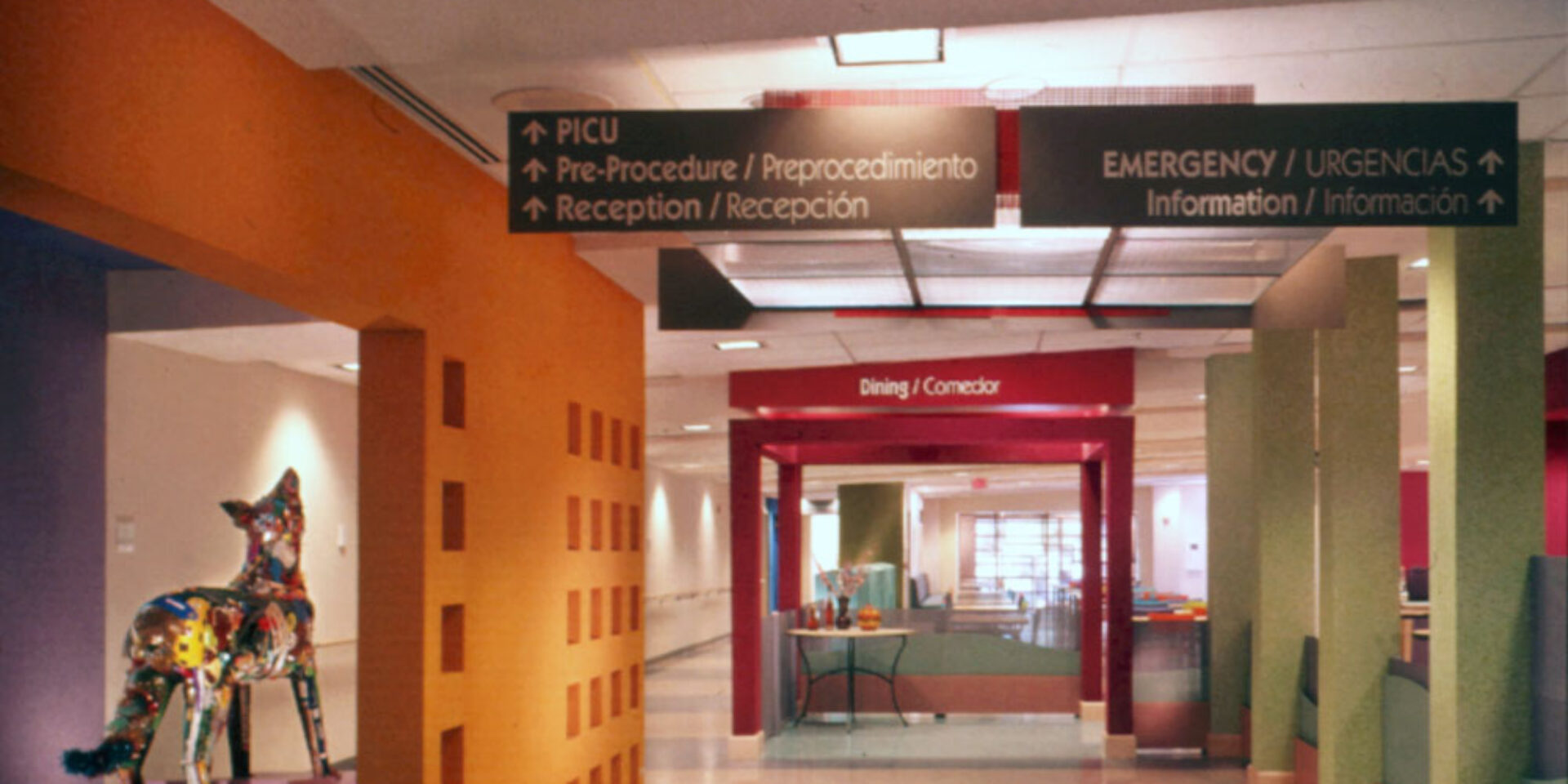
Image was of paramount importance in creating this brand-new children’s hospital from an existing adult facility. The result projects an image that is intriguing, child-friendly, distinctive, inviting, and non-age-specific while promoting the desired brand characteristics of crispness, clarity, efficiency, and professionalism. The design is based upon shadow play and celebrates a playful interaction between natural and man-made elements found in the Arizona landscape. The existing campus architecture was rectilinear and serrated in form, creating the foundation for a formal, man-made grid that organizes the exterior site and interior public spaces. Individual shadow-play walls create a rhythm and act as markers, defining the boundaries of the campus, and vehicular and pedestrian pathways throughout. These walls also act as colorful exterior elements that help mask the view of the rooftop systems from the freeway and the patient tower windows. The neutrality of the minimal directional and informational signage was designed to contrast with and increase its recognition in this colorful environment. Floor space was reserved in architectural programming for artwork that could serve as wayfinding landmarks within the main circulation system. During the construction of the building, artwork was produced in a community-based artwork program with children collaborating with local fine artists.
Project Details
Design Team
Daniel J. Clements III (Principal in Charge)
Design Firm
Karlsberger Companies
Fabricators
ASI Sign Systems/Arizona


