Muskoka Lumber Community Centre
The Town of Bracebridge, Ontario, Canada, was built around a waterfall on the Muskoka River, and is shaped and characterized by its proximity to Lake Muskoka. Since the modern settlement of Bracebridge in the 1860’s to this day, the town’s connection to Lake Muskoka and the Canadian Shield has formed part of its identity.
Agency
MJMA Architecture & Design
Practice Area
Client
Town of Bracebridge
Industry
Today, Bracebridge blends local residents with over 100,000 seasonal property owners visiting primarily in the summer. The continued rise of population in this bucolic and recreation-focused Lake Muskoka region put pressure on replacing the existing aging 1949 Bracebridge Memorial Arena and Carnegie Library, built in 1906. This co-location offered the opportunity for a landmark facility providing the community with state-of-the-art recreation, civic, and wellness amenities; becoming the most important building and ‘Social Heart’ of the community and region.
The Challenge
Client brief: the new centre will have a “Made-in Muskoka” look and feel, reflecting the nature of Bracebridge and its residents.
Project Vision
Community and stakeholder engagement uncovered opportunities to incorporate the local context into the design. Tools like a ‘Graffiti Wall’ and ‘Ideation Panels’ allowed residents to provide direct input. During engagement, the design team learned more about organizations like a quilter’s guild who used the former arena for bazaar. This inspired the design of the building’s exterior.
The ‘Made-in-Bracebridge’ design approach also extends to the interiors, colours, and graphics. It’s informed by 3 primary sources.

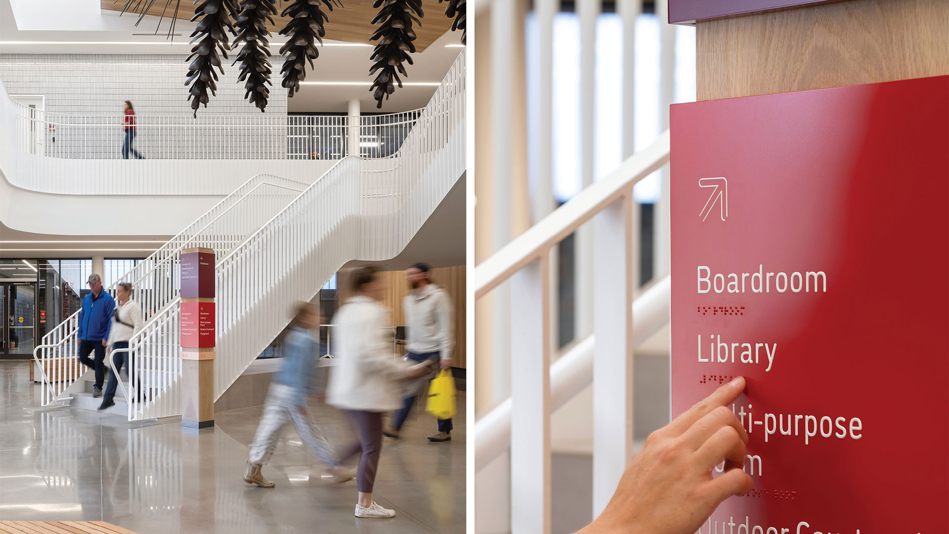
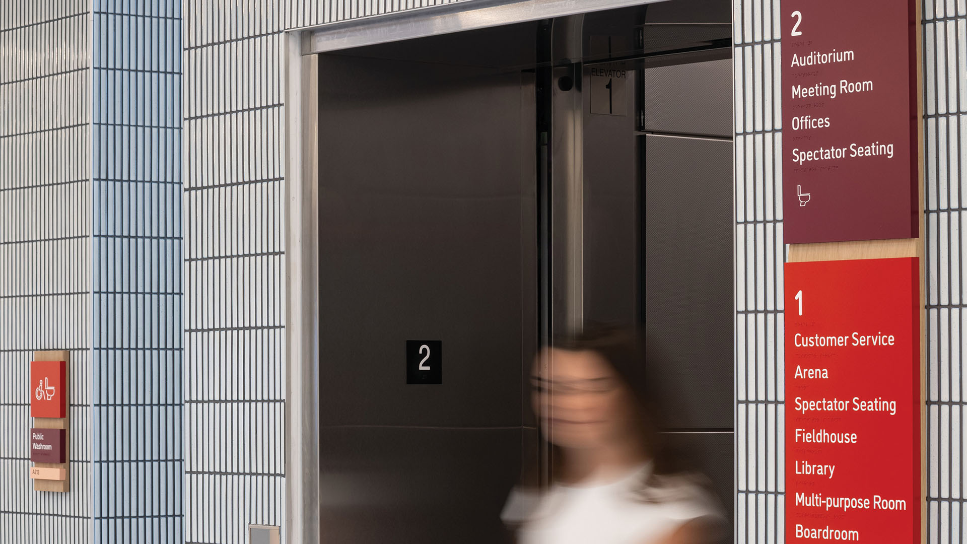
Primary building directional sign in lobby with tactile content and braille; fabricated as acrylic panels wrapping an oak timber post – referencing local signage tradition.
Scott Norsworthy Photography

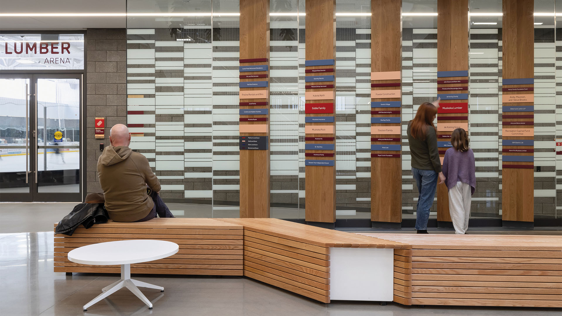
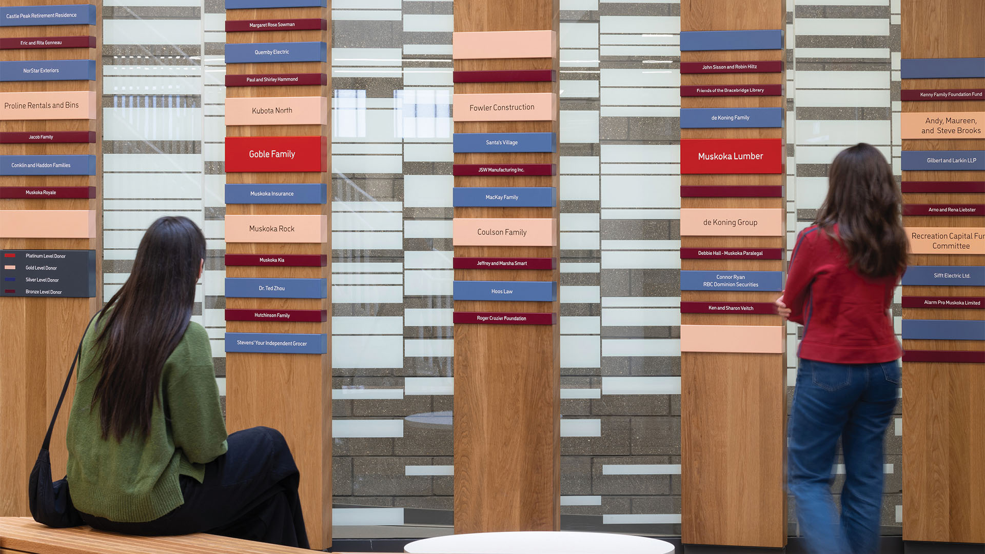
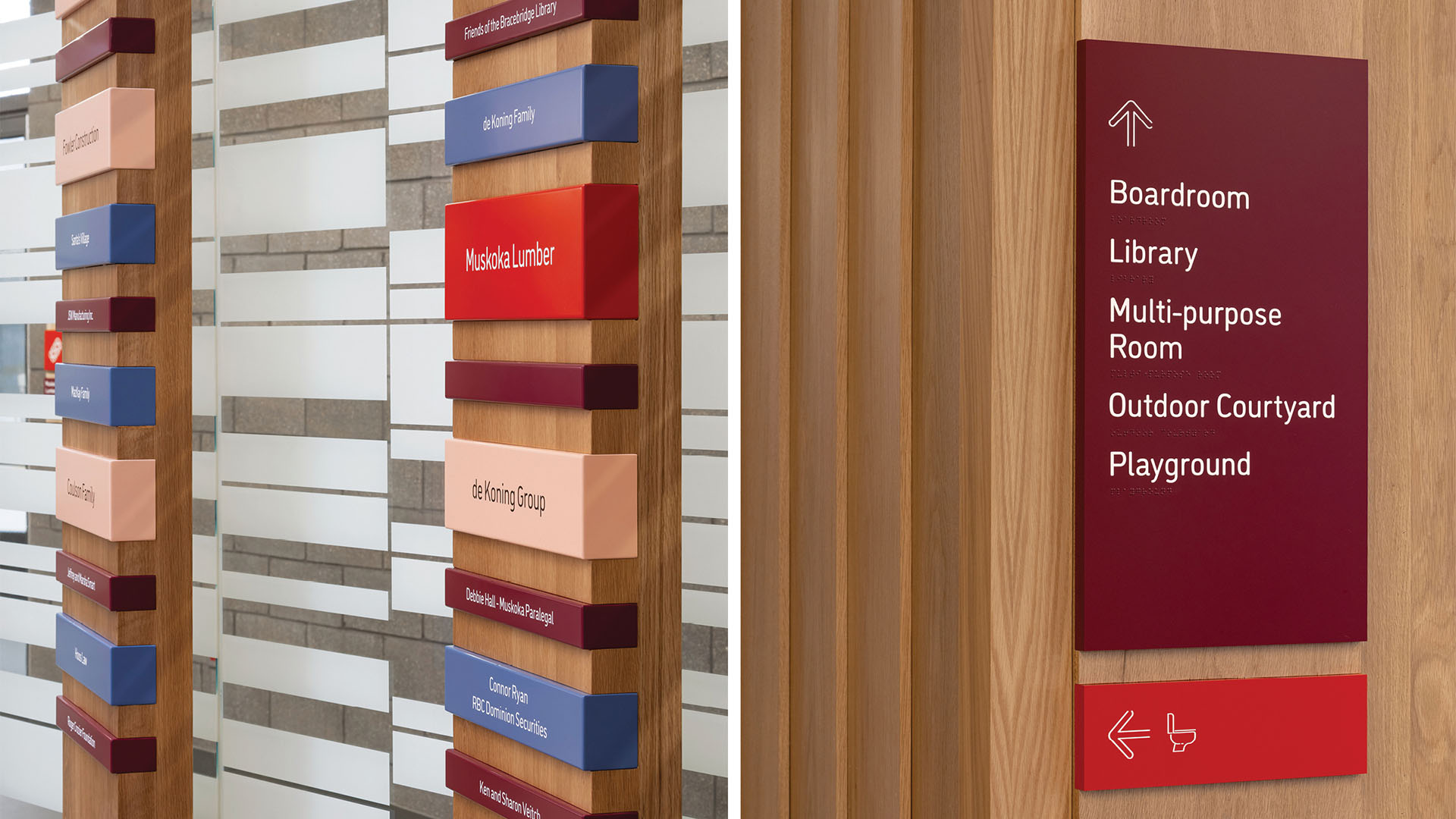
Donor wall in lobby; custom aluminum channels inset into routered solid oak timber; and directional signage – both referencing local signage tradition and colors of the Muskoka region.
Scott Norsworthy Photography
Design + Execution
First is the connection to the site:
The project is surrounded by forests and is close to Lake Muskoka. Seasonal shifts in colour and lake hues served as source of inspiration. The journey to the site, including a road that cuts through pink granite, is referenced by the first flagstone on the building’s forecourt.
Second is the connection to the local donor:
The primary sponsor, Muskoka Lumber, worked with the design team to create ship-lap interior siding made from donated wood, referencing the region’s architecture. Off-cuts were used for signage and wayfinding.
Third is a connection to local tradition:
Hand-painted or carved family nameplates hung on trees as wayfinding signs inspired the facility’s signage. These stacked markers served as a reference for organizing wayfinding information.
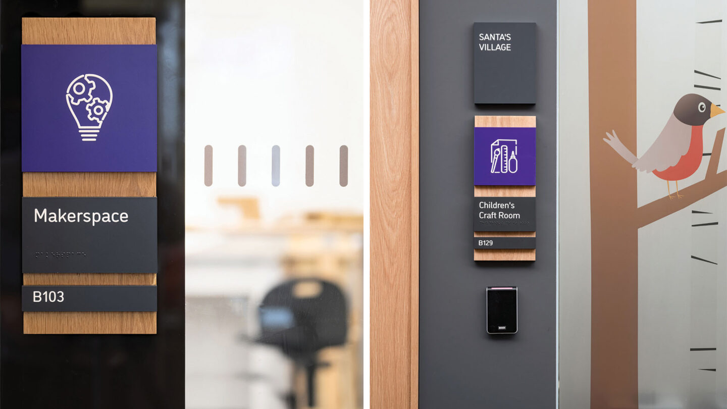
These 3 sources also informed elements like: the donor wall, room signage, directional signage, arena environmental graphics and seating patterns, court configuration markings on the field house floor, and custom pictograms that use colours to define different program spaces.

Donor wall in lobby; custom aluminum channels inset into routered solid oak timber; and directional signage – both referencing local signage tradition and colors of the Muskoka region.
Scott Norsworthy Photography

Elevator directional, room sign, and projecting flag sign; all inset into oak timber backers – referencing local signage tradition and colors of the Muskoka region.
Scott Norsworthy Photography

Home & Visitor players bench signage; made from left-over oak timber from the shiplap interiors. Above, arena seating colors and pattern reflect the colors of the Muskoka region.
Scott Norsworthy Photography
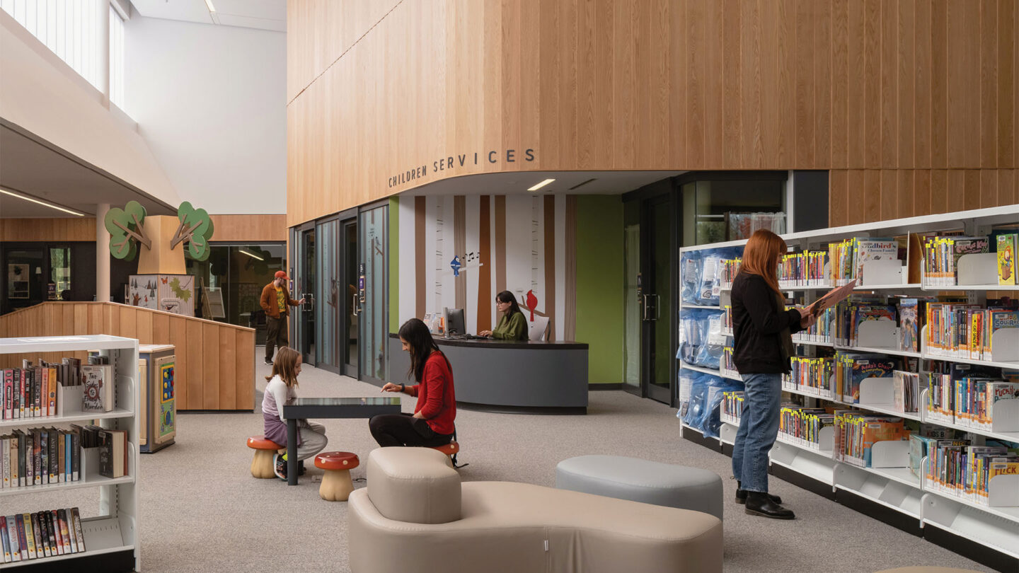
Library with shiplap interiors; library signage with bespoke playful pictograms inset into oak timber backer.
Scott Norsworthy Photography
Library with shiplap interiors; library signage with bespoke playful pictograms inset into oak timber backer.
Scott Norsworthy Photography
Project Details
The wayfinding design has excellent connections to the locality for this community centre. The color scheme is beautiful, connecting to the seasonal color shifts of the lake and the forests. The community’s deep connection to the lumber industry also shows coherent material choice.
There is no shortage of notable wayfinding projects that use wood. But in this case, it was both inevitably appropriate, and well designed.
Design Team
Tim Belanger (experiential graphic design partner)
Tarisha Dolyniuk (interior architecture design partner)
Ted Watson (architecture design, partner-in-charge)
Ricardo Duque (project design manager)
Raymundo Pavan (experiential graphic design lead)
Krista Clark (design team)
Monica Leung (design team)
Brad Vokey (design team)
Lucas Postlethwaite (design team)
Natalia Ultremari (design team)
Melissa Lui (design team)
Hyaeinn Lee (design team)
Collaborators
Spectra Advertising (physical fabrication firm)
Muskoka Lumber
Archmill House Millworkers
Photo Credits
Scott Norsworthy
Open Date
October 2024