Merriweather District
The Merriweather District is a vibrant mixed-use community on 68 acres in Columbia, Maryland, adjacent to the famed Merriweather Post Pavilion, consistently ranked one of the best outdoor amphitheaters in the country.
The Challenge
The team was enlisted to create and implement the wayfinding and identity signage for the district. The team was provided with preliminary signage programming and placeholder sign elements that were intended to be redesigned. These were done in advance to provide “placeholders” for the entitlement process. However, this also provided the team with a fairly constrained set of parameters to design within.
Project Vision
The idea was to design bold signs for a new district that are befitting of the vibrant identity and brand messaging. The team’s goal was to keep the signage on-brand, not only visually but also in spirit, by building upon the guiding principle & rallying cry of the new district — Grow Boldly, initially inspired by the region’s visionary founder, James Rouse.

Illuminated letters feature a luminescent paint. The resulting effect appears solid during the day, while at night, the faces of the letters glow a soft yellow.
Patrick Ross Photography

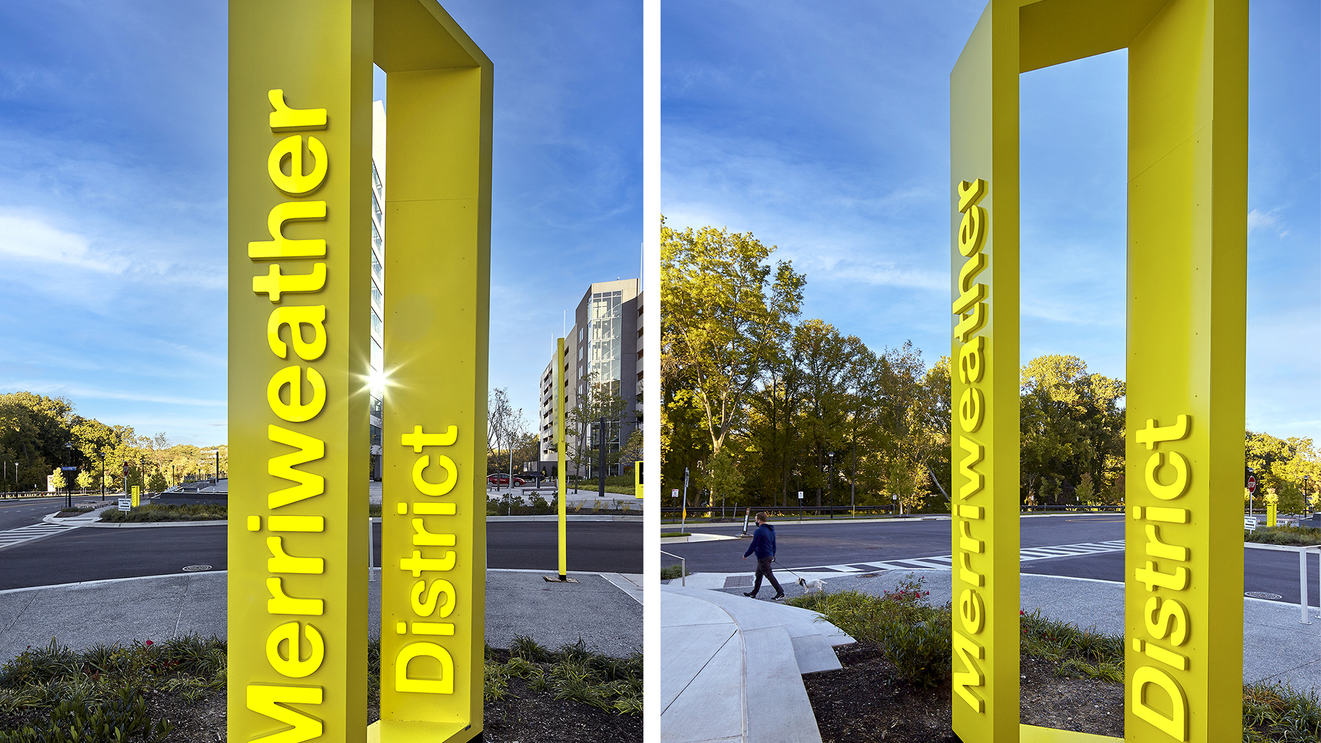
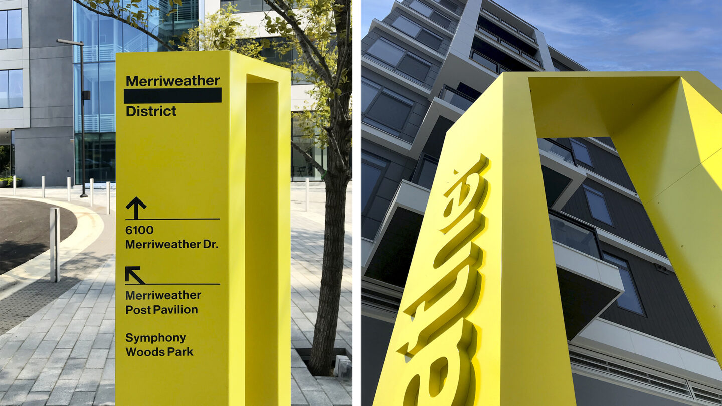
The letters appear as a solid, almost ”molded,” one color sculpture during the day, while at night, the faces of the letters glow a soft yellow.
Ashton Design
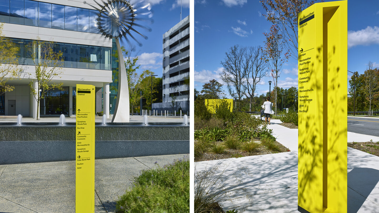
Pedestrian directional signs also feature the center ”window” void inspired by the project logo.
Patrick Ross Photography
Sign details
Ashton Design
Design + Execution
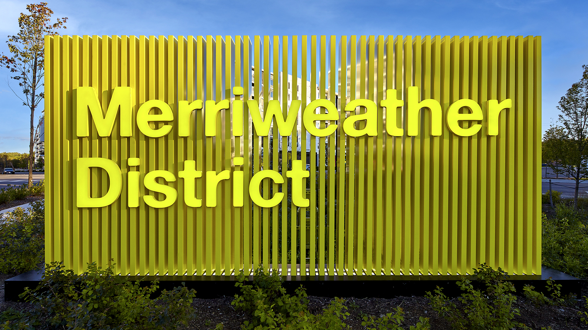
The “Perspective” sign concept was inspired by the “window” portion of the Merriweather logo. This void between the Merriweather text and District text was inspired by the shape of the central ColorBurst Park and serves as a dynamic visual vehicle for photography, illustration and brand messaging.
The team wanted to replicate the dynamic morphing of the logo window within the vertical identity signs in the way that would conceal and then reveal the surrounding environment as the visitor walks past.
Illuminated letters on the two main signs feature a luminescent paint—a bright yellow color called “Estrellita“ (little star). The resulting effect appears as a solid, almost “molded,” one color sculpture during the day, while at night, the faces of the letters glow a soft yellow.
The final designs reflect the strong Merriweather brand through bold, sculptural and iconic signage that gives the district its distinct feel.
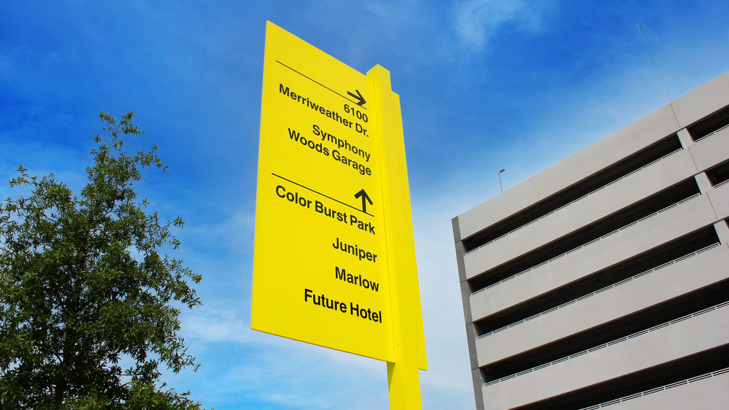
Minimal vehicular directional sign.
Ashton Design
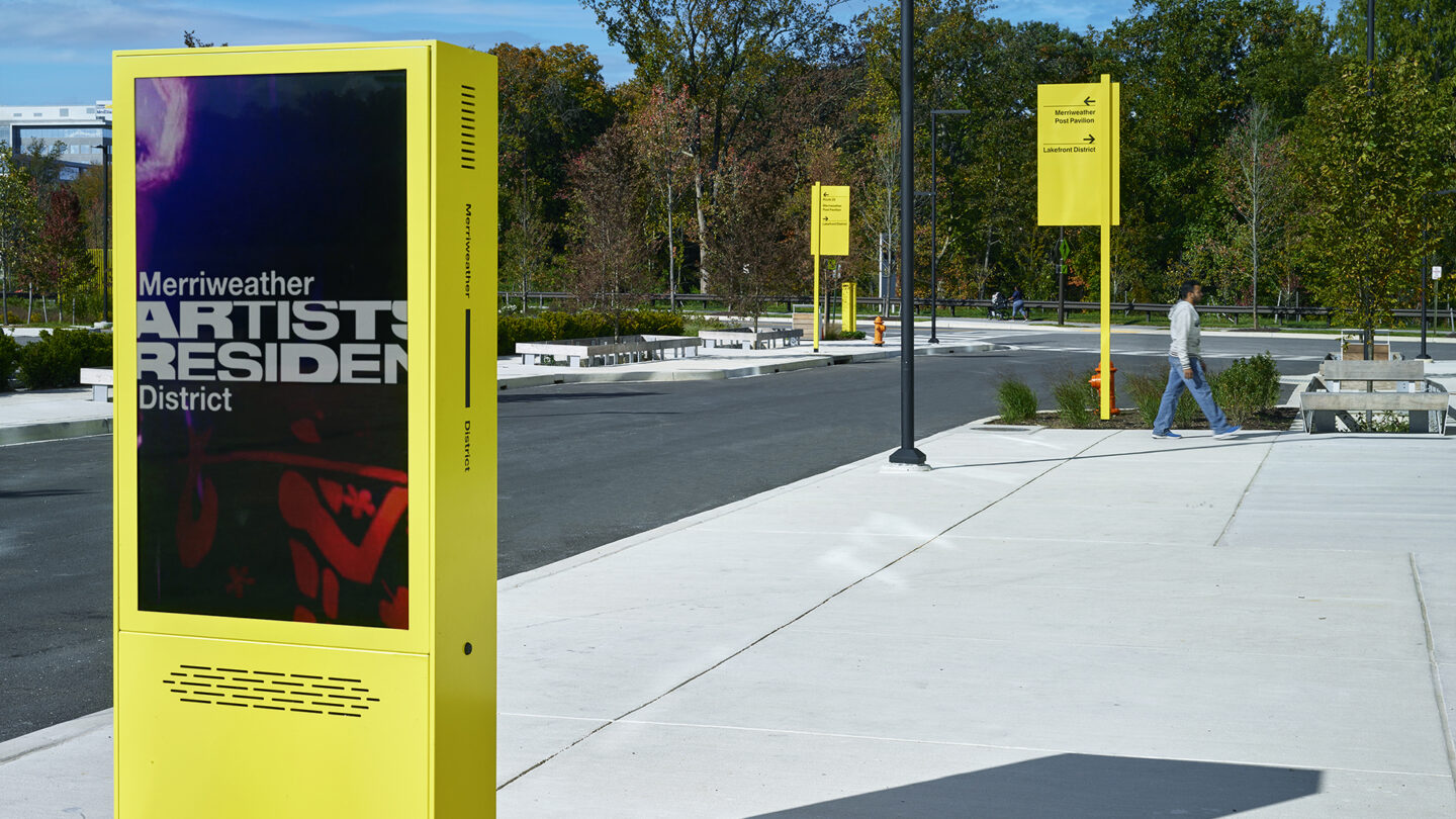
Digital directory and vehicular directional signs.
Ashton Design
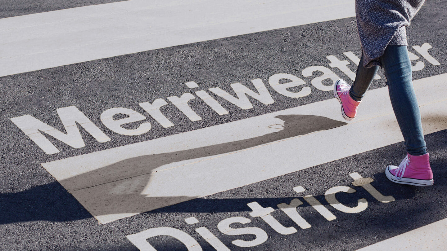
Custom crosswalks with a fitting use of the logo.
Ashton Design


Project Details
The wayfinding and branding for the new Merriweather District are bold and eye-catching, yet the pops of color are harmonious with the natural surroundings. The markers are easy to see ahead of time while driving, which is a huge plus!
This project’s sculptural signage elements stood out in our wayfinding category, because they are bold, colorful, and effective.
Design Team
Alexey Ikonomou (creative director & project manager)
Keith Kellner (lead designer)
Andrew Walters (designer)
Collaborators
Ad Vice Studios, LLC (physical fabrication)
JP2 Architects (architecture)
Mahan Rykiel Associates (landscape architecture)
Photo Credits
Patrick Ross Photography
Open Date
August 2020