LinkedIn Toronto HQ
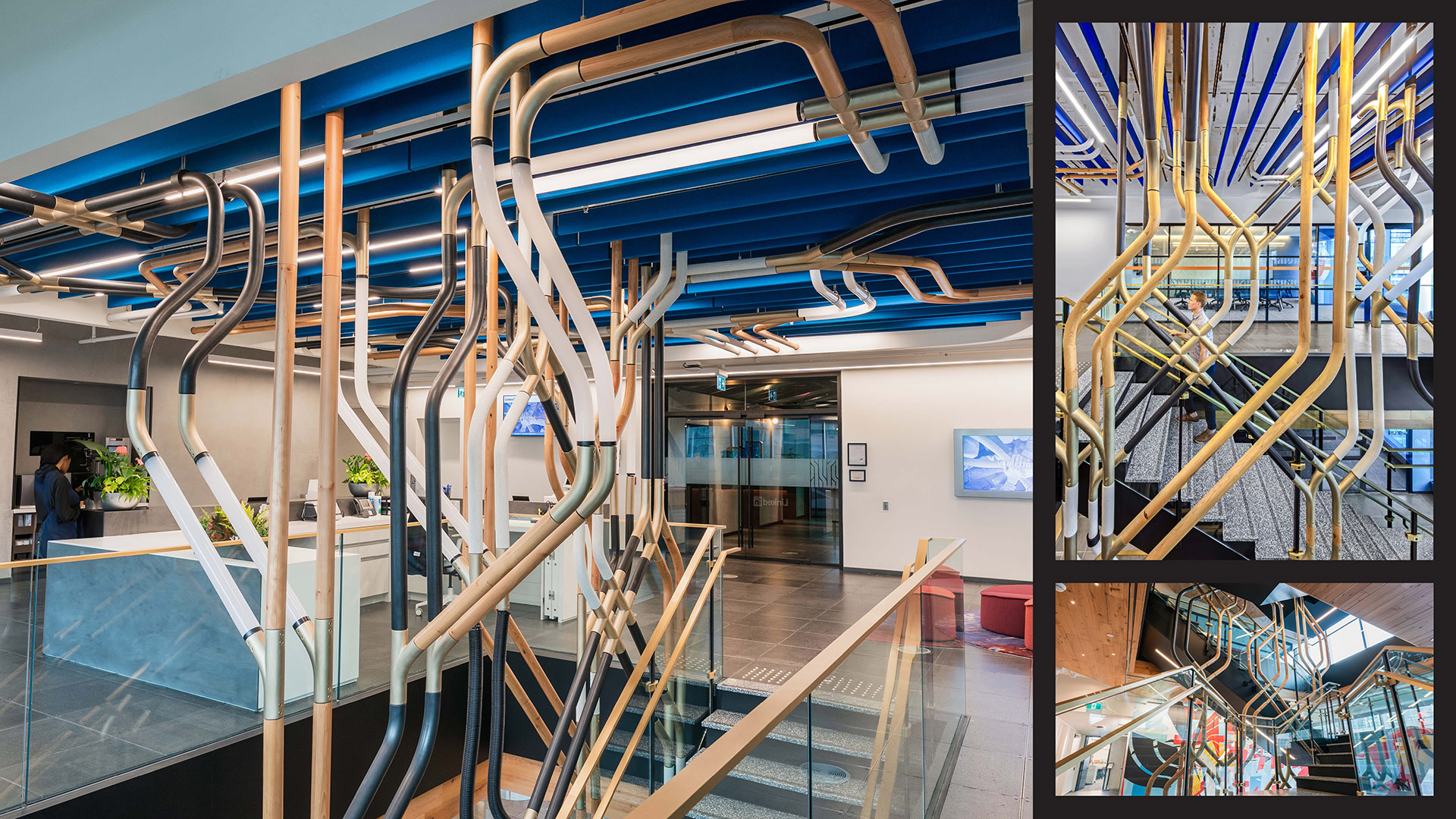
At the heart of all LinkedIn spaces is their brand story. Their offices are rich experiences rooted in their values and culture that inspire global impact, celebrate local flavor and above all, connect people. While this project primarily spotlights Toronto, the space serves as LinkedIn’s Canadian headquarters by reflecting near and far landscapes. CannonDesign’s experiential graphic design team created 104+ custom flat and interactive graphics. Our creative partner, Acrylicize, designed the sculptural stair elements and elevator lobby features, and Jeannie Phan illustrated three large-scale murals. It takes more than paint to create a great place to work—it takes heart. LinkedIn Toronto HQ environmental graphics blends their unique culture, a playful sense of wit, and their anthemic brand spirit.
The Challenge
With all LinkedIn project, the challenge is to blend company-wide cultural tenets with local nuances. Here in Toronto, we created a work environment that inspires innovation, draws in world-class talent, and celebrates the spirit that makes their family uniquely “Toronto.”
Because a workplace isn’t just a place to do work. It’s a place that excites and inspires employees to be their most productive and creative selves.
LinkedIn’s core workplace team and an advisory board comprised of local Toronto staff collaborated with our interdisciplinary graphic designers throughout the process. We hosted participatory review critiques, on-site walking tours of the city, and community-facing workshops to understand the nuances of Toronto. The DEI-focused advisory board also helped select a local artist for a special mural installation.
Project Vision
Inspired by the rich tapestry of influences that characterize the city and workplace, LinkedIn’s Toronto HQ environmental graphics project is themed after the “cultural mosaic.” Within the 90,000-square-foot space split across three floors, the graphic program explores the intricate web of connections, overlaps and nuances that reflect the multicultural vibrancy of the city.
Elevator wayfinding mimics Toronto’s transit, identifying the floor number mixed with quotes about collaboration and adventure. The “inbug” highlights local flowers inside neighborhood boundaries.
CannonDesign

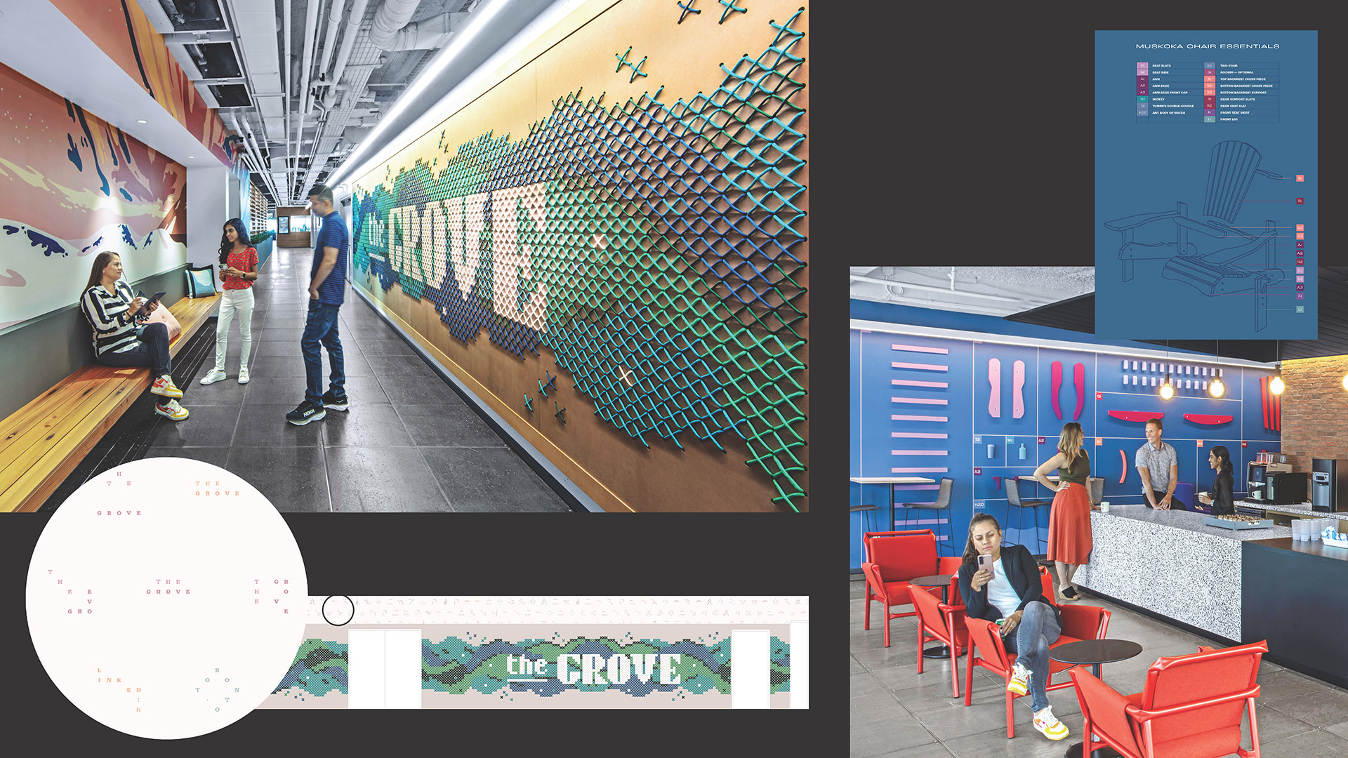
A Cross-stitch directs towards “The Grove” cafe, named after a cluster of trees. A deconstructed Muskoka chair lists elements needed to relax in the lounge.
CannonDesign

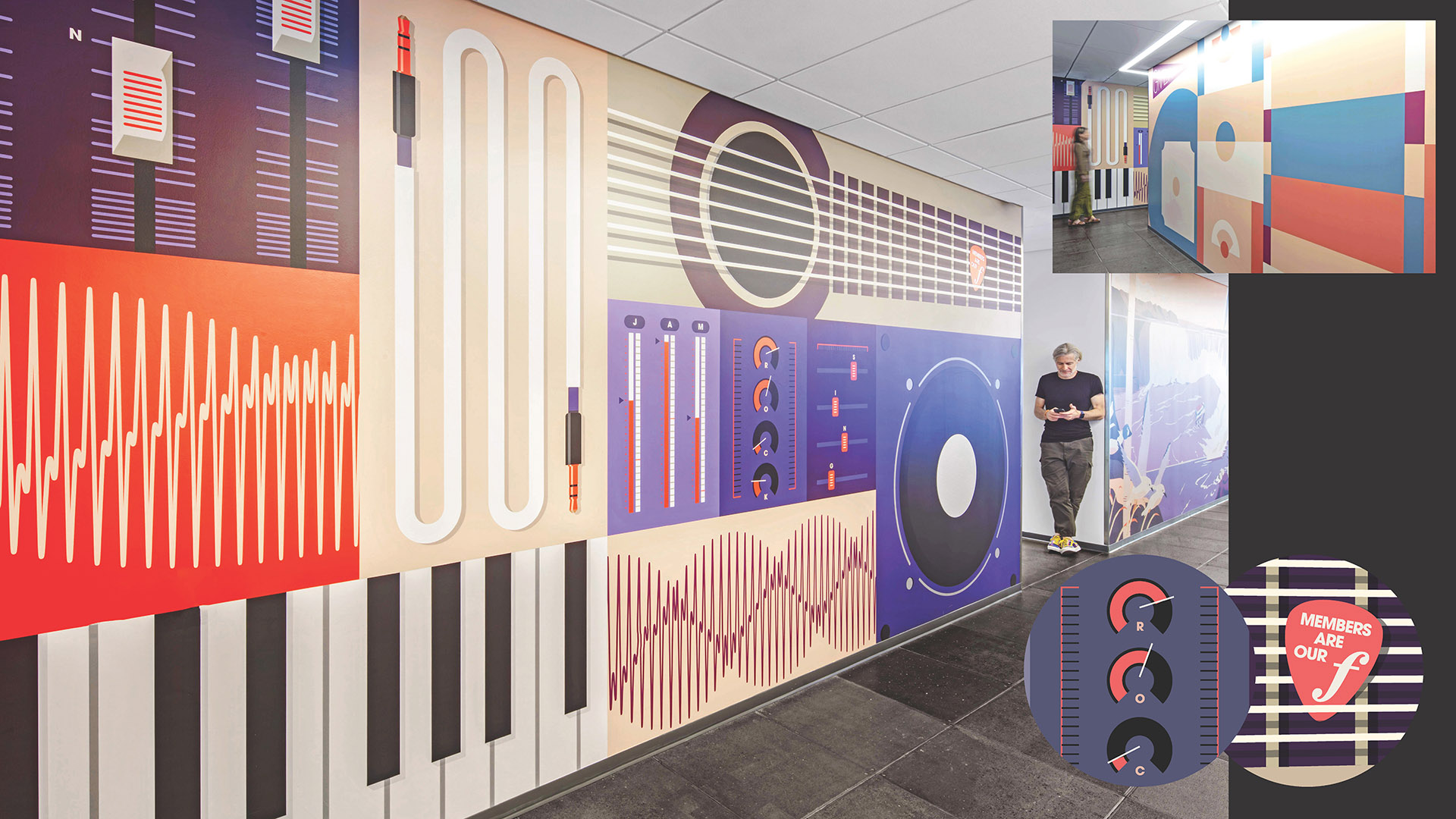
Elements hidden in the recording-studio graphic spell words of inspiration and LinkedIn values. The graphic outside the game room depicts fields from pro sports teams.
CannonDesign
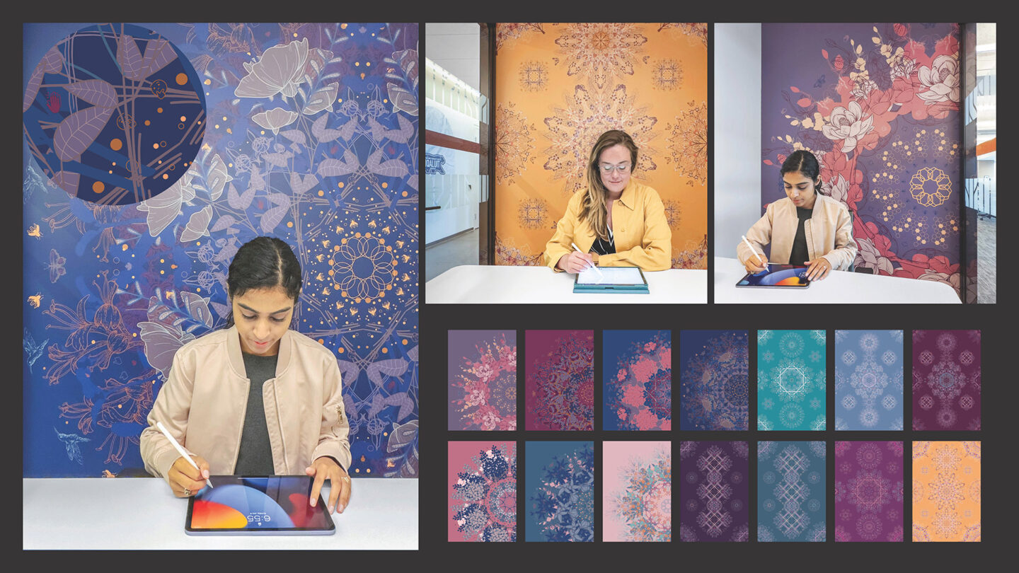
Kaleidoscopic illustrations in phone rooms feature local flora and fauna (insects, flowers, birds, etc.) and incorporate small references to LinkedIn “reaction icons” and maple leaves.
CannonDesign
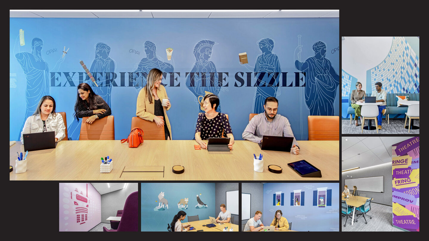
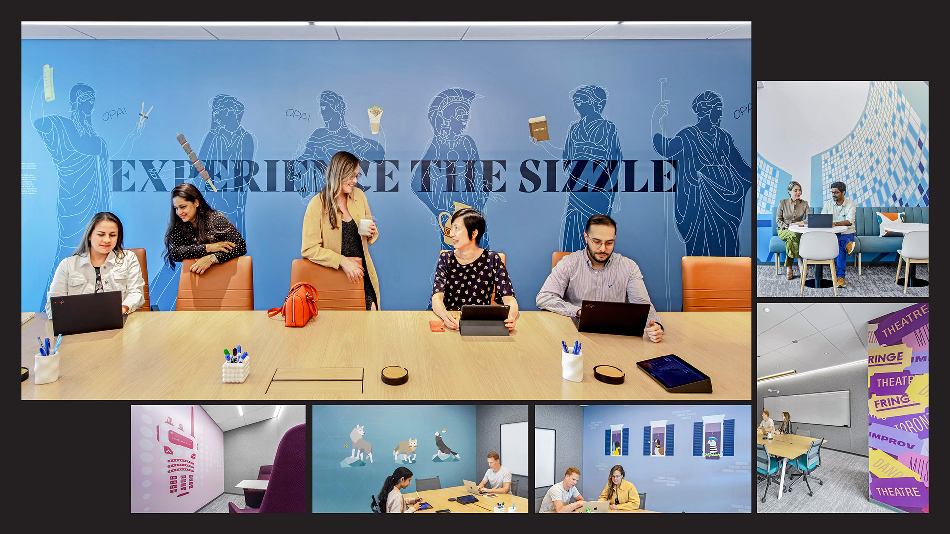
Conference rooms are named after Toronto’s cultural festivals, notable discoveries and groups of Canadian animal. “Taste of the Danforth,” a celebration of Mediterranean culture.
CannonDesign
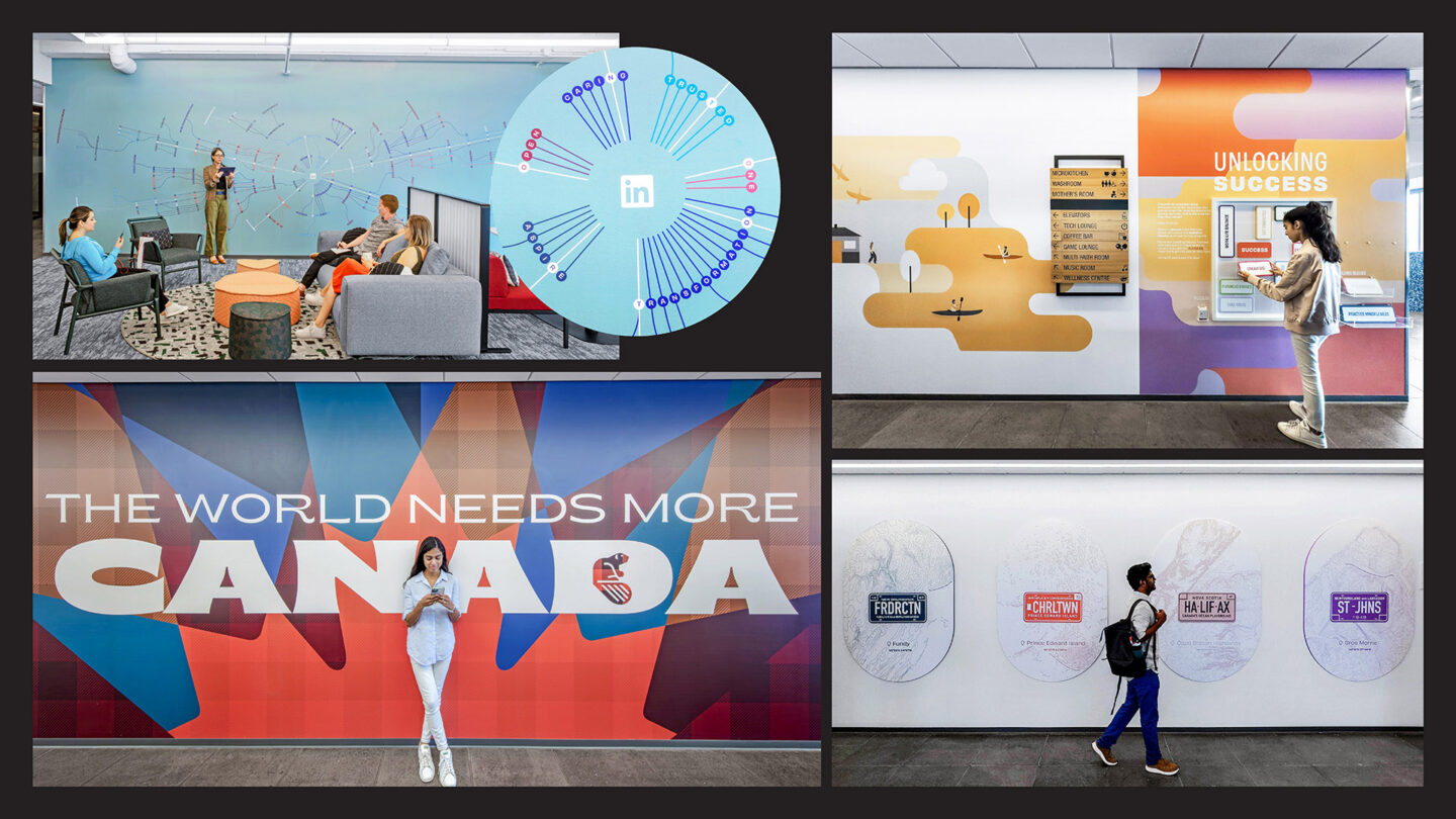
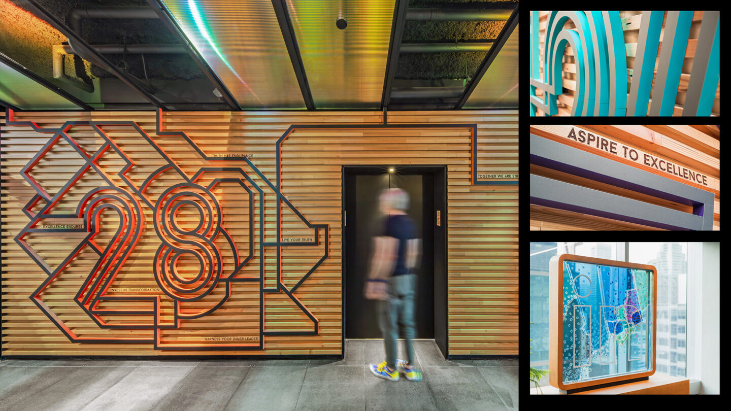
Hallways tell stories of LinkedIn’s mission and Canada’s landscape. A “family tree” graphic and game detail themes of success, and license plates celebrate Canada’s provinces.
CannonDesign
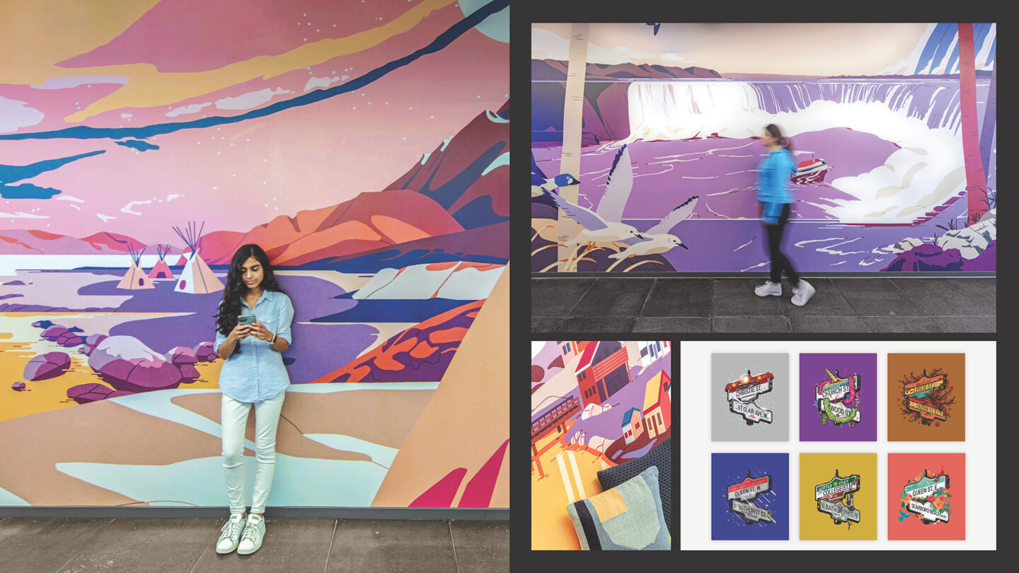
Artist collaborations highlight Canada’s diverse culture. Jeannie Phan’s three-part series depicts indigenous landmarks in murals, and Raj Gupta’s collection illustrates neighborhood quirks as street signs.
CannonDesign


Project Details
Design Team
Dylan Coonrad (creative director)
Jess Wier (graphic designer)
Nicole Sowinski (graphic designer)
Sharon Matthew (graphic designer)
Jackie Tobin-Beiss (graphic designer)
Chelsea Docherty (graphic designer)
Stefany Brady (graphic designer)
Abbey Furlow (graphic designer)
Miranda Hall (project manager)
Collaborators
Acrylicize (three-dimensional graphics)
Jeannie Phan (illustrator)
Photo Credits
CannonDesign
Open Date
June 2023