Gridlock: Unlocking Parallel Practices in Graphic Design
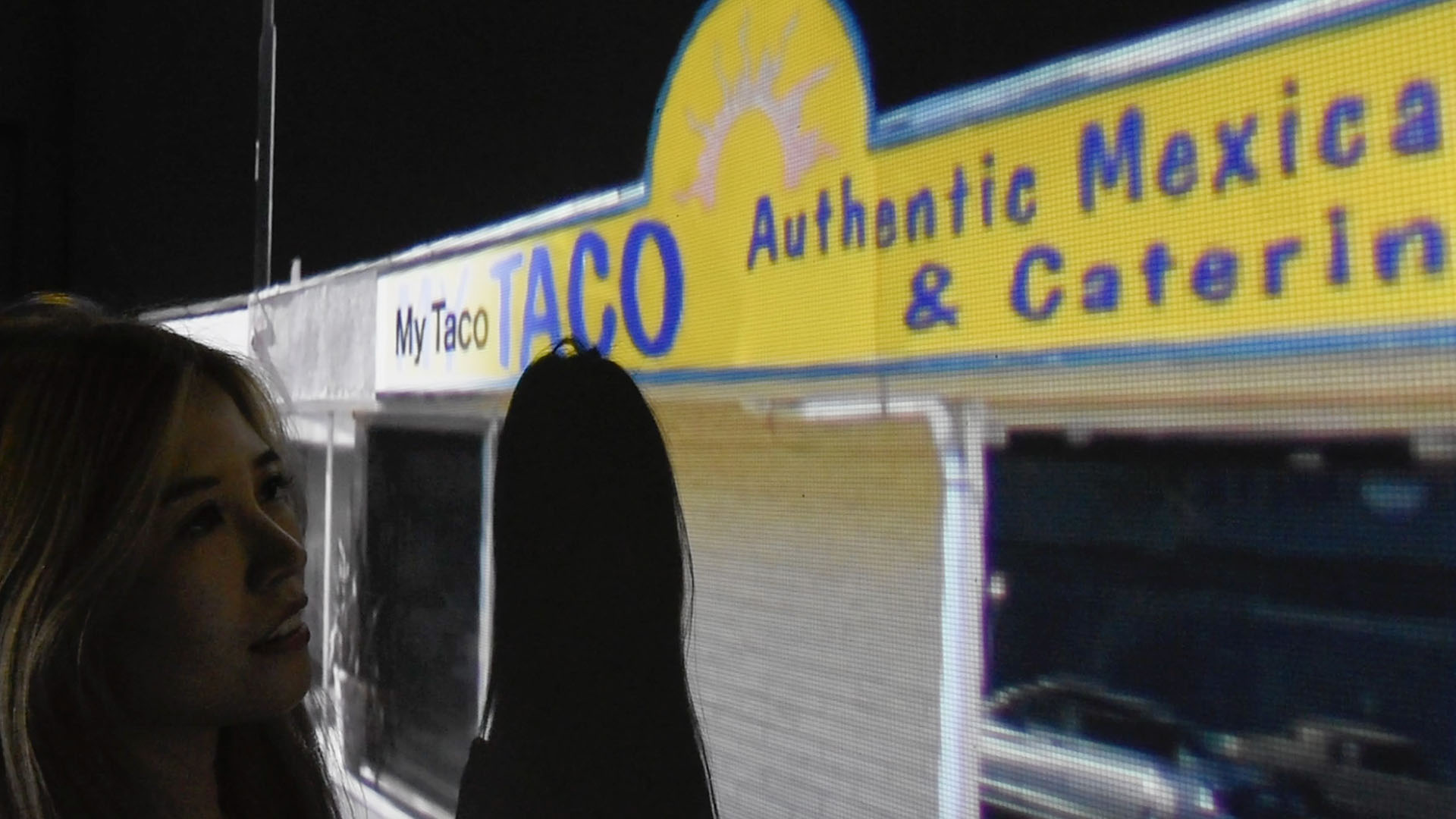
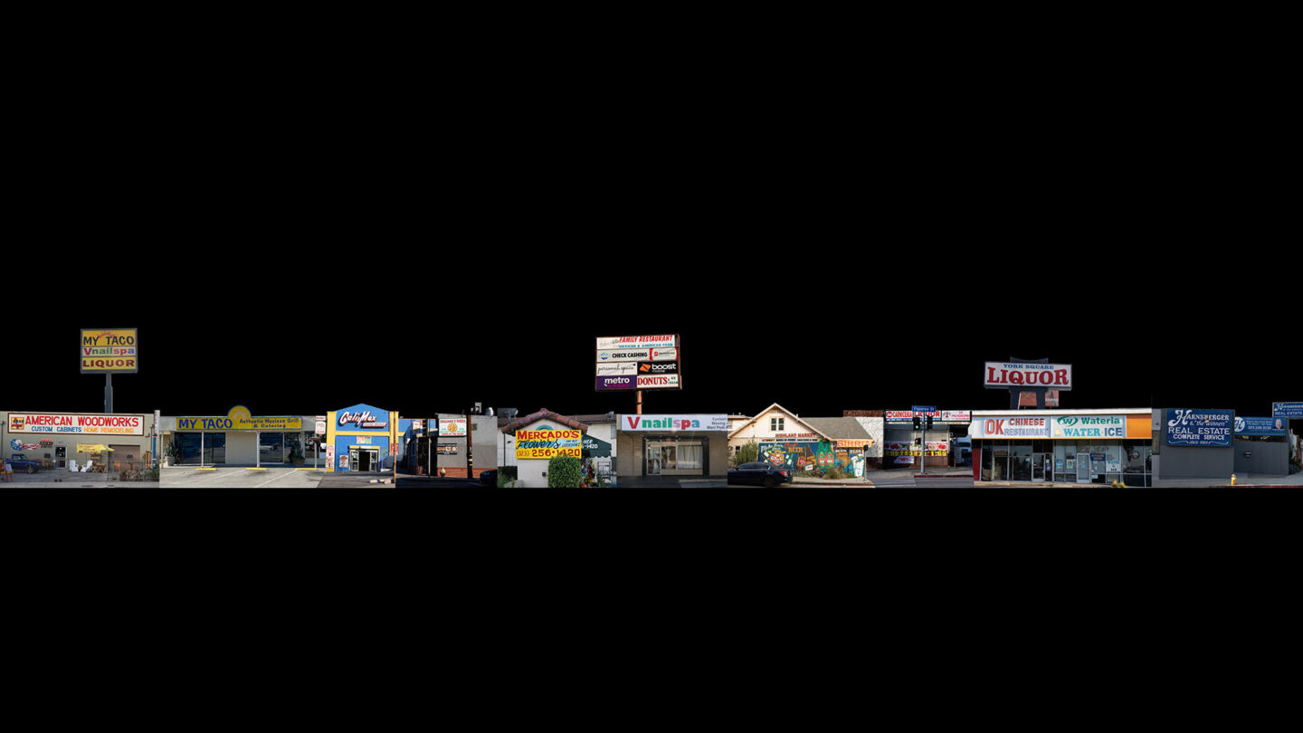
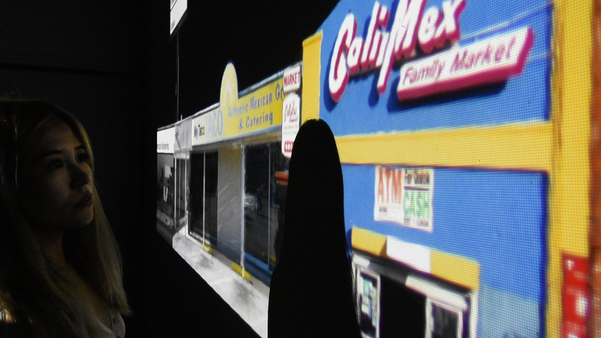
This thesis installation aims to highlight the importance of vernacular signage to the landscape of Los Angeles. Thirteen sites from Figueroa Street and York Boulevard are compiled into a singular strip. The type and color is removed from the storefronts, transforming them into a monotonous landscape which is then projected across a 30-foot surface. As the participant interacts with the piece, moving along the street, the eclectic facades shine through, showcasing what is lost when we try to impose our own aesthetic values within a space.
Agency
Emma Shipley
Practice Area
Client
Graduate Thesis for Art Center College of Design
Industry
The Challenge
The goal of this project is to encourage dialogue between designers around embracing imperfect exploration as a healthy tool. We can build upon the rigorous foundations which shape graphic design while breaking free from stifling rigidity in our practice. Vernacular design and traditional design—while seemingly adversarial—can exist together within our field, allowing us to embrace change rather than reject it.
Project Vision
Perhaps in reaction, Emma spent their thesis year exploring the ways in which “vernacular” methods might inform my own process. The resulting period of deep exploration was illuminating, shining light on the on-going struggle of the designer. So many of us desire to create good work and in doing so we are crippled, prevented from making freely without judgment or scrutiny. It is no surprise that so many of us are drawn to the vernacular designs of our environment.

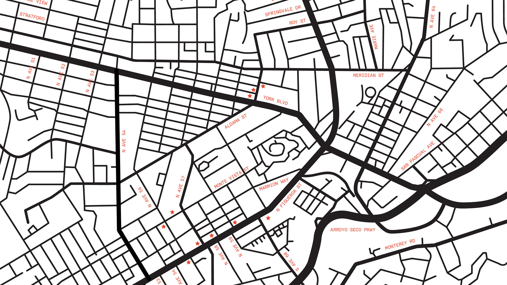
Los Angeles is a playground for vernacular design—a vibrant mix of styles and cultures—representing the chronicles of the city. My research began by finding and documenting sites in my neighborhood.
Emma Shipley
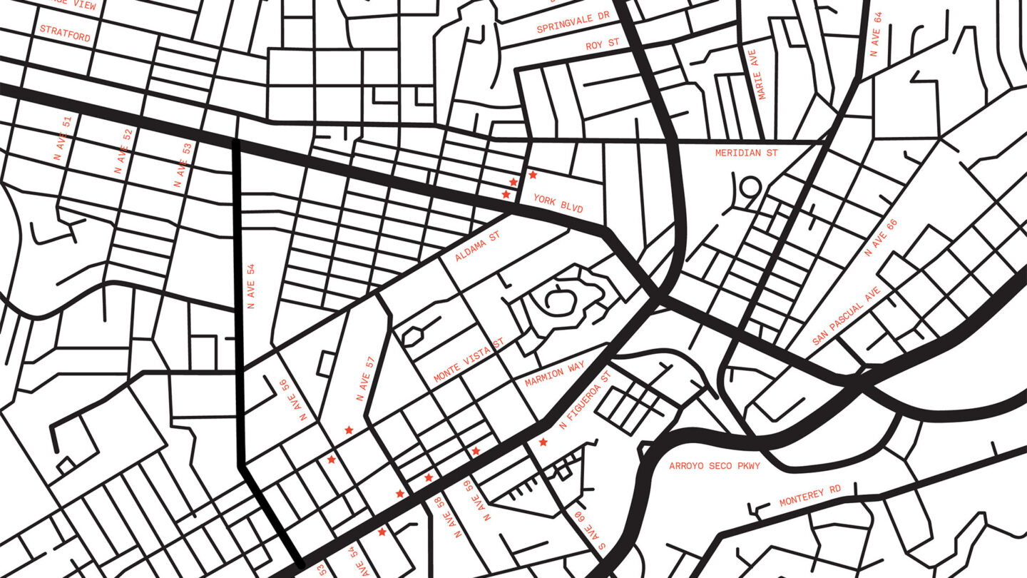
I narrowed my sample to thirteen sites from my documentation, all captured within a five block radius of my house.
Emma Shipley
Design + Execution
The term vernacular refers to the native dialect of a place. It is considered a mode of expression as opposed to formal speech. But, at its core, it is a form of language. If we extrapolate that to graphic design, vernacular becomes a form of design language. And, like language, it is often specifically tied to the place in which it exists and the individuals who reside there. In the world of graphic design, the concept of the vernacular has been long-debated. It is polarizing, particularly as it has come to represent the work that exists outside of the orthodoxy—or work created by practitioners without formal training in graphic design. It is either romanticized or ridiculed, becoming a way to distinguish who is part of our world and who is not.
We find vernacular influences throughout graphic design history, more often than not appearing at times of great technological change. A fierce dialogue around the vernacular erupted in the early 1990s with the introduction of the personal computer. The field of graphic design was changing, and many jobs would soon be lost to automation. In response, the use of vernacular source material skyrocketed. For some, it took on a romanticized view of the past, of simpler times—hand painted signage, intricate illustrations, and ornamentation. A reaction to the impending shift towards digital tools and technologies. For others, it was a rejection of high culture—of the corporatization and capitalization of traditional design work. Throughout, the designer was often positioned above the so-called vernacular practitioner.
Today, we are yet again undergoing a period of massive technological change, and the global pandemic has accelerated the shift from physical to digital. In the era of Zoom, so much of our work lives on the screen—our projects starting and ending with a digitized slide deck. A refreshed brand of corporate modernism has championed the user experience, creating an endless stream of products that are crisp, clean, and considered. Although the resulting work is beautiful, there is little room for spontaneity, constraining the creative process and removing the opportunity to learn from mistakes. Additionally, we are watching the innovation and advancement of Artificial Intelligence unfold before our eyes—each week presents a new discovery, a new tool, a new technology.
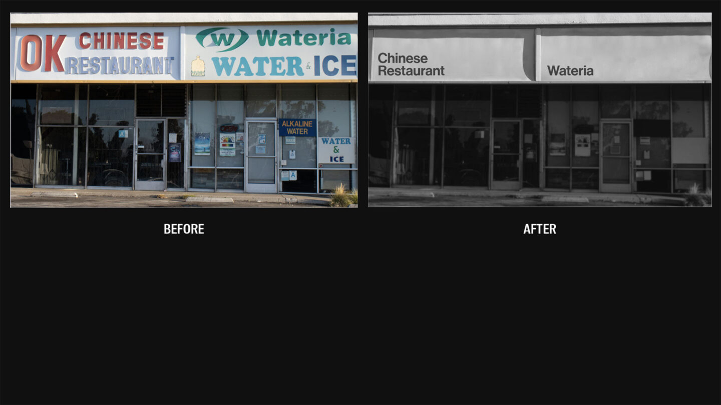
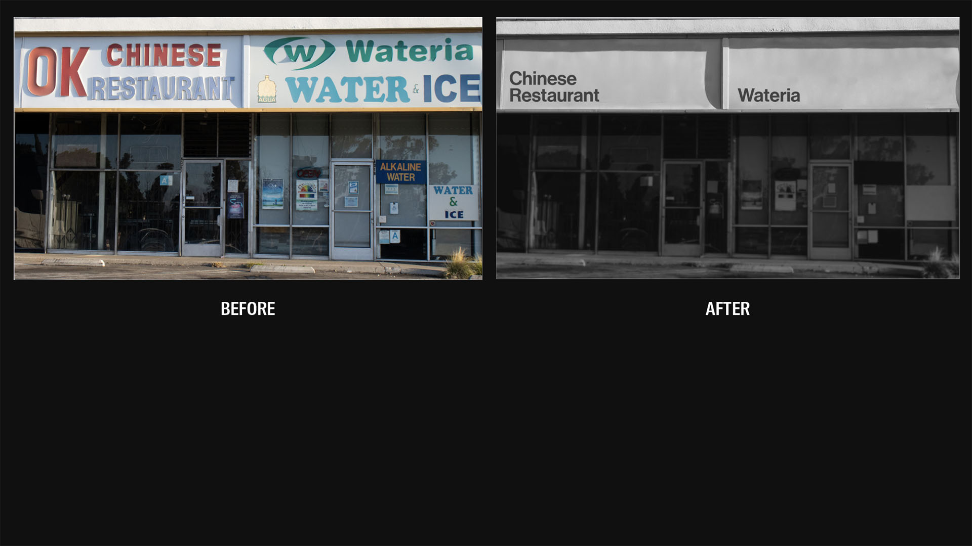
I removed all color and detail from each of my chosen sites, resetting the type in uniform Helvetica.
Emma Shipley
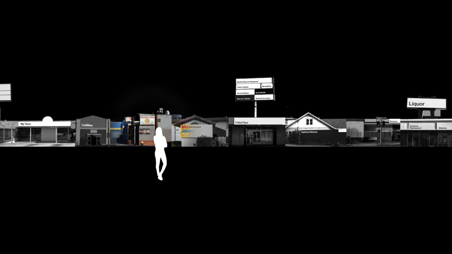
The sites are configured into a single strip and projected onto a 30-foot wall. As the user interacts with the space, color is returned to the environment.
Emma Shipley
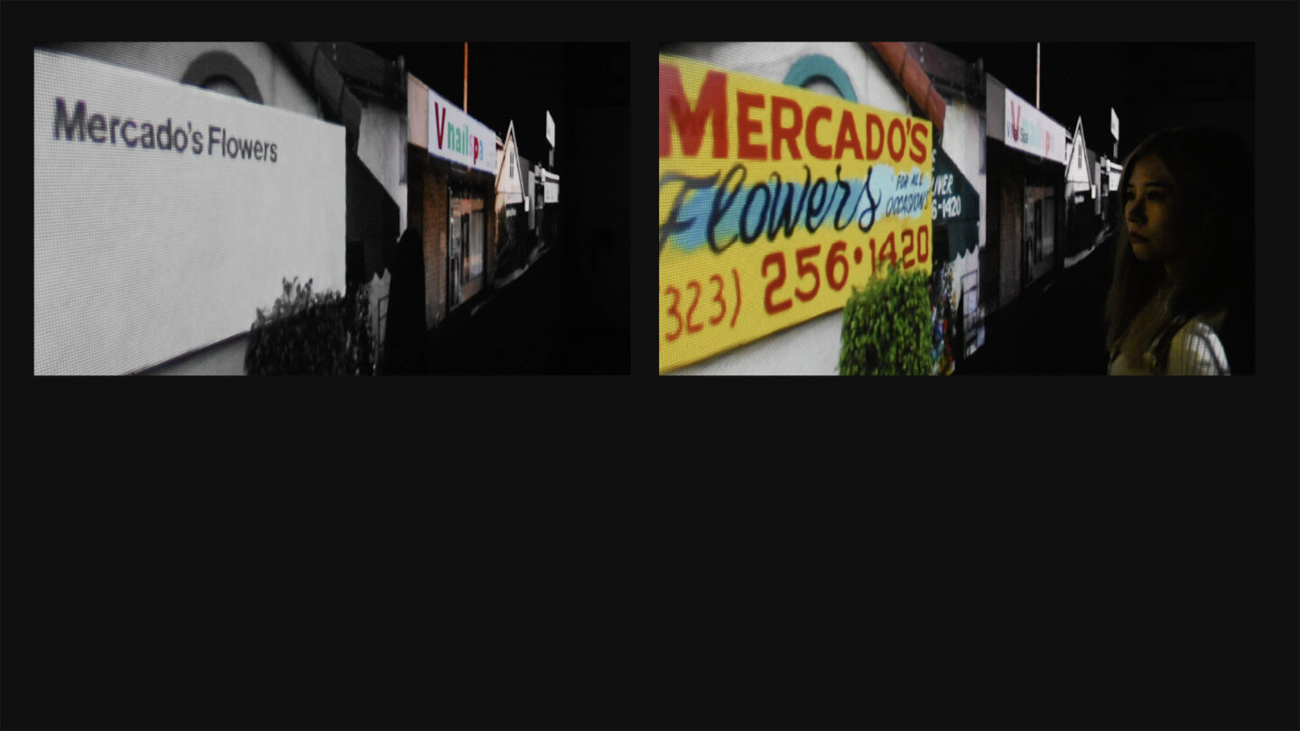
This shift, which is accomplished using processing, illustrates the impact traditional design ideals can have when imposed on the built environment.
Emma Shipley

What do we stand to lose when we do so?
Emma Shipley
Emma Shipley


Project Details
Design Team
Emma Shipley
Collaborators
Thesis Advisor and Videographer: Brad Bartlett
Model: Chloe Zhang
Photo Credits
Emma Shipley
Open Date
April 13, 2023