Gimpo International Airport: Info Inclusive for Everyone
With an annual passenger load of over 24 million passengers annually, servicing over 60 international destinations and all domestic flights, Gimpo International Airport is an extremely active and bustling airport for its size.
Agency
YIEUM Partners
Practice Area
Client
Korea Airports Corporation
Industry
The Challenge
The design team was also tasked with providing thoroughly researched strategies with modeling to support their findings and produce a set consisting of a detailed design manual, a total wayfinding solution manual, and a signage fabrication and installation manual.
YiEUM Partners’ signage solution was designed to provide information to this complex demographic utilizing an “Info-Inclusive” design strategy to ensure that all users would be able to manage their way through the airport with ease and dignity.
Project Vision
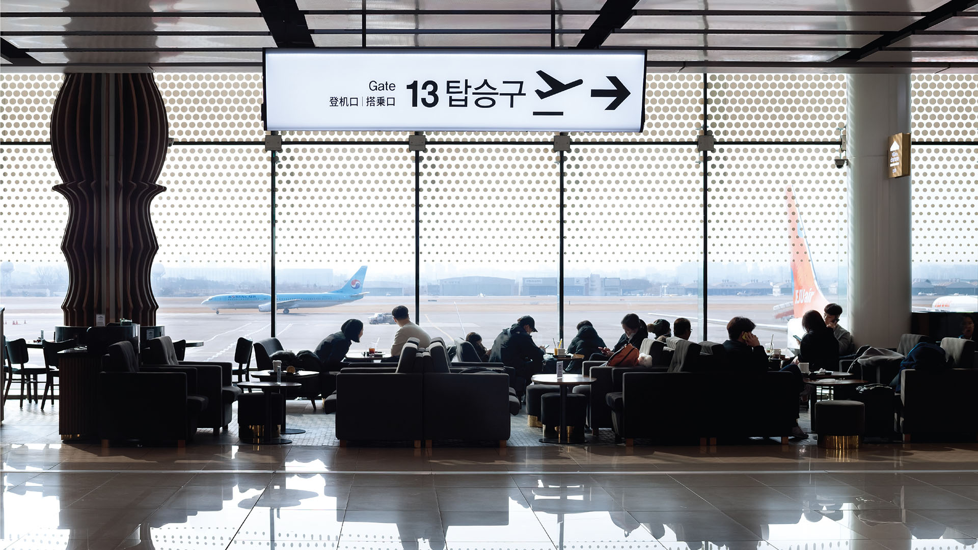
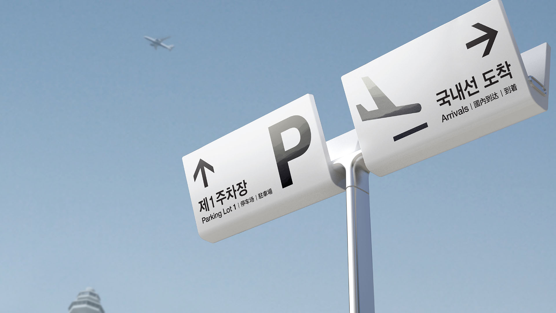
Signage had to provide information in four languages. However, a significant minority of travelers from southeast Asian-Pacific regions are unable to understand any of those languages, so the team developed a series of pictograms to be presented at large scale on signage; all pictograms comply with ACI, ISO and KSA 0901 standards for maximum recognition and readability.
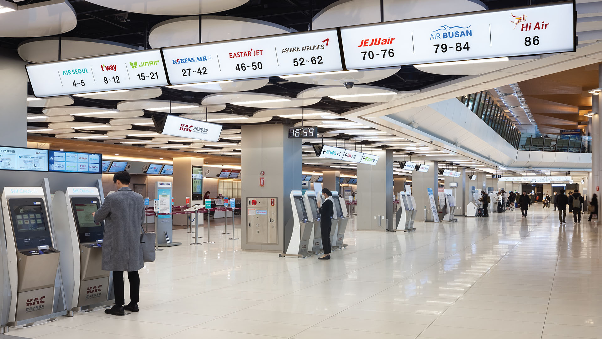
Further, check-in counters were identified on signage using the airline’s actual logo and colors, giving users the ability to recognize their airline by brand image.

With an annual passenger load of over 24 million passengers annually, servicing over 60 international destinations and all domestic flights, Gimpo International airport is an extremely active and bustling airport for its size.
Young Chae Park
While most international airports tailor their signage system for the local language and English, the design team’s signage solution had to incorporate four languages (Korean, English, Chinese and Japanese).
Young Chae Park

Organized and easy-to-read check-in information is complete with each airline’s unique logo.
Young Chae Park
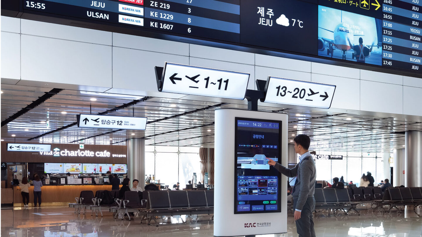
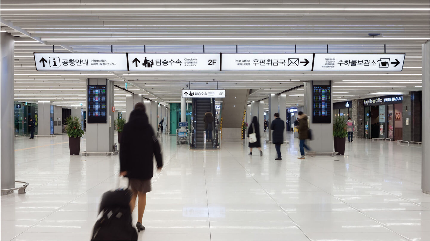
The wayfinding solution is digitally integrated, offering users facility information presented in their language of choice.
Young Chae Park
Design + Execution
The structural layout of the facility—a space of low ceilings and a densely populated field of structural support columns—created a very limited field of view, making the existing signage nearly invisible.
YiEUM Partners’ wayfinding signage solution was designed to visually lift the ceiling, while providing better recognition and guidance for users of the facility. A white, angled, internally lit signage solution was designed to provide information—without decreasing the overhead clearance in the low-ceiling environment. The signage itself would also serve as a light source to create a brighter environment, while increasing legibility even in adverse lighting conditions.
The most dramatic change to the terminal was repurposing immovable structural support columns. YiEUM Partners realized that users could be directed into prescribed “lanes” of travel by strategically placing wayfinding signage while using the densely packed pillars as permeable walls. Further, the design team convinced the airport to move all information kiosks to central hubs at intersecting routes of travel to provide users with information services from all angles of approach, as opposed to their previous locations against walls.
Additionally, Yieum was asked to design furniture for check-in counters and lounge areas in order to create a sense of harmony with the wayfinding. They oversaw fabrication and installation to ensure quality control and trained KAC staff on future wayfinding system maintenance and expansion.
By creating an info-inclusive strategy to provide information for all travelers regardless of language, the demand for information from users trying to find their way has decreased so dramatically that airlines have been able to discontinue using their own personnel in the hallways to provide guidance for their passengers trying to navigate the airport.

The angled, internally lit signage solution was designed to provide information without decreasing the overhead clearance in the low-ceiling environment.
Young Chae Park
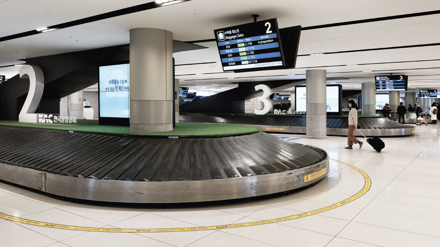
Yieum Partners’ work also included oversight of fabrication and installation to ensure quality control, while training staff at KAC for the ongoing maintenance and implementation in possible future expansion.
Young Chae Park
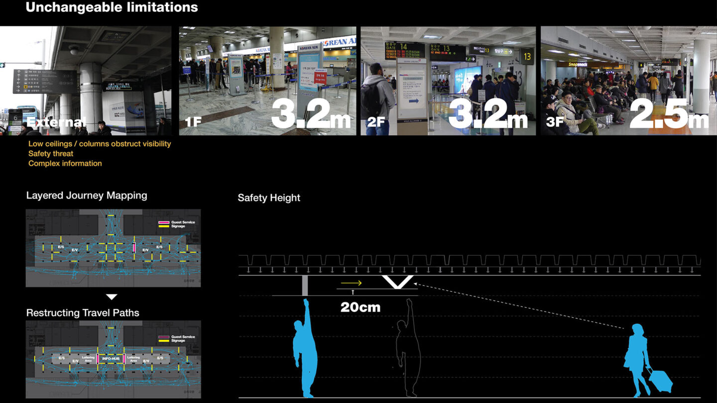
Yieum Partner’s practical solutions overcame a host of unalterable limiting elements.
Young Chae Park
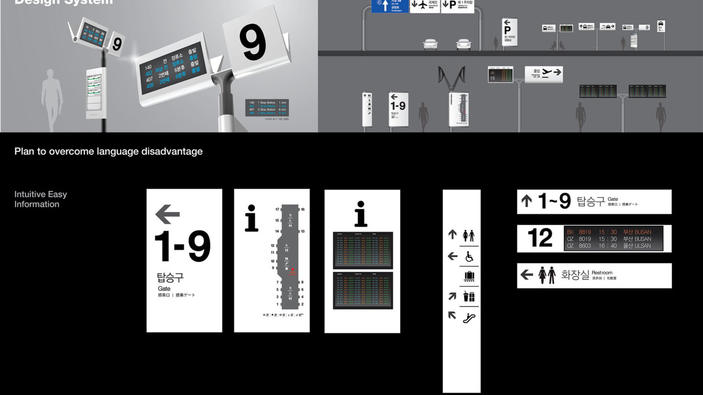
All pictograms were created to comply with ACI, ISO and KSA 0901 standards for maximum recognition and readability.
Young Chae Park
Project Details
This elegant integration of multiple languages with bold symbols that require little time or effort to understand establishes a new standard for addressing a transit audience. Remarkable restraint and refinement.
Wayfinding for complicated places needs to be very simple, yet highly effective; this solution is just that. The design captures my attention with the simplicity of its typography and icons, along with the thoughtfulness in layout to accommodate different languages. Highly user friendly.
Rarely have I seen airport signage that makes me proud to be a designer. This juggles different languages with ease, balancing negative space and hierarchies in a clean and sharp fashion.
Design Team
Jangon Ahn (Principal in Charge)
Dongchan Seo (Design Director)
Daeho Kim (designer)
Songyul Park (designer)
Garam Kim (designer)
Junyoung Woo (designer)
Collaborators
Korea Airports Corporation
YD Corporation
Design Team
Jangon Ahn (Principal in Charge)
Dongchan Seo (Design Director)
Daeho Kim (designer)
Songyul Park (designer)
Garam Kim (designer)
Junyoung Woo (designer)
Collaborators
Korea Airports Corporation
YD Corporation
Open Date
November 2019

