Found in Translation
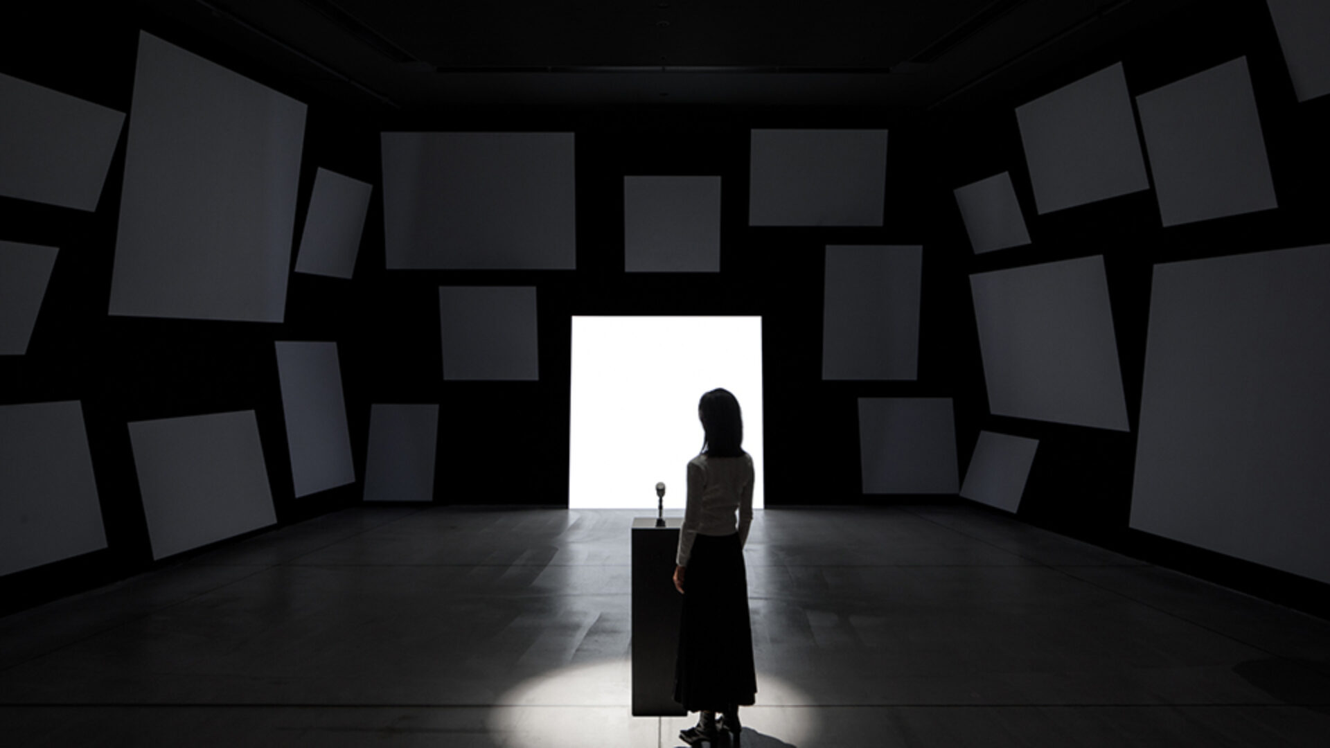
Found in Translation is an interactive, immersive installation for the exhibition. Using their own spoken sentences, visitors viscerally experience the process of machine translation. Visualizations show how the machine learning model clusters words from different languages by semantic similarity, and translations are presented typographically and auditory across 24 languages.
The Challenge
The team was invited to create an installation for the exhibition Understanding Misunderstanding at 21 21 Design Sight in Tokyo.
On one hand the installation should show the magic of Google Translate and how it works today. On the other hand it should show recent advances in Machine Learning research around machine translation: Using the data sets from many languages instead just two actually improves translations across all languages. These fascinating findings were supposed to be communicated in an engaging and interactive way in the exhibition.
Project Vision
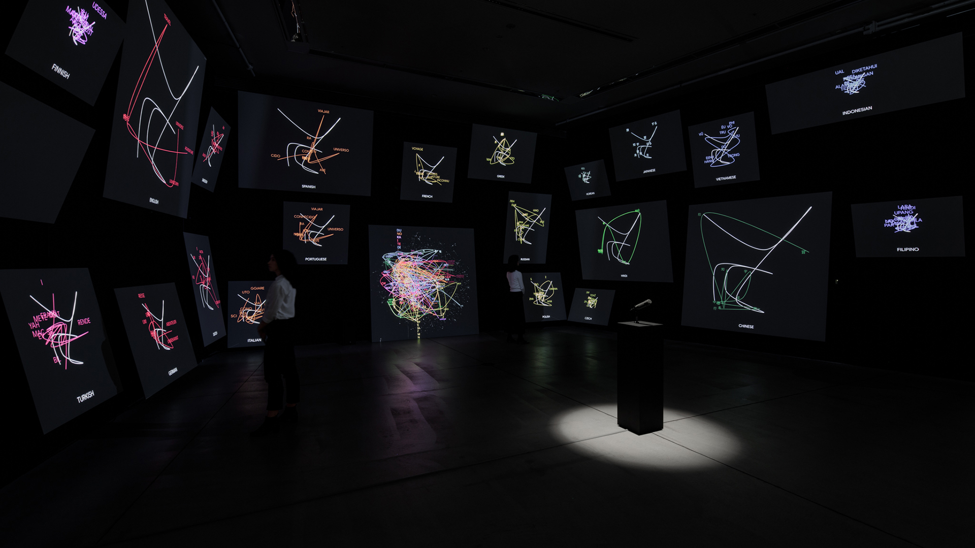
Once an answer is spoken into the microphone a visualization shows the multi-lingual machine learning model that is used for translations. Word by word and sentence by sentence it becomes apparent which words from which languages are clustered together.
The visualizations travel across the entire room, showing a spatialized version of multiple small diagrams across the room. Each diagram animates the text version of the translation. The back panel provides background information on the technology behind the installation, explaining multilingual machine learning models, transfer learning, and other findings by language machine learning researchers.
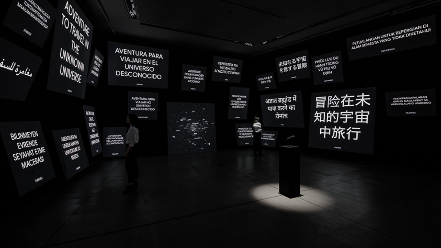
Photo Credit: Taiyo Watanabe
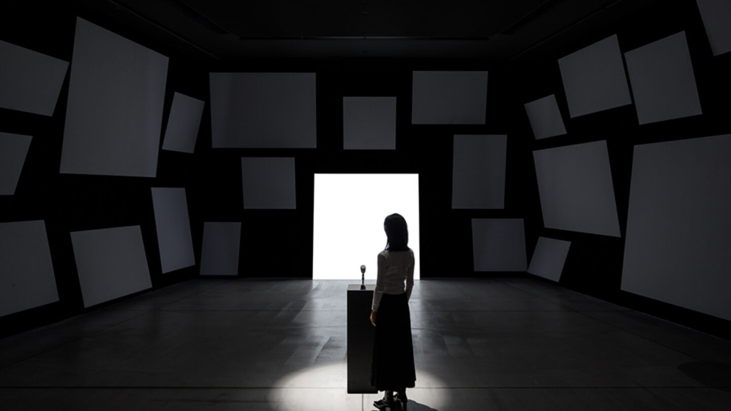
Photo Credit: Taiyo Watanabe
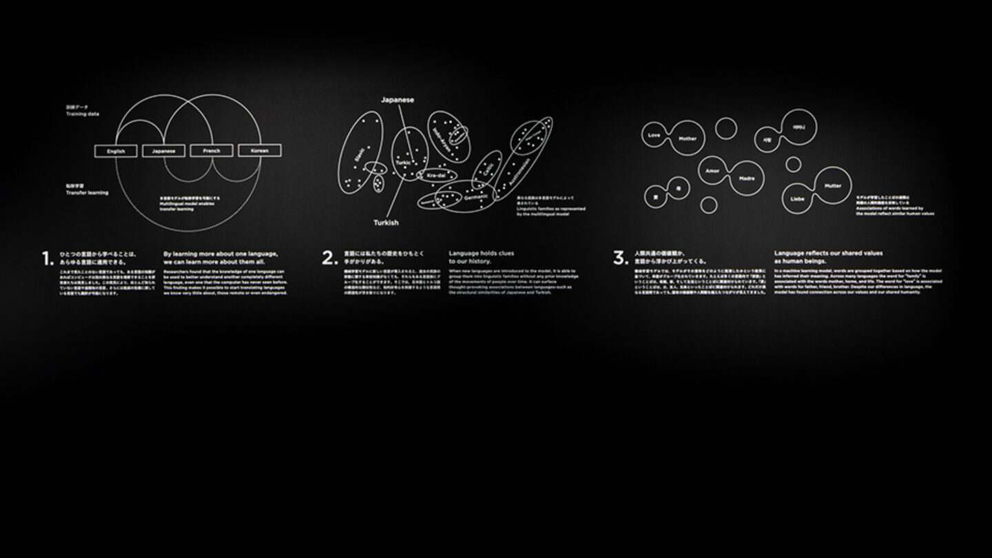
Photo Credit: Taiyo Watanabe
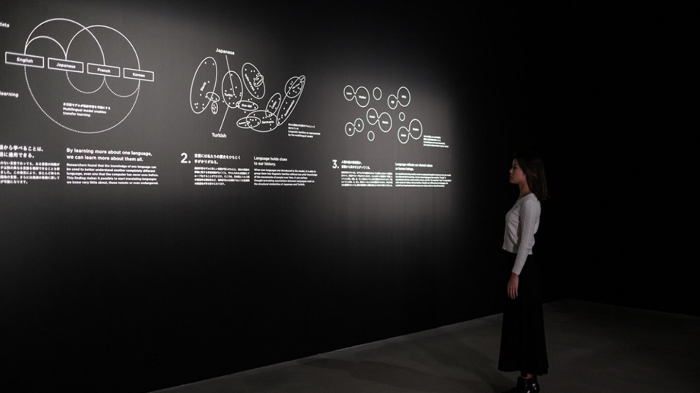
Photo Credit: Taiyo Watanabe
Design + Execution
The solution was to distribute information across interactivity, time and the spatial composition. TheGreenEyl created a room with 24 screen panels and 24 speakers, and a microphone at the center of it.
When visitors enter the room, they are asked a question that they can answer verbally. As this sentence is being translated, they see the entire data set on a central screen, with language-pair-specific visualizations. These all then resolve into the translation displayed in typography, different languages, and writing systems, and each speaker plays back voices for each sentence. Since viewers get a sense of the underlying data modeling, they understand which words and which languages are closer together than others. They can also try out different sentences to do further analysis and comparisons. In addition, there is a text panel at the back of the gallery explaining some of the underlying concepts.
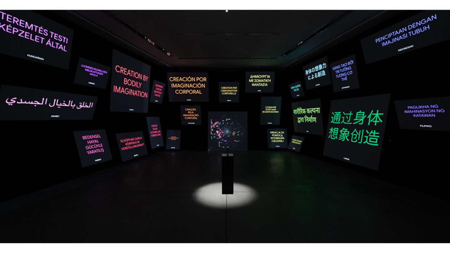
Photo Credit: Taiyo Watanabe
Project Details
This simple yet powerful audio-visual experience immerses the visitor in an awe-inspiring universe of typography, sweeping curves, and spoken language. The entire exhibit is fully personalized to the visitor, shifting and animating to visualize the words spoken in response to a question. Through sophisticated and visually mesmerizing scientific diagrams on angled planes of various sizes, visitors discover commonalities among languages and cultures.
I love how this very technical topic of machine translation was humanized and visualized. Using spoken sentences for the input of the visitors and output of the machines amplifies the human connection. The simple elegant motion graphics coupled with the spatial setup created an intimate experience despite the amount of media being used.
This room is a fantastic expression of one of my favorite goals of interactive experiences — to give people super powers. Say anything, and the space responds to you in every language. You are in the heart of the universal translator. Even more importantly, you can see how the machine translation is happening in real time. A.I., deep learning, and high dimensional neural networks are incredibly unintuitive and their workings opaque. By visualizing how the algorithm arrives at each of its translations, the visitor can build an understanding of how the overall system works. The overall effect is both empowering and awe-inspiring at the same time.
Design Team
Richard The (creative direction, concept, visual design)
Frédéric Eyl (concept)
Andreas Schmelas (software designer)
Marian Mentrup (sound designer)
Pam Anantrungroj (spatial designer)
Calen Chung (visual designer)
Collaborators
Google Creative Lab, Dominick Chen
Maco Film, Luftzug
Photo Credits
Taiyo Watanabe
Open Date
October 2020


