Elizabeth Line
London’s first accessible railway is the result of the biggest infrastructure project in a generation. Now known as the Elizabeth Line, Crossrail is the new high frequency, high capacity railway for London and the South East of England. Making travelling in and around London quicker and easier, the Elizabeth Line reduces crowding on the London transport network by carrying more than 1,500 passengers on each train during peak periods and around 200 million passengers each year.
Agency
Maynard Design Consultancy
Practice Area
Client
Crossrail Ltd
Industry

The Challenge
Maynard was commissioned to design a line-wide wayfinding identity and product family to unite all 41 individually designed stations for a seamless passenger experience.
Project Vision
A line-wide strategy demanded design components that would act as common threads to the passenger experience across all stations. Focused on the below ground tunnel environments, we introduced a common design language across a family of architectural components. Our products included cladding, platform edge screens, seating, lighting, digital advertising, signage and customer information systems. As part of the common components team collaboration was central to curating one seamless, fluid architectural space. Each individual component was designed to feel integrated with the fabric of the architecture. We developed a sign family based on existing standards, and detailed design guidelines for all members of the sign family including information hierarchies, type sizes and layout principles.

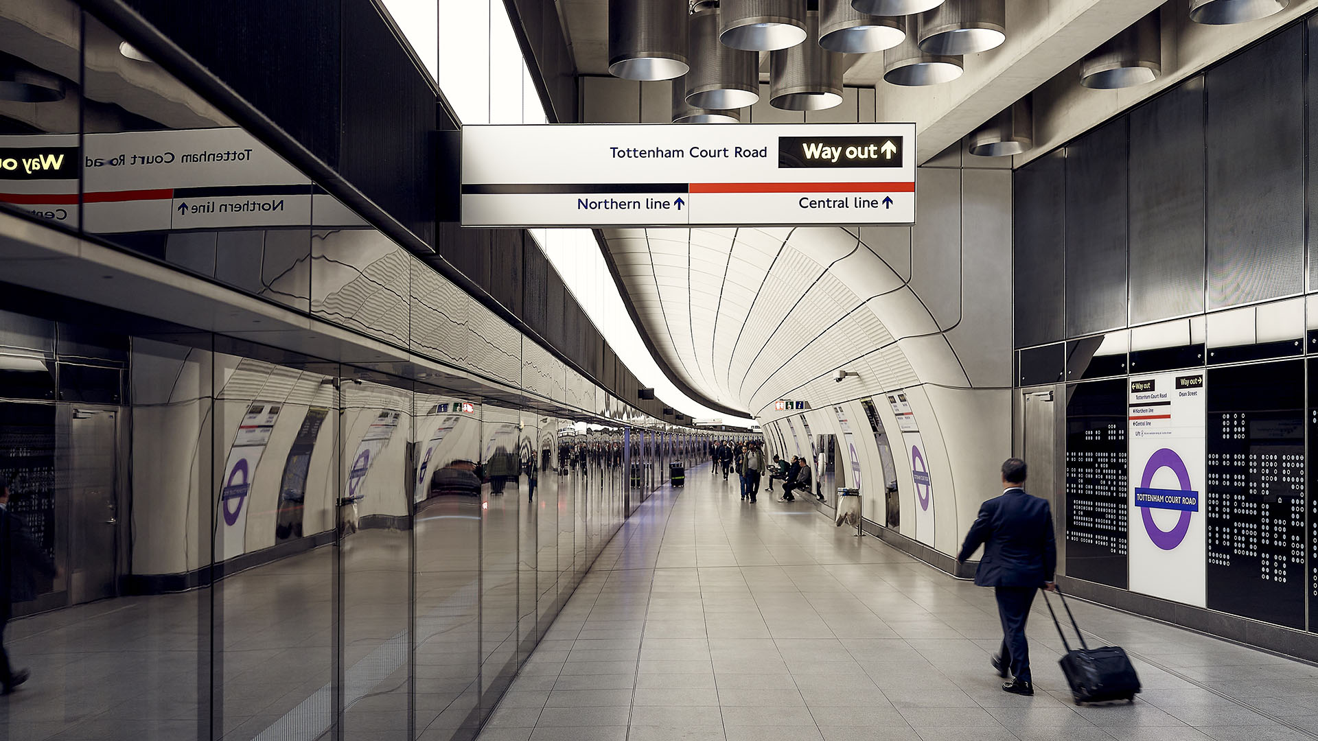
Example of multidirectional wayfinding totem at a key decision point intersection.
Ruth Ward
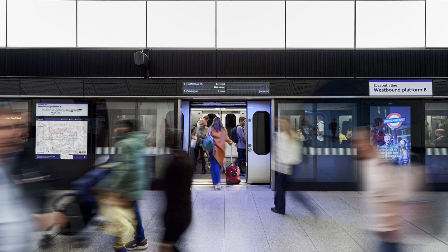
Example of live digital platform screens, automatic doors, directional signage and mapping.
Ruth Ward
Design + Execution
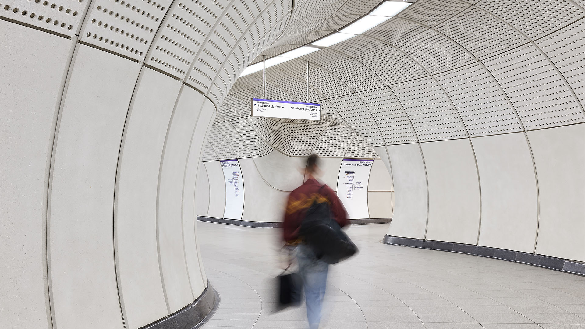
It was important that the line-wide system feel intuitive to all users, not just those already intimately familiar with the city. Intuitive environments were enhanced by a robust and consistent wayfinding system. Zoning of departure and arrival information as well as progressive disclosure allows passengers to be provided with the right information, in the right place at the right time. Consistency across stations allows for predictable and easy-to-find information. Wall-based signage is curved and set into the cladding, sinking into the decluttered architectural space. Early project engagement with manufacturers allowed for the development and incorporation of advanced new printing technologies for glass signage.

Example of vertical circulation with integrated digital advertisement and curved cladding.
Ruth Ward

Example of 250m long curved platform with warm lighting and projecting directional signage.
Ruth Ward
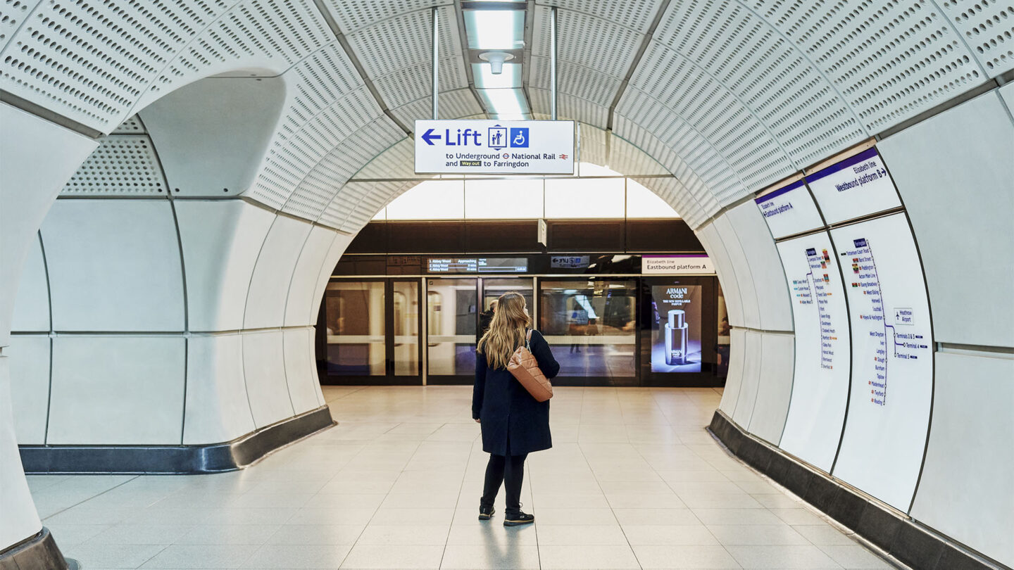
Example of integrated curved signage and accessibility signage routes.
Ruth Ward

Example of interchange from street to platform.
Ruth Ward
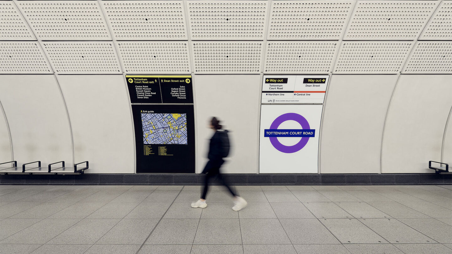
Example of Legible London signage being introduced below street level for above ground orientation.
Ruth Ward
Project Details
With a well-respected visual language to uphold, millions of journeys to support, and an exceptional level of complexity to tackle, the stakes were high and the opportunities to fail were great. The depth of strategy and level of execution met the challenges and will certainly serve as a benchmark for all.
We acknowledged the formidable task facing the design team: devising a comprehensive line-wide strategy that seamlessly aligns with TfL's existing approach. Placing people at the forefront, they've crafted a solution that delivers essential information without detracting from the architectural journey. The thorough prototyping and early involvement of contractors serve as valuable lessons for any undertaking similar projects.
The intricacy of developing a transit system of such scale and impact cannot be understated. The connector is elaborate and yet subtle; every aspect, from lighting and materials, to sign, reflects innovation and empathy, ensuring smooth passenger movement. This project honors what has come before, but pushes forward, establishing a distinctive yet familiar sense of place.
Design Team
Julian Maynard (project director)
Guy Hohmann (lead industrial designer)
Peter Brown (senior industrial designer)
Hayley Branston (lead wayfinding designer)
Collaborators
Grimshaw (architecture)
Atkins
Equation Lighting
Photo Credits
Ruth Ward
Open Date
May 2022
