Dynamic Visibility: Signage & Wayfinding System for Museum of Moving Image
Dynamic Visibility is a rebrand and wayfinding project developed for Museum of The Moving Image. Dynamic, meaning changing, varying in volume, or powerful, is a word that best describes the heart of the museum. Visibility, the ability to be
seen or unseen, is another key to the museum’s subject— Moving Image. Through the innovative play of varying visibility and changing visuals, this project aims to increase the museum’s brand representation in the surrounding area as well as improve visitors’ ease of navigation from nearby subway stations to the museum, and through the exhibits that span across three floors.
Agency
Jenny Hsin-Yi Chang
Practice Area
Client
Museum of the Moving Image
Industry
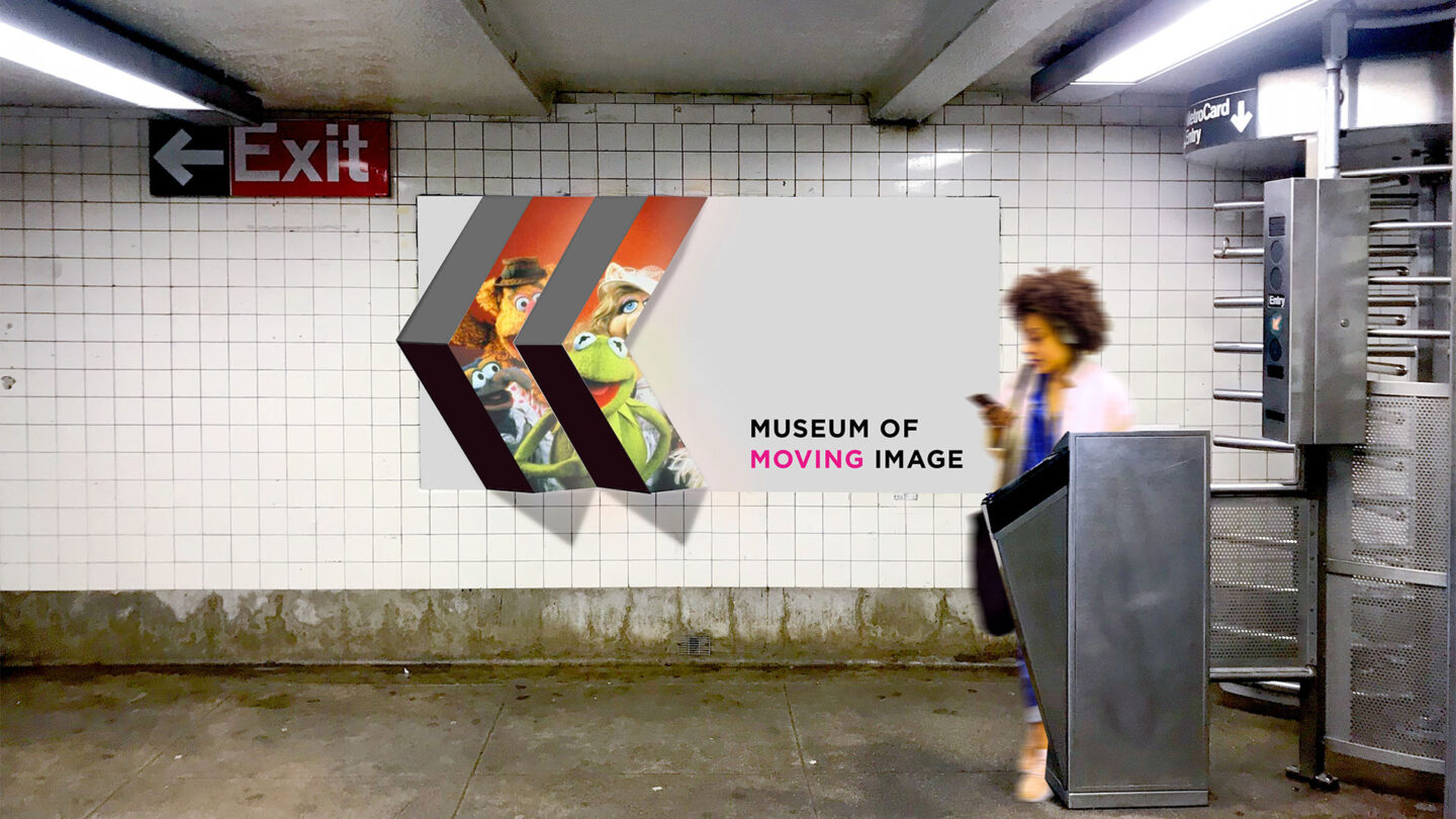
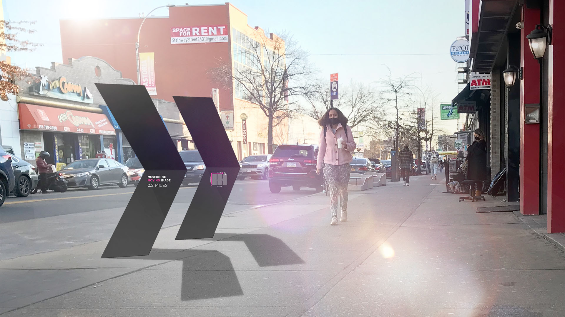
At nearby subway stations, bold branding and LED display panels are interlaid onto the dimensional pleated structure to entice and direct visitors to the museum.
Jenny Hsin-Yi Chang
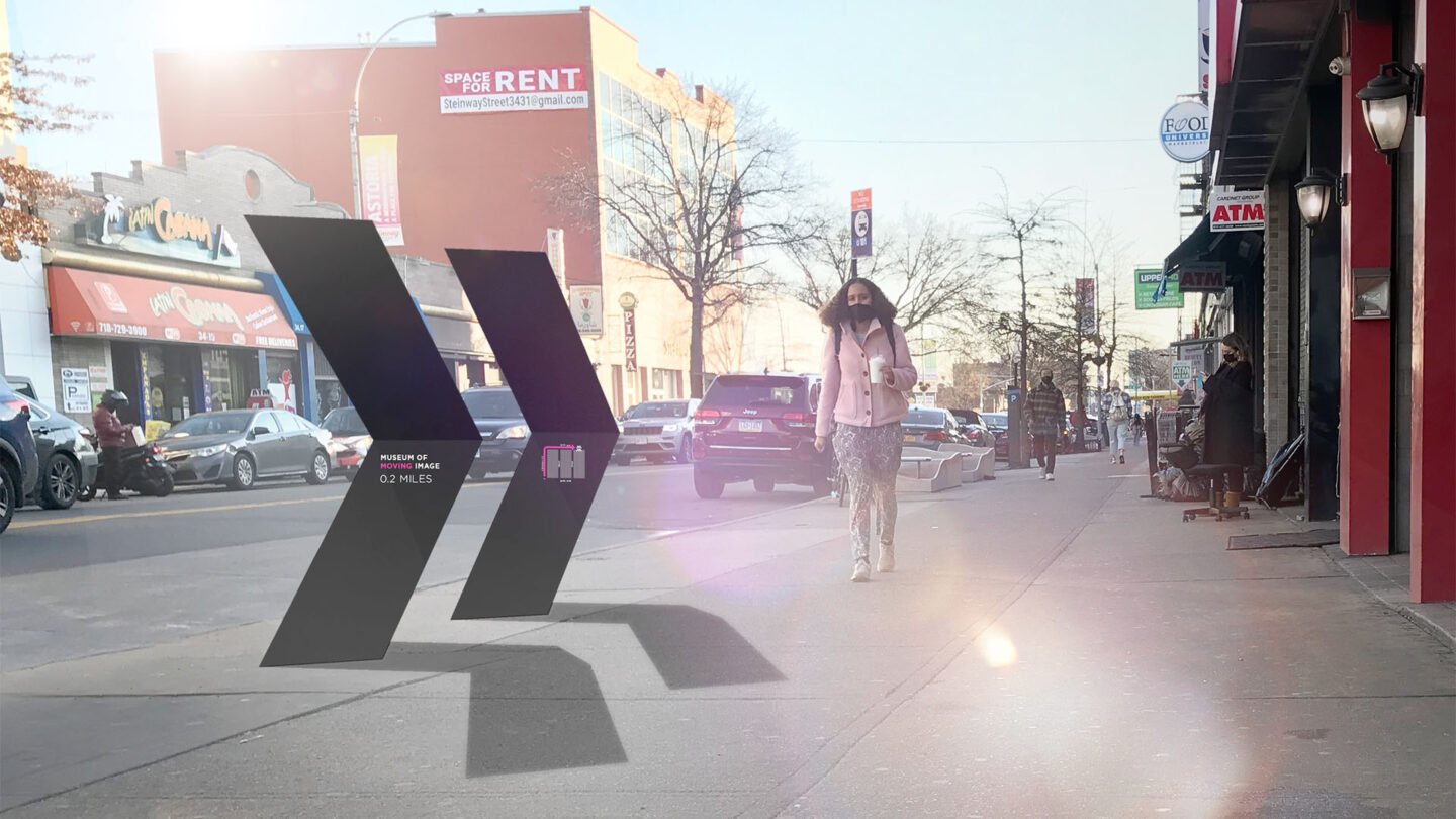
Other than providing directions to the museum, the street signs interact with the sun to form an ever-changing logo with its shadows, providing a foretaste of the museum’s
dynamic experience.
Jenny Hsin-Yi Chang
Project Overview
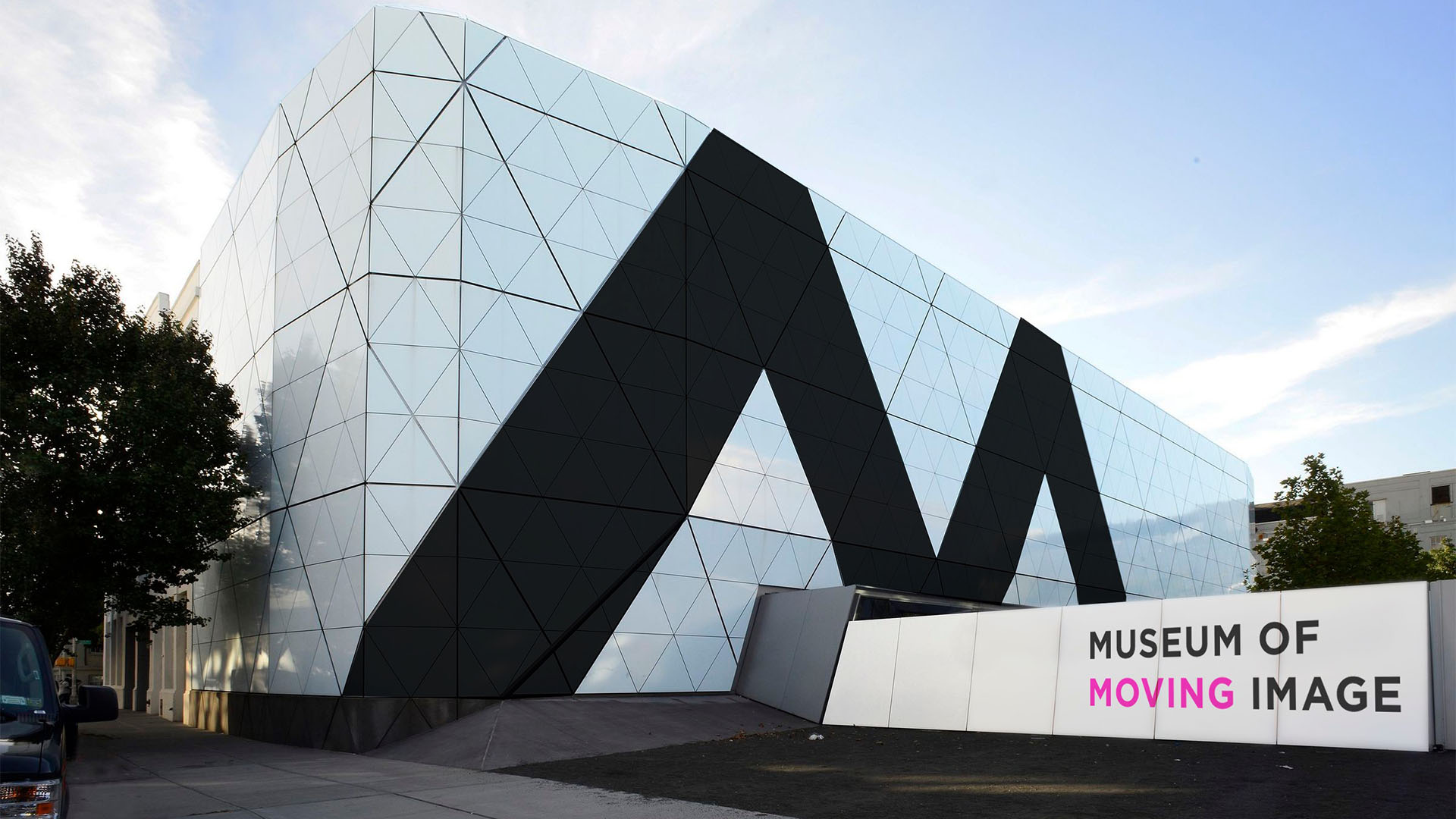
As a museum that celebrates all forms of moving images, the museum’s dynamic spirit is well manifested through the museum’s prized moving image collection as well as the unique architecture that provides a sense of movement and change through its angular lines and its interplay with natural light. The challenge is, how do we extend this representation through the branding and wayfinding system inside and outside the museum?
The solution is clear — these systems must be a part of the dynamic, changing visuals as well.
Inspired by the architecture, this project explores the idea of creating a system of changing visuals through the interplay of graphics and static forms. A pleated “M” form is developed from the triangular grid featured in the architecture. The form creates an interesting play between light and shade, and provides the perfect opportunity to host different images or information for viewers approaching from different angles — a great way to create changing visuals and serve navigational info to where it’s needed. The form was then translated graphically and became the double M mark that serves as the logo of the museum.
The next challenge is to expand this branding design into a signage system that can function well in two very different environments—the busy and competitor-filled Astoria streets, and the minimal and airy interior space of the museum. In response, a strategy of varying visibility is developed: to be boldly visible to create a visual presence on the outside, and to be invisibly visible to yield the spotlight to the content on the inside.
On the outside, the branding utilizes bold black lines to establish a visual presence for the museum while providing directional info to the visitors. In accordance with the branding design, the exterior signs aim to create changing visual effects with static forms. From the pleated two-way subway signage, sundial-like street signage, to the large-scale perspective graphics on the back facade and front entrance, each visual shifts or differs as visitors approach from different angles or different times of day, providing a foretaste to the dynamic experience inside the museum.
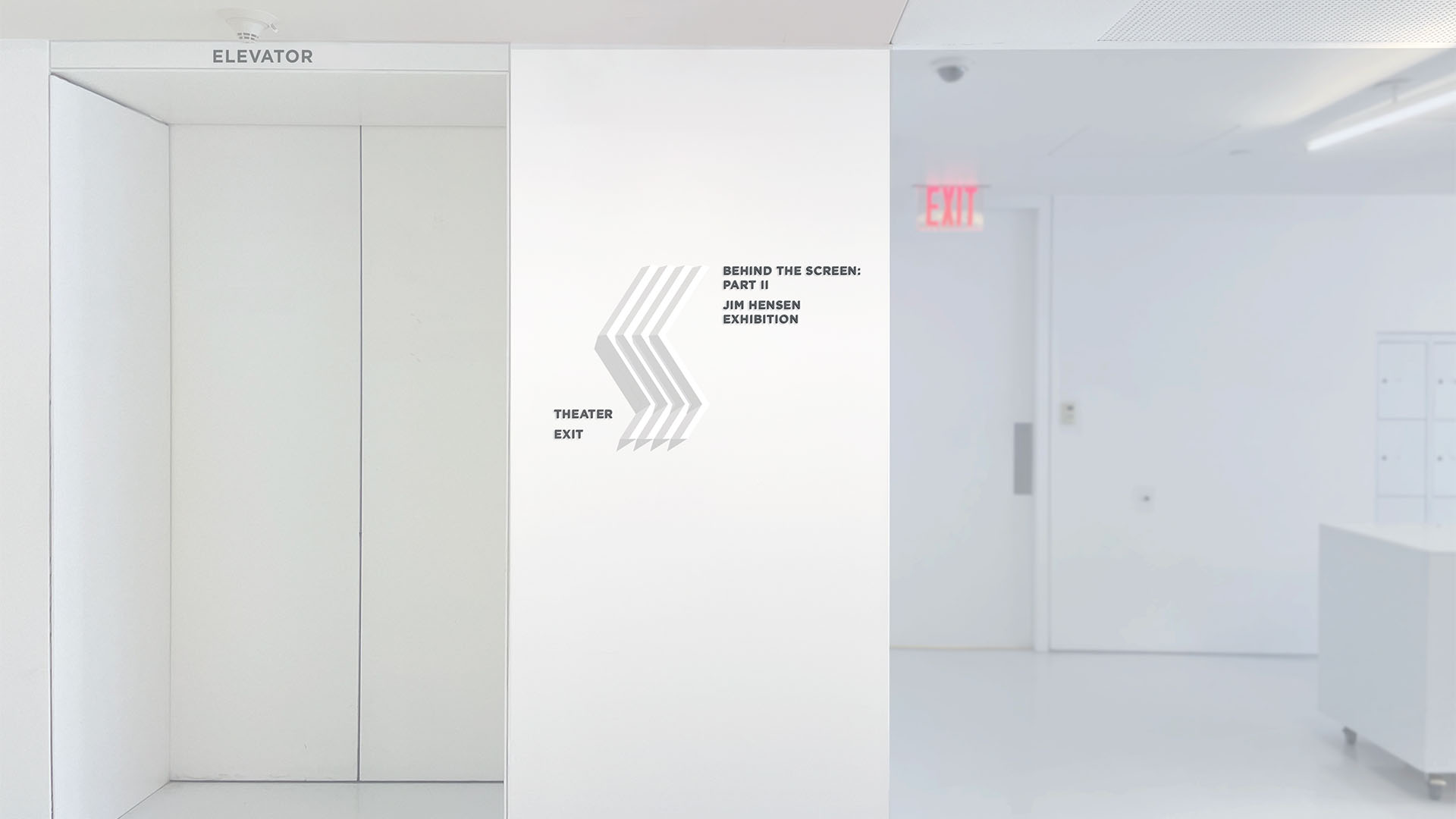
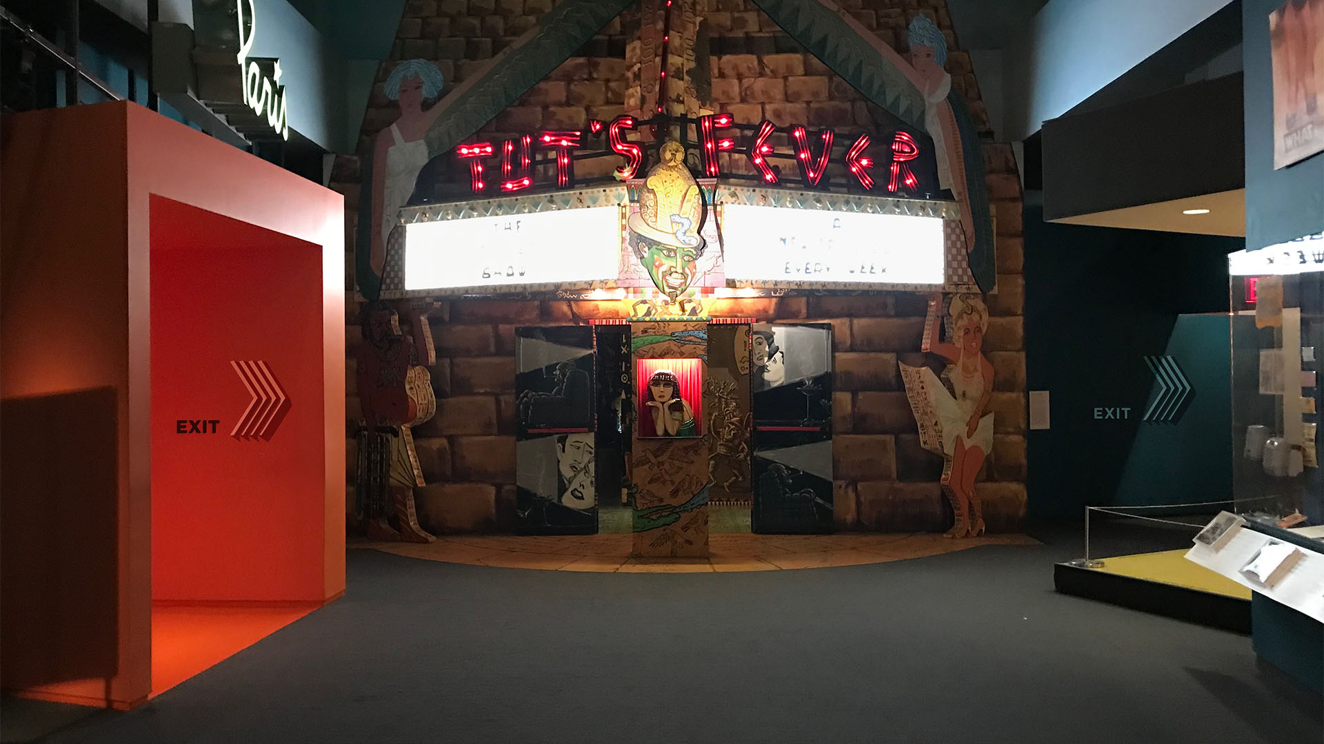
As the visitors step inside the museum, the branding turns to its minimal form to blend in with the environments and shift visitors’ focus from the museum as a whole to the rich content within. From directional signage to identification signage, these signs rely on the form and its light and shade to create visual interest and convey critical directional info. The neutral and minimal form of these signage ensures their ability to blend in with various exhibit environments and provide a constant thread that guides visitors throughout the museum.
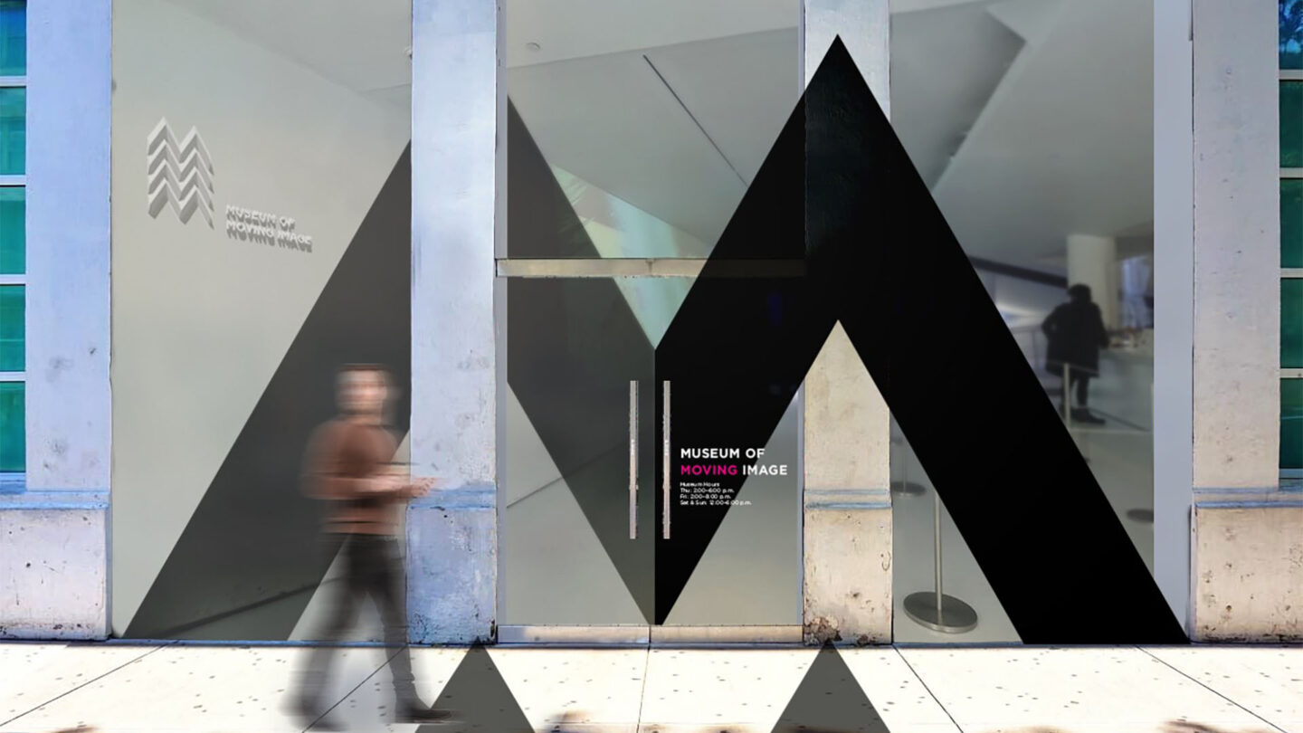
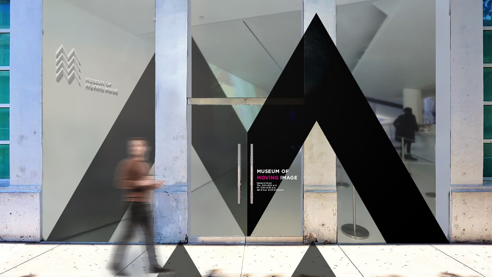
The entrance design utilizes transparent glass windows to improve visibility and perspective branding graphics that span from the sidewalk, facade to interior surfaces to draw visitors’ attention inward.
Jenny Hsin-Yi Chang

Once inside, the wayfinding system shifts to a minimal form to blend in with the environment and provides info without distracting visitors from the content of the museum.
Jenny Hsin-Yi Chang

The minimal interior signage system
blends well into the widely diverse exhibit environments and becomes the consistent thread guiding visitors throughout
the museum.
Jenny Hsin-Yi Chang
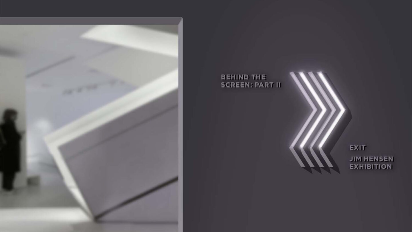
In dark areas, LED lights are embedded inside the acrylic shells, and can be programmed to light up at certain hours to prompt visitors to move towards a certain direction.
Jenny Hsin-Yi Chang
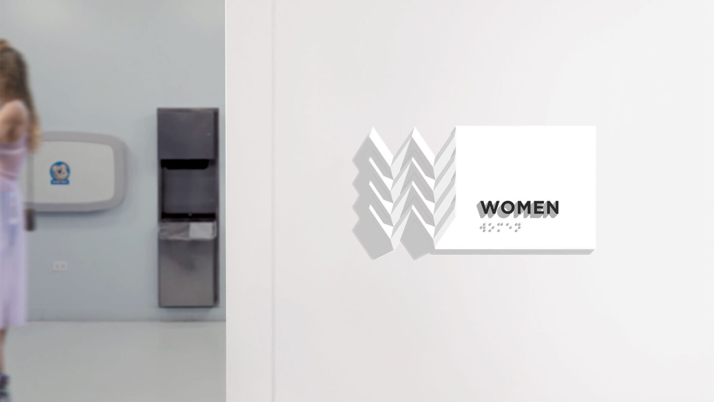
The logo is expanded to create a series of signage with dimensional pleated letterforms. Other than creating subtle visual interest, they also allow visually impaired visitors to experience the brand.
Jenny Hsin-Yi Chang

Project Details
Design Team
Jenny Hsin-Yi Chang
Photo Credits
Jenny Hsin-Yi Chang (photography)