Downey City Library
The Downey City Library has been a neighborhood landmark for more than 100 years. Over time the facility has evolved into a multi-faceted social hub and learning space. In 2016, Downey voted to fund the renovation of several civic buildings, including the library. This presented an opportunity to create a considered, inviting, energized space to match the library’s vital role in the community.
Agency
Handbuilt Studio (a DBA of NAC Inc.)
Practice Area
Client
City of Downey
Industry

The Challenge
The team’s overarching goal was to create an inclusive facility that would support contemporary learning and evolving technologies. All spaces had to be flexible, functional and inspiring. The design for the space needed to align with a bold vision of what it means to learn, grow, and connect in the 21st century.
Project Vision
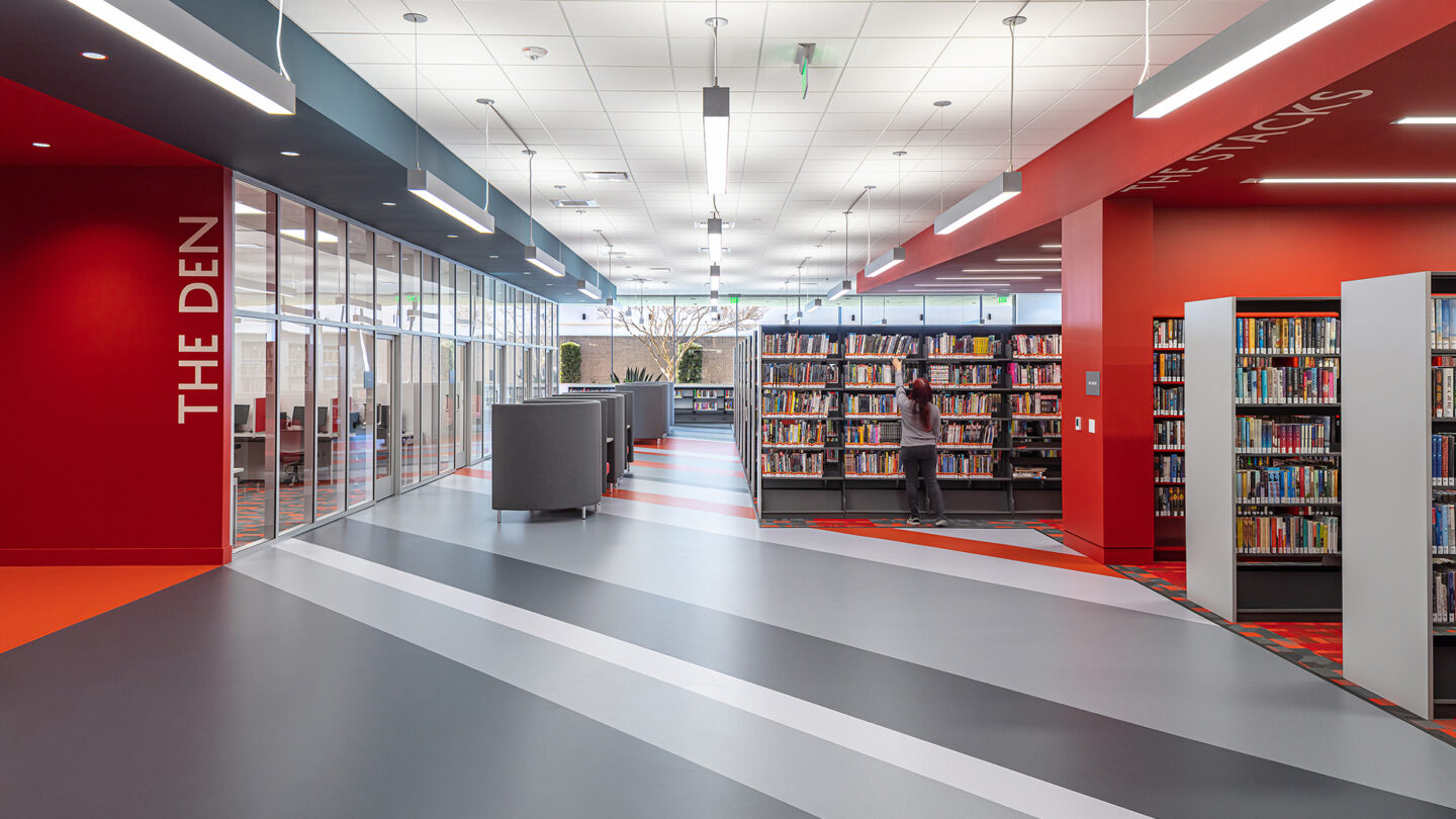
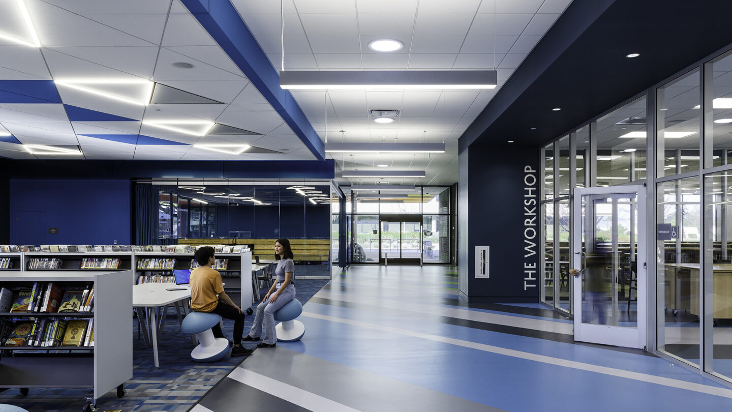
The library is future-focused, organized, and abundant. It accommodates quiet moments of reading alongside joyous collaboration. It provides tools for adventurous experimentation while also serving as a steady, reliable community resource. This mixture of clarity and richness exists throughout the space. Color serves as a significant clarifying presence, creating well-defined areas for specific purposes. The color transitions from one location to another within the flooring allow for lively moments of transition from one space to the next. Signage for each area uses large, bold typography.

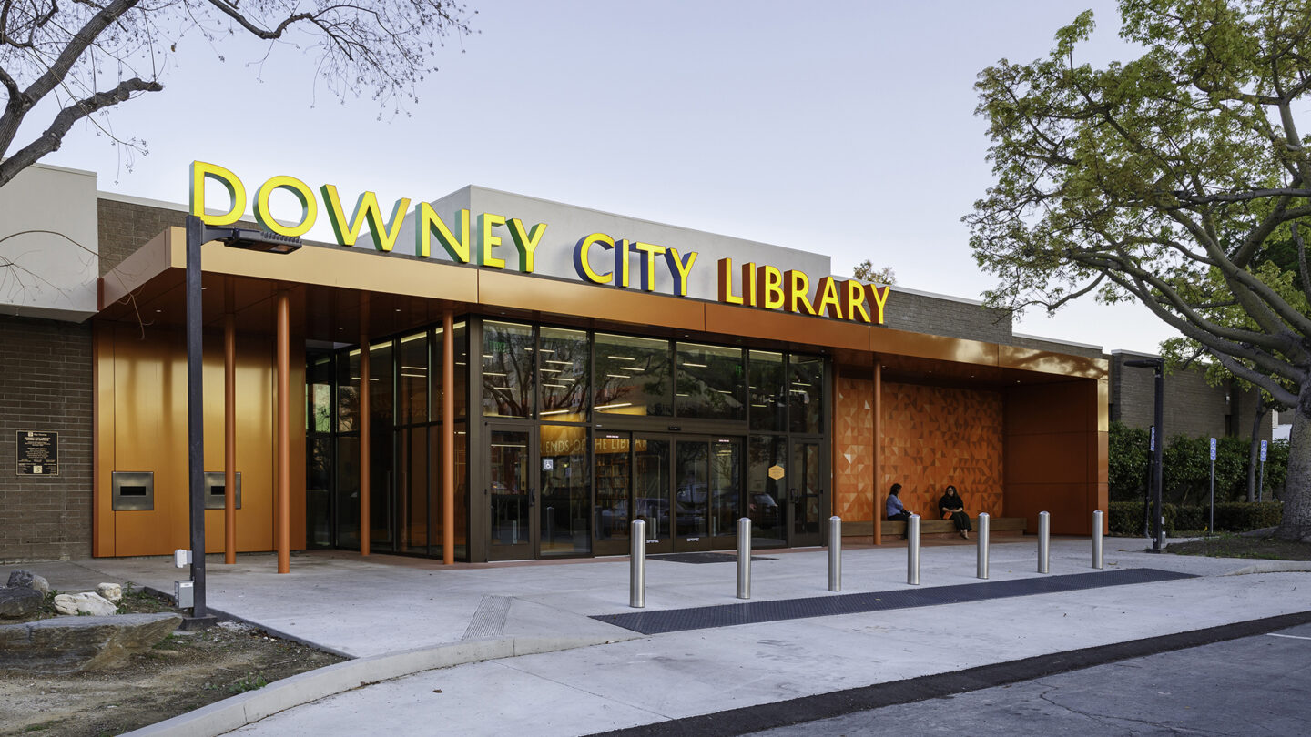
A bold entry for a bold space, radically welcoming all ages. Colors along the edge of the sign provide a hint of the indoor color system.
Peng Tianxiao

Not everybody needs an info desk! Color and movement on the floor and ceiling help you find your way.
Peng Tianxiao

The library’s trees were a major inspiration for the project. The ceiling sculpture becomes a map in the shape of bold, stemming branches.
Nico Marques

Just beyond the lobby, you discover that color, energy, and flow are all around. New ways of learning call for more than just quiet and symmetry.
Peng Tianxiao
Design + Execution
Many interior details take cues from the plants and environment outside the library building. The main wayfinding in the lobby is a custom aluminum tree sculpture with radiating branches. The exterior aluminum panel mural shimmers with a custom triangular design that mimics the sunlight filtered through the nearby leaves. The carpet patterns evoke the multi-faceted color of leaves and grass on the ground. The mural in the green Children’s area takes advantage of the long, vertical windows and feels like enchanting streams of light beams through a forest. The ceiling treatment in the blue area picks up on hues of blue and white from the open Downey sky.

Signage for each area uses large, bold typography. The placement is allowed to be more playful and respond to its specific context.
Nico Marques

Destination or discovery, the stripes lead you to your destination yet suggest enticing detours along the way.
Peng Tianxiao

The mural in the children’s area takes advantage of existing long, vertical windows that now stream enchanting beams of light through a forest.
Nico Marques
Project Details
Bold colors, clear wayfinding, and nature-inspired designs bring new life and energy to this library. This refresh creates a joyful space for the community to learn, gather, and play.
One of the nicest and most refreshing signage systems for a library I’ve ever seen. Bravo!
Design Team
Handbuilt Studio, Juliette Bellocq, Brooke Irish, Yuju Yeo (environmental & graphic design)
NAC Architecture, Louise Griffin (project manager)
Helena Jubany (principal in charge)
Micheal Pinto (design principal)
anica Baker (project architect)
Jamie Lee (job captain)
Peng Tianxiao (designer)
Collaborators
Sign Pro, The SH Group (physical fabrication)
NAC Architecture (architecture, planning)
Photo Credits
NAC Architecture
Nicolas Marques (Photekt)
Open Date
May 2021


