First Sentier Investors Workplace
First Sentier Investors are a global asset management company with a client base across Asia, Australasia, Europe, and North America.
Agency
THERE
Practice Area
Client
First Sentier Investors and Commonwealth Bank Australia
Industry
The Challenge
Following a recent sale from their parent company, the organization underwent a rebrand as a stand-alone business, while relocating to a new workplace in Sydney’s recently rejuvenated Barangaroo precinct.
Their new home called for a suite of signage, wayfinding and environmental graphics that would reflect the company’s core values while harmonizing with the aesthetic of their office interiors.
Key to the architectural design intent was the Japanese concept of wabi sabi, a worldview centered on the acceptance of transience and imperfection.
Project Vision
The idea of crafted spaces and handmade materials was a cornerstone of the interior design, which also used careful illumination to draw attention to aspects of the interiors.
As the company was undergoing a complete rebrand during the construction of their new office, the environmental graphics couldn’t rely on any traditional brand cues, and so the interior design narratives became the basis of the work.
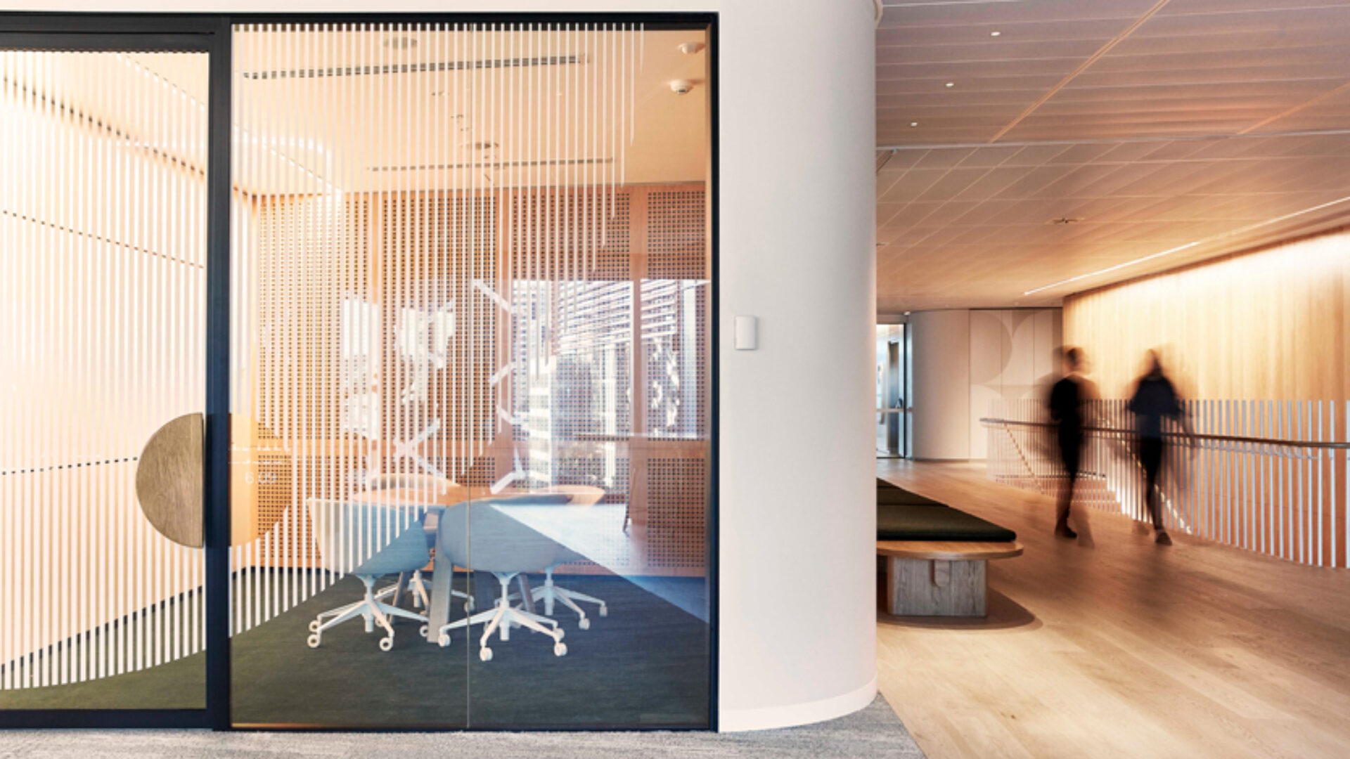
Playing off the idea of illumination and layering, THERE developed a series of large-scale wall and glazing treatments designed to look like abstract beams of light falling on the timber and glass panels that lined the core of the building. The simple geometric shapes and patterning were a nod to the modernist interiors, while also being akin to traditional Japanese design. Graphics were intentionally placed so that they fell perfectly over different substrates, and subtle color changes created a sense of shifting light patterns as they transitioned around the floor.

A delicate sense of illumination plays out through minimalist graphic installations.
Steve Brown

Graphics are used to delicately complement the interior design scheme.
Steve Brown

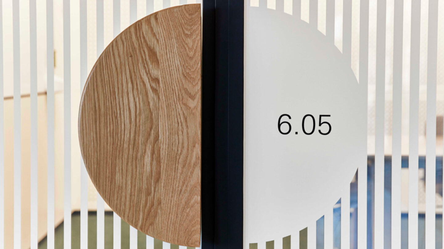
Sculpted Corian sign-forms create moments of delight in the entry spaces.
Steve Brown

Graphics were intentionally positioned to fall across multiple surfaces, and conceal or reveal different spaces.
Steve Brown
Design + Execution
A clean minimal graphic language was further applied to locker graphics, operational signage, and wayfinding.
In the elevator lobbies, beautifully sculpted level identification signs made from Corian welcomed visitors on arrival, with integrated LEDs giving the numerals a halo-effect in light. Meeting room identity signs were incorporated into glazing treatments, but perfectly positioned in the space so that they aligned to the feature door handles.
Perfectly placed signage to balance with the interior design features.
Steve Brown
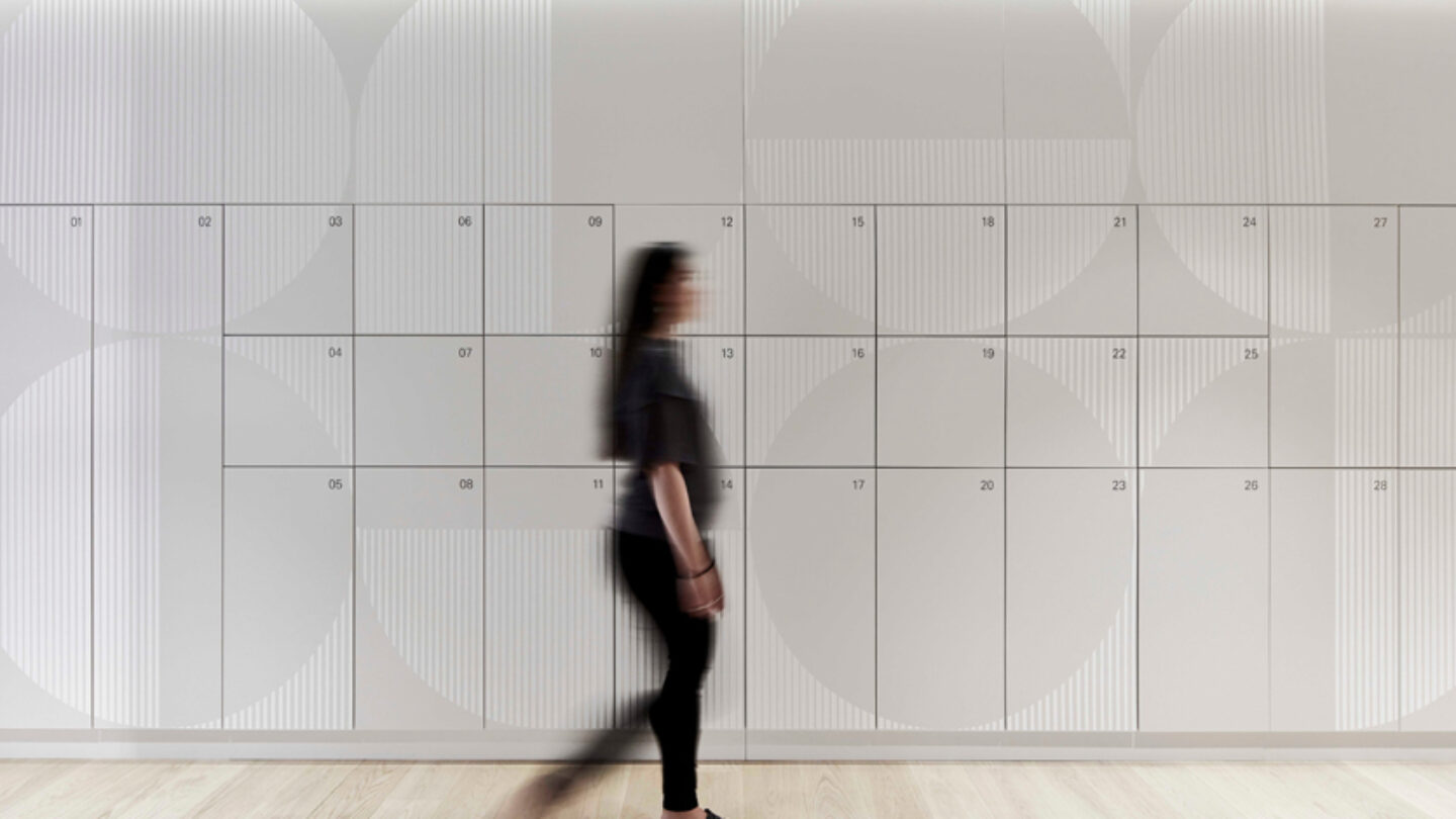
Graphic patterning was used to animate locker banks and circulation spaces.
Steve Brown

Simple, understated wayfinding to help navigate the floor.
Steve Brown
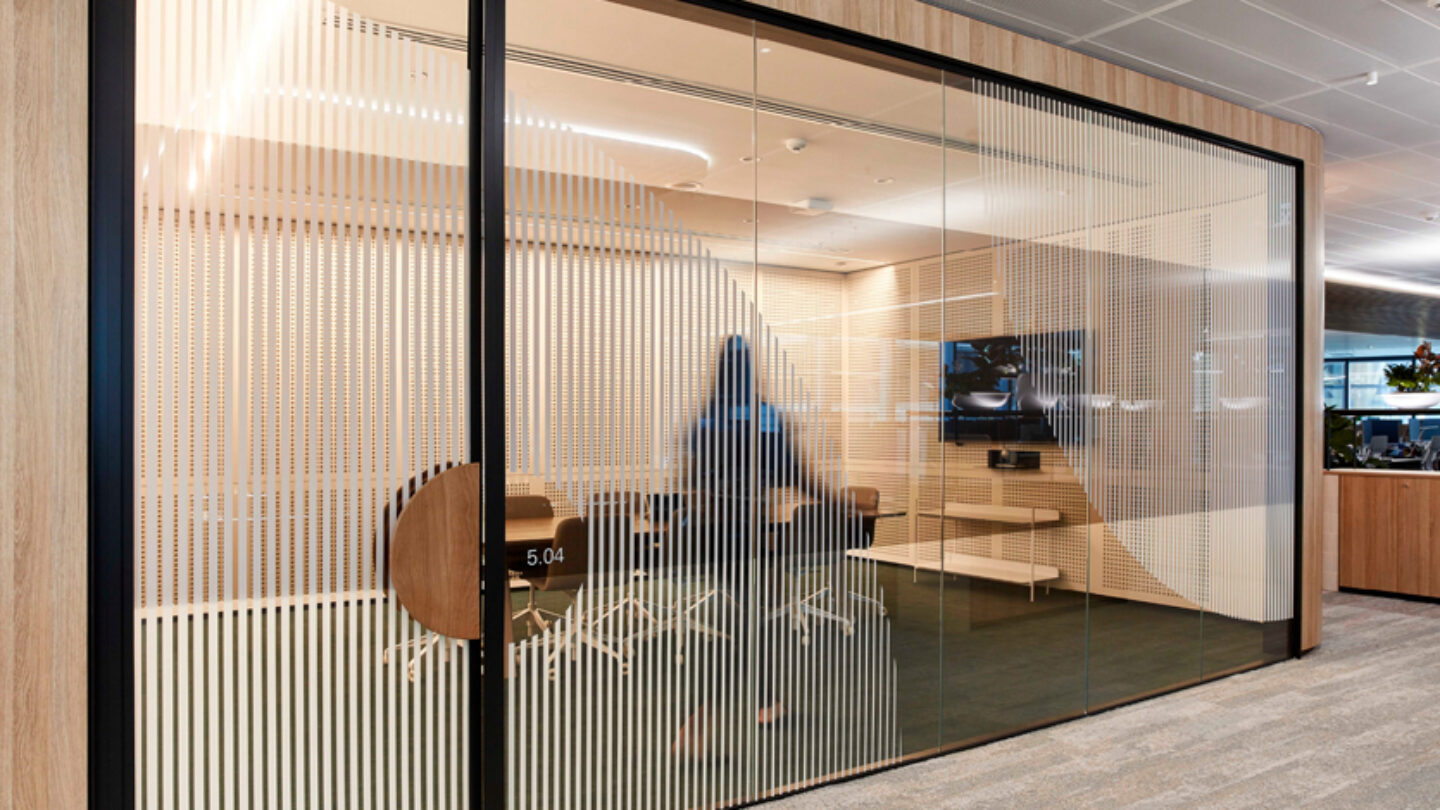
Meeting room glazing activated with graphics.
Steve Brown
Project Details
The execution and elegance are top-notch.
Sophisticated, yet approachable. Beautifully intricate details. So minimal yet so perfectly expressive of the client’s identity.
Design Team
Paul Taboure (executive creative director)
Charlie Bromley (head of environments, design lead)
Scott McNamara, Lauren Barber (designers)
Tania Sacco (senior project manager)
Consultant
Nettleton Tribe (interior design)
Fabricators
Scaffad (signage fabrication)
Eyetonic (graphics fabrication)
Photo and Video Credits
Steve Brown (photography, videography)
Mansur Amiri (videography)
Open Date
October 2019