Project Treeline
As a leader in food service and retail packaging, Graphic Packaging International has a deep commitment to environmental impact and creating a better future for the planet. To reflect this commitment, the design team thoughtfully selected recycled materials that put into practice responsible, yet courageous choices to create branded impact. Inspired by Graphic Packaging products, the design language celebrates the folds and facets of paperboard packaging, while soft curved geometric forms reference the natural world and the company brand.
Agency
Practice Area
Client
Graphic Packaging International
Industry
The Challenge
Amenities such as new fitness, dining facilities and break rooms on each level were prioritized to incentivize employees to return to the workplace. Each break room features a distinct patent drawing created by a Graphic Packaging International employee of a product that is relevant to the department working on that level. These custom wallcoverings were printed using multiple layers of ink to generate an embossed effect that adds depth and recalls the inherent texture of paper.
Project Vision
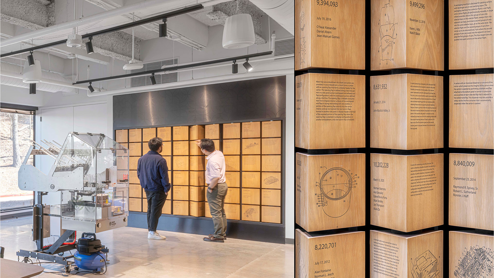
On the first floor, the Experience Center is designed as a multi-use space where several small exhibits and flexible displays are strategically located along a customer’s tour path and serve as talking point prompts. These displays point to Graphic Packaging International’s legacy of designing and patenting consumer packaging products and machinery as well as showcase the latest state-of-the-art products and technology.
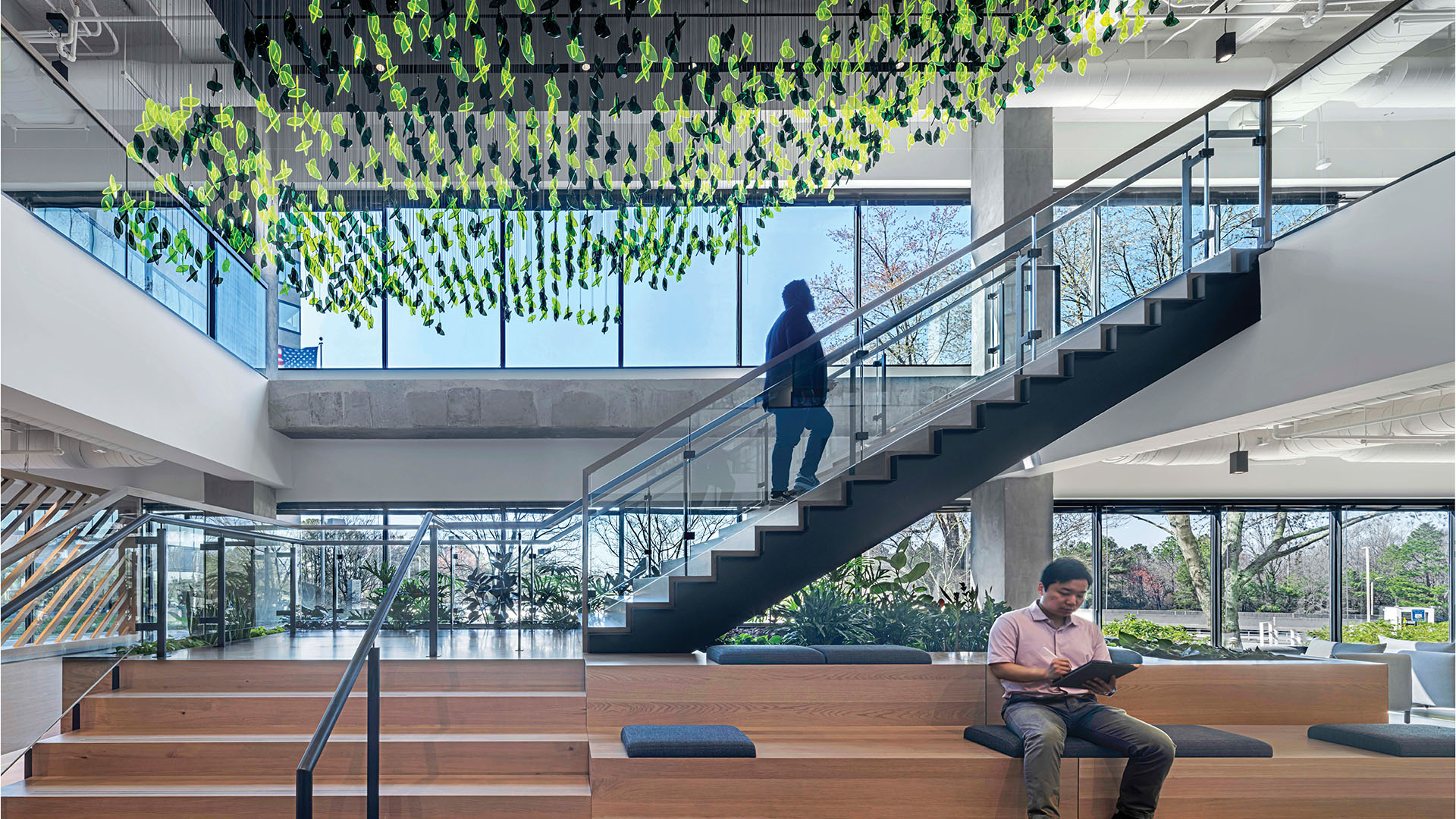
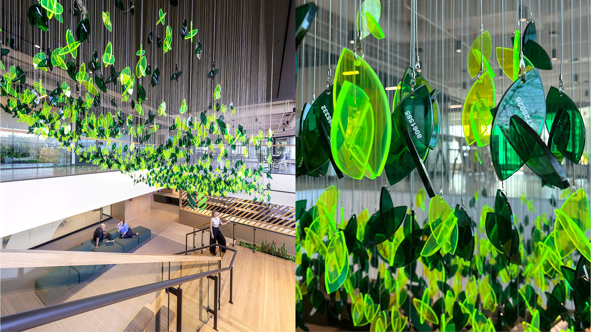
A connecting stair between the first two levels creates traffic and buzz at the intersection of the Product Lab and client-focused meeting rooms. Suspended in an upward gesture over the open stair, a cluster of over 2,700 green leaves representing unique patents created by Graphic Packaging International. This display creates a sense of awe and pride among customers and employees and reference the prolific impact that Graphic Packaging International has in their industry. The leaf motif is a symbol of sustainability from the the company has brand and an extension of their tree logo. Each leaf is printed with a unique patent number and is designed to grow over time as new patents are developed. Made from transparent brand green acrylic, the leaves allow light to travel through them and reflect the color onto the stair, a reference to the transparent process of the company.
Further in the space, an interactive exhibit encourages customers to learn more about the work at Graphic Packaging International next to a machine showing how the packaging is manufactured. A curated selection of 60 patents is on display with a product description, patent designer recognition and product drawing. Visitors can physically engage with the exhibit by rotating a three-sided wood module to read the information.

The suspended display inspires awe and showcases Graphic Packaging’s expertise, evolving over time with new patents added using easy mechanical fasteners.
Eric Laignel
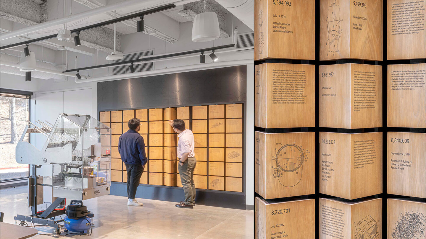
The display of 60 top-performing patents at Graphic Packaging International inspires visitors, featuring rotating wood veneer panels with patent drawings, descriptions, and designer recognition.
Eric Laignel
Design + Execution
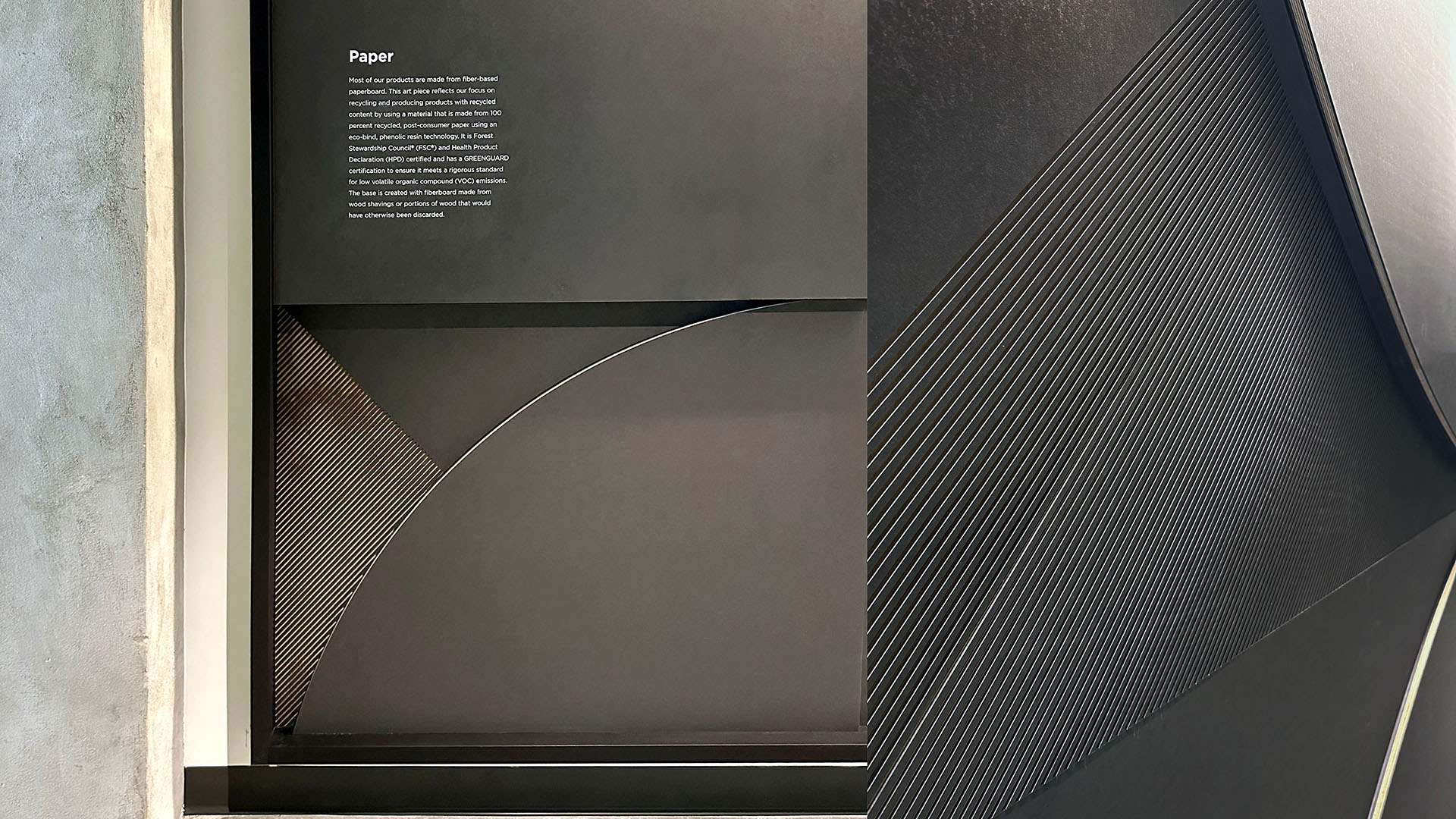
The entry to each workplace level greets staff with a large scale installation of the Graphic Packaging brand pattern created from materials commonly used to create their packaging and machinery, using paper, cardboard, wood and metal. Each installation includes a brief description of the material used and how it reflects the company’s ESG goals. These eight unique installations are made from corrugated Wellboard (a 100% cellulose product), a 100% recycled paper composite, byproduct salvaged wood, and metal laminate made from 82.5% recycled content. The base layer of each is made from wood shavings or portions of wood that would have otherwise been discarded. Each installation is custom routed into a unique composition of the Graphic Packaging International brand pattern to aid in wayfinding per level as well as provide visual inspiration and instill a sense of purpose as employees start and end their day.
The emphasis on sustainability extends to the signage and wayfinding system by utilizing a salvaged wood and a 100% recycled paper composite substrate for the code signage, giving it a soft, paper-feel surface texture. Level numeral identifiers and wayfinding directionals use the same palette and blend into the raw, refined interior design of the space.
Graphic Packaging International reports that the brand experience has been immensely popular for staff and new customers and the branded touchpoints make it easy for Graphic Packaging representatives to tell their story and excite customers about their innovative products.
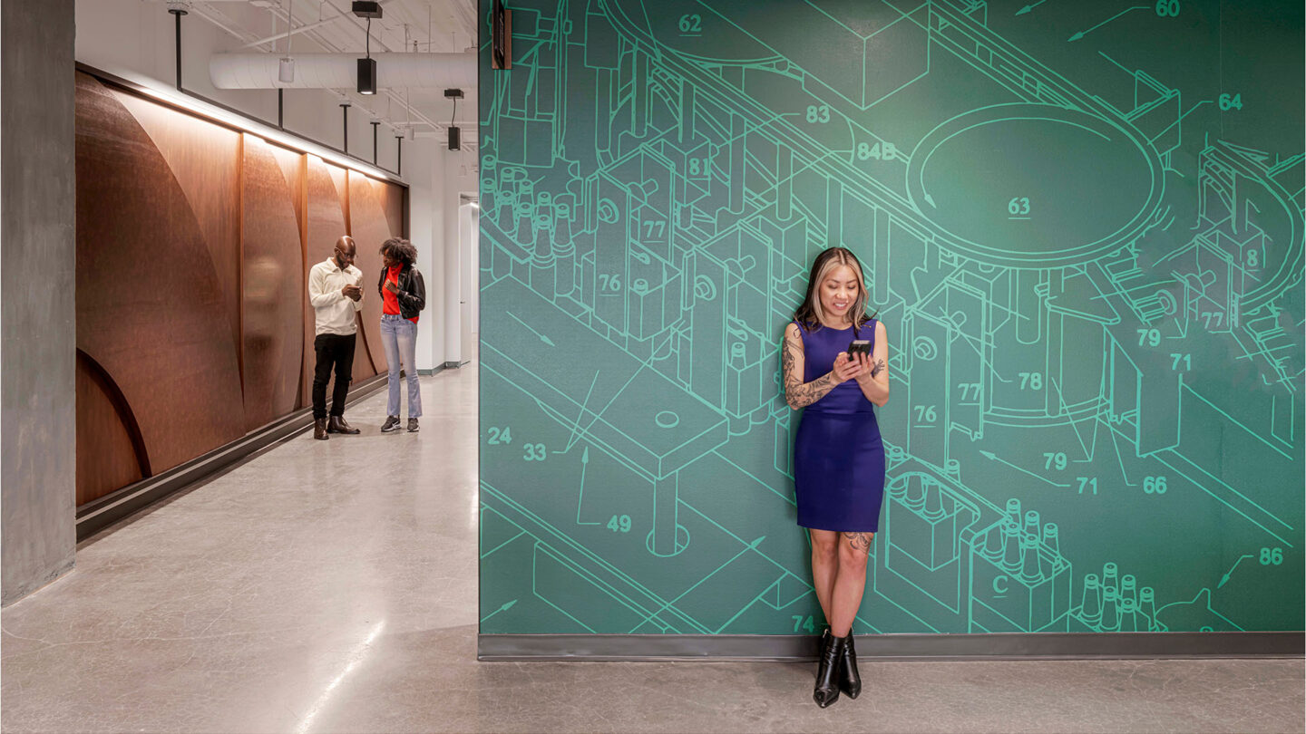
Break rooms on each level feature department-specific patent drawings for wayfinding, with raised linework on custom wallcoverings and recycled metal installations reflecting brand patterns.
Eric Laignel
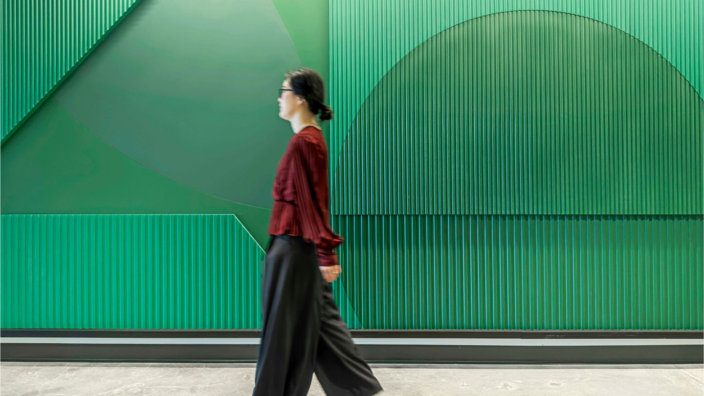
Large installations outside each elevator lobby are inspired by paper packaging geometry, using recycled materials like paper, cardboard, wood, and metal, reflecting Graphic Packaging’s brand pattern.
Eric Laignel

Each installation describes the recycled material used, inspiring employees to consider their work’s impact, while unique compositions aid wayfinding with custom routed and painted details.
Eric Laignel
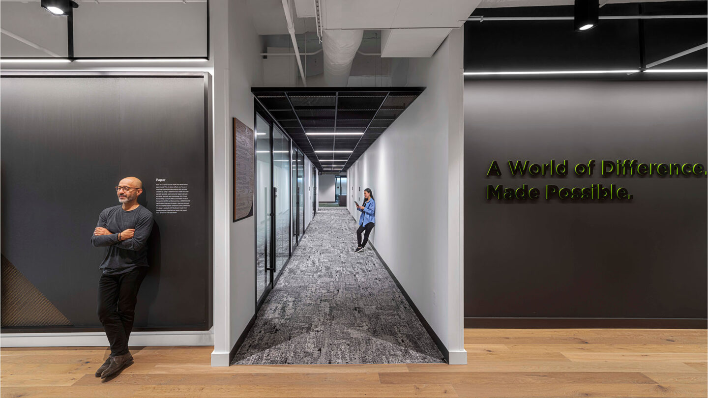
Level 9 features “A world of difference made possible” with recycled material installations, reinforcing sustainability using recycled paper signage and salvaged wood throughout the project.
Eric Laignel
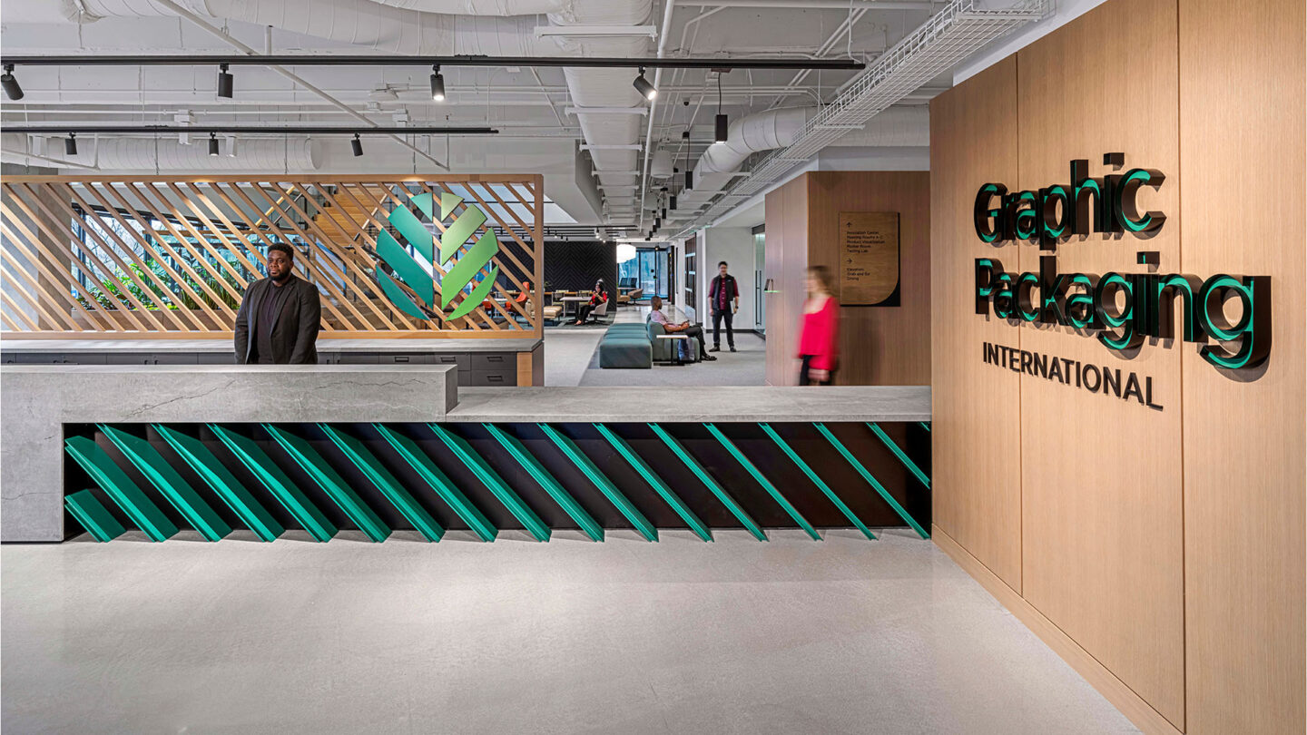
Repetitive angles from the logo welcome customers to Graphic Packaging’s Innovation Center, reflecting the transformation of raw paperboard into sophisticated consumer packaging.
Eric Laignel


Project Details
Design Team
HOK
Photo Credits
Eric Laignel
Open Date
October 2023