John A. Volpe National Transportation Systems Center
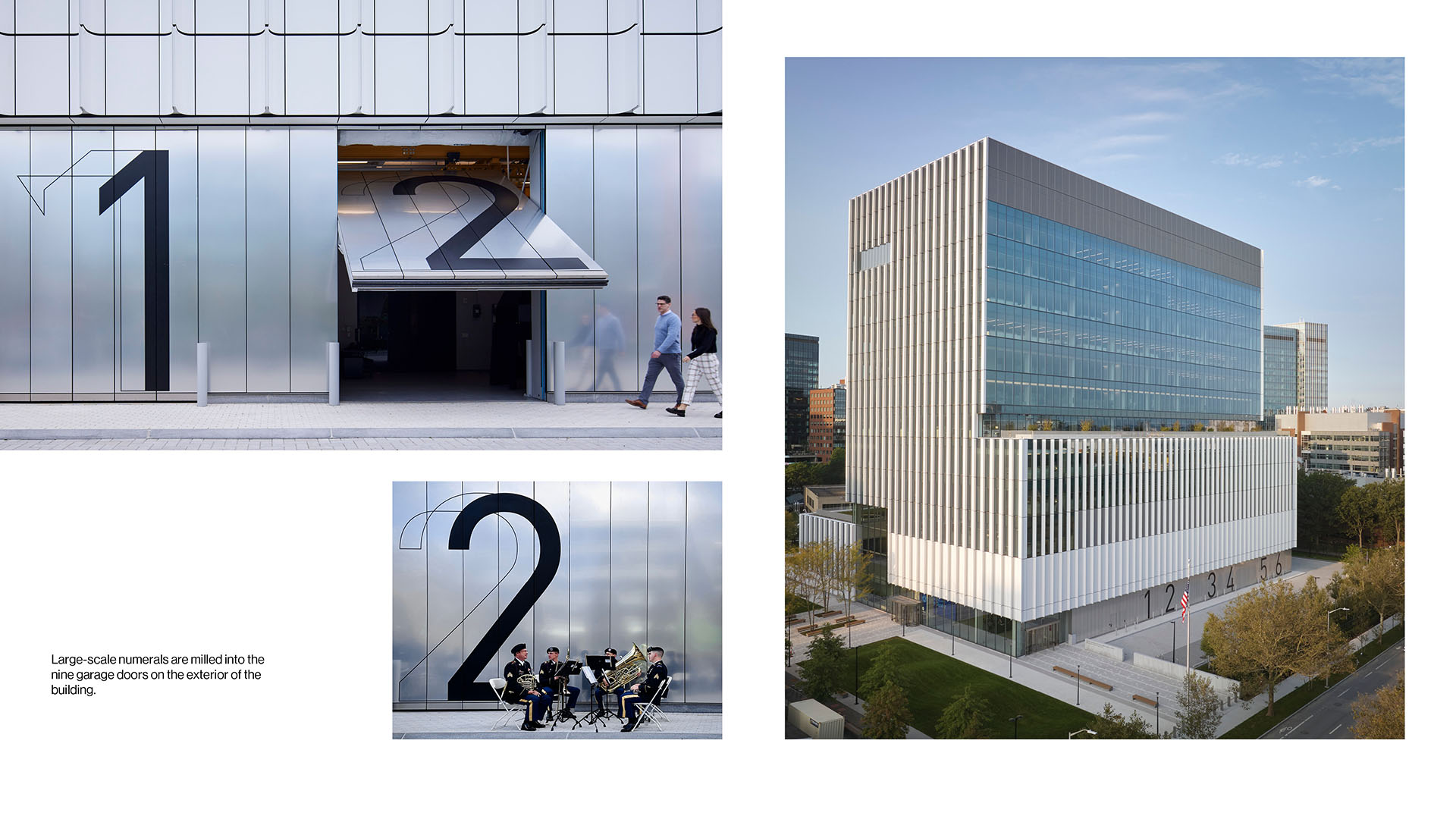
The John A. Volpe National Transportation Systems Center was founded by the U.S. Department of Transportation in 1970 to advance transportation innovation for the public good, and its new building furthers this critical mission. Conceived as a vertical campus, this project brings the entirety of the U.S. DOT Volpe Center under one roof, with laboratories, data centers, offices, and amenities that were once spread across several structures. After five decades of operation in an “inherited” building within a fenced campus in the Kendall Square neighborhood, the U.S. DOT Volpe Center is now finally part of the public realm—engaging the streetscape and putting its work on display.
Agency
SOM Graphics
Practice Area
Client
The U.S. Department of Transportation in consultation with the U.S. General Services Administration
Industry

The Challenge
Creating a vertical campus requires a comprehensive signage and wayfinding program. The project packs a breadth of programs within its 13 stories, with offices, conferencing, child care, a cafe, a fitness center, two terraces, and a large suite of different types of laboratory spaces. It was a challenge to develop a strategy that makes the building easy to navigate, while also displaying the institutional identity of our client as an integrated part of the architecture.
Project Vision
We envisioned a graphics and wayfinding program that would assist navigation through this vertical campus, convey a sense of institutional identity, and resonate with staff. It was important that our design celebrate the whole of the Volpe Center while being agnostic to any particular department or group. The team strived to develop a design to make this building feel welcoming and specific to employees of the Volpe Center.
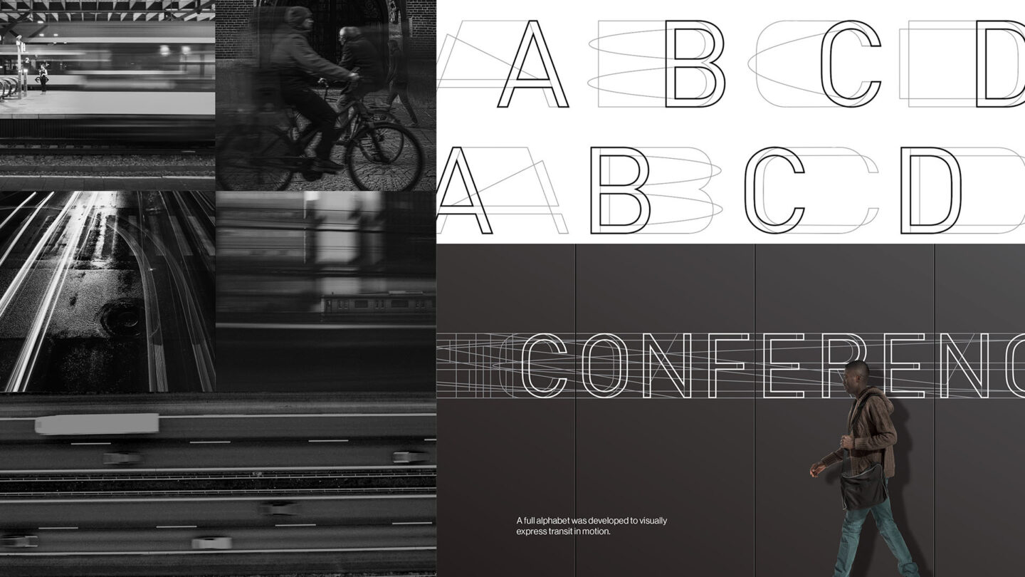
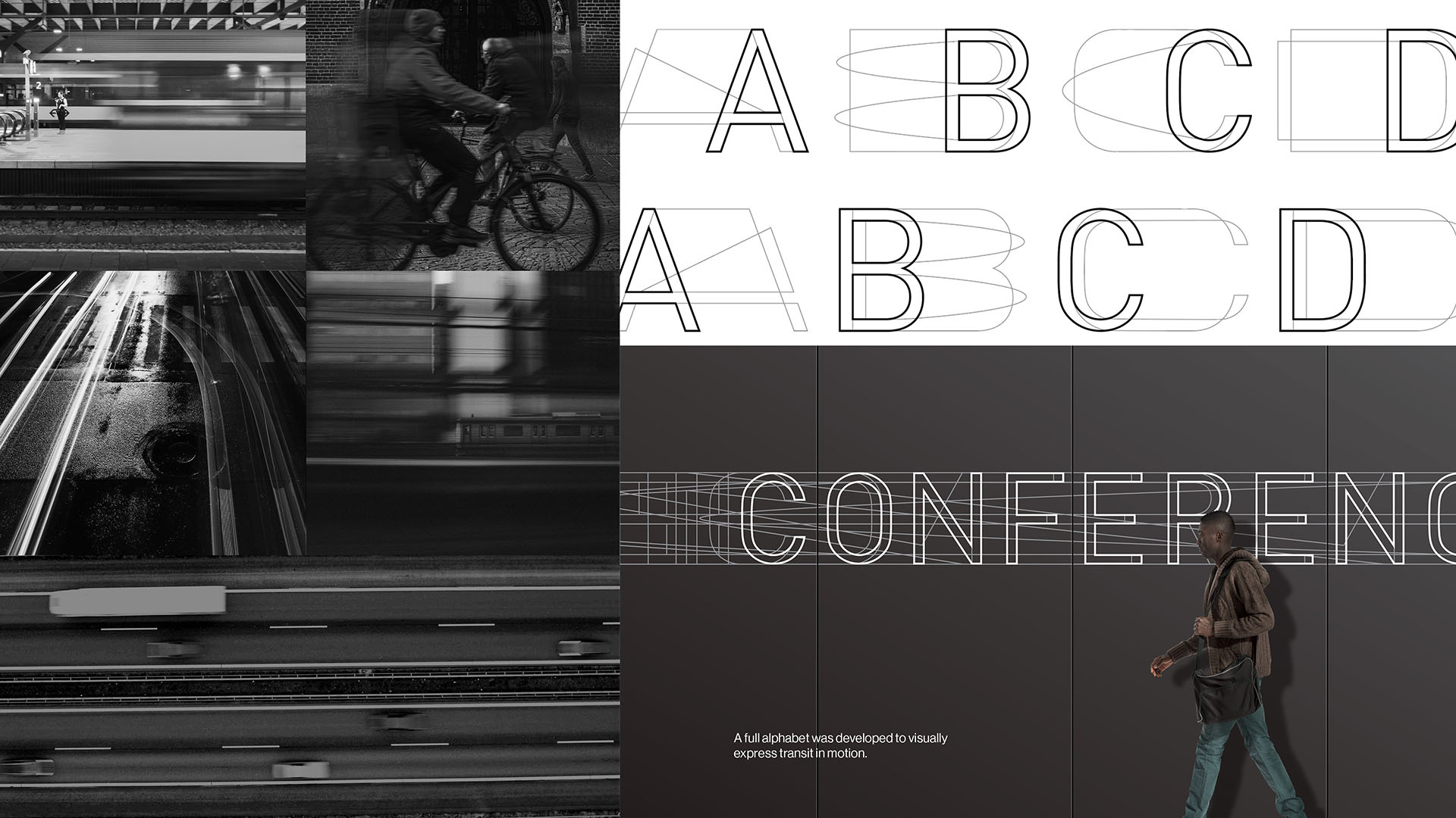
A full alphabet was developed to visually express transit in motion.
SOM, Jahanzeh Ahsan, Bernd Dittrich, Point Blanq, Kimi Lee
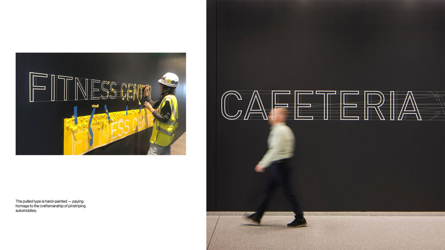
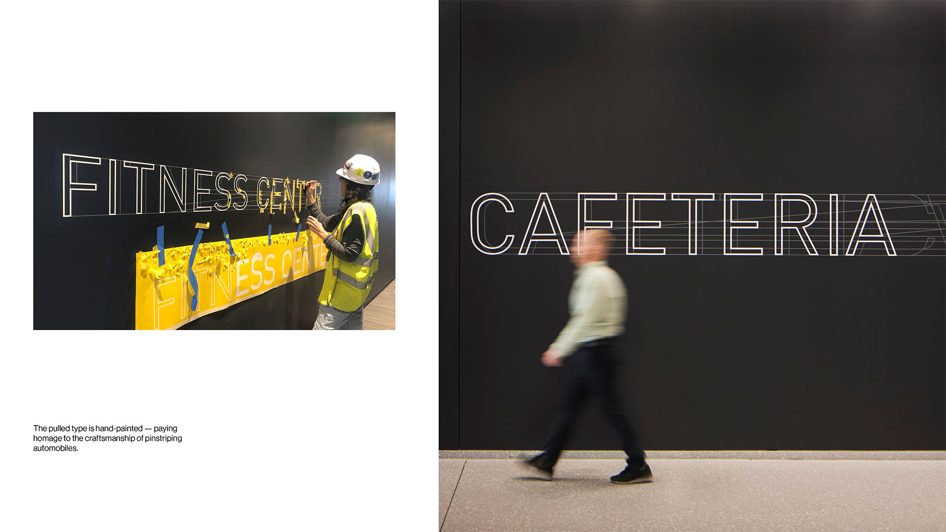
The pulled type is hand-painted paying homage to the craftsmanship of pinstriping automobiles.
Dave Burk, SOM
Design + Execution
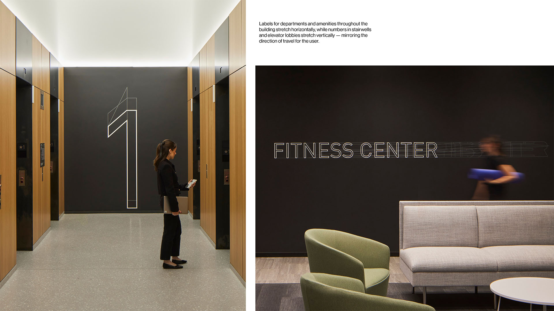
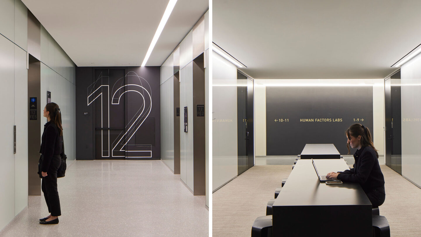
Through the use of typography, we were able to visually express transit in motion abstractly emphasizing the movement of a plane, train, or car. This typography was applied both outside and indoors, conveys movement in every character. The letters are styled to echo across the walls as if traveling through space. Labels for the departments and amenities throughout the building stretch horizontally, like a train or car whizzing by, while numbers in the stairwells stretch vertically, mirroring the direction of staff circulating between floors. Inside, all the pulled type was hand-painted, resembling the craftsmanship of a pinstriped automobile. Additionally, the team utilized images provided by Volpe’s archives to create abstract murals that serve to add color, identity, and a memorable landmark on all of the large typical workplace floors. Each mural transforms one photograph by stretching a vertical row of pixels horizontally. The result conveys a sense of motion through the juxtaposition of seeing the original image and the graphic blurring.

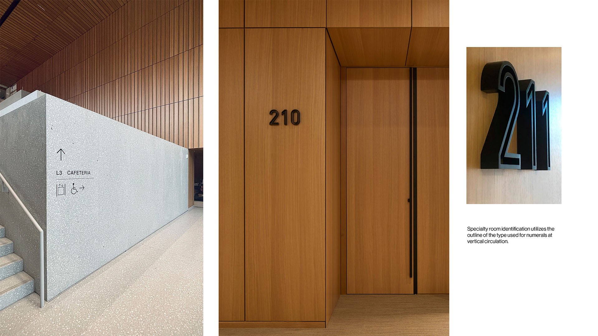
Labels for departments and amenities throughout the building stretch horizontally, while numbers in stairwells and elevator lobbies stretch vertically mirroring the direction of travel for the user.
Dave Burk

Specialty room identification utilizes the outline of the type used for numerals at vertical circulation.
Dave Burk

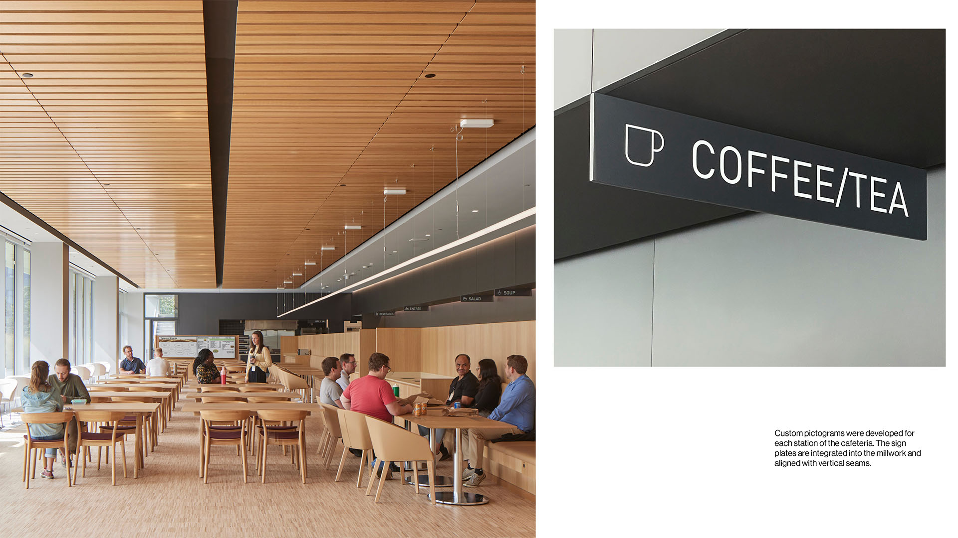
Custom pictograms were developed for each station of the cafeteria. The sign plates are integrated into the millwork and aligned with vertical seams.
Dave Burk
Dave Burk
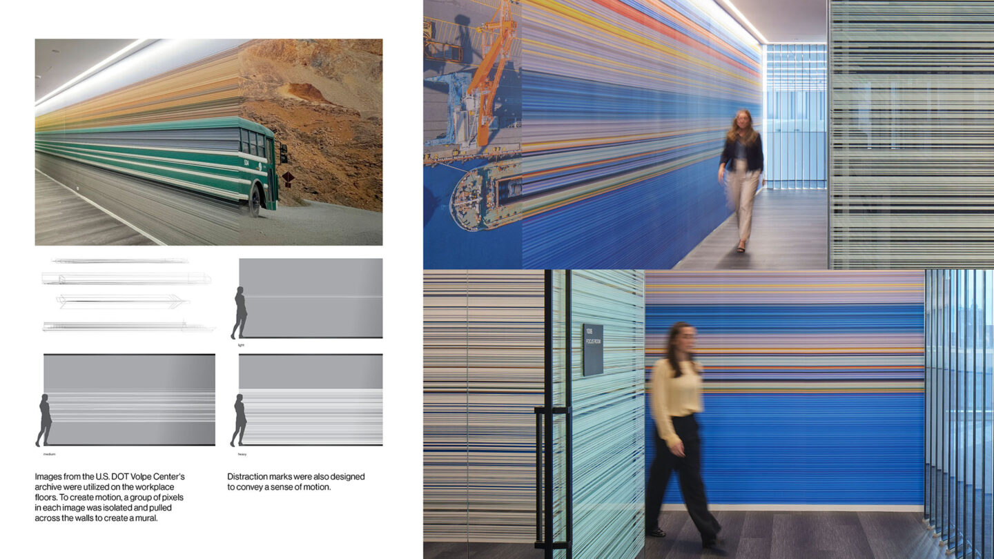
Images from the U.S. DOT Volpe Center’s archive were utilized on the workplace floors. To create motion, a group of pixels in each image was isolated and pulled across the walls.
Dave Burk, SOM
Project Details
What could be a standard government building is transformed through a singular and appropriate metaphor motion. The bold use of black and white, paired with the pops of color through abstracted image walls, create a timeless and dynamic workplace.
A successful example of a restrained approach that transcends utility, complementing the aspirations of the architecture. The subtle variations in kinetic graphics and typography successfully unifies and accentuates the environment, imbued with the space with a sense of place and purpose.
Design Team
Lonny Israel (principal in charge)
Kacey Bills (project manager)
Dan Maxfield (senior designer)
Nour Mourad (designer)
Danielle Burton (designer)
SOM (architecture)
Reed Hilderbrand (landscape architecture)
Poblocki Sign Company LLC (physical fabrication)
Photo Credits
Dave Burk
SOM
Open Date
September 2023
