Allina Health Surgery Centers
There is nothing more deeply personal then dealing with health, especially when there is a need for surgery. The experience is acutely felt not just from the patients, feeling vulnerable and scared, but also from the intense stress of the staff. Emotional experience creating a dramatic need to rethink how design can calm and soothe experiences that are life altering.

The Challenge
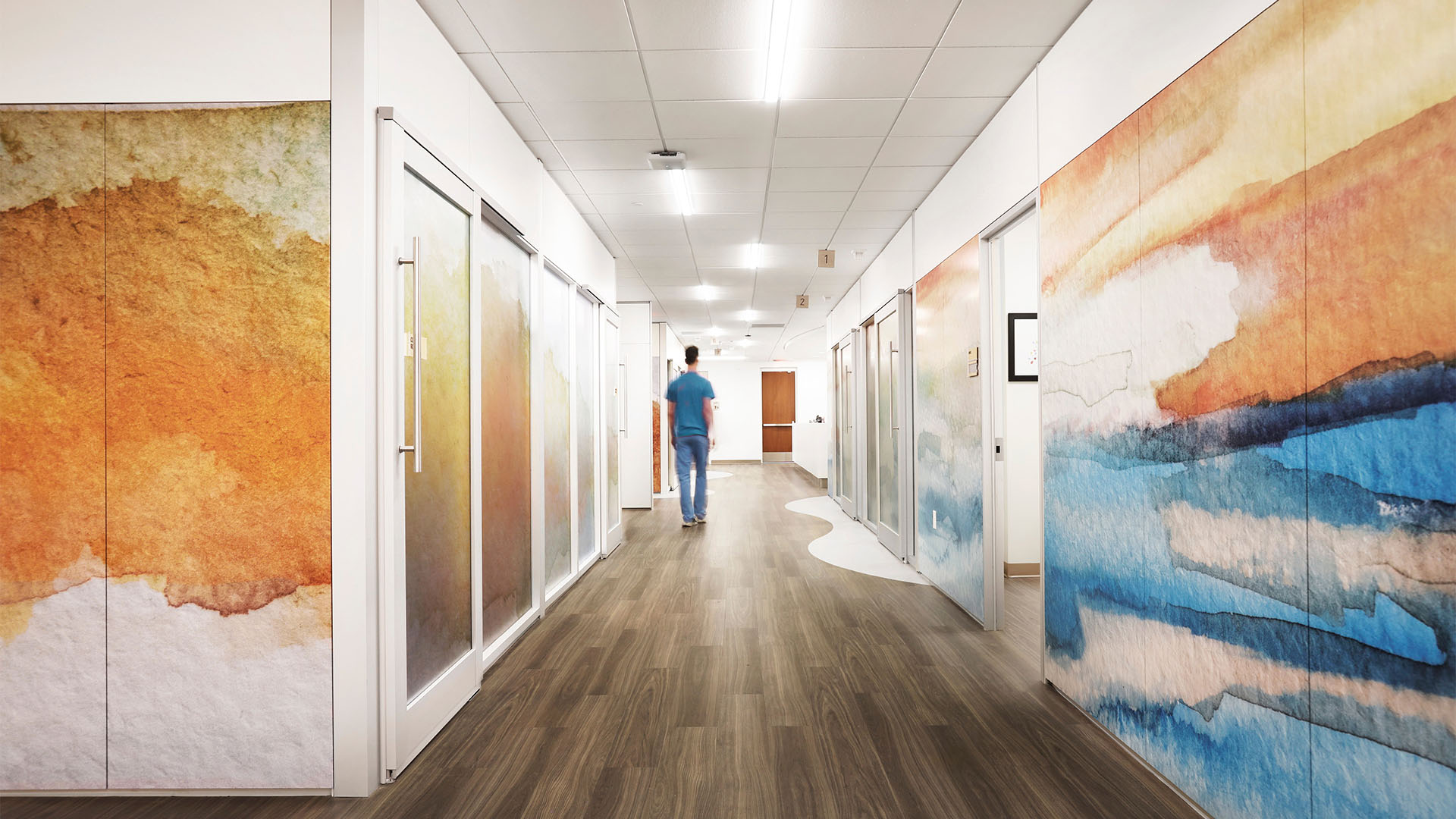
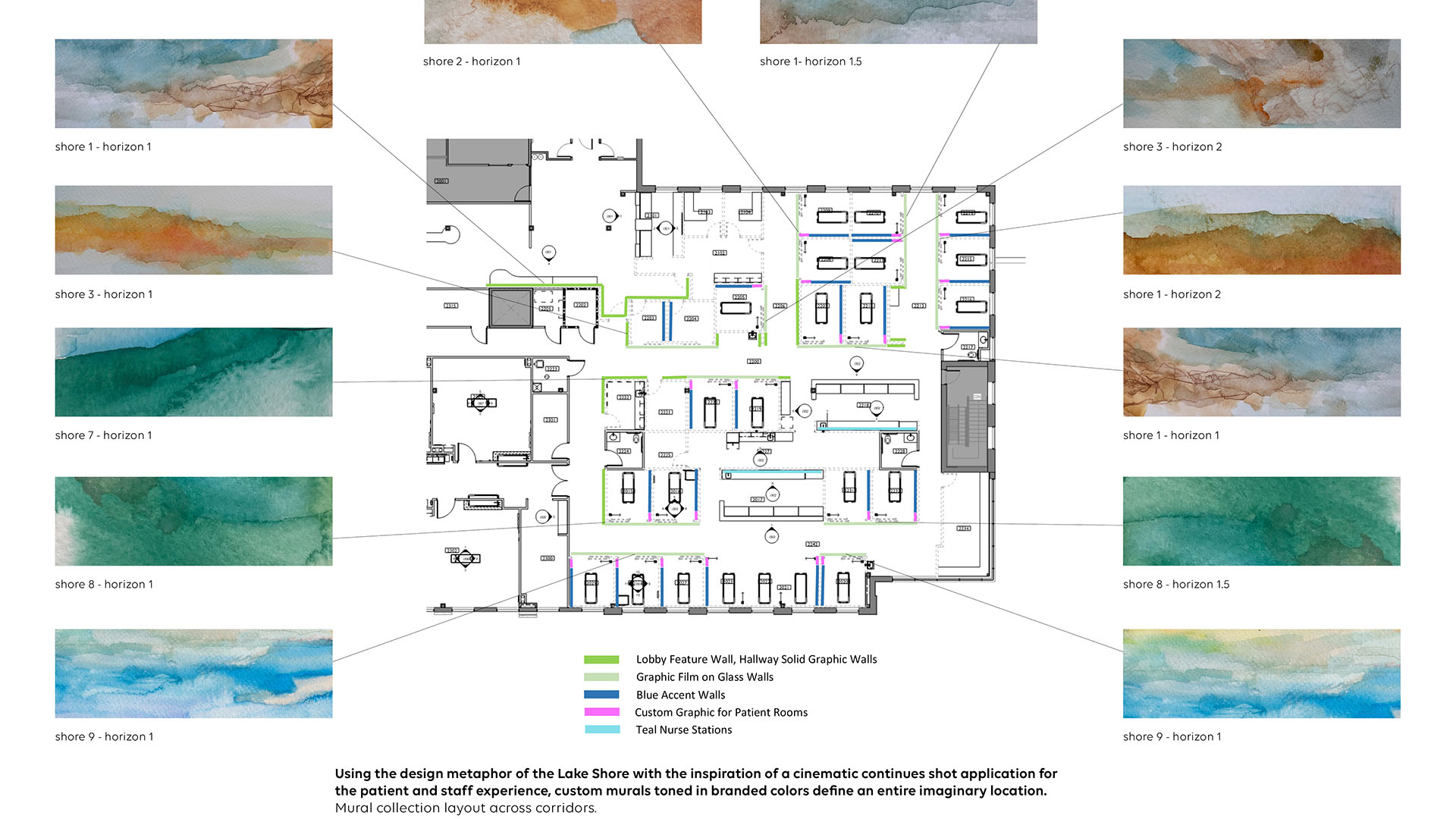
Careful consideration of the patient experience went into planning how the paintings would ebb and undulate in intensity through the different spaces and needs of the Surgery Center. With a range of different procedures and amounts of times that patients are in their rooms for treatment and recovery, color and intensity play important roles that keep patients in 18-24 hour rooms as calm as patients in 3-6 hour rooms. Along with the careful planning of imagery in a horizontal format running across corridors, each patient room and office also has a vertical slice of painting that carefully connects to the corresponding hallway murals, bringing the experience of the design metaphor of the Lake Shore into every room.
The “slice” in the rooms work in multiple ways. The narrowness allows for the need for medical equipment without being interrupted, and it also allows for the patient experience of reclining in the bed to still be visible. The slices down the wall are also done in more saturated tones giving the experience of the feeling of a foreground, while the murals seen through the glass give a softer view that feels like an atmospheric quality, successfully building an environment that feels like you are on a lake shore looking across.
Project Vision
The paintings were created with the design metaphor of the Lake Shore and done in textural strokes and tones to calm, while subtly also matching the brand palette of Allina’s identity, carefully connecting the brand presence in an artful application that gives life to their story of place. Going beyond using art as just a decoration, the paintings transform a highly technically location into a fully integrated environment of art as an integral presence in the built locations.
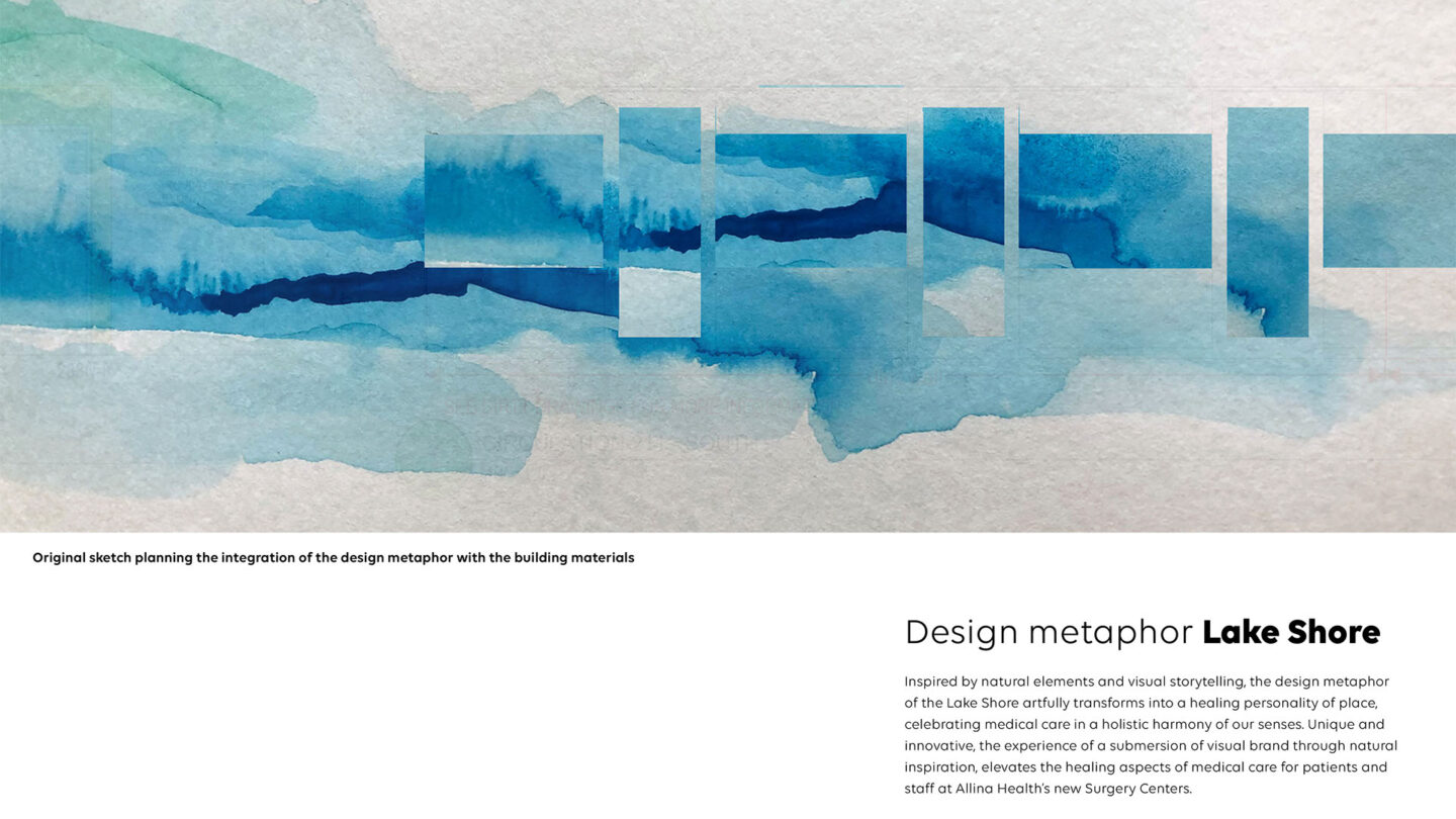
Design Metaphor: Lake Shore. Inspired by natural elements and visual storytelling, the design
metaphor of the Lake Shore artfully transforms into a healing personality of place.
Heather Novak-Peterson
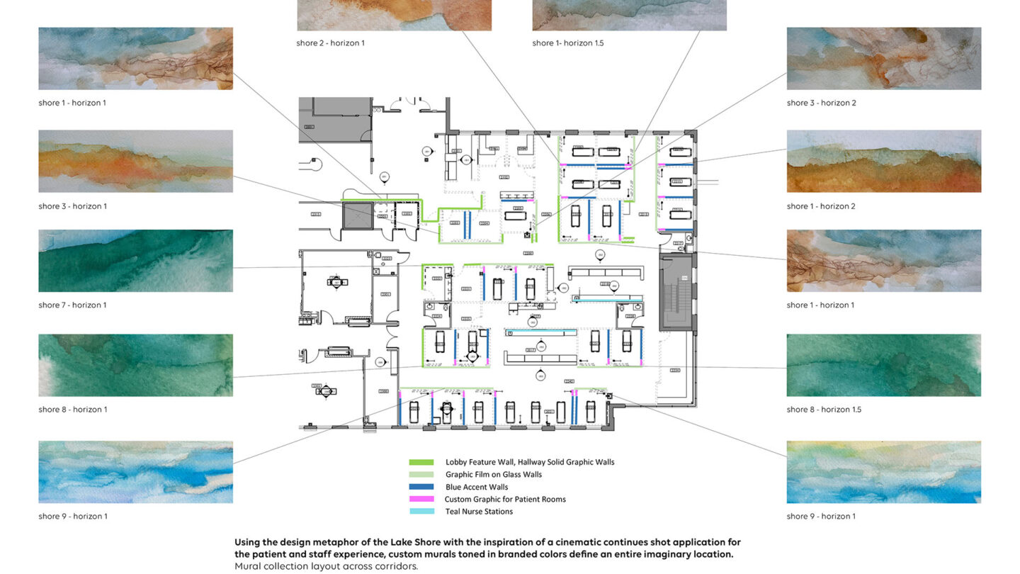
Defining design metaphor of the Lake Shore with inspiration of a cinematic continues shot application for the patient and staff experience, murals toned in brand colors define an entire location.
Heather Novak-Peterson
Design + Execution
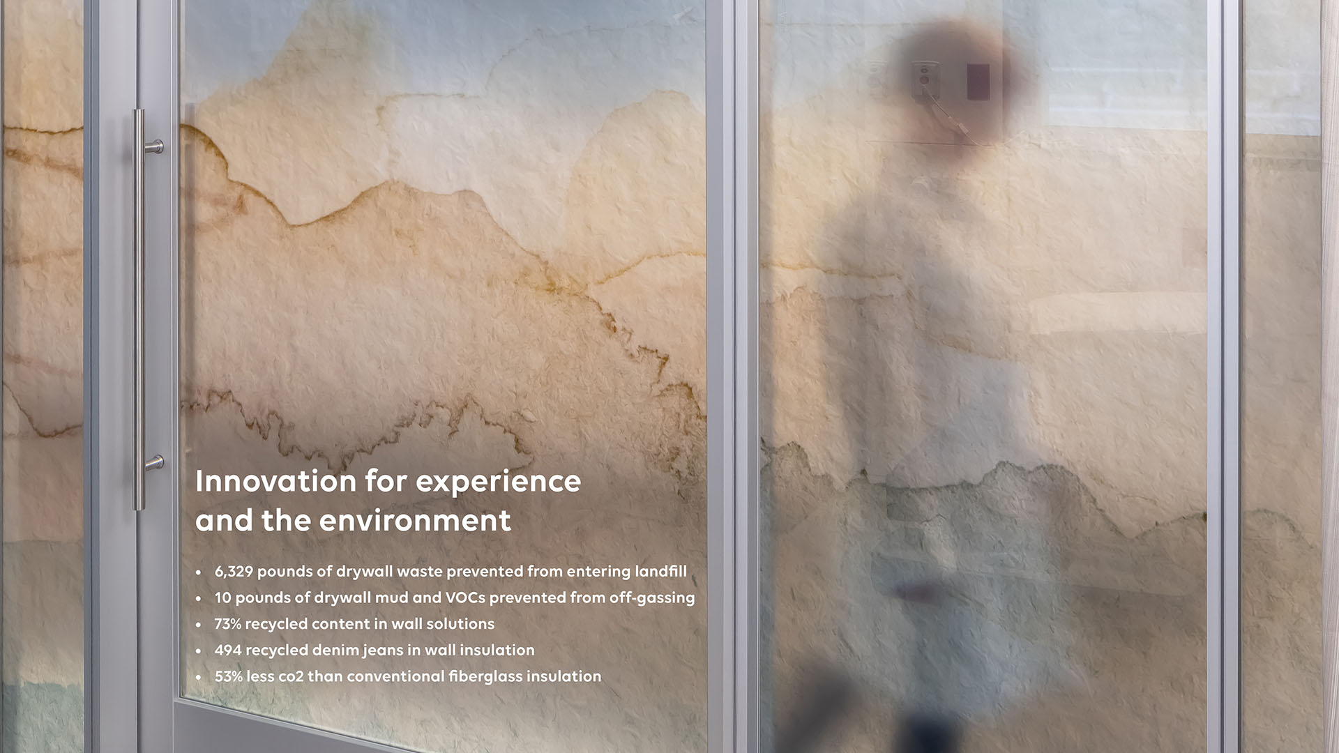
The installation of the graphics into the built environment is also an important aspect of these Centers. The paintings are all directly printed on tile, glass and solid substrates utilizing wall systems that are also significantly more environmentally friendly than regular construction applications. Each panel, tile and pane of glass are labeled and printed off site, and then installed on location with an exact fit that allows the lines to flow uninterrupted. The visual texture of the watercolor paper, ebbing tones and hues, create a visually dimensional texture across the various materials, while keeping the smooth sealed surface appropriate for the use and need of the space. This signature Branded Environmental design has been an incredible success in consistent construction application and the elevated experience from patients and staff. The feedback from patients is a communal sense of calm and many have reported that they felt much less anxiety being in a more artful environment compared to traditional bland medical spaces, while the staff have a renewed sense of calming purpose that is helping to combat burnout and fatigue and is significantly helping retention.
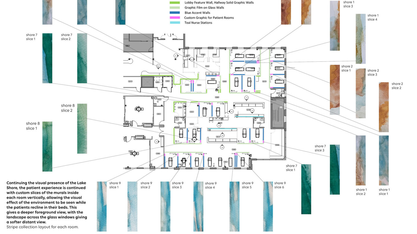
Stripe collection layout for each room.
Heather Novak-Peterson

Innovation for experience and the environment.
Brandon Stengel

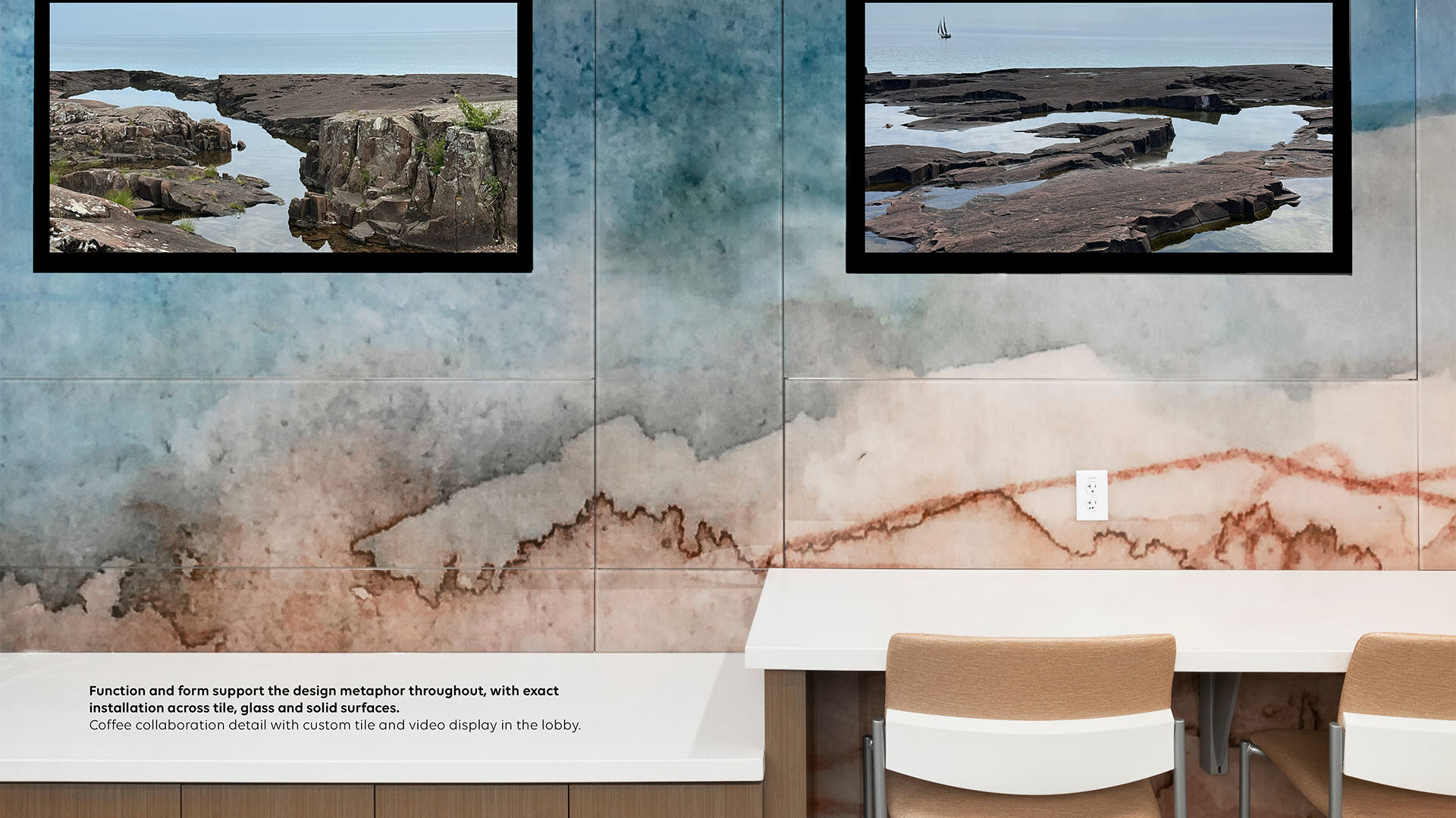
Function and form support the design metaphor throughout, with exact installation across tile, glass and solid surfaces. Coffee collaboration detail with custom tile and video display in the lobby.
Mitchell Stier
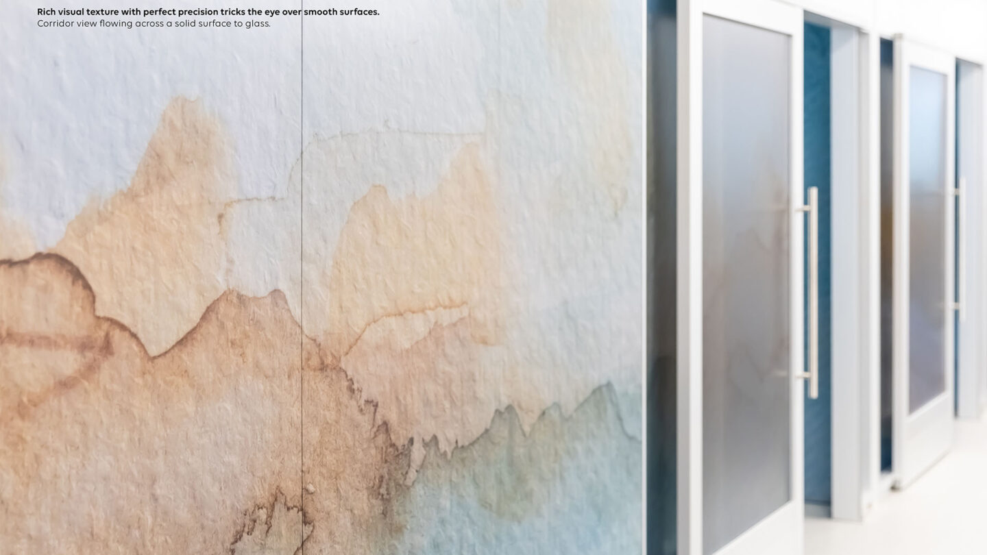
Rich visual texture with perfect precision tricks the eye over smooth surfaces. Corridor view flowing across a solid surface to glass.
Brandon Stengel
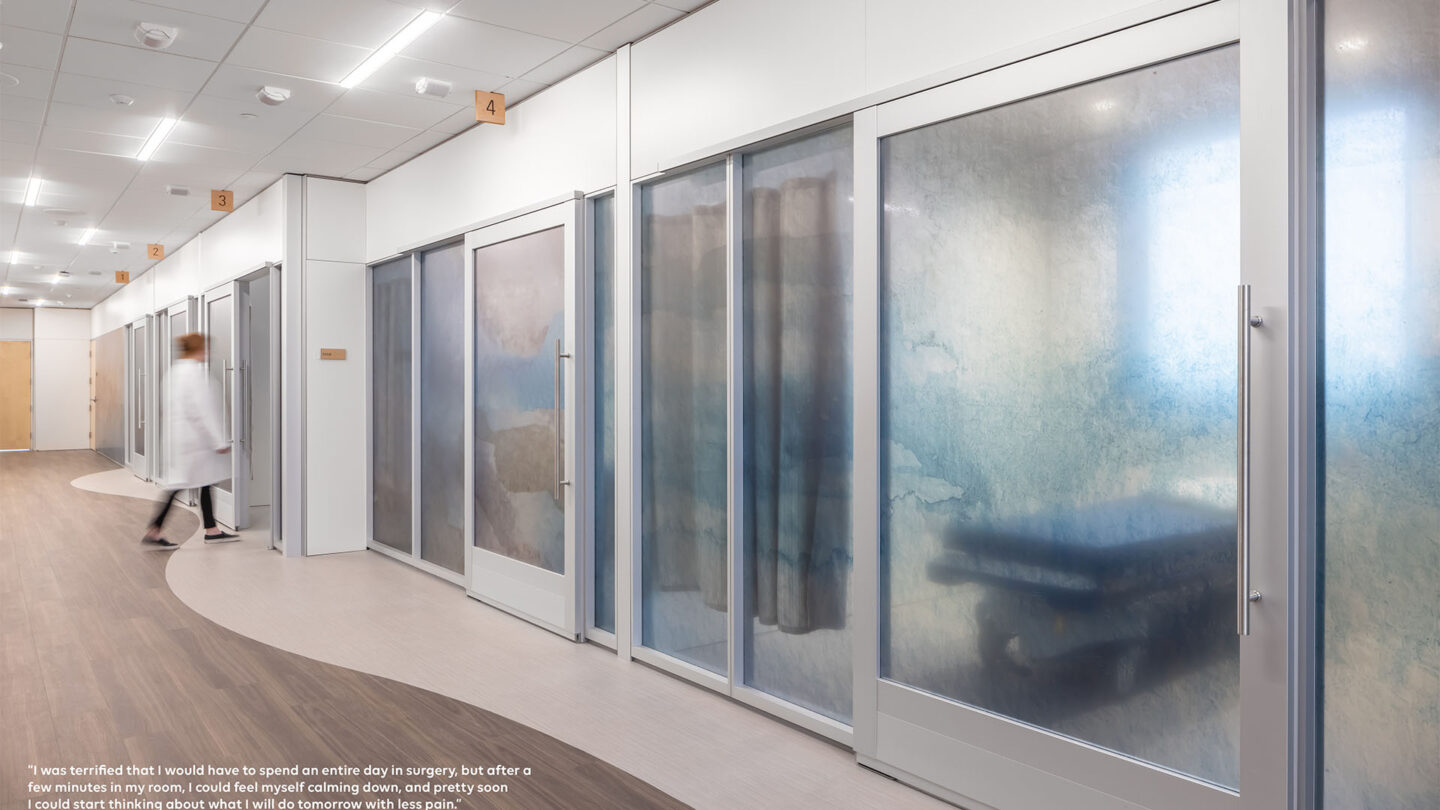
Doctor approaching a patient room in the 18 hour surgical wing.
Brandon Stengel
Project Details
An elegant example demonstrating the impact of color, texture, and composition to transform sterile spaces into soothing sanctuaries benefitting both patients and visitors.
The environment, both within the healthcare facility and the world at large, were prioritized in this elegant and calming solution. This thoughtful approach to creating a peaceful atmosphere through use of color hues, texture, and embedded meaning clearly demonstrate the impacts that placemaking can have on our wellbeing and peace of mind.
Design Team
Heather Novak-Peterson (principal and designer)
Collaborators
BDH (architecture)
Synergy Architectural Studio (architecture)
Identity Ink (physical fabrication)
DIRTT (physical fabrication)
adaptt
Photo Credits
Brandon Stengel, Farm Kid Studios
Mitchel Stier
Open Date
October 2023
