Give Me a Sign
What symbol do you wish existed? The “Give Me a Sign” exhibition at the Cooper Hewitt, Smithsonian Design Museum charts the impact of the original 1972 Symbol Sourcebook, and invites visitors to create their own symbols for 2024.
Agency
Studio Matthews
Practice Area
Client
Cooper Hewitt, Smithsonian Design Museum
Industry

The Challenge
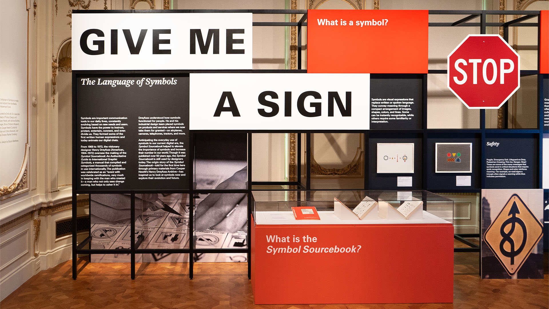
We were tasked with bringing the Symbol Sourcebook content to life as a dynamic in-person experience, featuring audience contributions and engagement. Additionally, we were challenged to devise an inexpensive display system that barely touched the walls of the galleries, to successfully ‘float’ within Cooper Hewitt’s historic and protected spaces. As the core content of the exhibit was a book, there were very few artifacts to showcase, meaning that we had to bring dimensionality and depth through our design and all with a very tight fabrication budget.
Project Vision
Inviting visitors to ‘give me a sign’: Crowd-sourced content was a hallmark of the original Sourcebook, authored by industrial designer Henry Dreyfuss (1904–1972). Dreyfuss and his team invited designers from around the world to contribute (mail in!) their icon designs to the Sourcebook, in an effort to promote the power of symbols to facilitate quick and efficient global communication. In this spirit, one of our main goals was to integrate audience engagement and visitor-contributed content, leading to the following exhibits: In a gallery describing the rich history of Olympic symbols, visitors can interact with a projection of a life-sized Olympic symbol a weight-lifter, a volleyball player, a wrestler and try striking a pose to match. In another, visitors gathering around a central illuminated table can learn how symbols are designed and try their hand at solving classic design symbol problems. Their sketches are added to the growing collection in the gallery. As they exit, visitors are invited to identify and create a symbol they feel is missing from the world, and submit their idea or design online, to co-create an international Symbol Sourcebook of 2024. Starting with something so familiar to the audience everyday symbols presented an opportunity to play with scale and create a mix of fun and challenging experiences.

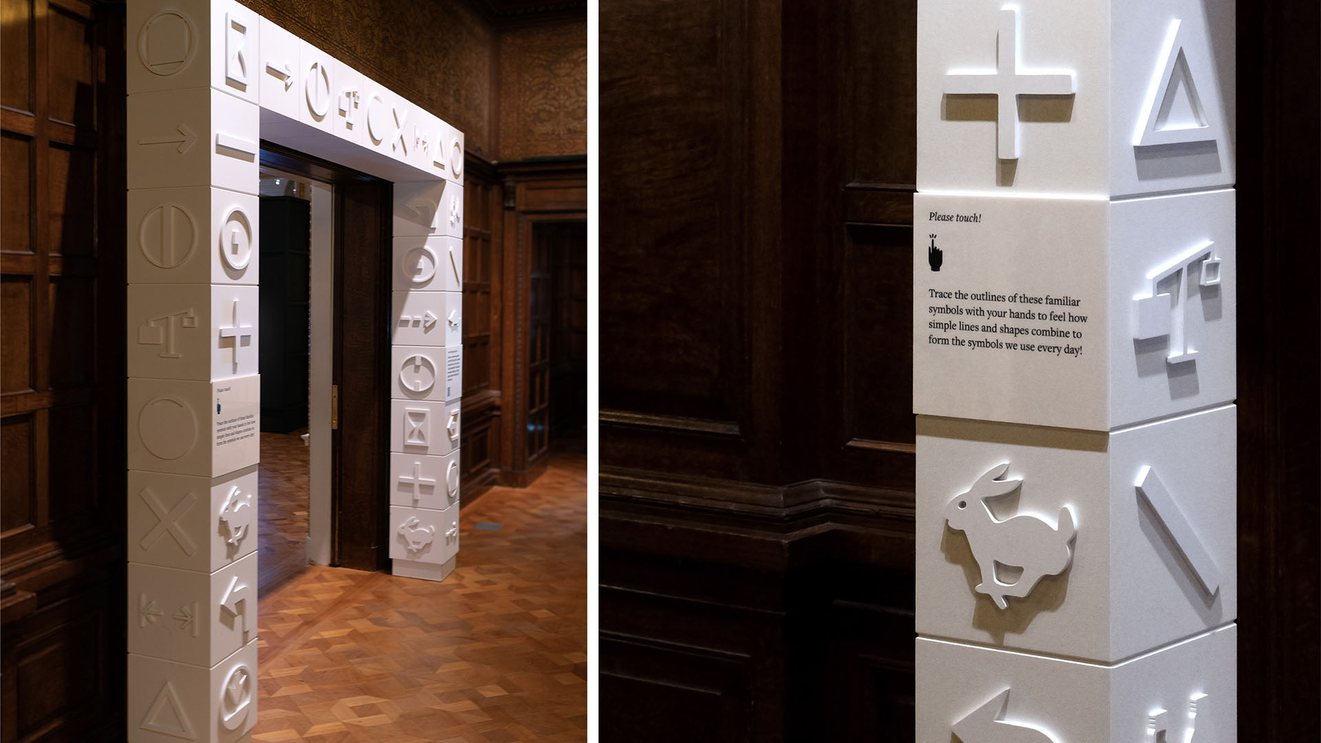
An entry portal to the exhibition responds to the surrounding gridded, paneled walls of the Cooper Hewitt lobby, and provides a tactile experience for visitors.
Studio Matthews
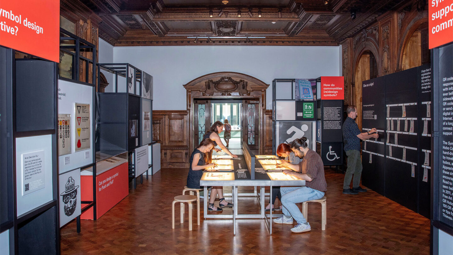
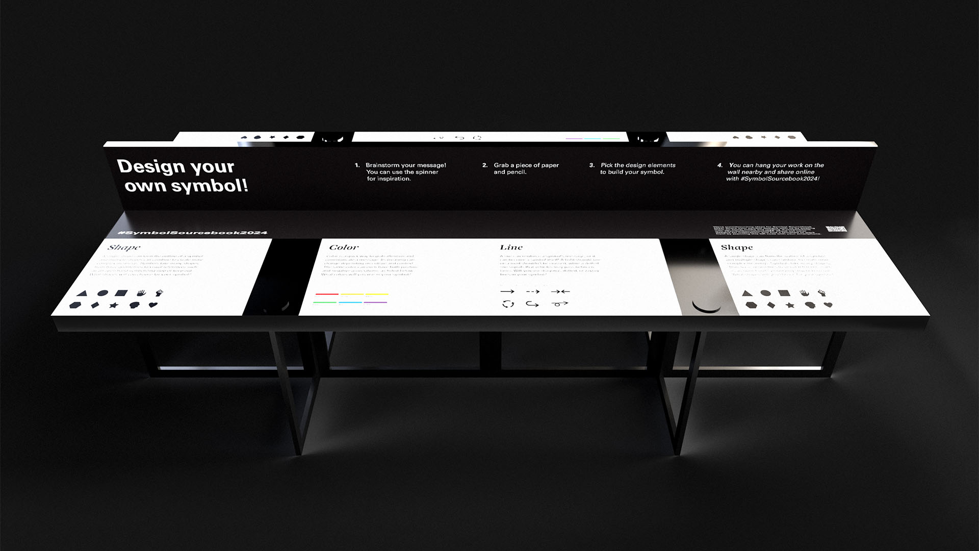
Visitors gathering around a central illuminated table can learn how symbols are designed and try their hand at solving classic design symbol problems.
Elliot Goldstein
Design + Execution
The freestanding modular system was designed to accommodate a wide mix of content, from photographs to quotes to artifacts. The grid system references the strong modular design of the Symbol Sourcebook. An entry portal to the exhibition responds to the surrounding gridded, paneled walls of the Cooper Hewitt lobby, and provides a welcoming, tactile experience for visitors. Visitors gathering around a central illuminated table can learn how symbols are designed and try their hand at solving classic design symbol problems. Icon sketches from the worktable can be added to the growing collection in the gallery. Some symbols in the original Sourcebook are a little cryptic to today’s audience. As they exit, visitors are challenged to correctly identify the meaning of some of the 1970s symbols.

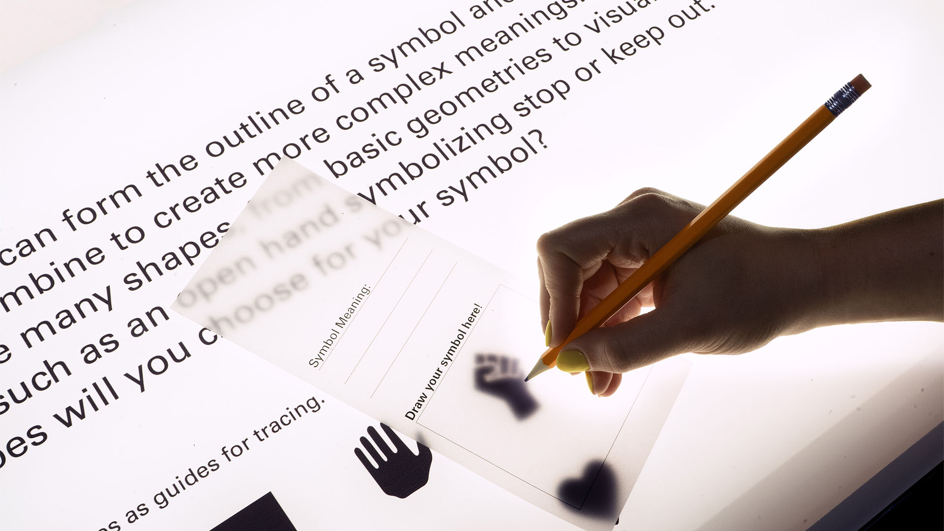
The central light box work table presents visitors with a range of symbol design challenges.
Studio Matthews
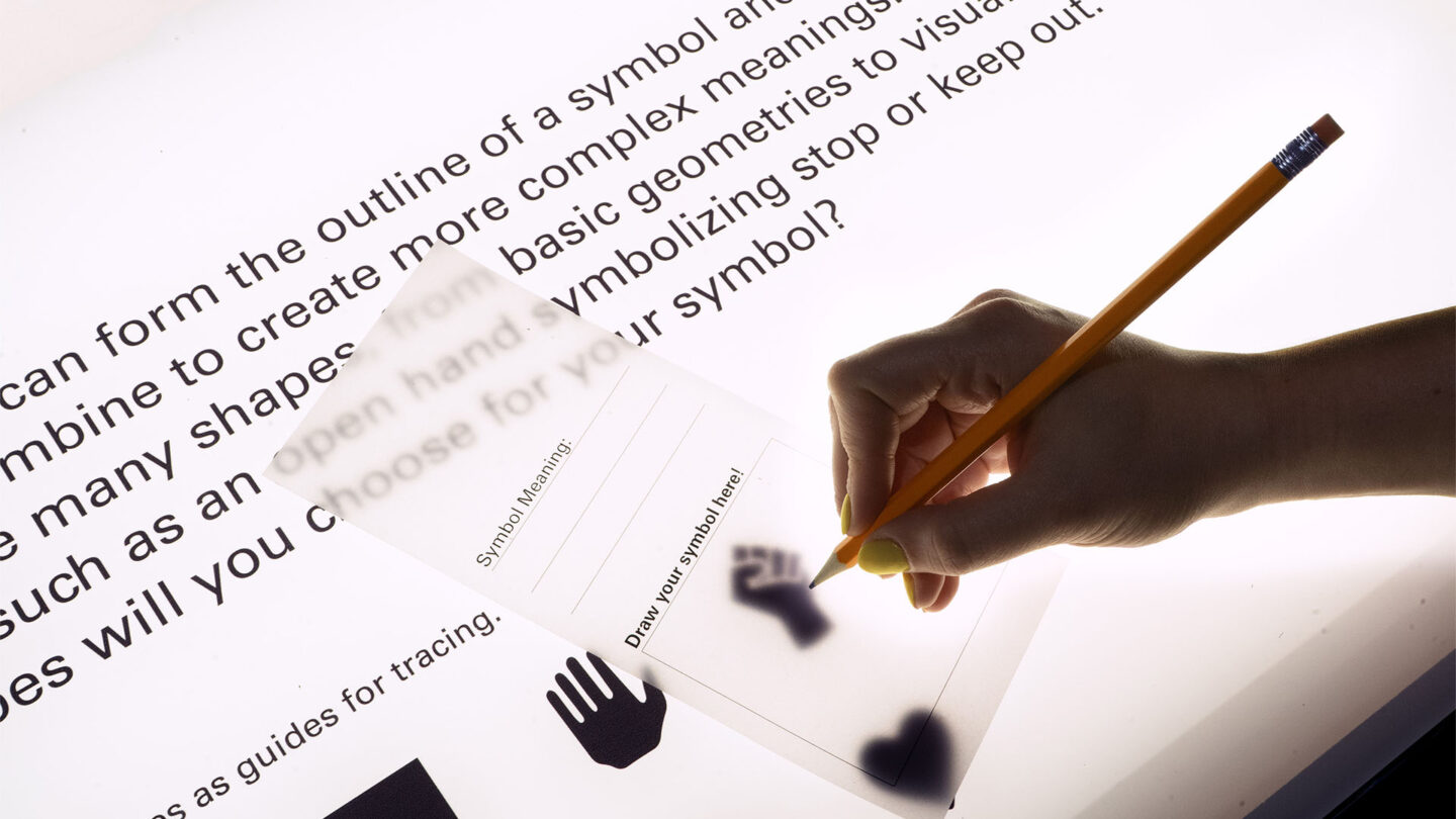
Icon sketches from the central work table can be added to the growing collection in the gallery.
Studio Matthews
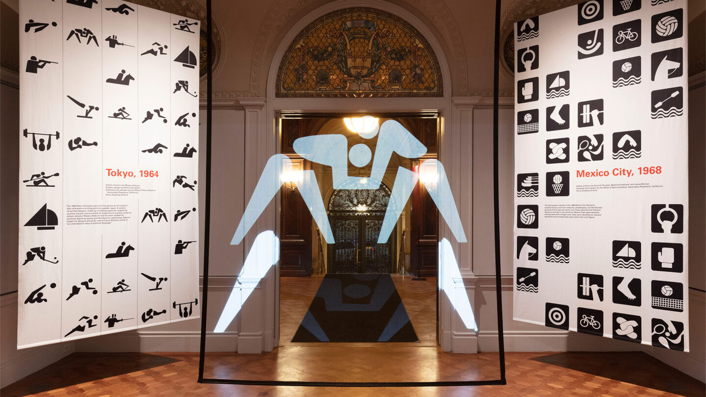
Surrounded by iconic families of Olympic symbols, visitors can interact with a projection of a life-
sized symbol and try striking a pose to match.
Elliot Goldstein

Can you mimic the sports symbol using your body? Visitors can interact with a projection of a life-sized Olympic symbol weight-lifter, volleyball player, wrestler and strike a pose to match.
Studio Matthews
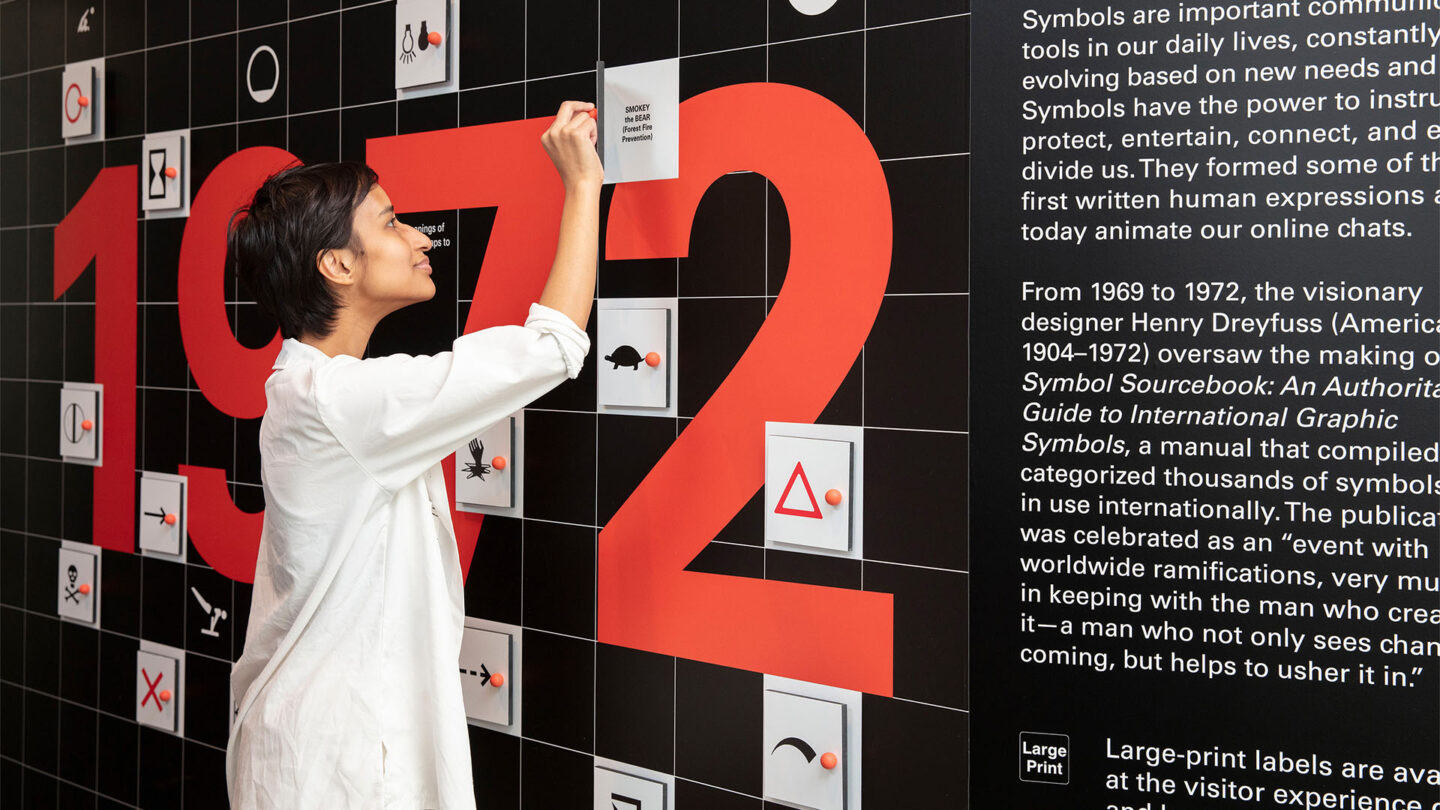
Some symbols in the original Sourcebook are a little cryptic to today’s audience. As they exit, visitors are challenged to correctly identify the meaning of some of the 1970s symbols.
Elliot Goldstein
Project Details
The restrained use of color, maker aesthetic, and playful moments create a visually appealing and engaging experience. The tactile approach allows visitors to stop and contemplate what could be an overlooked detail. I wish I had seen this in person!
This exhibition's success lies in its ability to achieve a remarkable impact with minimal resources. Its simplistic yet effective modular system, coupled with engaging forms of interactivity and inventive concepts, culminate in a unique visitor experience.
Design Team
Kristine Matthews (design principal)
Marta Bernstein (project lead designer)
Jessica Cooper (designer)
Eli Kahn (designer)
Daniel Robinson (illustrator)
Meg Graham (project manager)
Collaborators
Volume Industries (physical and digital fabrication)
Noah Loesberg (physical fabrication)
Diamonds Green Inc. (physical fabrication)
Emily Orr (associate curator)
Yvonne Gomez (exhibitions head)
Molly Engelman (exhibitions project manager)
Photo Credits
Studio Matthews; Elliot Goldstein © Smithsonian Institution
Open Date
May 2023
