Food for Thought
“Food for Thought” was a groundbreaking exhibit that recognized heroes who otherwise go unnoticed those who prepare and distribute over 88,000 meals each day to ensure Baltimore City Public School (BCPS) students don’t go hungry.

The Challenge
This important topic warranted a big impact, but needed to be implemented with an incredibly small amount of funding. The budget had to support both traditional interpretive graphics, hands-on interactives, and the gallery’s lighting and audio programming. The project required extremely creative and budget conscious design decisions throughout the entire process.
Project Vision
Even when school buildings closed during the COVID-19 pandemic, BCPS’s Food and Nutrition Services staff never stopped feeding students and their families. In a city where nearly 80% of children are considered food insecure, their dedication makes a tremendous difference. We worked with the Baltimore Museum of Industry to design an immersive experience that elevated these workers to the level of recognition they deserved. To showcase who they are, we focused visitor attention on striking portraits by photojournalist J.M.Giordano and personal interviews created by public radio producer Aaron Henkin. To impress upon visitors why their work is critical, we bolstered each image with data graphics about the impact of school nutrition on kids and the greater community.

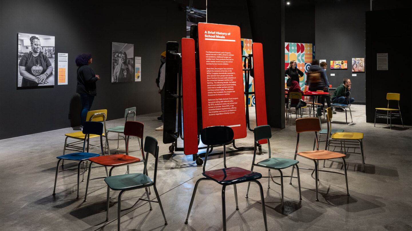
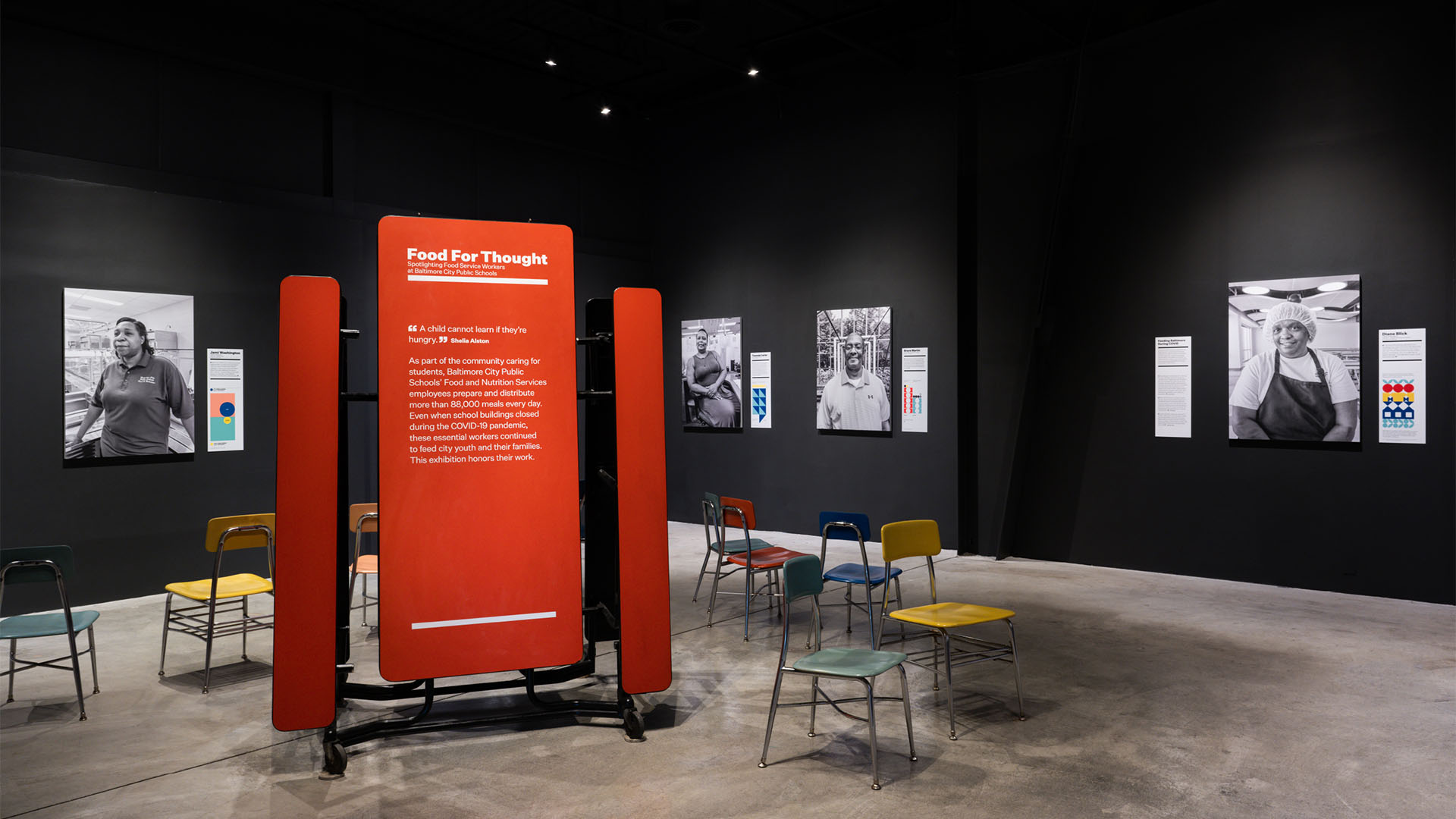
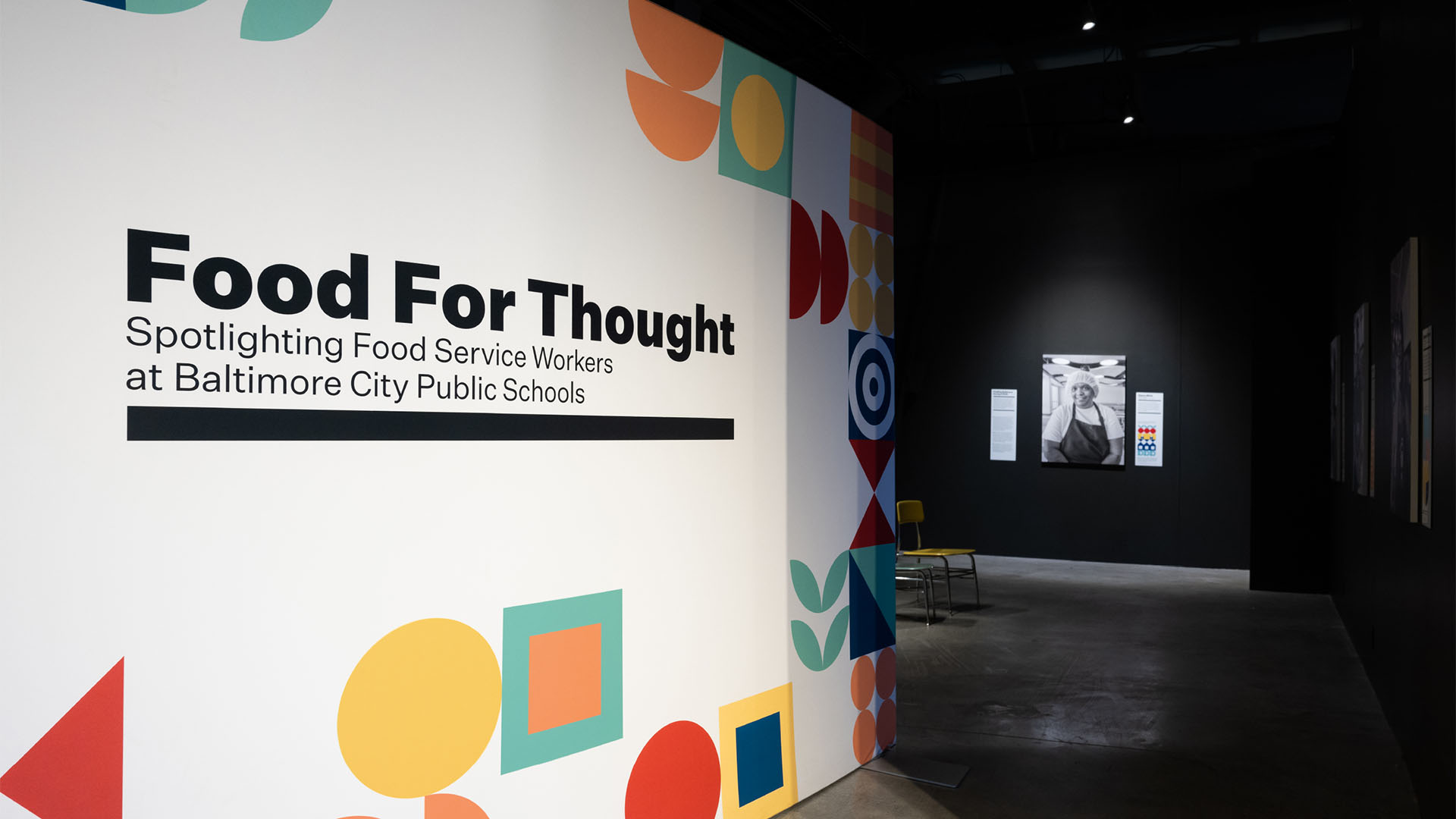
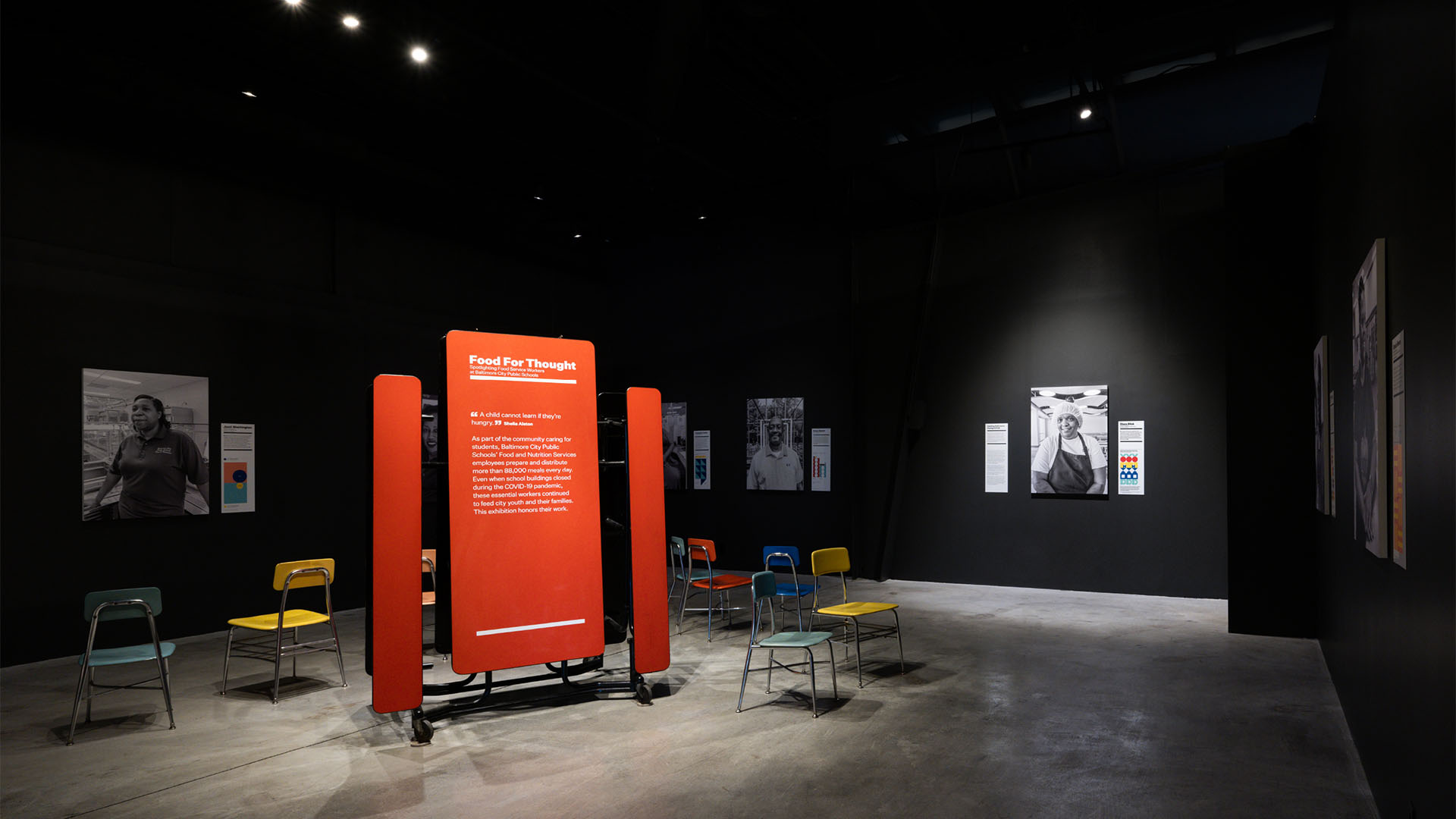
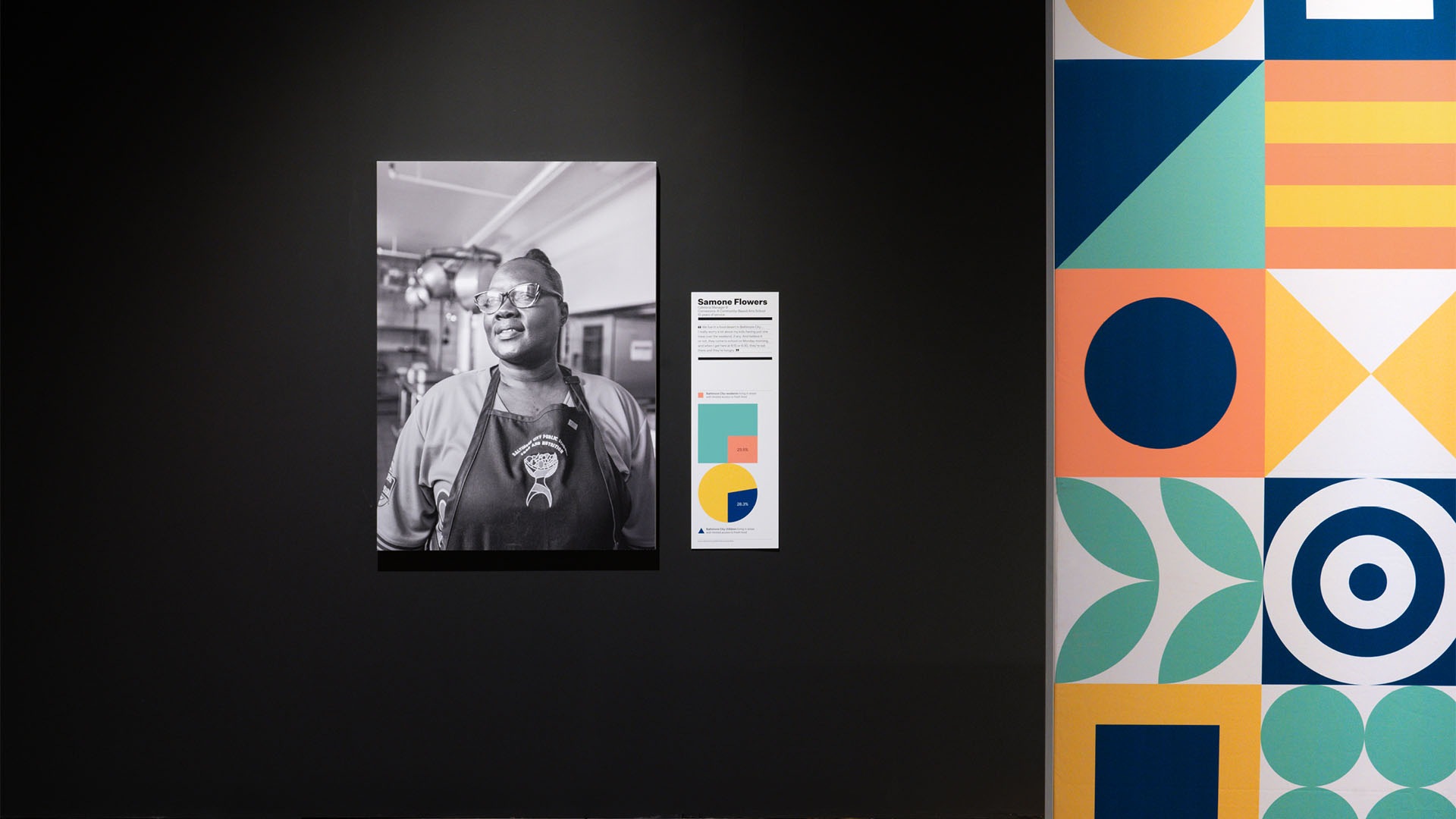
The entrance wall welcomes visitors with the exhibit’s signature “Educational Bauhaus” style. Its simplified shapes in our melamine color palette are a subtle introduction to the nuanced discussion ahead.
Vivian Marie Doering
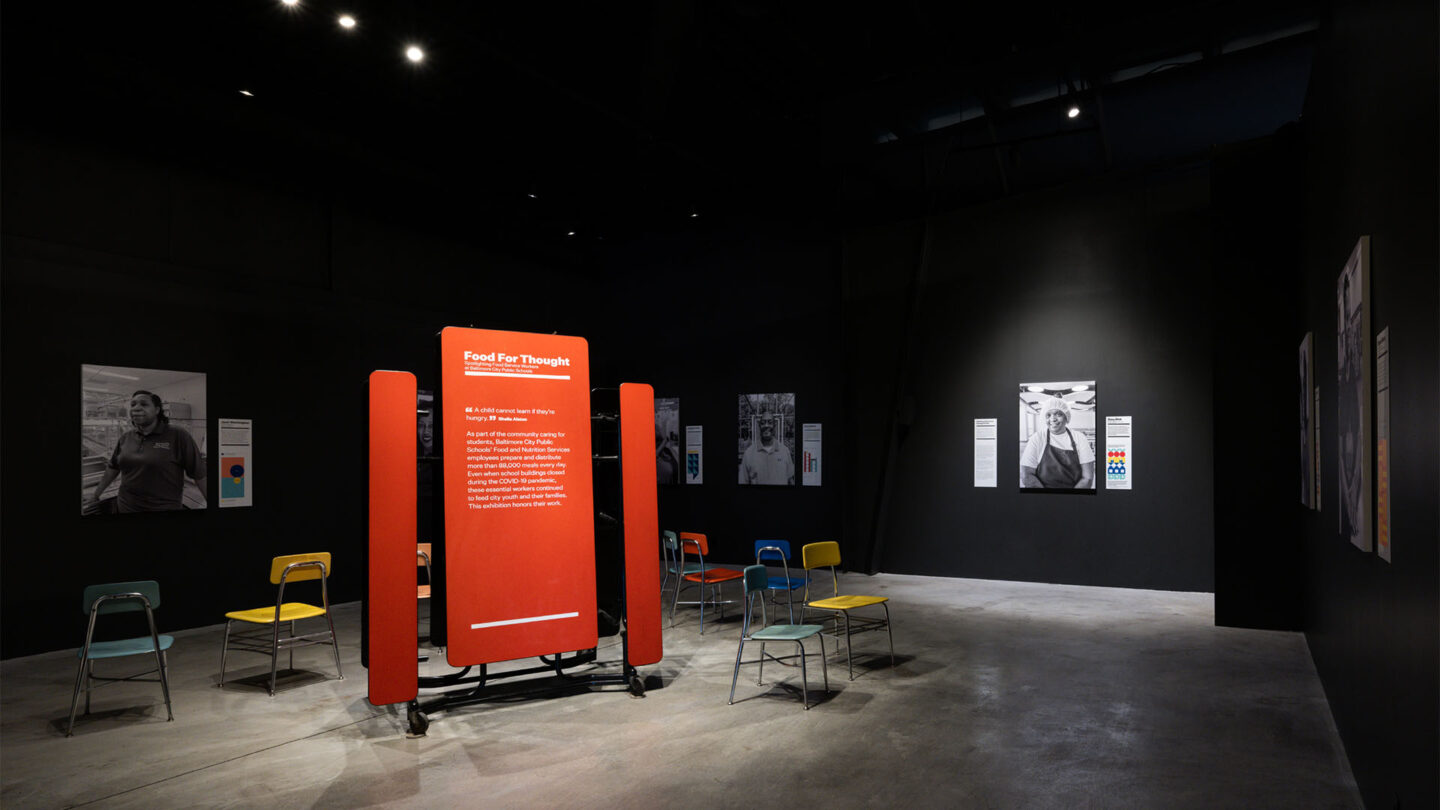
Syncing the audio presentation to the lighting controls allowed us to illuminate each worker’s portrait as their voice played above. Cafeteria chairs put visitors in their own school experience.
Vivian Marie Doering
Design + Execution
When setting the scene, we used cafeteria furniture in unexpected ways. We hand-picked melamine chairs, sourced from BCPS’s surplus supply, to create the color palette; elsewhere, a traditional cafeteria table was reimagined as a text panel. These items elicited a familiar sense of learning, but in a new context, perfect for the educational approach of the exhibit. To increase the visibility of our essential workers, portraits were shot and displayed to make each subject look and feel like a superhero. Accompanying audio recordings allowed them to share their story in their own voice. As a person’s interview played in the space, overhead lighting spotlights that speaker’s portrait. Supporting data graphics followed the chair-based color palette. Topics covered included school nutrition, students’ favorite school meals, and food insecurity in Baltimore. The visual system’s adherence to geometric forms, a simplified color palette, and function-as-design sensibility amounted to a style we called “Educational Bauhaus.”
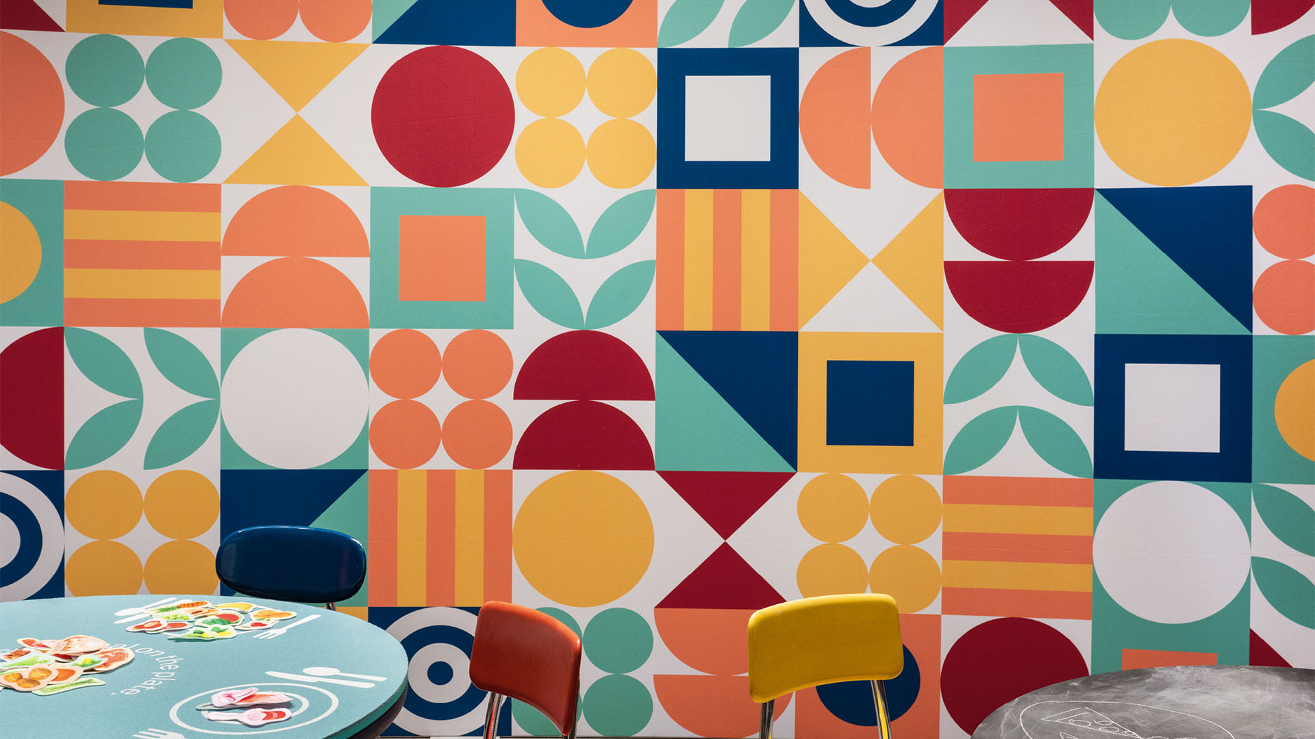
An interactive area encouraged both children and adults to engage with the subject of school meals and nutrition. Two tables introduced tactile elements typically found in primary schools: a chalkboard table asked visitors to “draw your favorite school food memory,” while a felt-covered table prompted them to “create a balanced meal on the plate.” At a third table, people were asked to write thank-you notes to food service workers; the resulting messages were displayed nearby. Ultimately, the project came together thanks to a lot of cooperation, collaboration, and budget resourcefulness. It generated a great deal of press, and it sparked a city-wide conversation about the hunger and nutrition issues plaguing many of Baltimore’s most vulnerable residents. Still, no amount of press can overstate the commitment the Food and Nutrition staff have to taking care of our children’s wellbeing. They work tirelessly and stretch every penny to keep these kids fed. By making the personal feel heroic and the heroic feel personal, we hope we remind visitors that individual efforts on a daily basis can positively impact us all.
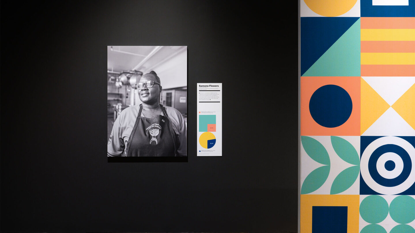
Data graphics accompanying each portrait visualize food-based topics and carry the color palette throughout.
Vivian Marie Doering
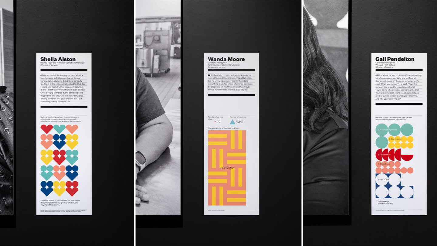
The graphic panels’ shape and layout mimic nutritional labels–another example of the mix of play and gravitas present throughout the exhibit.
Vivian Marie Doering

An interactive, hands-on area offers opportunities for both children and adults to engage with school-based meals and nutrition.
Vivian Marie Doering
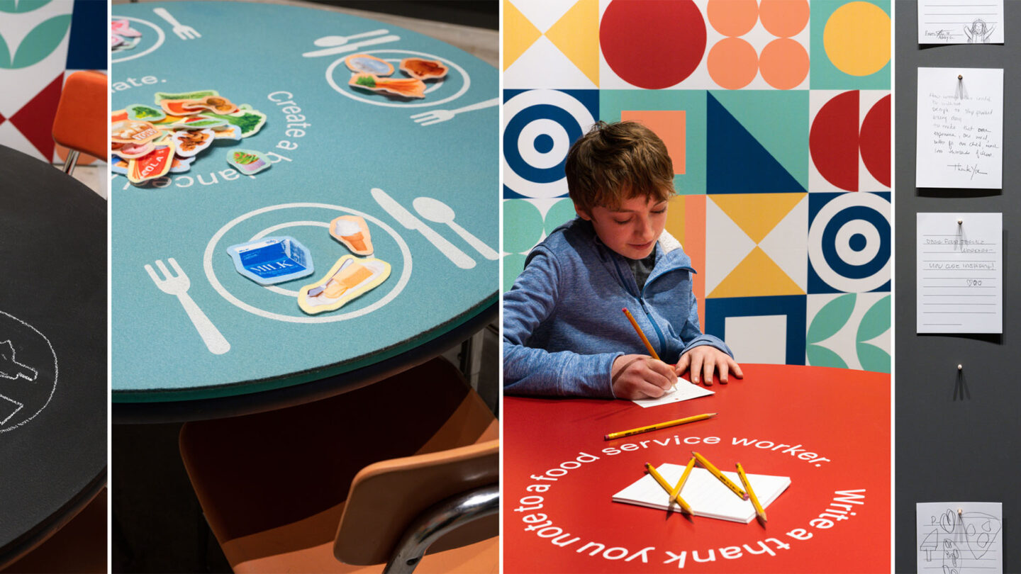
The area’s three tables feature grade-school level activities: chalk drawing, felt food, and a simple writing prompt.
Vivian Marie Doering
The exhibit juxtaposes everyday materials with the immersive choreography of the portraits and interviews to create a surreal experience that heightens each visitor’s awareness of the food service workers’ heroism.
Vivian Marie Doering

Project Details
Food and food scarcity is an extremely important issue that many young people struggle with on a regular basis. To celebrate service workers, typically not at the foreground, through the use of mundane materials like lunch tables make this project excellent. Public school workers are unheralded leaders, design coupled with this social issue was wonderful.
Centering the voice and importance of a vital role in society that often goes over look gets to the core of what make experience design so important. This exhibition create a very compelling and approachable space that balanced graphics with familiar objects, like the lunch table, to connect with the audience.
Design Team
Jeremy Hoffman (creative director
Collaborators
P&M Exhibits (physical fabrication)
DUO Signage + Graphics (physical fabrication)
Aaron Henkin (interviews and audio production)
J.M. Giordano (portrait photography)
Beth Maloney (curator)
Photo Credits
Vivian Marie Doering
Open Date
February 2023